In creating websites, design is of utmost importance. Web design helps you build your brand and it tells your customer what kind of business you have. Subconsciously, people are naturally drawn more to things that are visually pleasing. In fact, a Stanford study said that 75% of users base a company’s credibility on its visual design. When it comes to designing, there are two kinds: creative design and functional design. Something that’s eye-catching is not necessarily a good design. There are times when function is a priority in design.
Creative and Functional
 Image Credit: Paldesk
Creative design’s purpose is to make a product look good. The designs are usually eye-catching, unique, and memorable. This is so that customers who see your brand or your product, pay attention to what you’re selling. These designs can come in the form of ads, videos, social media posts, or the visual design of your website. You’ll know that something is a great design if it’s memorable, clear, credible, unique, and relevant.
On the other hand, functional design is when something is designed in a way that the tool performs its task. In web design, if the goal is to sell your product, you design your website in a way that it highlights the features of your product. If you’re a blog and you share information, your website is designed in a way that your posts are readable and easy on the eyes.
So what should you keep in mind to make your website more functional?
Functional Design Rules

Consider your website’s purpose/goal
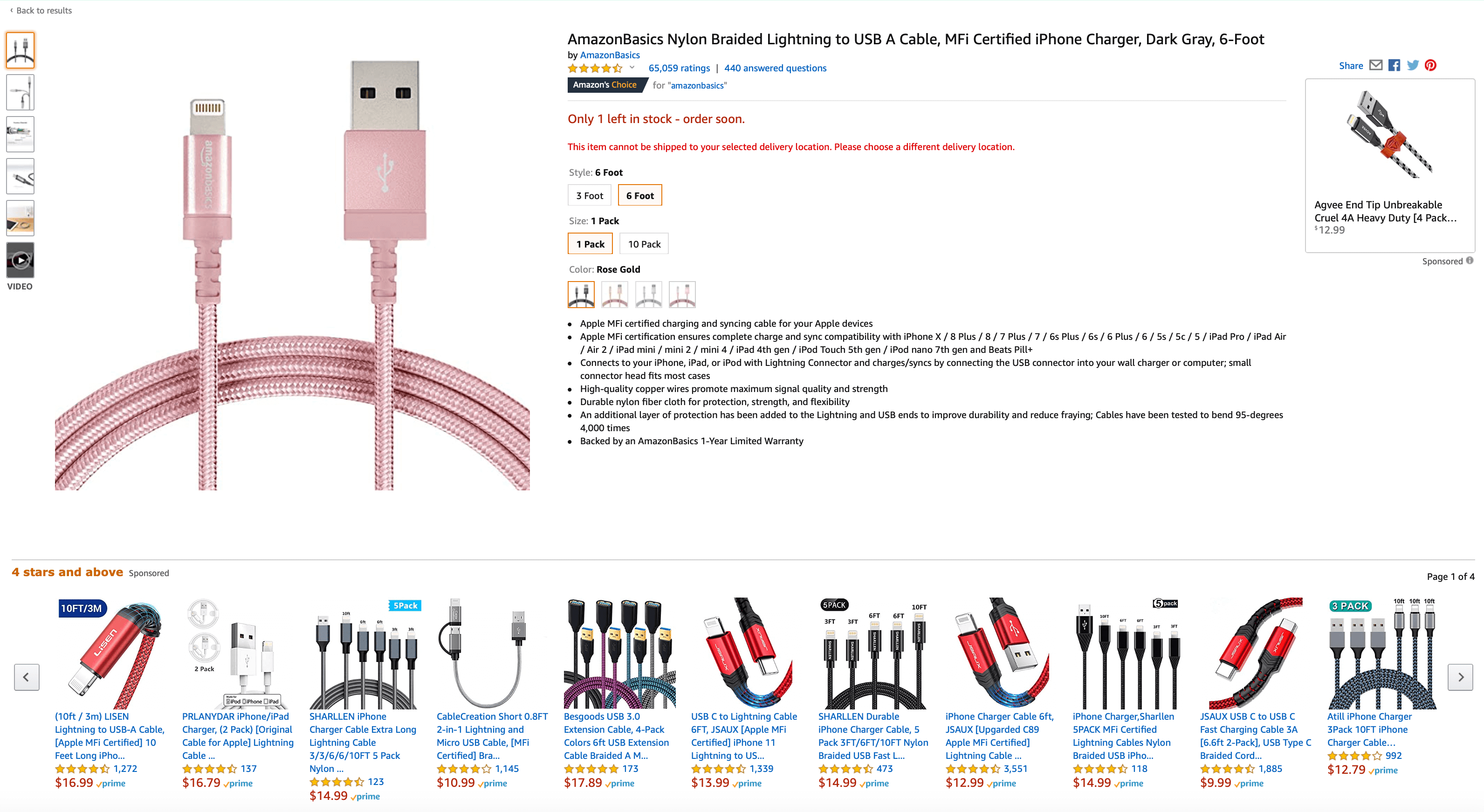
The first thing to consider when designing a website is its purpose or goal. Knowing your website’s goal and purpose will help you decide what features you want on your website. One great example of this is Amazon’s website. Amazon’s goal is to sell the products they have on their website. To achieve this goal, Amazon has created a design where users can easily see customer reviews of the product. Additionally, they also added a section where users can see related items to the product, as well as other items that customers who visited the page viewed.
Remember your audience
Another thing to keep in mind when designing a website is your audience or your target market. Knowing your audience will not only decide the navigation of your website but also how user-friendly your interface would be, as well as how readable your website should be. If your website’s audience are kids or the elderly, then navigating through your website should be simple. Complicated motions or placement of linked pages, while aesthetically pleasing, may make someone who is not as tech-savvy confused. Moreover, if your website serves an audience from different backgrounds, you need to think of a design that would be inclusive.
Simple and Clear is the way to go
When you want your website to be user-friendly, simplicity and clarity is the best way to design a website. When someone visits your website, you want them to immediately know what your website does or what it is for. A confusing navigation of your website, or unclear content will only result in the user not understanding your website. When that happens, your website basically did not achieve its goal or purpose. When designing, make it a goal for your website to be like a ball – a simple design that everyone knows how to use and play with.

Getting Feedback and Handling Errors
This is especially important for interactive websites. Always remember to let the user know that your website is working. Show the user that the task is already done or completed. Not informing them will only leave the user unsure if the task actually went through, and when you leave someone feeling unsure if your website is working or not, there’s a possibility they won’t come back for a second time.
Another thing to remember in web design is that your website should be able to handle errors. There will be times when users or customers of your website are bound to make a mistake. It’s unavoidable but websites should have the ability to accommodate those mistakes. These could range from persistent menus to 404 error pages that can link them to other pages that they might be looking for. Always remember that a good web designer is able to anticipate the mistakes of a user and makes sure that the website knows how to give a solution.
Desktop and Mobile-Friendly Use
Websites today are accessible through different mediums – desktops, laptops, tablets, and cellphones. While there are now tools that can automatically adjust your website design to desktop use or mobile use, some websites don’t. If a website doesn’t have a mobile-friendly design, it becomes much harder to navigate, thus, making it more difficult for your users. This is especially important nowadays as majority of the people who access the internet access it through their phones.
You might also enjoy: