Is your client having issues with people abandoning carts on their product page? Or maybe they look and look but never make the purchase.
Some consumers are going to browse but making the conversion from window-shopper to a customer is the final obstacle to gaining new sales. If your client have noticed a slump, or want to grow the business, here are eight things you can do to increase product page conversions.
1. Split-Test
The split-test is a valuable tool to help you objectively review your pages. These tests reveal the pages that are having the most activity. More activity is a good thing because it adds to the likelihood of sales.
Using the test to weed out the pages that don’t work means your e-Commerce site is going to do far better than before. Don’t forget to also test your mobile pages. It’s a growing trend to shop on your phone and you don’t want to miss out on those sales.

2. Keep the Call to Action Above the Fold
This rule applies to what the user sees on their screen (above the fold) when they land on a page. You only have seconds to create an impression that urges the user to scroll down and continue investigating.
Rather than depending on their willingness to scroll down, put your call to action above the fold. If they have to work for it, you will lose them. Make it bold and noticeable so that they will see it and use it. While a button that says “add to cart” can be great, you might want to spice it up a bit by changing the wording a bit. Incorporate your brand into that button to make them stand out.
3. Tell a Story
If you want to sell a product, tell a story about it. Maybe a bit about the makeup guru and the inspiration for this particular product line. Or, the winemaker who has an amazing story about his trip to Italy and what he learned there to include in their wine.
These heartfelt stories attract buyers. They want to be a part of that story and buying the product does that for them. When they show off the product, they are more likely to remember the story and share that with friends. Someone will ask where they found it and your website gets mentioned. Most people don’t forget where they make an emotional purchase.
4. Add Reviews and Testimonials
Reviews and testimonials are your best friend. It’s not enough for you to believe in your product or service. We wish it was but having other people talk about how they loved your products will get more people interested. A lot of people will not buy a product without first reading reviews and testimonials.
Especially new product trends and services. CBD gummies dosage is a tricky thing for some and they want to read about how others figured it out with your help and your product. Maybe they are new to the area and are hesitant over which landscaper to hire for groundskeeping. Get those reviews and testimonials for a fast boost to conversion.
By the way, don’t stress out much about negative reviews. Those are perfect for helping you fine-tune your offerings and service. They are also a tool to show others how you respond to criticism and if you make changes, you are serious about customer services.

5. Use a Heatmap
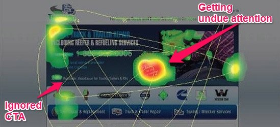
Heatmaps are a must-have when designing or redesigning a website. They are also handy to teach you more about the people visiting your site. With a heatmap, you can see what it is your consumers are looking at.
You can also see how far they scroll down and everything they click on. It helps you learn if there are any distractions on your site that have them leaving the page before completing a conversion. Then you can make changes accordingly to match the habits of your potential buyers. Intuitive websites gain a lot in sales.
6. Add a Guarantee
When you add a guarantee, you are showing the consumer your confidence in the product. It means that if they aren’t happy, they know they haven’t wasted time or money buying the product. There are choices to the kind of guarantee, you need to find the one that feels right to you.
Many people have success with the money back – no questions asked guarantee. However, be mindful of that policy. If you are selling an energy drink and people want to send empty cans or bottles back for a refund, that can be a big problem. Tailor it to your brand and mission. For example, this CBD company offers a 30 day money back guarantee if you’re not 100% satisfied with your purchase.
7. Give Your Buyers a Clear Value Proposition
A clear value proposition tells the consumer why they should buy your product and not your competition. What sets your product or service apart from others?
If you don’t tell them, they are going to look for the cheapest version without considering yours. Use your mission to think back to why you wanted to sell this product or service to the masses. The clear value proposition should be inspiring to your clientele.

8. Provide a Variety of Payment Options
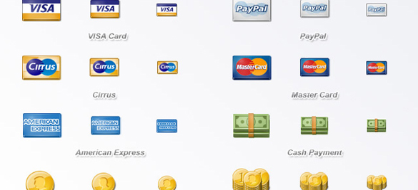
Think about all of the ways we pay for things in the world. PayPal is a hot one. There are tons of credit cards available. Some people even use electronic funds transfer (EFT) for purchases. If you limit the choices, you limit who can buy from you.
Have as many options as possible so everyone feels welcome to the table. Don’t forget about using third-party credit lines for purchases as well. You get the money, the third-party credit line (such as Bill Me Later) takes all the risk.
These eight solutions are quick things you can do to boost your product page conversions. Keep your eye on the prize and nurture the relationship between you and the buyer. These tricks will help get a sale but it’s up to you to keep that buyer for the long haul. Some of these tricks may not help much. Use what works and leave the rest for another time.
Author: Spyre Studios