
Websites with animation are pretty common nowadays and we don’t even know it. The animation could be injected into a website to make it the main focus of interest – landing pages, backgrounds, headers, and more. However, some websites introduce the animation so subtly, readers don’t often notice it. This could be via scrolling, navigation, loaders, progress bars, and the like.
Here are some great examples of websites with animation and how they used it to highlight the website:
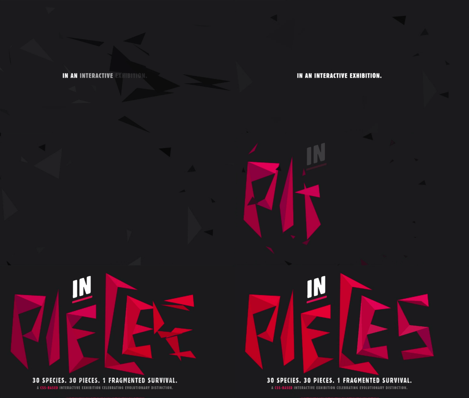
One of the great things about the animation from the Species in Pieces website is the fact that it presents it as 3-dimensional. While it may seem like a lot of work, creating 3-dimensional animation is worth it as it is more attractive to readers. Creating 3-dimensional images takes a lot of effort to learn and takes an equal lot of effort to do good. But, learning how to do 3D animation is always worth it.
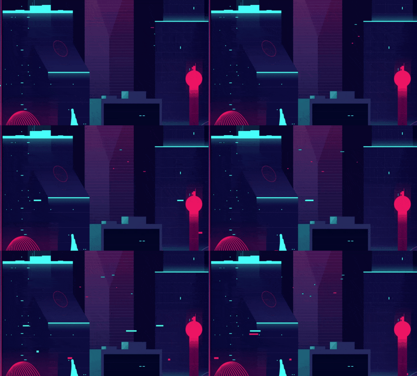
Everything in Roll Park is Moving
What is cool about the Roll Park website is how everything seems to be moving. The transition of the elements is prompted by scrolling. There is no heavy-duty animation on the website but the transition work has breathed life into it. Interactive websites improve user interest and keep them scrolling. The Roll Park website is a great example that simple animation can make the greatest difference in the website.

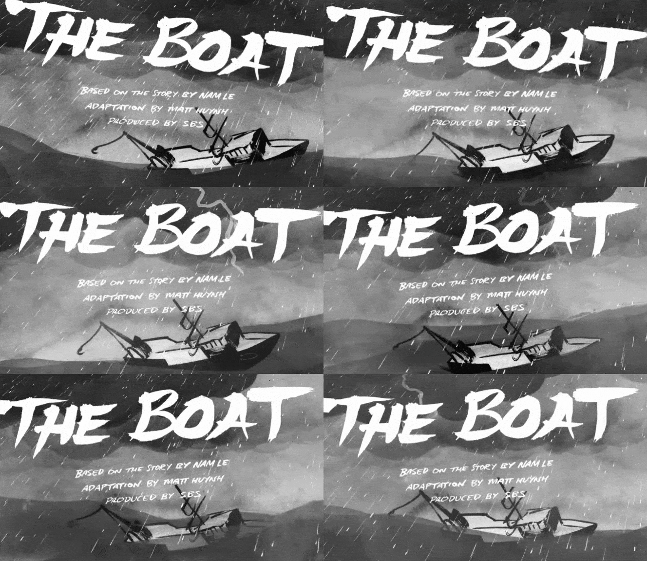
Story Telling of The Boat
Moving black and white sketches – this is the entire design concept of The Boat. This is a storytelling website; it is simply a digital book with moving illustrations. One design tip for creating animation in websites is to give the readers full control of it; this makes the website more interesting and interactive. The Boat has successively done this, requiring prompts from the readers before transitioning onto the next animated illustration or next act in the story.
Traditional Animation with Tarot-a-bot
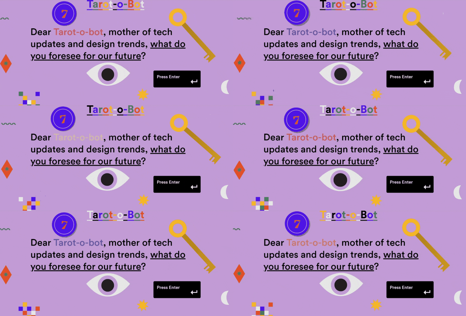
The Tarot-a-bot website shows your typical or traditional website animation. These may look like the things that we have seen back in the early 2000s and 2010s. However, we take note that design trends always go back and forth in time. Designers still do consider traditional animation in their work (albeit with newer codes and language) to make it look retro-unique and relatable to a wide range of audiences.
Navigation Prompted Animation in Pete Nottage
If the client wants a very subtle animation injected into a website, navigation prompted animations are the best way to go. The cursor needs to hover over a certain image (or menu) for it to move. This is a great idea as it prevents the attention of your readers to be taken away from where you are targeting them to interact. Besides, too many things moving in a website all-at-once can look clumsy and cluttered if not done properly.

Minimalist introductory animation from Google
These kinds of animation are commonly seen upon opening websites aimed to market services, apps, or other products. The motion prompts the users to explore more about what is being offered to them.

Of course, parallax scrolling is a prompt we normally see in websites with animation nowadays. The movement of the scroll transforms a website from one form to another, linearly. Without the need for excessive transition work, the website looks alive. On top of that, interactive websites are always interesting for the audience.
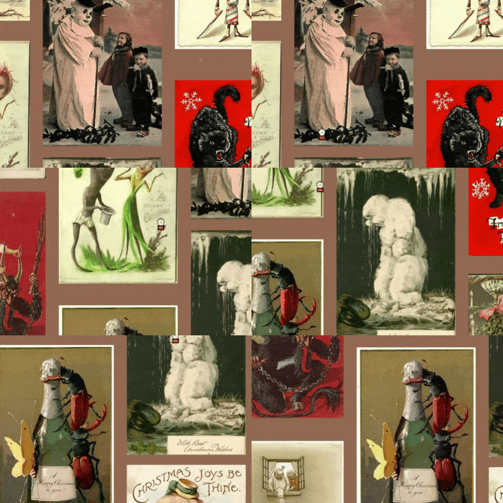
Movable backgrounds are also one subtle technique in introducing animation to a website. Just like in the example below, a user must choose from an entire moving wallpaper of postcards to send to their friends for the holidays. Once they have selected one, they could click on it and it will prompt the next required action (writing a message or sharing the card).

Also read: 16 Free Looped Animation and Samples to Use for Your Projects