
If you’ve got these things in your website, you better remove them before 2019. Here’s our “favorite” outdated or regrettable content choices.
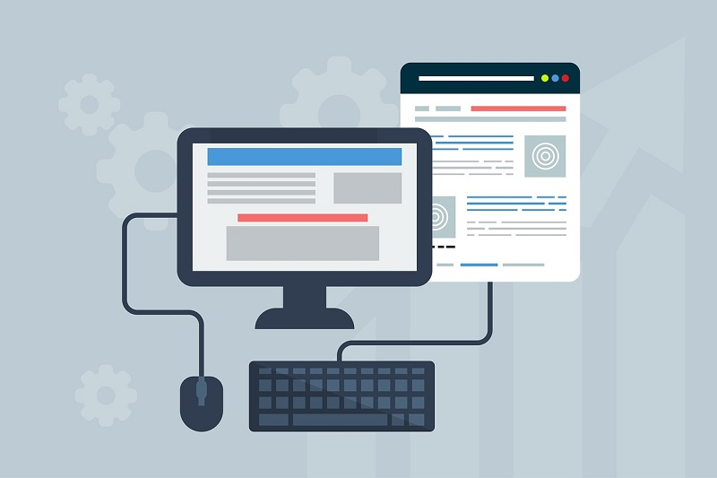
Mouseover Navigation Menus
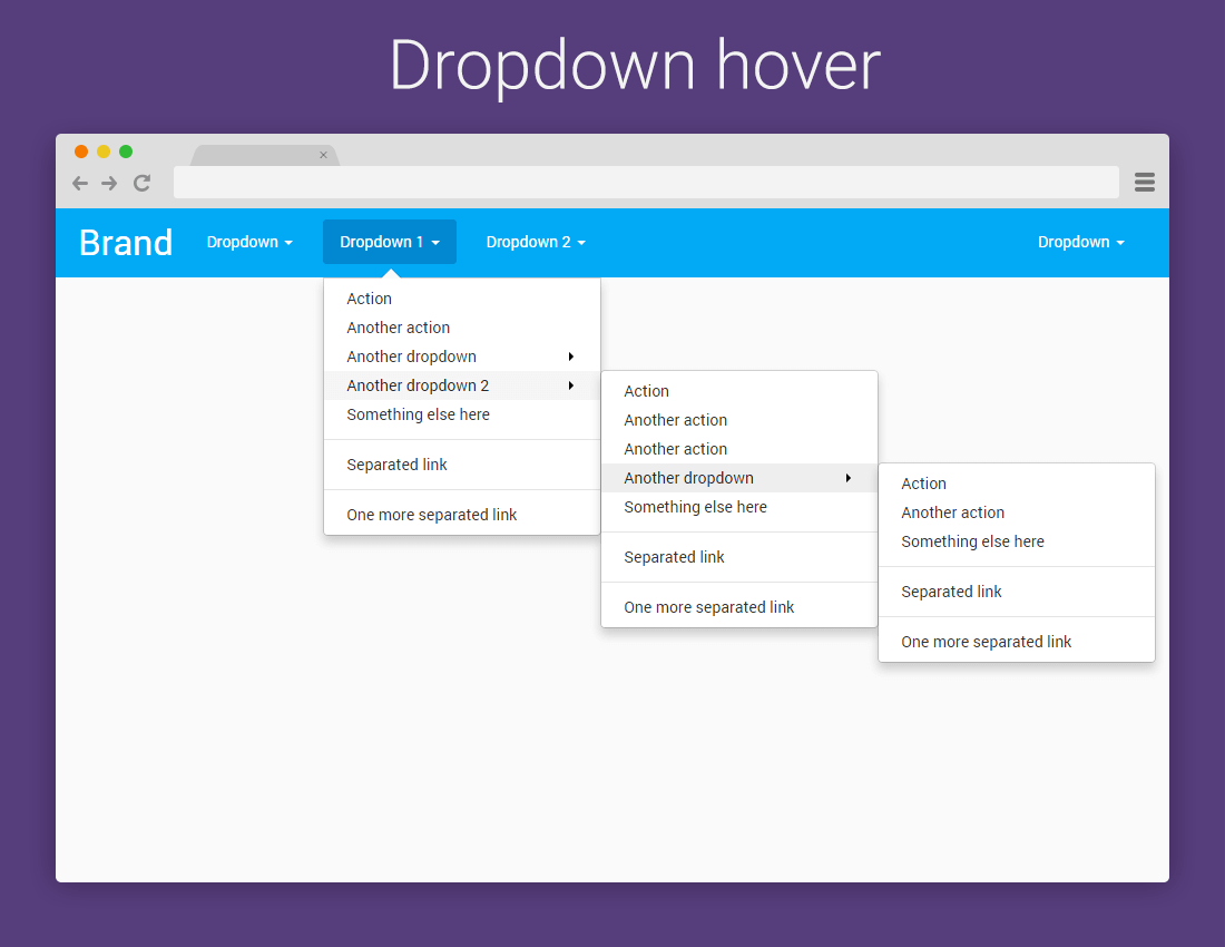
The most obvious problems with mouseover navigation menus is that not every visitor has a mouse. How does a mobile user “mouseover” something? Obviously, they don’t. This leads to slapped together navigation solutions for mobile devices that fail to deliver either clarity or usability.
Trim down your navigation options. Use microcopy that clearly conveys what the user will find on the other side of the link. And arrange them in a way that works for both desktop and mobile users. While the hamburger menu is hardly our favorite design element, it’s better than mouseover navigation.
It’s really best to think carefully about any hover features. You want to reflect desktop user interaction, but don’t go nuts with them. Push up video controls when mousing over a video frame is a good use, for example.
Non-responsive Elements
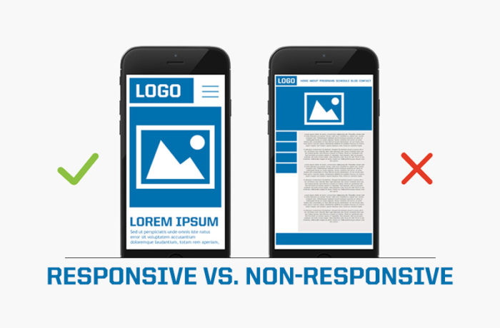
If your website still includes non-responsive design elements, you should be lashed in the public square. What’s kept you? We’ve been doing this for years now. If your ancient website doesn’t respond to the user’s screen size, fix it right now.
This is a little less severe for images. However, you should be using the <picture> tag to provide multiple resolutions for the same image. This avoids the ugly blown-up, pixelated look at high-density displays. Static images are not the egregious sin of non-responsive elements, but you can be sure to find them on next year’s list.
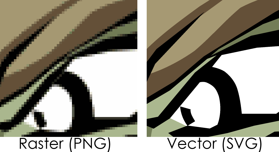
Raster-based Icons
This might be a little controversial as a recommendation, but raster-based logos and icons are definitely on the way out. They’re dragging their feet, but nevertheless, they’re leaving. Any new design assets sound absolutely be vector images like SVG. Obviously, we’re talking about things like logos, icons, and the like. You can’t encode an image with SVG.
This goes a little further than just SVGs, however. It’s also advisable to remove any image-based effects you have on your site. One archaic way of producing button dimension was layering an image on top of the button to imply depth. Today, we can use CSS to achieve the same thing, both faster and with a smaller page size.
Social Media Integration
The time for social media integration has come and gone. It’s a great idea to include a link to your social media properties on your About page, of course. But using integrated social media sharing options is nothing but archaic. The track the user aggressively and almost no one clicks on them. Furthermore, they’re basically neon colored exit signs from your site. Why do you want people to leave your site?
Stock Photos

Stock photos are great for filler content. When you’ve just started a venture or built a quick-and-dirty website, stock photos are an appealing and appropriate option. But they should be removed as quickly as possible. Replace them with images you own that are relevant to your brand. Pictures of smiling strangers in a conference room or an attractive park tell the user nothing about your brand. Plus, they’re generally pretty obviously stock photos, which won’t help with user satisfaction.
If you can’t afford to get rid of stock photos, then being pickier about your images. Maybe you don’t need quite so many, or maybe there are illustrations you can use in place of photographs. Obvious stock photos tend to reduce customer trust and sentiment, which is the opposite of what you want.
Press Releases and Links
Press releases sure seem like a good thing to post on your blog. You might even make your own navigation button for press content. This massively overestimates the popularity or usefulness of press content. Sure, it’s good to see that companies have been featured in prestigious publications, since it conveys social proof of the brand’s effectiveness. But the icons of those publications are enough.
Rather than include press releases and links, pivot to user reviews. That’s what people use to make decisions about purchases.
Aggressive or Complex Forms
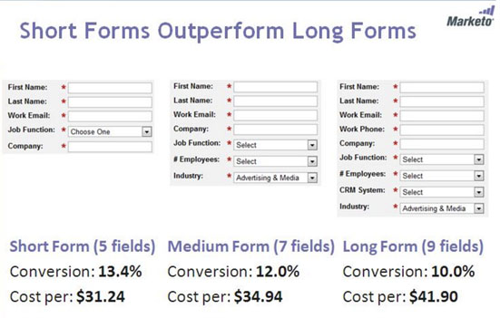
Intelligent users have become suspicious of companies requesting too much information. The user should know why the information you’re requesting is necessary. For example, it’s obvious that you need an address to receive a mail-order product. But what about forms for downloading a PDF whitepaper? Requesting more than the user’s email is burdensome for the user, limiting the number of people who are willing to provide their information. So keep your forms short and only request information that is obviously necessary for the stated purpose.
You might also be interested in these other posts:
Draw with CSS: Using CSS To Draw Elements
Best Practices For Website Footer Design
Building Effective Navigation Menus
Author: Alex Fox