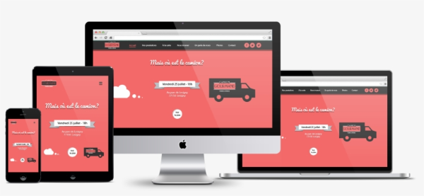
If you’re a graphic designer who regularly works with visual elements, you’ll know how frustrating it can be when the end result looks like nothing you had in mind when you started out. For instance, the colors you initially chose might look completely different in a different application; or the layout you intended got so messed up that it looks like it melted in the sun when you use a different device!
All of these unintentional alterations can be solved with one versatile file format: PDF. Graphic designers who have worked with PDF documents know that any design will look exactly the same no matter what device or viewing application you’re using. Why is that? It is because of the Portable Document Format’s ability to faithfully render content in the same way it was saved irrespective of the medium or software. Have you ever noticed any difference when viewing a visually rich PDF on your Chrome browser vs. a professional PDF editor like PDFelement or Adobe Acrobat? They’ll be exactly the same, and that’s why the PDF format can tremendously improve a designer’s productivity – by completely eliminating the variations and quirks that come with other file formats.
What PDF Is and How It Can Help Designers Improve Their Productivity
The Portable Document Format was designed with one intention in mind – to create a digital document file type that would be independent of hardware or software. That means a document that will look exactly the same no matter which computer, what application, and what content you had inside it.

That’s the main reason it works so well for designers. As a knock-on effect of this, the format is also meant for wide distribution; in other words, anyone who sees the contents will see it essentially the same way, subject to reasonable variances in resolution and color capabilities of the viewing device. So, whether the content is being viewed on a smartphone, a tablet, or a 27-inch Mac monitor with Retina 5K, the layout, relative size, color rendering, and other attributes will remain exactly the same. For the end-user, it might be viewed on a billboard, a banner ad on a website, a social media post, or a smart TV, and still retain its original qualities the way the designer wants it to look.
Now that we’ve shown why PDF is the ideal format for designers, let’s look at some productivity tips where this file format plays an important role.
– Tip #1: Choose the Right PDF Utility
The first tip is to get yourself a rock-solid PDF editor because you’ll need an easy way to make changes or mark-up a file for a colleague to work on. Don’t rely on online tools for this: a downloadable utility is far more secure when you’re working with proprietary designs and copyright-protected material. That means you also need something that can apply password-based encryption, watermarks, etc.
In addition to this, you also need a tool that allows you to share PDFs easily by email or a cloud storage service like Dropbox or Drive. It should also be optimized to the right size so you can have a bunch of documents on a pen drive or even your phone without putting too much load on the memory capacity of the device.
The tip here is to choose something that’s affordable, versatile and works across multiple operating systems and device types.
– Tip #2: Use File Conversion to Your Advantage
Although a PDF document is a great way to share your work with others, it’s not ideal in terms of editing, annotations, signing, and so on. That’s because these actions require a PDF editor as discussed in the previous tip. You can’t expect all your collaborators – including your client – to have access to a solid utility, which brings us to file conversion. Transforming a file into a different format allows your colleagues to work with the tools they have.
For instance, converting a PDF file into a format like Word or PowerPoint makes it possible for them to edit the file in an application they already have. For your clients, you might need to convert it to HTML so they can see a realistic mockup of what their website or landing page is eventually going to look like.
In short, make yourself and your work look good by choosing the right output format for various stakeholders in the design process.
– Tip #3: Use the Full Feature-set of your PDF Application
There’s no point in having a professional PDF editor if you’re not going to at least use the bulk of its capabilities, right? For that reason, learn how to do mark-ups, compress files for convenient sharing, apply permissions and restrictions, protect copyrights with a watermark, and so on.
The more you learn, the greater your productivity will be because you’ll know exactly what to do in any situation. For example, do you really want to have an unsecured document about a new branding project circulating by email? What if someone unintentionally shares it with the wrong person?
You could be held responsible for that even though it might not be your fault. Think about that.
– Tip #4: Optimize the Experience for the Viewer
Optimizing a PDF document can mean different things to different stakeholders. For the client, it might be important to send the file in a higher resolution because they care more about how it will look rather than how large the file is. Similarly, for content collaborators like editors, it might be enough to have a lower DPI resolution so you can send more files via email or on a thumb drive. Along the same lines, your image researcher might need to have accurate annotations for image alterations such as size, orientation, etc. There’s no “perfect format” aside from the final output – everything else is fluid and based on the needs of each stakeholder.
– Tip #5: Don’t Worry About Fonts!
The biggest concern with other file types is that fonts are rendered based on the font library available to the viewer. That problem is completely eliminated with PDF because any font is merely treated as an “asset” to be rendered with integrity. That means you can use out-of-the-way fonts to really make your work “pop” with uniqueness. In other words, any font becomes a printable font when the medium is PDF.
– Tip #6: Don’t Worry About Colors!
As with fonts, the colors you use in your visual elements are only as good as the format they’re on, and PDF is perfect for that. No matter whether the end-product is digital or a physical print, PDF is the best format to maintain the integrity of your color scheme. You no longer have to worry about colors looking strange or clashing in the final output as long as you’re happy with the results in PDF.
Following these tips will not only improve your productivity as a designer, but it will streamline your workflow, reduce the chance of errors, and help you build a solid reputation as a ‘consistently dependable’ professional designer.

That brings us to a full circle and back to choosing the right PDF tool – and we all know how designers love circles, right? To aid you in this endeavor, we recommend a robust PDF tool like PDFelement, which has all the editing, annotation, conversion, security, optimization, and other tools needed to make it happen for you and make your work stand out from the crowd.
Want to know more features of PDFelement or get some exclusive discount, please open their official site here.
