Outsized typography in web design is one of the most recent trends. With the advent of simple, neutral, and minimalist designs, designers must find a new avenue of adding drama and effect to their concepts. It is through this that outsized typography has played a big role. This kind of typography is used in advertising, brand creation, and more. There are so many uses for this design trend. Here are some of them:
Creates a dramatic design effect
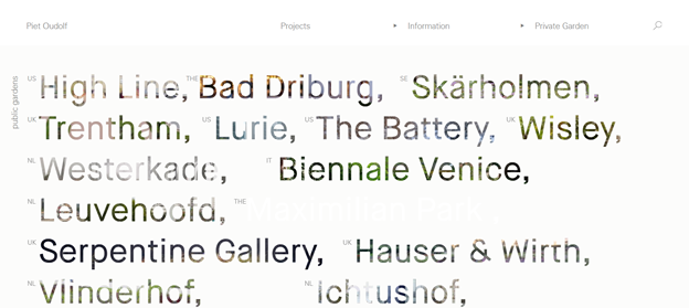
What is cool about outsized typography is that there is no need to choose decorative fonts. Usually, simple and neutral fonts in larger sizes create just the same dramatic design effect as a decorative script. Decorative fonts are usually used to draw the eyes of the user to information that is important – promotions, announcements, headers, and the like. Designers use an attention-grabbing script to act as a visual cue that certain information needs to be noticed. Using outsized typography (even the simple ones) creates that same dramatic, and attention-grabbing effect.

Image Source: Oudolf
Creative with minimal effort
Take this website for example. On a loud background, a simple outsized font-face is enough. If the web designer has used a more complicated typeface, or of a different size, the awe effect it has on readers would not be as strong as in this design.
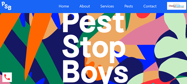
Image source: Pest Stop Boys
Could act as a logo
In this example from the Aiaiai Audio website, the outsized typography almost acted like a logo. It is a simple big-sized, white-colored font on a bold black and grey background. It has created an editorial effect that is cool and sophisticated. The web designer did not need to create a website header to match the simple background design. The outsized typography is great for editorial effect. It is also great for high-fashion websites that want to create bold, but simple designs.
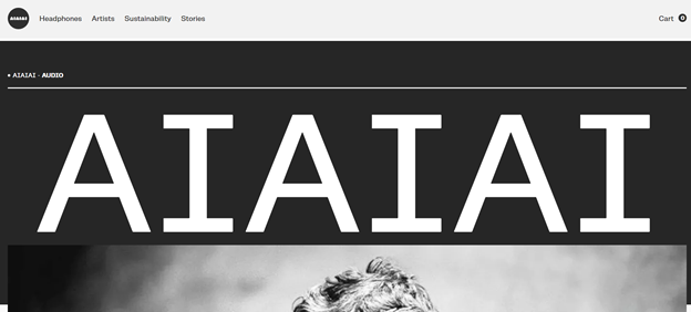
Image Source: Aiaiai Audio
Adds recognition to a website
Outsized typography can help establish a brand. Design plays a big role in the visual recognition of a website. Since outsized typography holds users’ attention much longer, it creates a deeper impression in their memory. Because of this, a lot of websites with outsized typography are quite easy to remember. Using large, red, and bold fonts on a bare black background? It is surely difficult to forget.
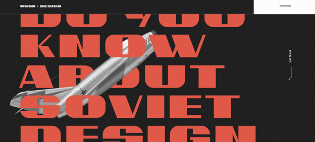
Image source: USSR Design
Sets the mood of the website
We don’t really appreciate how important fonts are to web design. It sets the tone and the mood of a website. The font connects the overall design theme with the content. It provides continuity between the web design and the niche. Using outsized typography does this from the get-go. Simpler and plainer font can be used for the text. Outsized typography can be used elsewhere – headers, titles, menu bar, etc. The bigger fonts could easily point readers to how they should understand the content. In this example, we are looking at a product for a snack. The outsized typography shows that the brand is fun, bold, and playful.
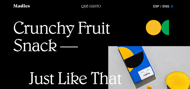
Image source: Madie
Also read: The Ultimate Guide to Creating a Socially Conscious Web Design
Author: Sangalang Kristine
Civil Engineer by profession, Writer by passion. Serving readers since 2014 on different niches like Science, Current Events, Tech, and Travel.
