
Website design. It has, and always been be, the first and foremost component of your website that the visitors will notice. As such, you can bet that whatever your website looks like will be the primary deciding factor whether the visitors leave or stay. Website designs for small businesses for that matter are quite crucial for the bounce rate.
Big businesses could get away with conventional or bland ones but for a small business, having an impact on your audience the very first time they open your website is crucial. If you amaze them with your ingenuity or originality, then you can bet they’ll stay even just to see the interesting artistry or effort that went into the website design.
Of course, when it comes to website designs for small businesses, looking to other successful sites can not only provide you inspiration but also an insight into good user interface. That, and there’s also the fact that it worked for them, so taking cues shouldn’t be harmful.
Hence, we have compiled for you some creatively acrobatic website designs for small businesses that ought to catch yours and your visitors’ eyes. Hopefully, you can learn a lot from them.
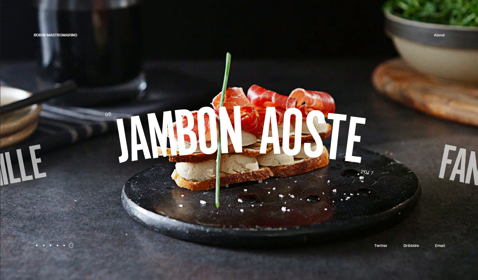
A little context, Robin Mastromarino is a French freelancer and his designs speak volumes of how online portfolios should be handled. A quick look at his website ought to be enough to give you an idea of how one should always present themself online and how much they can be intuitive even with just photos.
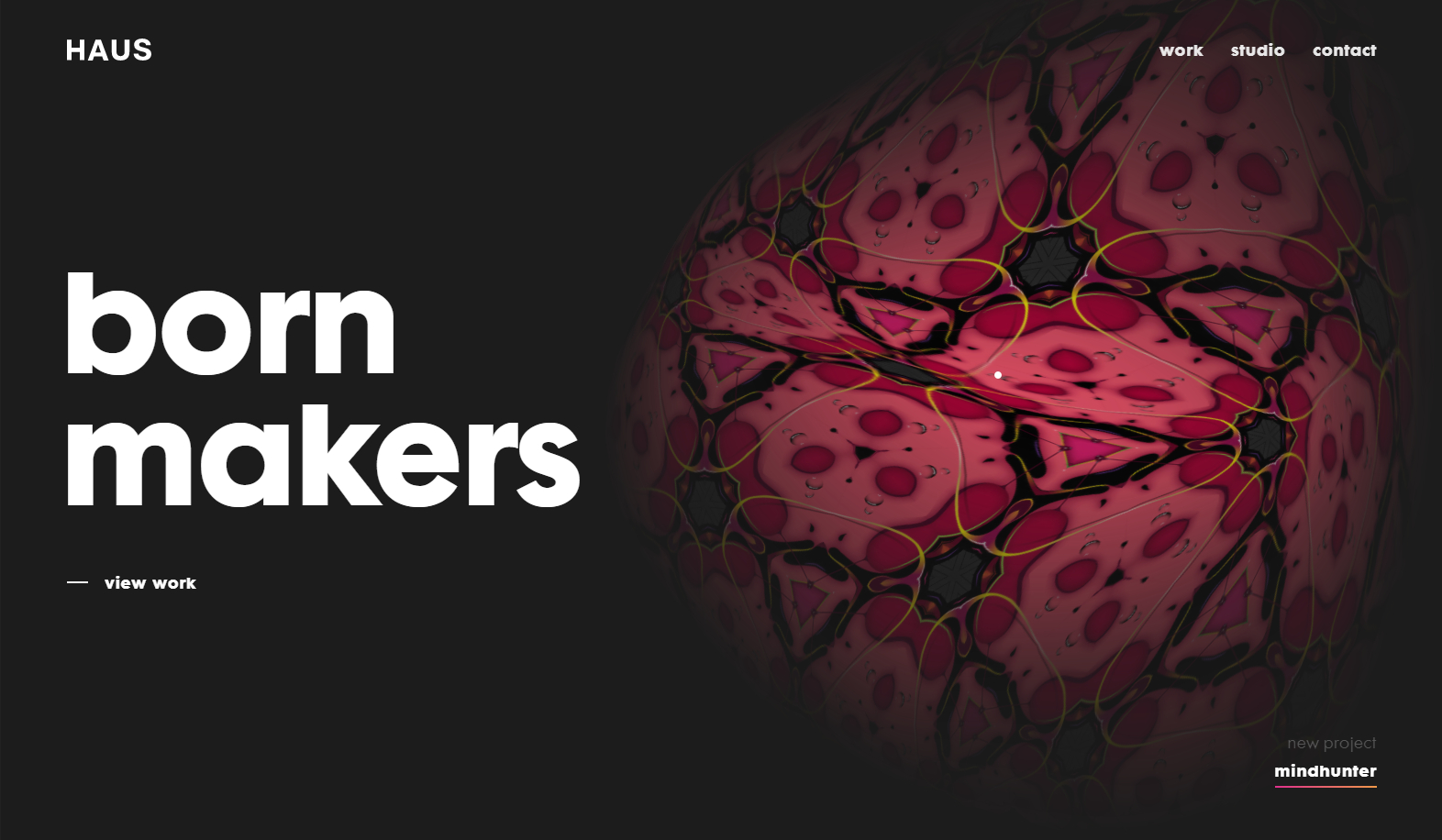
HAUS is a marketing website and as you can see, its design philosophies are just commendable. The front or homepage is clean and minimalistic yet still provides plenty of interactivity; it’s all thanks to that weird shifting blob of kaleidoscopic art that reacts to the mouse cursor.
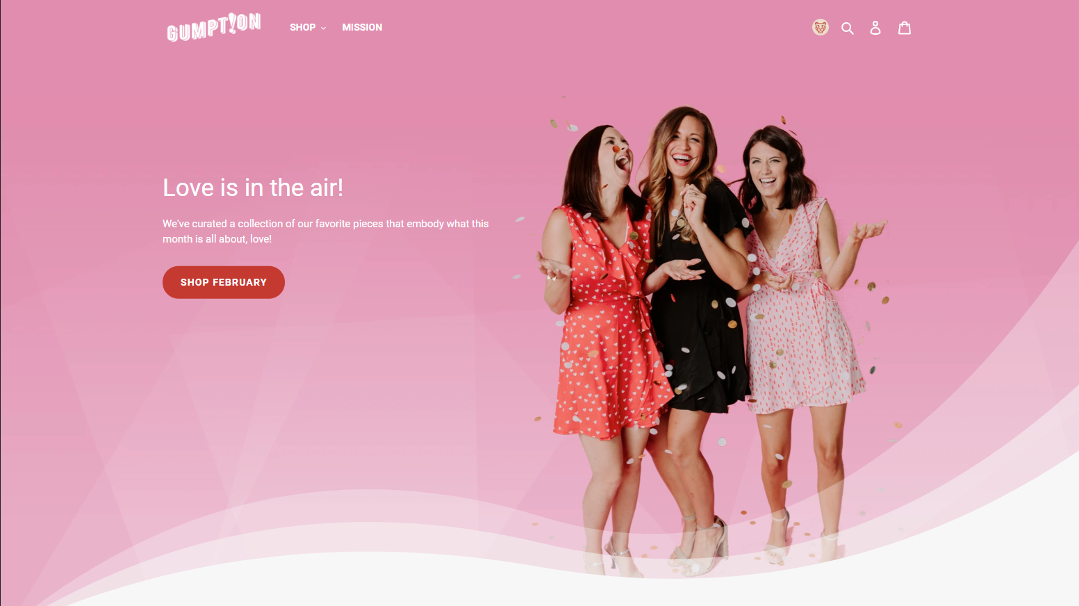
You might want to take your cues from Gumption when it comes to running an online shop especially one that deals in clothing. They have emulated what modern fashion looks and feels like on their website. The main target demographic, however, is women; that’s something to keep in mind.
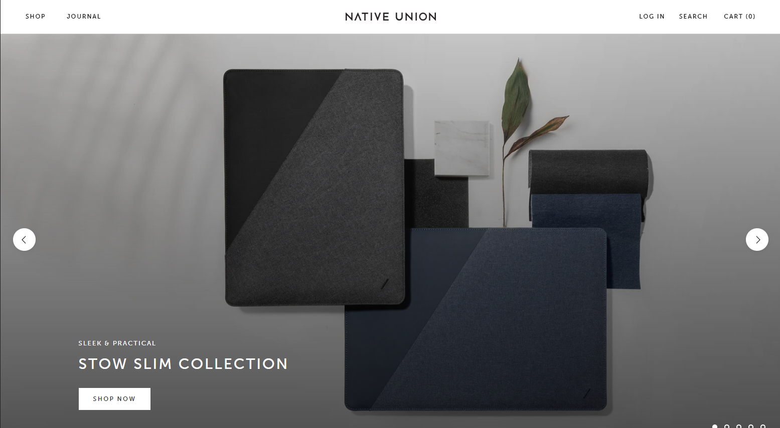
Now, if Gumption might not be your thing since you run a unisex business, then something more elegant like Native Union ought to do the trick. It’s an e-commerce or business website that makes any product it sells look luxurious.
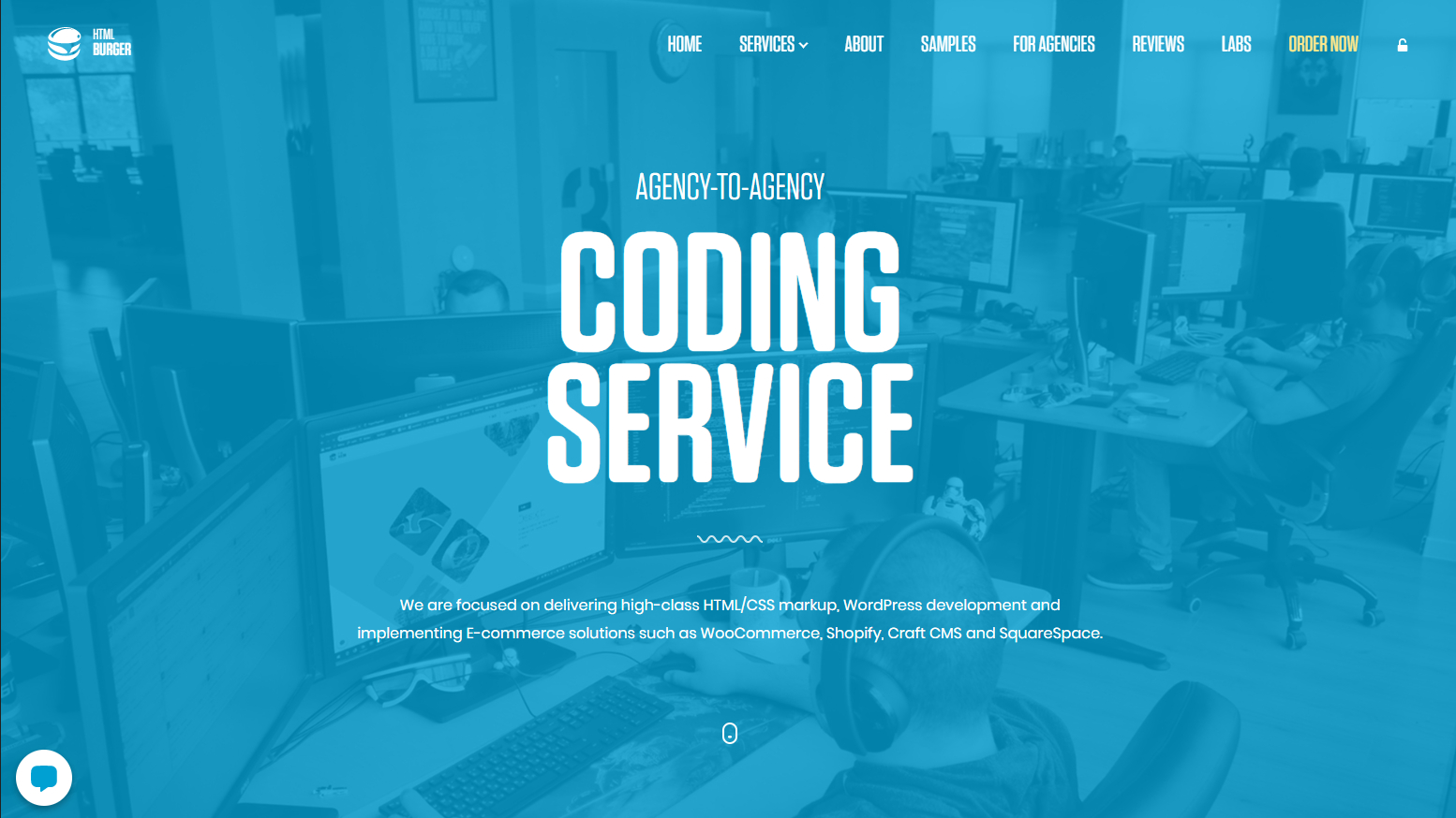
Here’s something for your programmers and coders out there. One of the sleekest web design agency website designs out there is htmlBurger. From their choice of font to their friendly color scheme, you’ll find plenty to like here.
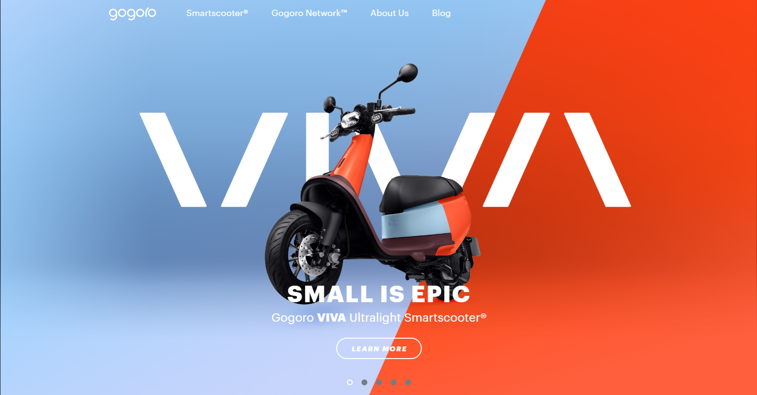
It looks like a big company’s site doesn’t it? Well, Gogoro actually counts as a small business. It’s actually a technology website and one of the most minimalistic ones to date. At the same time, its style is undeniable and not diminished by the minimalism.
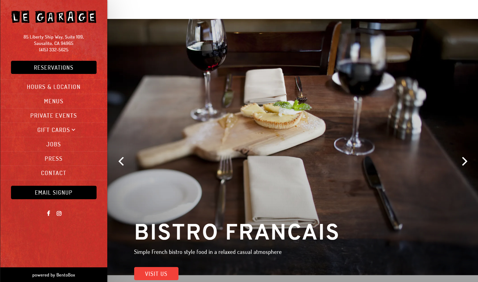
It’s already a given for restaurants to have their own website for better marketing. However, not just any restaurant website will do. Le Garage is a perfect paragon of how it should be done, visiting the website itself is like stepping into the actual restaurant with how hospitable their site looks like.
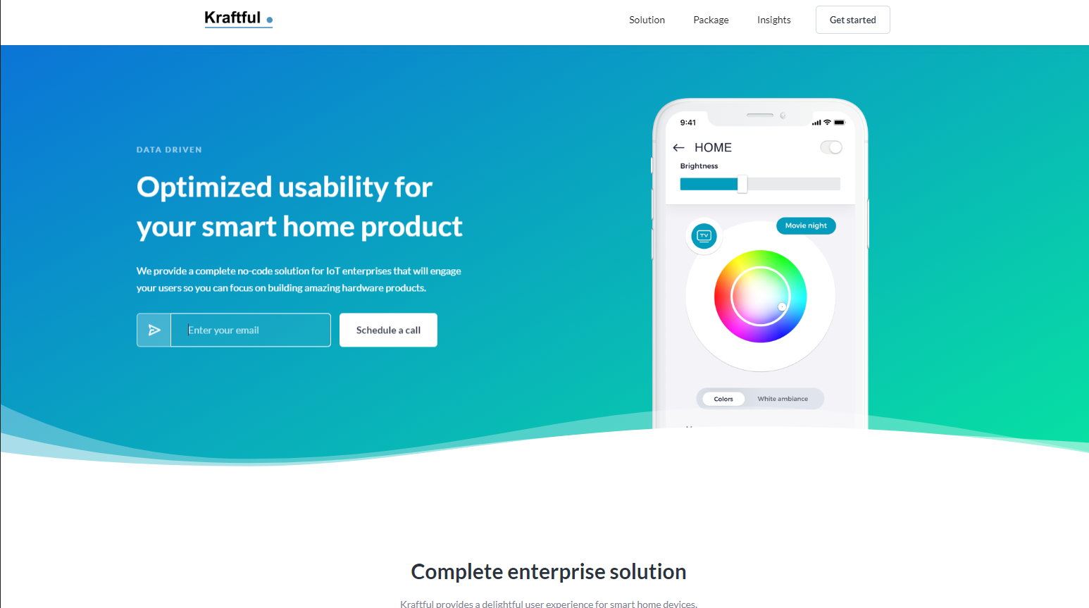
Kraftful is an app development website and service and their homepage perfectly illustrates their expertise. Moreover, their color choices are just comfortable for anyone’s eyes and very welcoming.
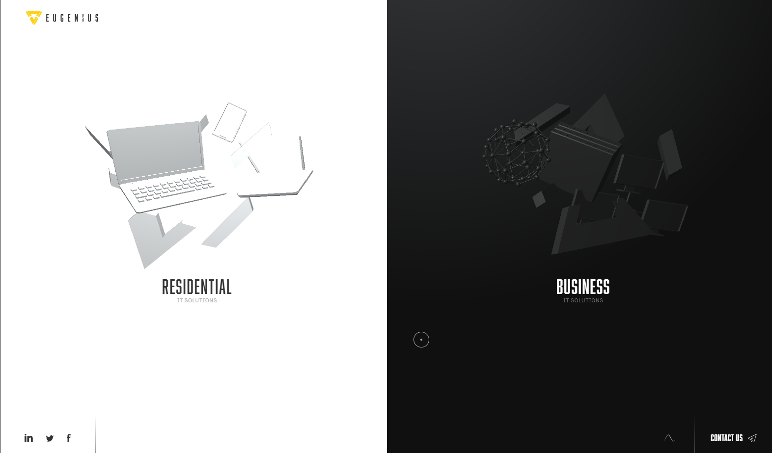
Have you ever wondered what’s the website equivalent of walking into an uber advanced tech conference? That’s what Eugenius feels like upon your first time visiting the site. Each visit is a visual and auditory treat.
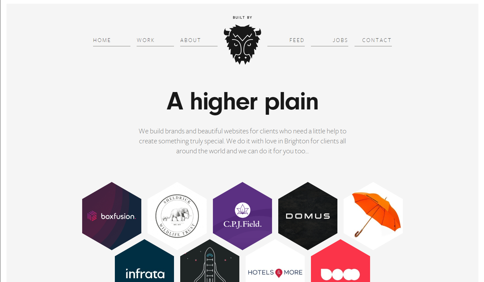
When it comes to building one-page websites with enough style, you can’t go wrong with Buffalo. Their deceptively simple layout masks just how complete the user interface really is.
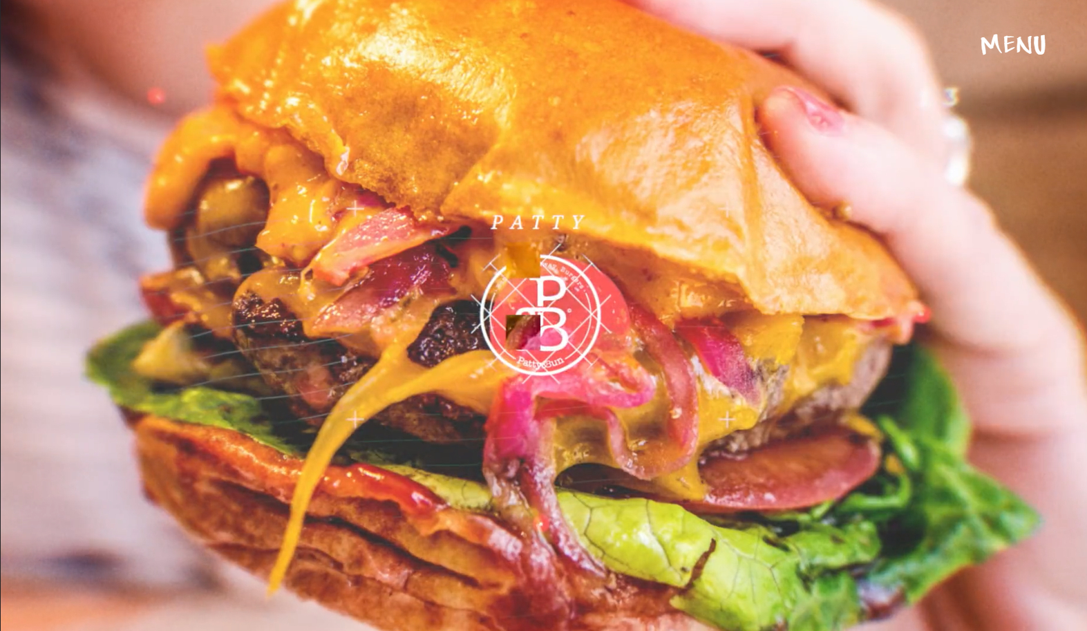
We have here another restaurant website but this time, a lot more playful and hip. At the same time, Patty and Bun makes their website accessible as well with minimal text and menus, they like showing more than telling.
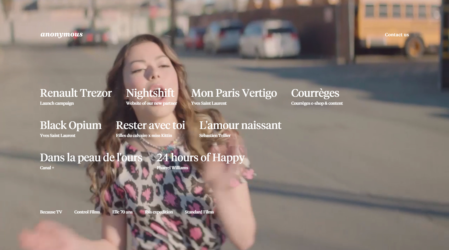
Anonymous simply sets the bar high for how interactive you can get with your website. Each mouse-over on a menu selection changes the background video, giving visitors a sense of control.
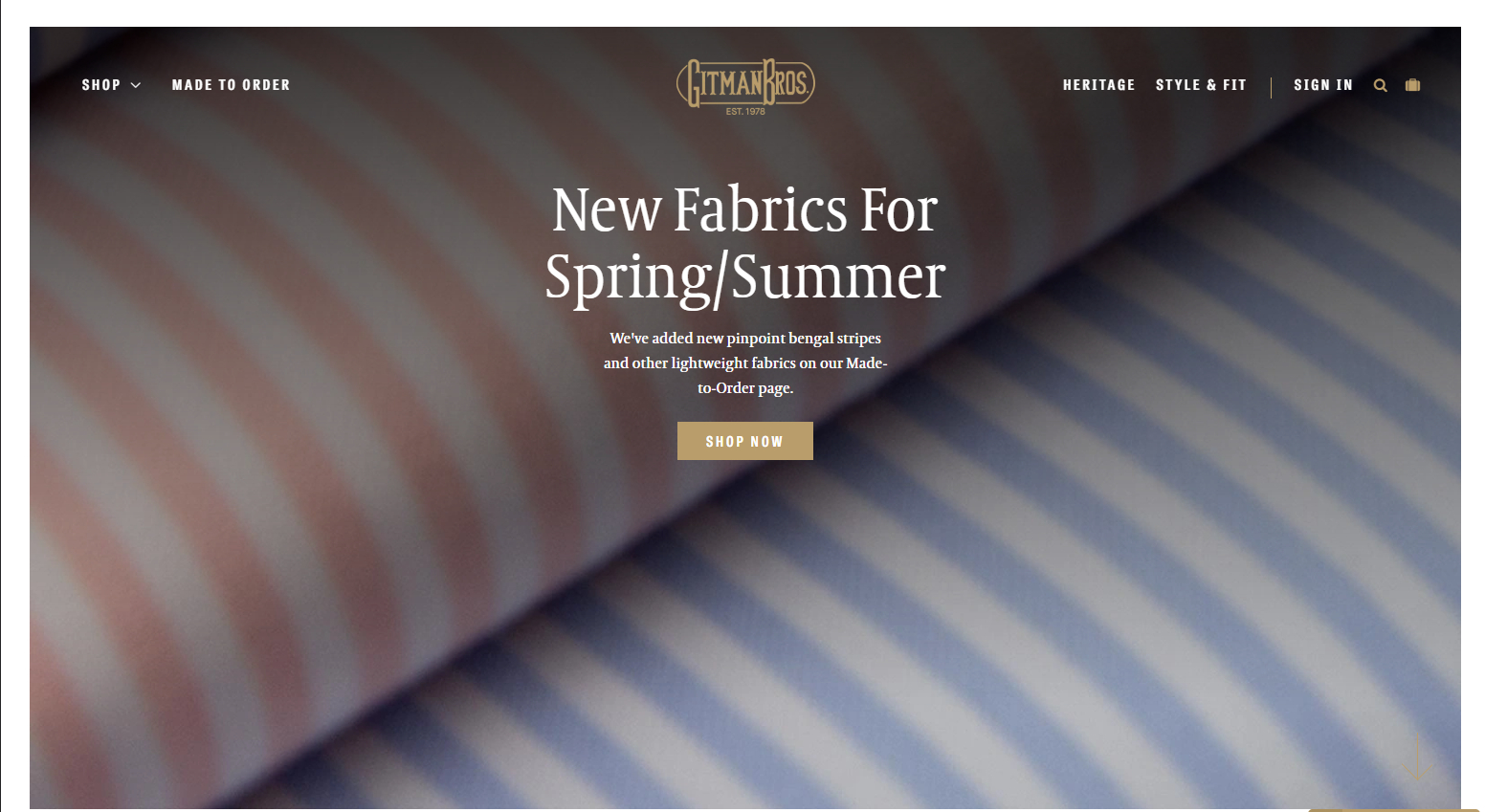
Gitman Bros. have been around long enough as a men’s apparel shop and they know what they are. As such, they’ve poured their simplicity and heritage into their simple yet effective website.
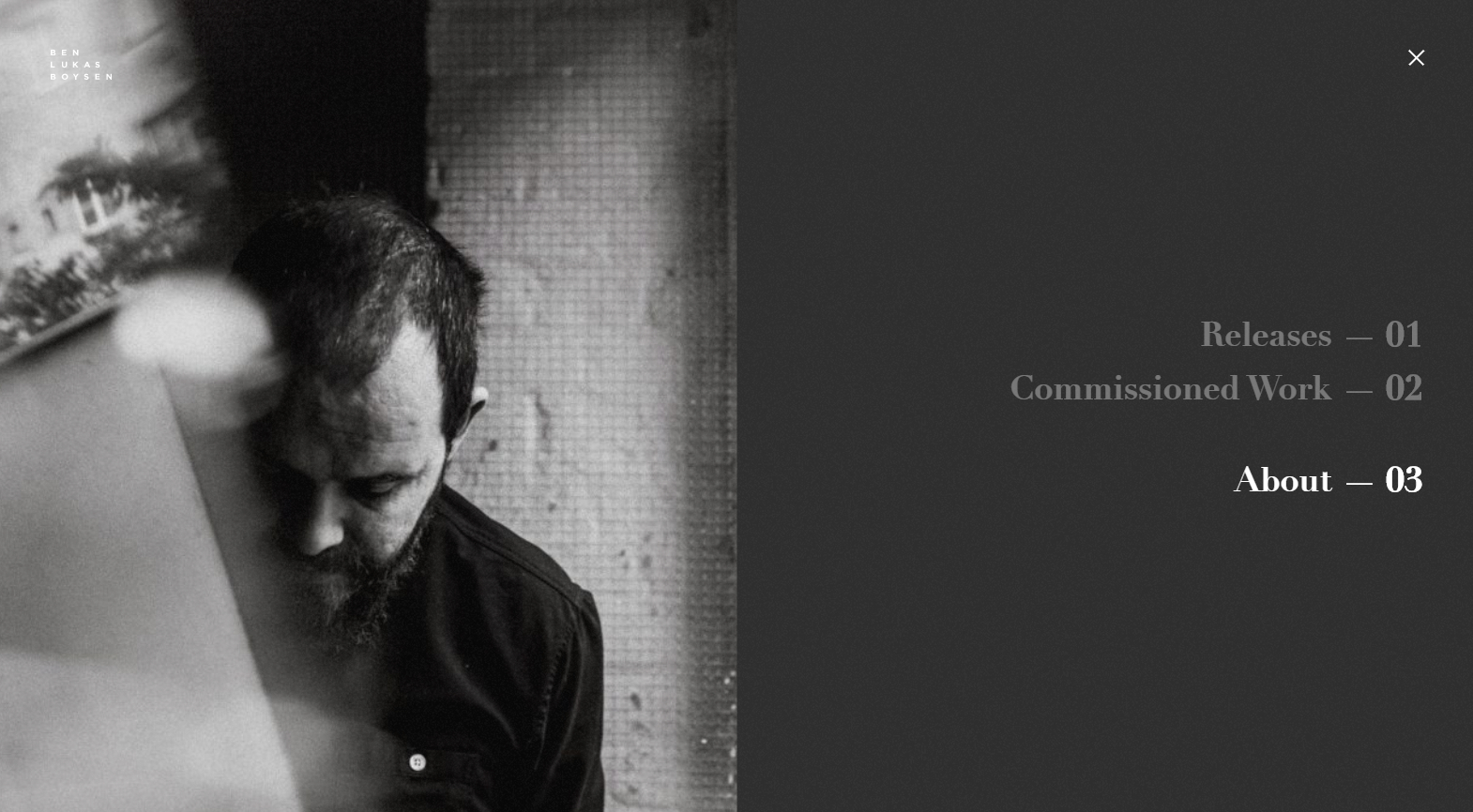
How do you convey the essence of music without any sound? Perhaps you should visit Ben Lukas Boysen’s website to find out. All you need are some dramatic photos and dynamic transition movements.
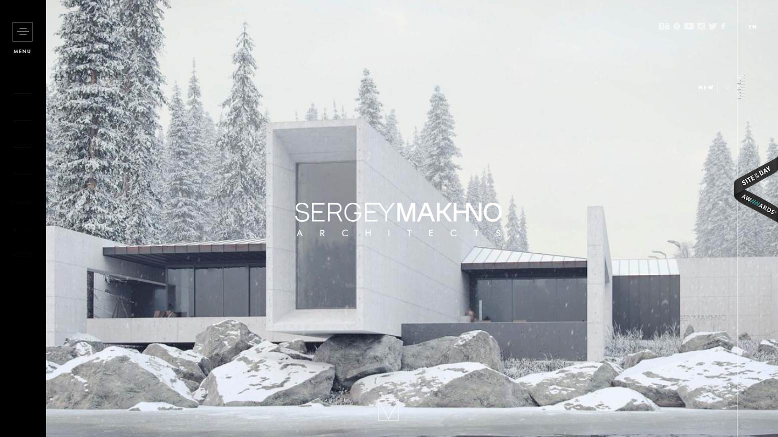
Sergey Makhno knows how to design a house and take care of its interior decorations as well. He extends that expertise to his website which is how interior design sites should be done; with careful and precise lines that also serve as decorations.
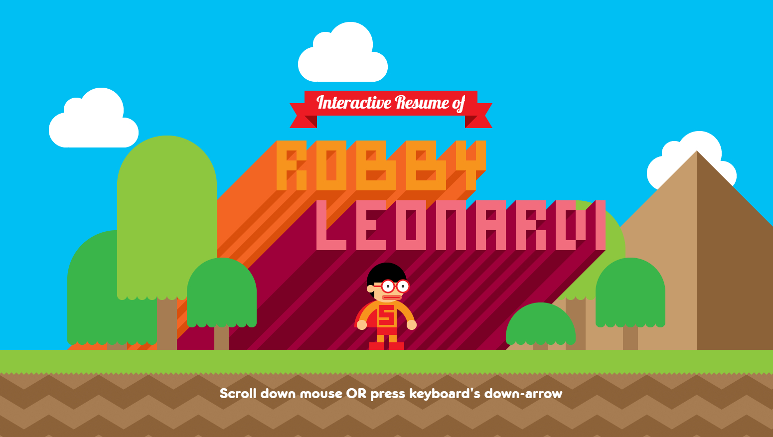
When it comes to interactivity, you just can’t beat Robby Leonardi. The guy turned his whole online portfolio into a side-scroller video game. That’s interactivity you can’t beat.
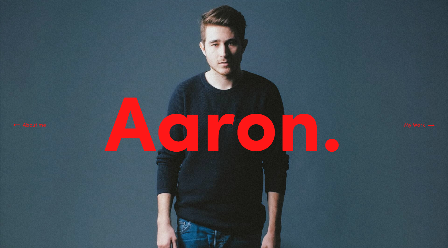
Aaron is a filmmaker who also uses his website as a portfolio to promote his works. How he does it best represents his skill and creative vision. Each navigation action plays a video in the background and the transitions are also smooth and stylish.
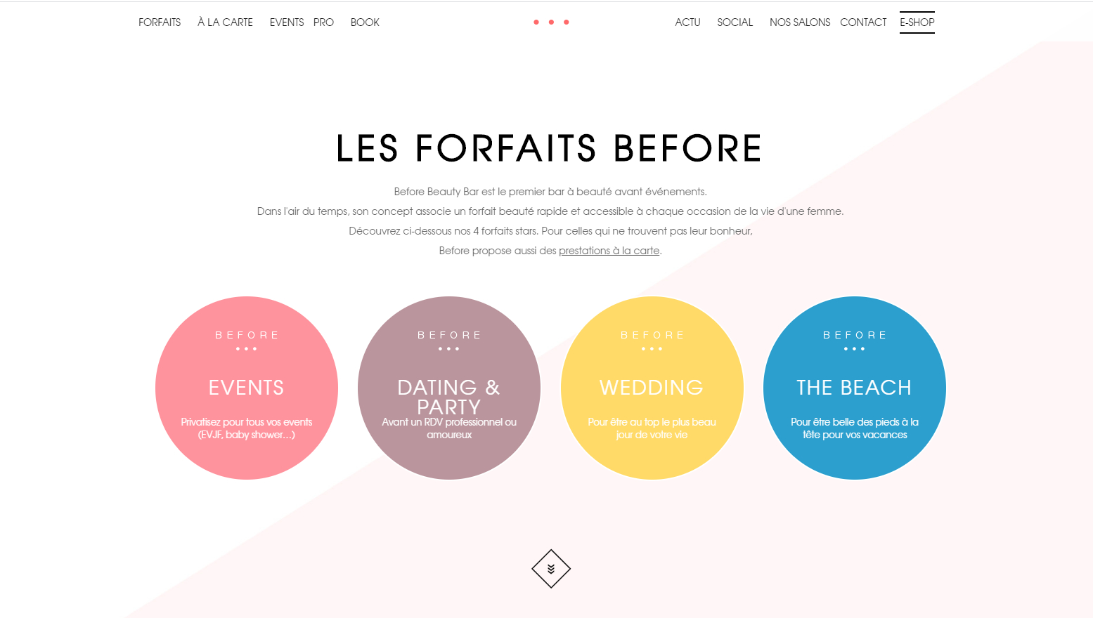
Are beauty and makeup websites your thing? Look no further than Before Beauty Bar. Visiting the website is like the act of applying makeup itself with enough interaction to keep you occupied and complementing colors to keep you comfy.
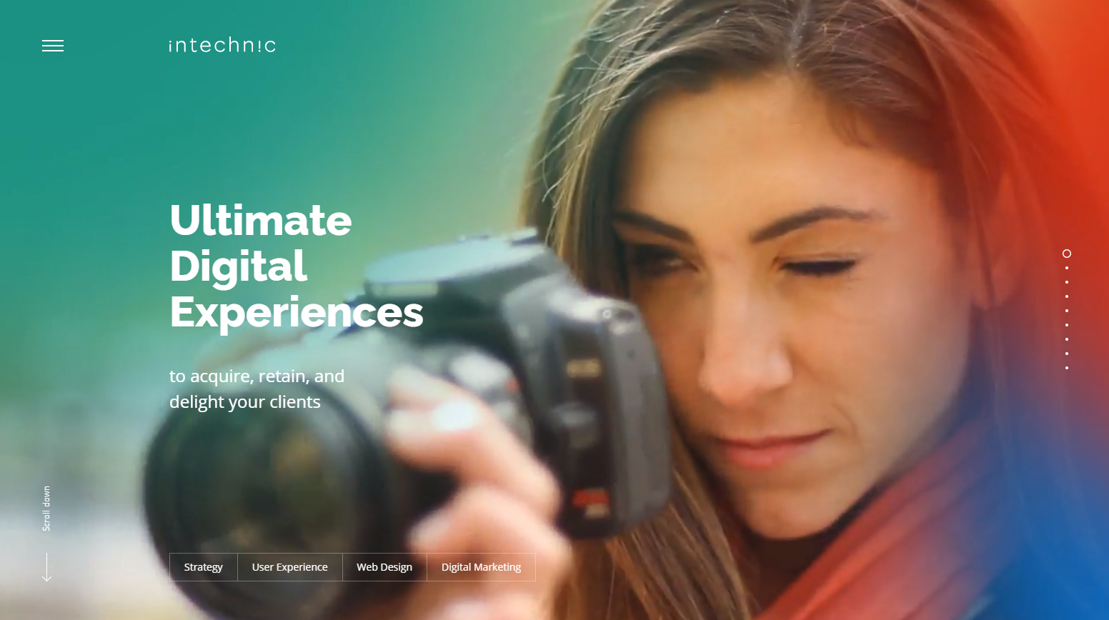
Intechnic is another web design and digital marketing agency that knows how to make good use of video backgrounds for their website. They’ve also seamlessly combined this with easy navigation a modern theme.
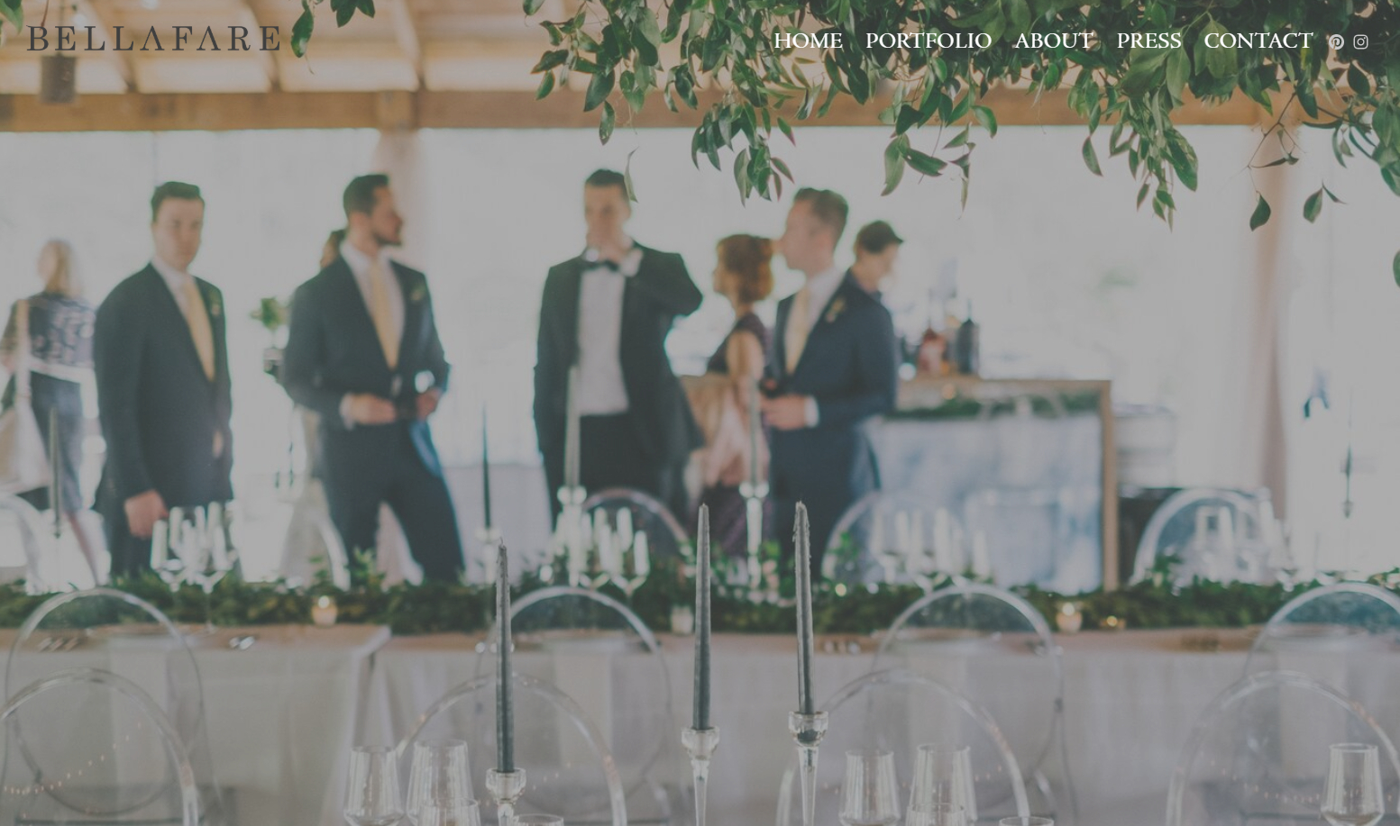
As an events coordinator agency, Bellafare spares no expense in making its website look accomplished. Right off the bat, it features great examples of its successful events paired with the appropriate style.
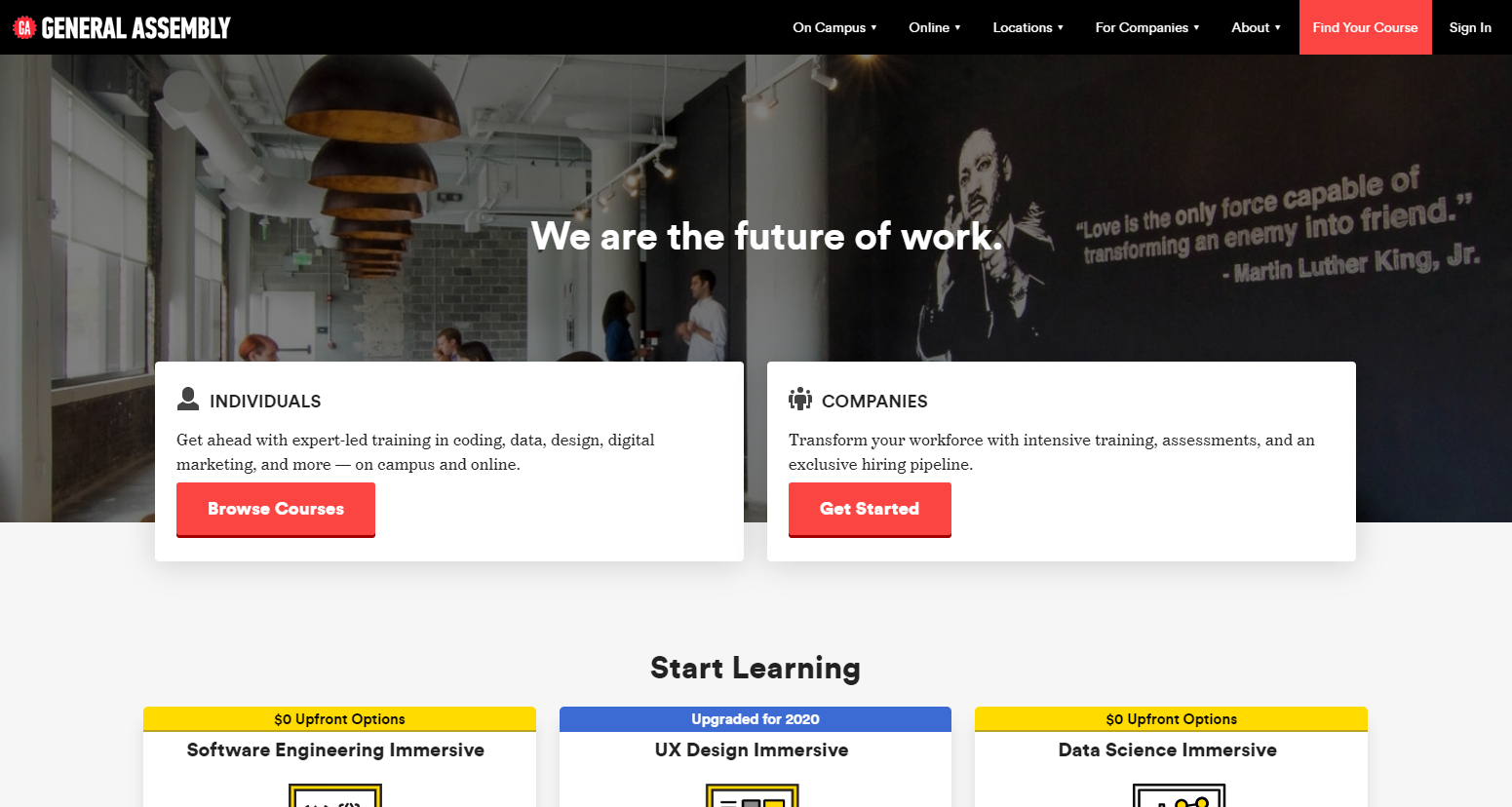
General Assembly is all about marketing and you can easily see they mean business on their website. They also utilize the blog card layout quite efficiently with all the necessary information contained within.
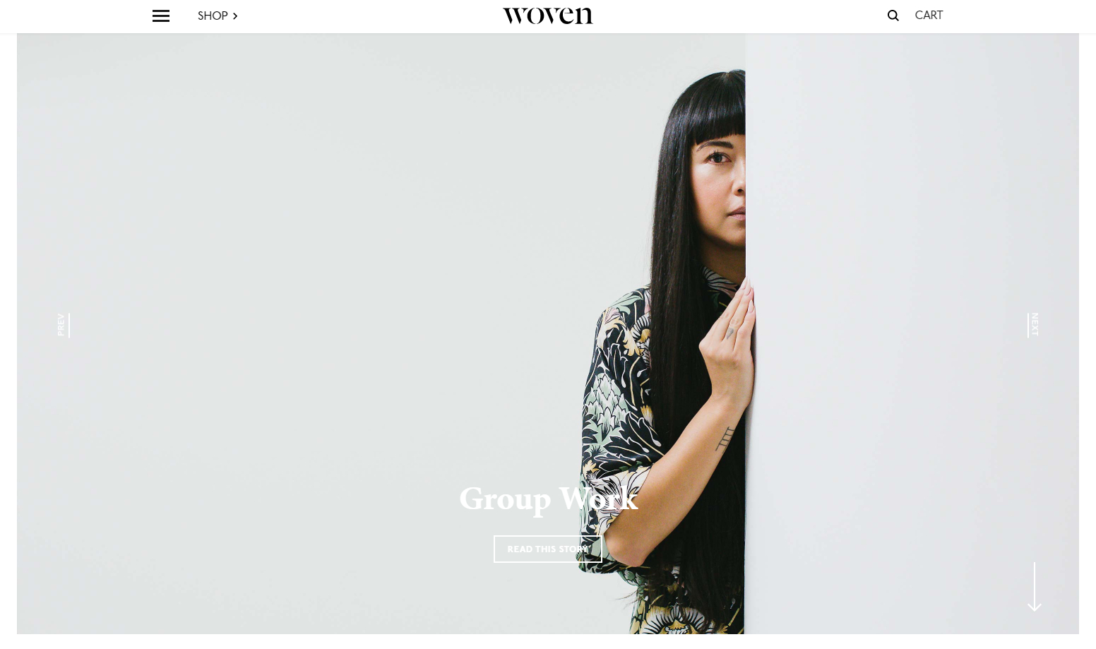
Modern travel and lifestyle magazines have always been pleasing to the eye but Woven Magazine takes that stereotype and intensifies it. They’ve managed to strike a perfect balance between functional and stylish.
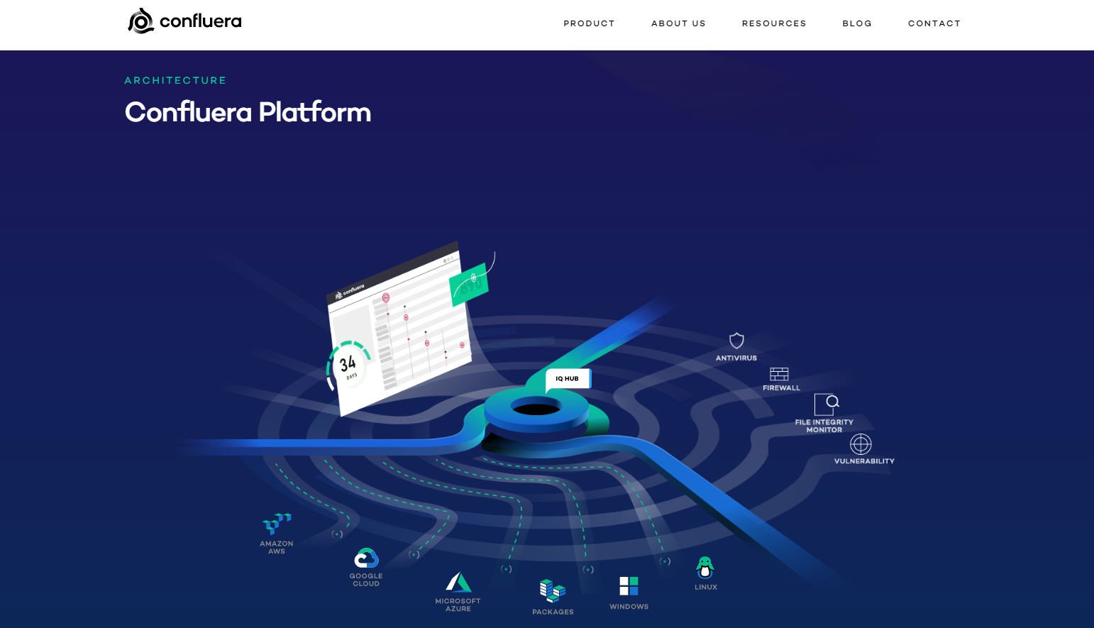
Security websites rarely inspire web designers but Confluera is different. The way they design their pages involve movement and animations, making them stand out in a sea of security software.
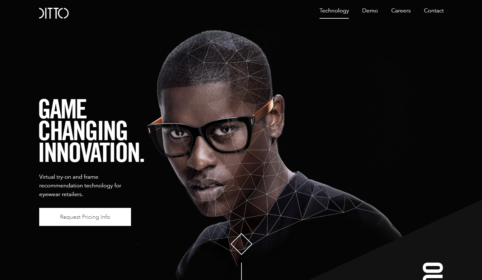
Ever wanted to see an over-the-top yet stylishly necessary eyewear recommendation website? Ditto is just the resource you need. It’s a virtual eyewear try-on website that will encourage you to try as soon as you visit the domain.
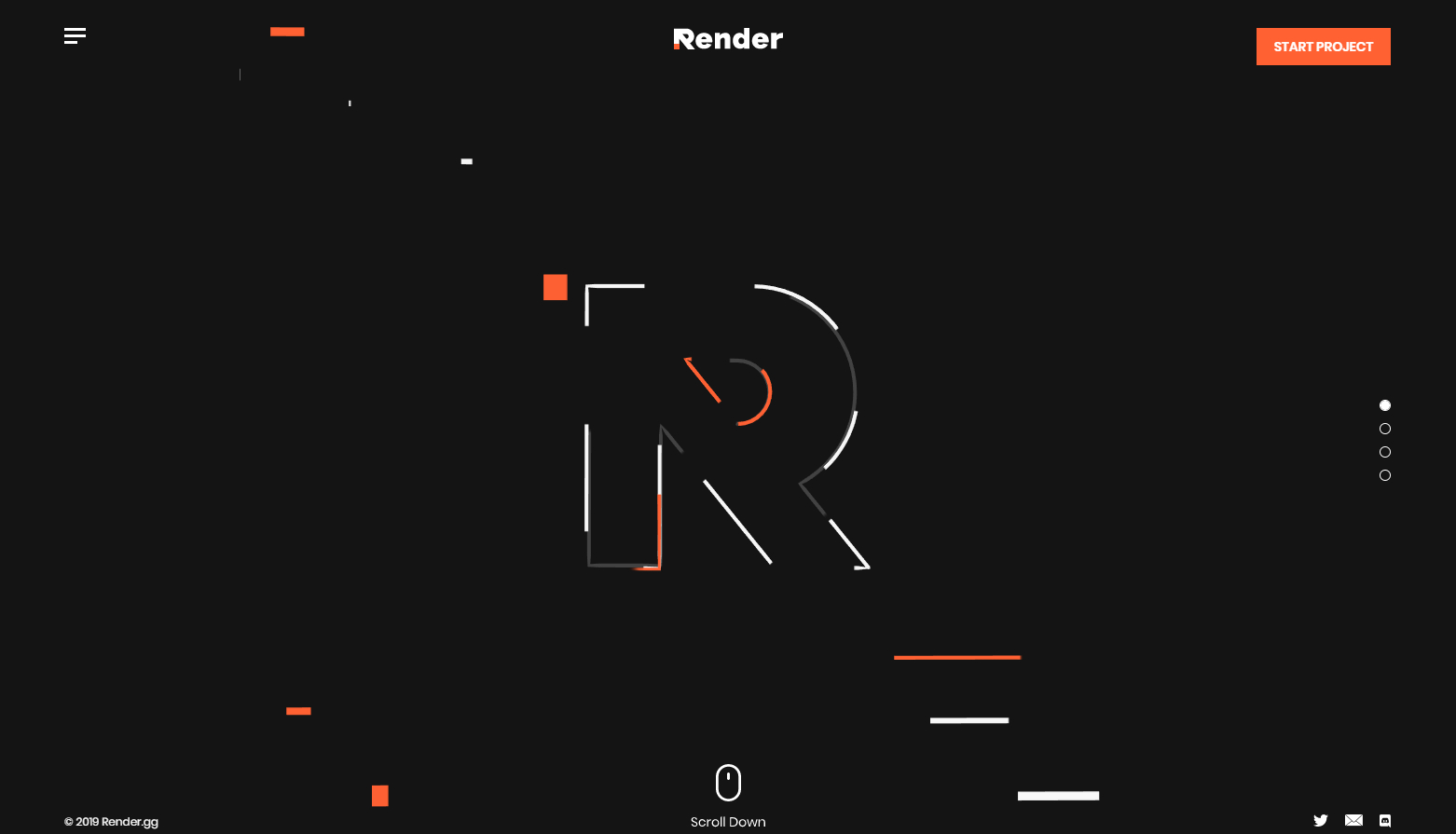
Render is a video production company and its website speaks volumes about how ultramodern they can get with their designs. It even gives off futuristic themes and impressions. Their style is ahead of their time as website designs for small businesses come, that’s for sure.
RELATED: Business expansion: Top tips for scaling your business the right way
Author: Sidlangan Natividad
