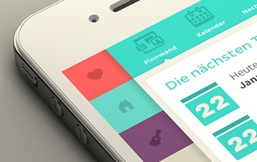
Flat design is increasingly being used in mobile apps replacing the commonly known intricate designs that are dominated by drop shadows, brushes and gradients. This design style incorporates flat shapes and icons. Flat design basically revolves around the use of rectangles, triangles, circles and other shapes without the need to use other design elements such as shadows or gradients. The design is specifically based on two main principles, which are simplicity and readability, and these guide designers in developing flat yet stylish posters, web layouts, software designs and other important applications. The following features explain more why flat design is the way to go for your mobile app.

Simplicity
Flat design refrains from the use of intricacies as more and more people are now looking for simple and easy to recognize design styles. The inception of mobile browsing also encourages the use of flat design because where the screen space is limited, the only way maximize the use of the pixels on the screen would be to use plain images. This is more of a minimalist style where designers largely focus on wide spacing between images, icons and other key elements of an application. Simple and flat images tend to load faster compared to those incorporated in complex designs where the browser cannot load design elements packed together with the main image.
Readability
The principle of readability is more of a minimalist style where more emphasis is put on leaving white empty spaces so that the text can be seen well. Lack of gradients, drop shadows and strokes ensures that texts placed within the app can easily be read. Google and Facebook have put flat design to good use by using simple yet colourful icons, designs and other eye friendly visuals.
Depth
Compared with previous design styles where bevels, strokes and gradients are key design elements, flat app design lacks depth. This is because it focuses more on simple 2D print and images don’t imitate colours or shapes of real life objects. There is no background image or real world textures and therefore all the app shows is the visual presentation of plain text and images.
Simple Elements
Flat design provides a simpler graphic user interface as images and icons are easier to use. Icons are made to appear flat using basic geometric shapes like triangles, circles, rectangles and squares. For an average person, this design eliminates the need for manual navigation because the visuals present themselves just as they are used.
Typography
Apps that have flat designs also have elements of typography in them to add style and provide a friendly interface. There is no need for calligraphy. Alternatively, crisp and clear font texts are used with shorter messages placed with contrasting colours and shapes making reading simpler.
Colour
Just like any design style, colour is also important in flat app design. It can make or break your application as it sets the whole feel of a given application. Desaturated colours are used to add artistic beauty to an app without over-indulgence that can make users uncomfortable. Candy colours usually recommended in flat design attract the eyes better. These colours also complement other design elements like typography without taking attention away from the main features of your application.
Though flat design appears to be uncomplicated, creativity is still a major factor you should consider. When thinking of possible usage of this design style, come up with unique, stylish, attractive and brand-new app designs. Experiment with your own styles until you become a better designer or choose mobile app developers who are experienced in flat design to ensure your app reaches its full potential.
