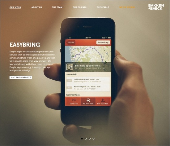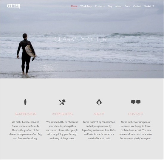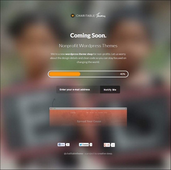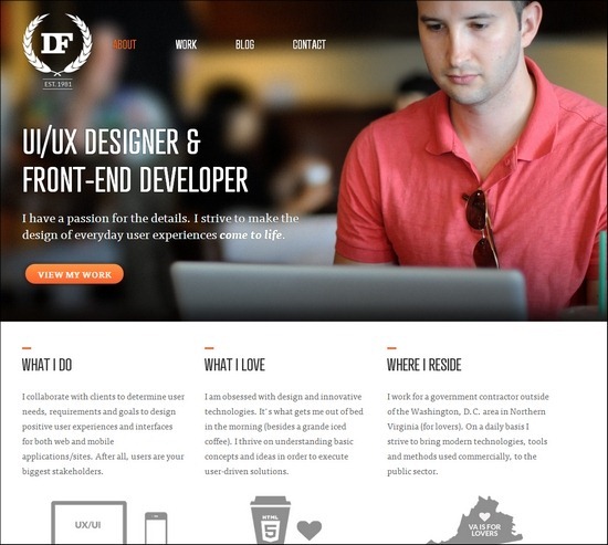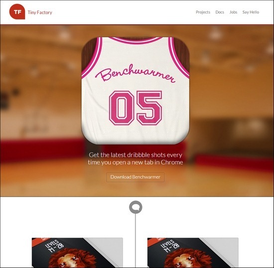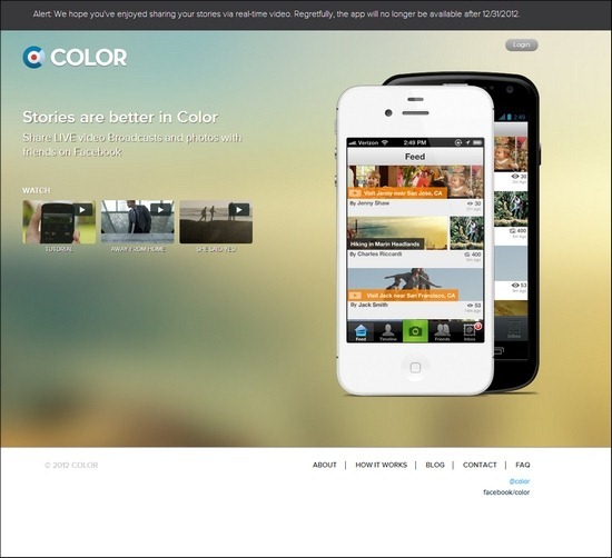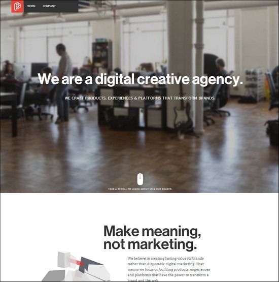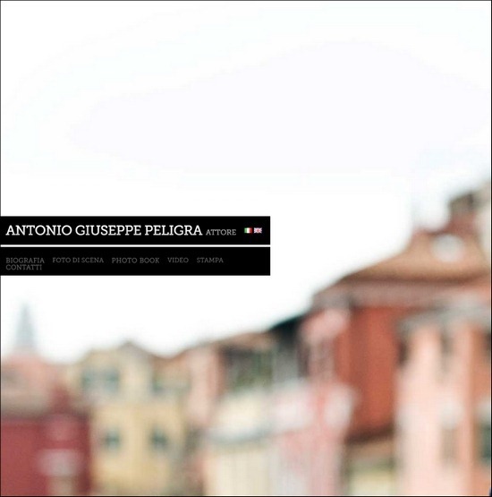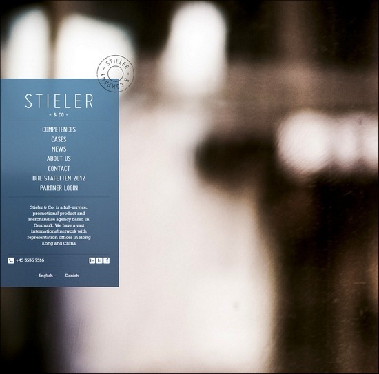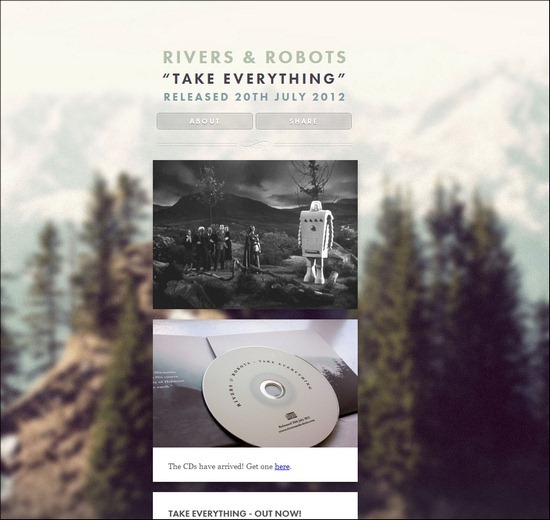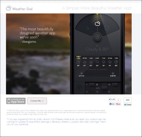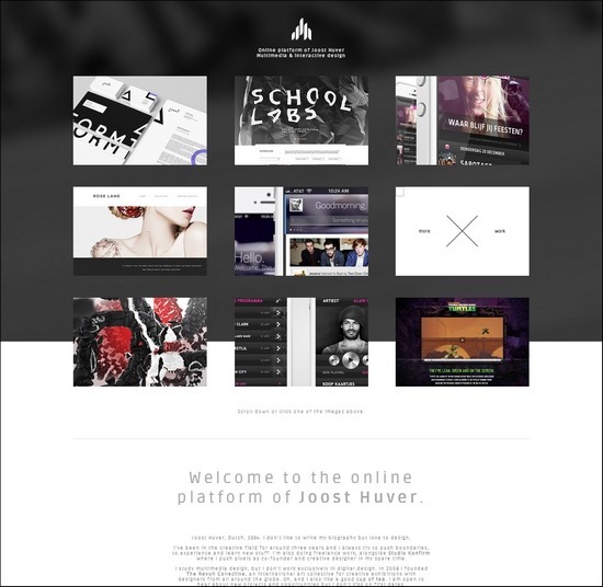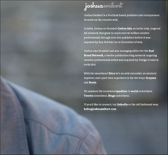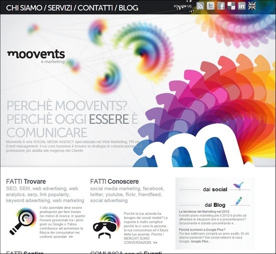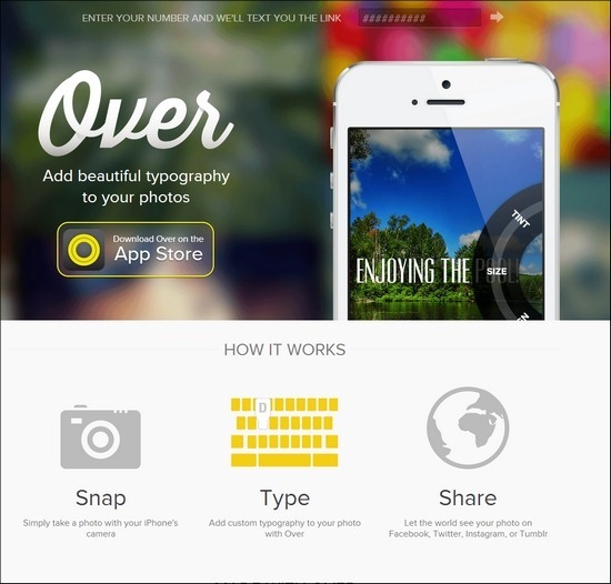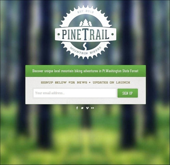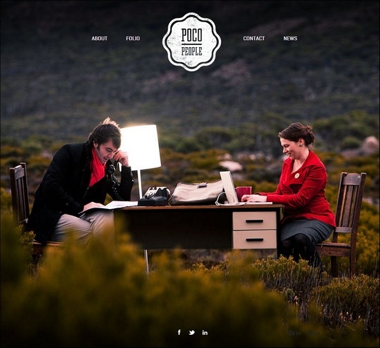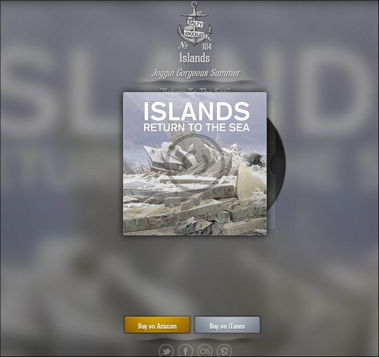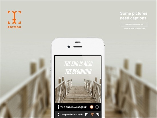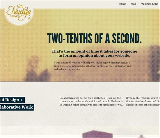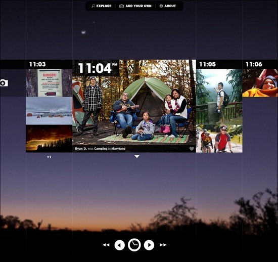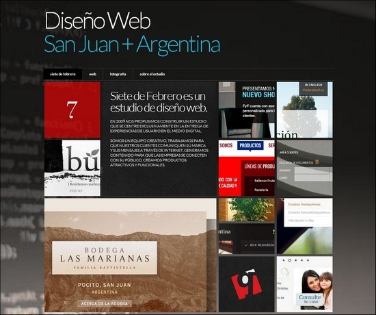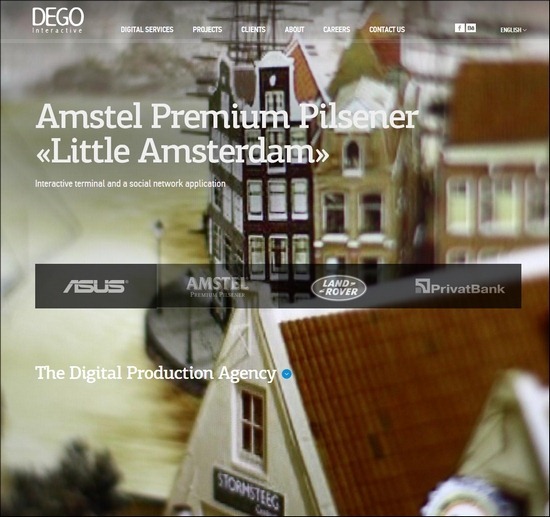
Choosing a blurred background image for your website may not be your first thought. Blurred photographs usually look like the work of an inexperienced photographer, however, when used as a background on a website something good often happens. When used correctly, blur effects add an illusion of depth and even make both images and the written content stand out more easily.
Though blurred backgrounds are not that commonly used in web design, it is a great technique to be aware of. One of the hottest trends right now in web design is to go completely minimalistic and flat and it seems opposite from trying to simulate depth and realism. It turns out, however, that it works great together. On a minimalistic website design, you will see that the blur background effect even grows stronger. A good and commonly used example is full with image sliders using blur background to highlight captions, product photos, call to action buttons etc.
We also see blur background effects commonly used in photography and portfolio websites and in advertisements where you need to highlight a product, a skill or a creation. If you want to experiement yourself with blurred backgrounds in web design, all you need is some background images. Check out this article from Tripwiremagazine.com where you can find a complete list of free blurred backgrounds.
I have done a lot of research on this topic and found a great collection of websites using blurred backgrounds and I am sure you can use this for inspiration. Hope you will like this article and share it with your friends. Enjoy!


