
A design system is a library of guidelines and reusable components that should establish the consistency of the product experience. The goal of a design system is to create a single source of truth, that is visible and maintainable by the team.
Perhaps not all teams need a design system. However, from my personal experience, designers and developers often have miscommunications without it. Although this process takes time and effort, it ends up being very effective because it lays the set of rules and principles that help you structure and speed up the product development process.
In this article, I would like to cover the main stages of the design system process. Here is a simple diagram of this workflow:

This is a collection of the rules or guidelines that will be used across all the components and layouts you will design. Commonly, this list consists of colors, typography, iconography, grid, spacing, accessibility checklist, and themes. Let’s take a look at them in a bit more detail.
Colors
This is a foundation of a product personality and one of the most crucial parts of UI design. The big number of UI states designer needs to come up with, require us to support a color palette with various colors, shades, and tints.
Steps for establishing a color palette:
- Use correct names for colors
I prefer using a mix of approaches, for example, for the main colors, I use functional names such asPrimary, Secondary, for others that are more contextual – definitive names likeError/Warning/Success, and for color shades/tints I use names with numeric scales, likePrimary-50/Primary-100. To dive more into the color name conventions, check out this great article. - Organize colors into groups /folders
In Figma, you can organize colors into folders so that it can be easy to find and change them in the components. - Document color accessibility
Prepare documentation where you can include the following: color name and value, foreground color, contrast ratio, accessibility level, and tints/shades. Text legibility is preserved by good contrast between the font color and the background color so it’s crucial to make sure that the contrast ratio of the key UI elements such as forms, buttons, and text is not less than 4.5:1. You can dive into the accessibility by checking Web Content Accessibility Guidelines (WCAG) 2.1 , but at the basic level WCAG 2.1 guidelines are categorized into three different level groups:
A level: low contrast. It’s not suitable for the text. Can be used for non-important elements/decorations.
AA level: minimum level of accessibility for all your most crucial UI elements (text, buttons, forms etc.).
AAA level: high contrast — more than 7:1. The highest level of accessibility. Not requirement, but nice-to have.

Accessibility best practices:
- Large text (> 19 px) should have at least 3:1 contrast ratio
- Normal text (< 19 px) and icons should have at least 4.5:1
- Manually test color contrast using Figma plugins or web tool
- Test your app in a dark mode
Typography
When it comes to the typography system, it’s important to align with the team on the name convention, and include all font styles and font sizes.
Name convention
On the web, we use standard names based on HTML text elements. If you design for iOS, I recommend using the system’s name convention.
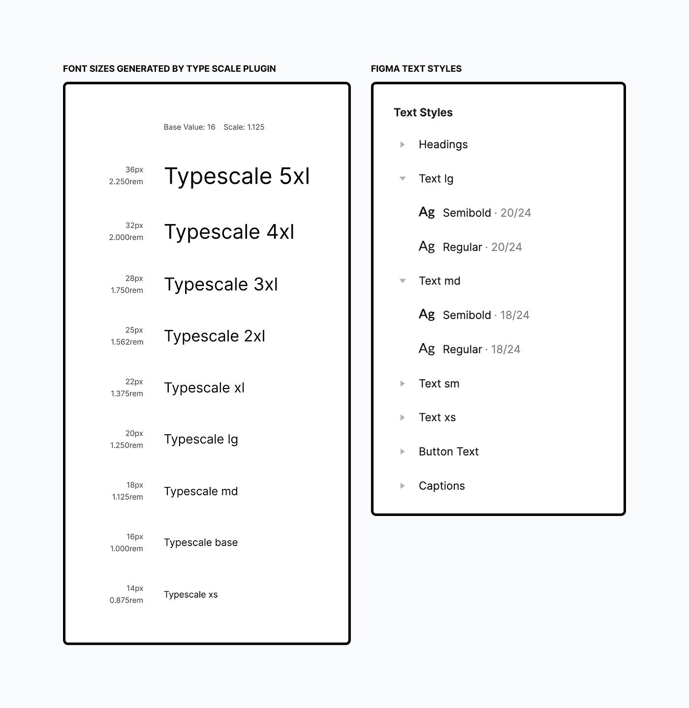
Font Sizes & Weights
We create different font sizes and weights in order to achieve visual hierarchy. As, the same font size can be used in separate components with two different weights, for each font size I prefer to assign its own weight style. In order to generate a set of font sizes and weights, you can use these plugins: Generate text style, Type scale, Web tool for defining a type scale.
Typography in Design Systems
Choose Fonts, Set a Hierarchy, and Integrate with Components
medium.com
Iconography
Icons should communicate messages given by the system and pay attention to the main information.
Best Practices to set up icons in Figma:
- Store each icon as a component so that it will be easy to swap it in the components.
- Name icons splitting them by the categories: each icon has a name starting from
Category/, for example, like this:Arrow/down-smallorArrow/down-medium. So,Arrow/is the category, anddown-smallanddown-mediumis the icon variation.
3. Remove redundant layers, so that to keep layers clean.
Grid
Grid aligns elements and typography in components and layouts. It structures content and establishes consistency. The grid consists of columns (1), gutters (2), and margins (3).
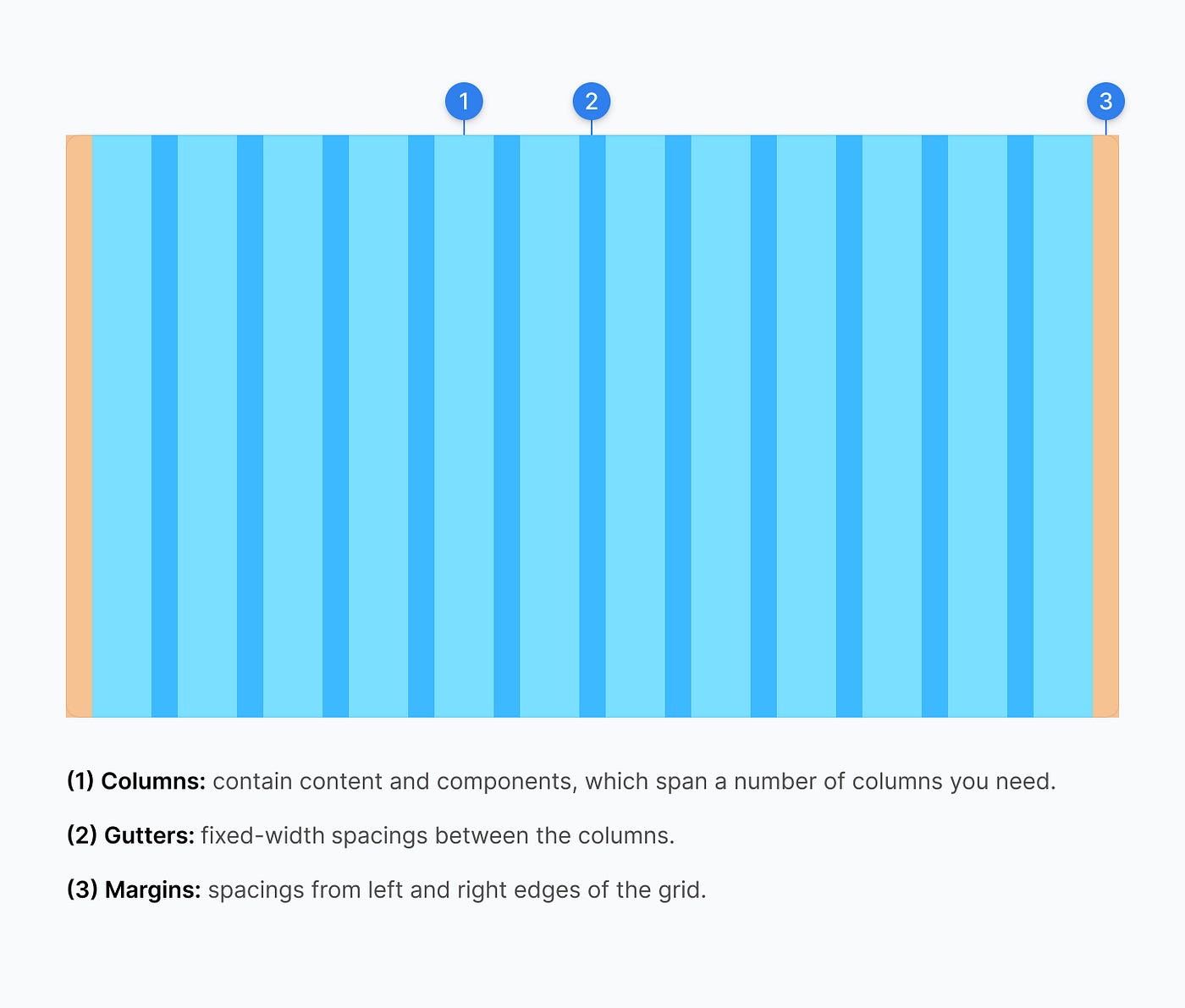
There are two types of grids:
- Fixed: grid where columns are fixed-width.
- Fluid: grid where column widths are defined by percentages and will resize based on the viewport.
When it comes to documenting grids in the design system, it’s crucial to provide guidance on how the grid is applied.
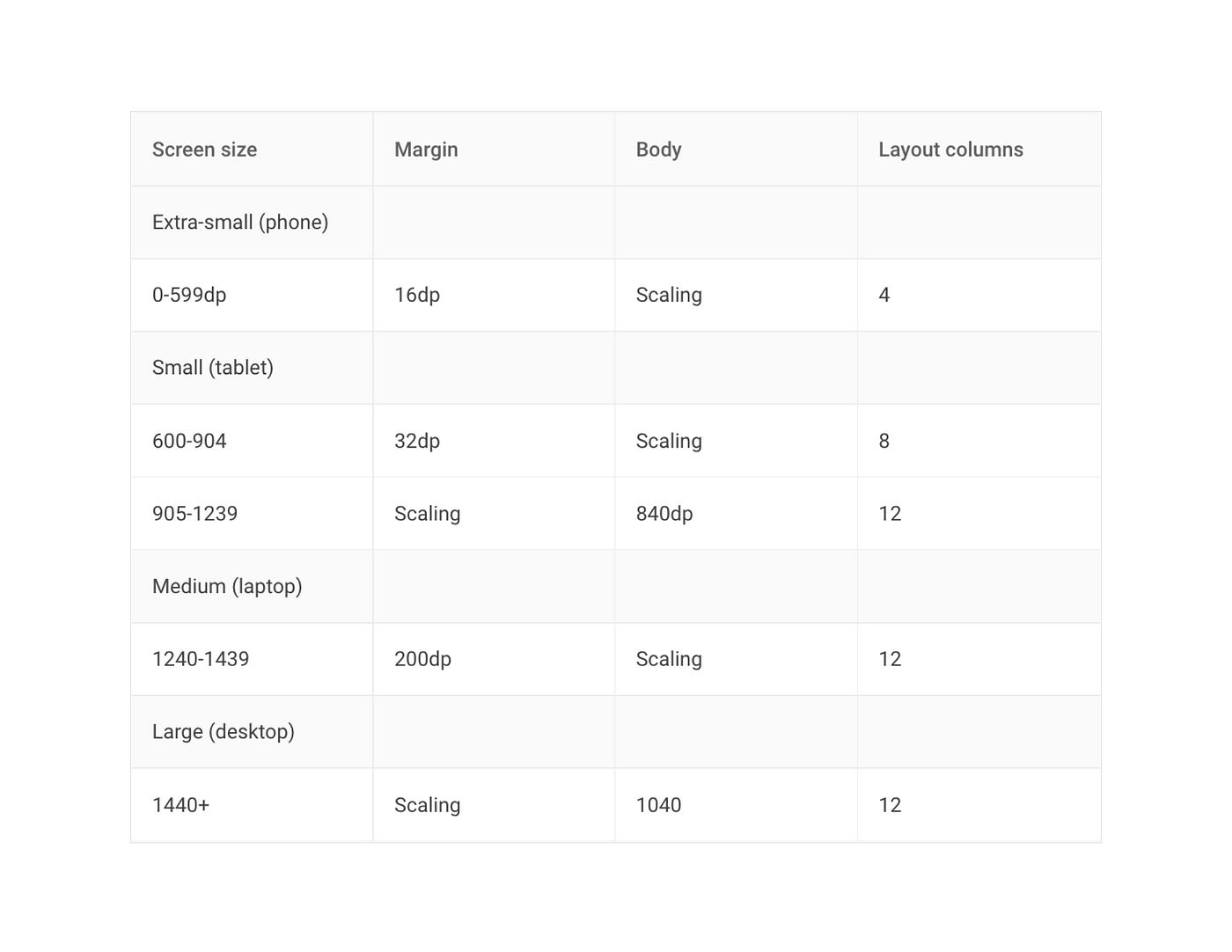
Responsive grids
Responsive layout grids determine how to organize content and components based on the screen sizes. Here, we should define the grid type and layout for desktop, mobile, tablet. If you’re not sure how to get started, check out this great article.
Breakpoint System
Commonly, we define breakpoints (screen sizes) based on the different screens, devices, and orientations. Depending on the content, we determine breakpoints and the number of columns for each viewport width.
Spacing system
This is a set of guidelines about how to arrange components and place them within layouts. The spaces inform the relationship of the specific elements in the component and communicate hierarchy.
Commonly in code, spaces are determined by paddings and margins. The paddings are the spaces between UI elements. If you define the spacings in Figma, make sure to include px and em units.

Great, Foundations is done! Let’s jump to the component library in Figma.

This is a set of UI components that are based on the foundations. I’d like to look at the main tips on how to create a clean and easy-to-use library.
Base Component
This is a way how to structure the UI elements such as buttons, and fields. What does it do for us? When we need to create various states, and styles of the same component, this concept helps to speed up a process. For example, in the image below, _Button base instance is nested into the Buttons component. In this case, _Button base is the base component, so if you decide to change its structure, this will affect all the nested instances, which is very convenient!
By the way, if the component’s title starts with an underscore _ , it will not be published in the Team library, and hence it allows to distinguish between the base and normal components.

Consistent name conventions
This is the most tricky part because it depends on several factors such as the product functionality, framework the team uses, and code style. It’s important to make sure that the component name in Figma has the same name as in the code because it will be easier for the dev team to scan and navigate through the Figma library.
There is no strict rule for name conventions, every team has its own use case, however, there are the key principles that you can stick to:
- Use nouns rather than a verb.
- Use common names as much as it is possible. You can find common UI component names on this great website.
- Keep it short and simple.
- Meaningful and not too abstract.
Here is a nice talk by Into Design Systems with Florian Gampert about Design System Naming Conventions.
Organize components and variants
Make sure that the component structure is consistent, and that there are no redundant layers. You can use a clean plugin, it allows you to remove hidden layers and ungroup single-layer groups.
To make sure your variants are easy to scan, use the Variant organizer plugin, it allows you to arrange them based on their properties.
If you’re working with startups or MVP projects, probably, using the open-source UI kit library such as MUI for Figma, Ant Design Open Source is a great choice because they provide you with various pre-defined components, that you can adapt to your needs.

Working on screens and templates, we often iterate, and Figma space is getting overloaded by a number of screens. Therefore, we need to make sure that, the team can easily navigate through the screen variations and quickly find a final and approved solution.
Indicate the status of the screens/pages
I prefer to create a page for each set of screens and assign them names that indicate the status of the screens, for example: Ready for development / Work in progress / Archive.
By the way, if you still want to indicate the status of each screen, you can use this nice Figma plugin.
Display user flows
Because it’s not easy to recognize connections between the screens at glance, you can use these nice plugins AutoFlow, and ArrowAuto, that allow you to generate the flow within the Figma file.
Provide documentation
If you want to make developers and stakeholders freely navigate and understand the context of the designs in Figma, provide them with the additional documentation. It can be a short description of the flow or annotations to screens, a list of associated tickets, or links. Besides that, I prefer to add meeting notes directly to the Figma file, which provides me with a quick reference to the discussion summary.

When you need to execute design handoff to the developer, it’s important to make sure that the component structure matches a coded component. It allows us to avoid misunderstandings between designers and developers.

Commonly, developers use front-end frameworks like React, Vue, and Angular to build components. Then, in order to publish coded components and create a library, there is a Storybook that does this job for you.
It’s now also possible to generate a Figma UI kit from the Storybook library by using Story.to.design plugin.
When it comes to the discussion of making a design system public or private, each team decides on its own preferences. Referring to Brad Frost, the creator of Atomic Design, he explains why it’s better to make it public. Even if it’s not public and not open for contribution, having the code visible to an internal team is very important and powerful, so I wish all the teams to be more transparent in this!
The goal of the design system is to create a unified language and provide a team with a feeling of being on the same page. Wrapping this up, let’s always think about how we can improve our workflow and how the design system can help us to achieve that.
I hope you’ve found this short article useful for you! Please, let me know if you have any questions or suggestions, I’ll be glad to hear from you! 🙂