We like to think of ourselves as productive and effective. We spend 8 hours a day working. Yes, this time might be interrupted with lunch and coffee breaks, but we are still largely working using our computers and we justify the salary we bring back home.
Now, what if you did an experiment and observe our mouse clicks in the next 2 minutes? What are you clicking on? Are your clicks responsible for executing an operation or are you mostly clicking to get to an operation?
You might notice that you are spending most of your time at your computer trying to navigate, to get to a certain place where information is or to execute an operation. You think you are doing work, but you are unaware that you are in fact running a marathon in virtual reality. If not virtual reality, then you are definitely moving across great distances in digital and mental space. This everyday travel happens both on screen and in our minds, yet we ignore a large portion of it. The danger of ignoring this travel comes at a very high price to our time, energy and productivity and I think that it’s actually one of the contributing factors to burnout.
To understand the gravity of the trap we have collectively fallen in, we have to look at the nature of stationary work and expand our definition of working space.
The screen as a physical space
If we think about it deliberately, we are somewhat aware that our screens represent a space, a surface that has an area defined by certain dimensions. Yet during everyday use, I think we often fail to perceive this area as actual physical space. The reason behind it might be the nature of stationary work. While working with screens, our bodies assume the position of stiff dolls, while only our dominant hand moves a tiny cursor. This creates a perception, an illusion rather of negligible movement or no movement in space at all. The reason behind this effect is that our bodies simply don’t receive any physical feedback. We might say to us sometimes: “How can I be tired from something that’s virtual, that’s not even real?”. It’s different when we are working with other tools which don’t have screens though. Our bodies might move more and we receive clear feedback from our senses that we are moving in space and it is more natural for us to acknowledge that we are doing work.
The spaces of user interfaces.
Movement across the width and height of the screen with a cursor IS, in fact, actual movement. Furthermore, we can move on the screen in more ways than one. We know that our screens can generate entire realms in 2D and 3D space in gaming, but space can also be generated by user interfaces. These spaces are not 2D nor 3D per se, but we do move and travel through them every day. What’s interesting is they might even represent 80% of our daily cursor commute.
In order to accommodate the inordinate amount of data and functionalities our computers and the internet have today, designers had to introduce grouping and hierarchy. The two things we see grouped and organized most often on our screens are data and functions.
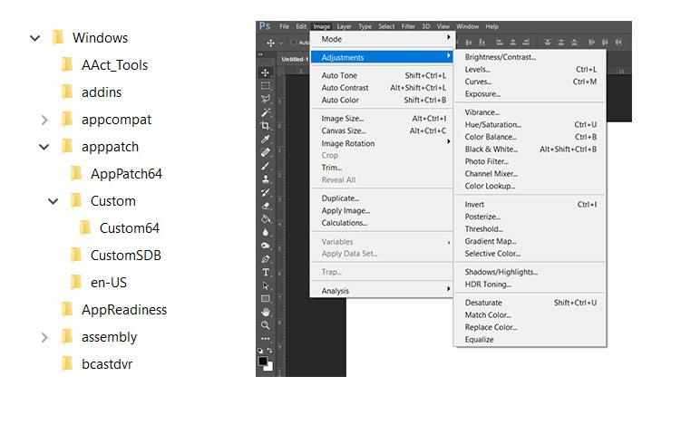
Good examples of data hierarchies are folder trees and sitemaps. They are both based on the tree structure which primary goal is to visually represent a system’s hierarchy and how items relate one to another within the given system. The tree structure in computers has evolved in several ways. The Hamburger menus for example, often collapse to lay out links for site navigation, links that hold certain information and data we need. The Windows File Explorer and the Mac Finder also help us navigate the thousands of folders which contain millions of stored files which our OS and ourselves need to edit or get information from.
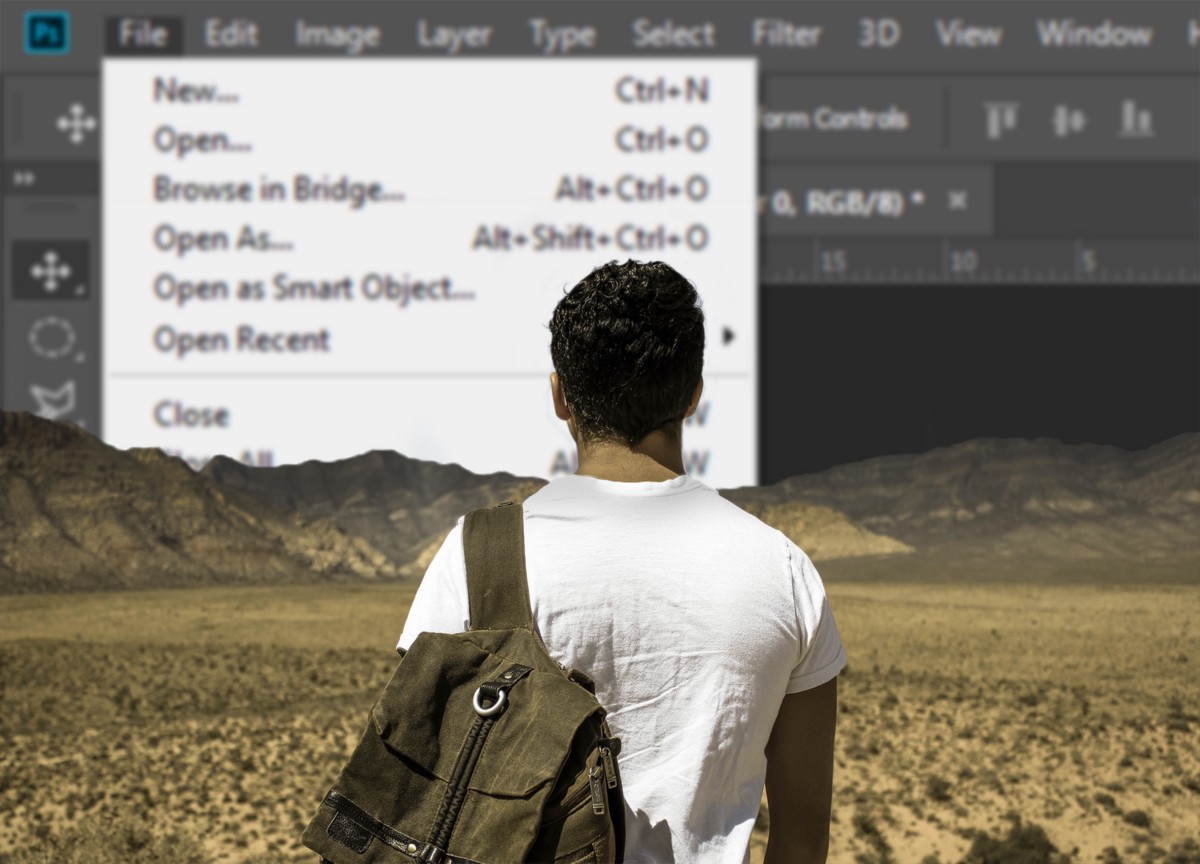
The Image menu in Photoshop or the menu that pops up after you click on the Share button on Facebook are good examples of function grouping and hierarchy. Each menu is designed to reveal a set of related operations and it’s based on the simple practice of logical grouping. While it helps us put reins on a large number of options and functions, it causes more trouble than we bargained for. We maintained this practice since early software which hit the ground running brimming with options and functionality, but it is also one of the reasons we’re in such a mess today.
The double travel in UIs
In order to navigate these groups and hierarchy structures, it is inevitable for us to activate our brains and consult our UI memory maps. Because data and functionalities are often hidden, we first need to remember where the data or the functionality IS, and then travel with the cursor to that given location. We do this constantly and we do it for each app and website environment we are currently working in. We activate our procedural memory pathways (knowing how to do things) many times a day, over an over, which accumulates and results in mental overload. This, in turn, results in decreased focus and efficacy.
One can even say that navigating UIs is like taking two roads simultaneously to reach the same place. The first happens via recall in our memory maps and the second happens on screen via our cursor. I think this model is far from elegant and strays a great length from efficient and acceptable.
The inefficacy of modern day work.
As an illustration, one of the things that made my previous job so draining was, in fact, the app and UI navigation. I had to use 6 web applications (Slack, Mail, Asana, Dropbox, Drive while rapidly accessing up to 5 client accounts daily) and I used up to 6 desktop applications: (4 Adobe + Word / Notepad for writing.) to do my daily work. As you can imagine, this included a lot of multitasking and moving across the screen with my cursor, but it also meant that I had to constantly navigate data, functionality groups and hierarchies. I had to remember where each function or link laid hidden in each of the UIs and I also had to navigate the folder structures of the cloud storage apps and the folder structures of my own hard disk.
I don’t think my case is special and I do think that our workplaces today are unnecessarily burdened with the use and abuse of apps under the guise of increased productivity. “There’s an app for that” stopped being a joke and has turned into a nightmare! More apps just mean more UI layouts to remember and navigate through.
What we call productivity today might actually be 80% comprised of commuting across the virtual space in order to gather useful data and activate the functionalities that do the actual work. We commute with our cursors not only across the screen, but we also explore deep into digital caves excavating hidden links and operations. If What You See Is What You Get (WYSIWYG) can be applied to this situation, it would be an actual farce. I actually don’t see it, I don’t know what I can get, and if I know, I have to go to work for it! Nielsen’s rule “Recognition rather than recall” has become an exception rather than commonplace of good UI practice.
Looking at solutions
I agree that the sheer amount of functions and data our computing devices operate with today really does require us to employ grouping logic and hierarchies. Do I also think it’s time we challenged these paradigms that have crept up and stayed in UX thinking unconsciously for decades? Also yes.
I guess, the takeaways for UX designers would be the following:
- Digital space is, in fact, a real physical space. One defined by width, length and various depths. A trip, although made with a cursor (or other controls) is still a trip.
- User interfaces create tangible spaces. The travel through these UI landscapes made of menus, submenus, and controls is actually what makes the majority of our working day. This navigation results in heavier mental load we are currently ready to admit to.
- Traveling through UIs is always double travel. UI travel happens first in memory and then on the screen. This is why recall should receive special attention during UX planning, strategy and design. Focusing on user journeys simply won’t suffice. While designing a simple user journey is always welcomed, memory recall is what actually lies behind our mental drain. “Recognition rather than recall” is not only a fancy rule. Implementing it can have an enormous effect on efficacy and our wellbeing.
- Modern work means that even the shortest user journeys can accumulate daily and can result in the user feeling like they have just run a marathon. Work has to be aligned closer to doing and less with traveling.
- Reimagine, experiment and challenge conventions. Mobile OSs have greatly succeeded in avoiding navigation based on the folder tree for example. What if all your user journeys are made of 1 step only? What if you guide your user through available functionalities instead of making them recall where everything is? This would not always make sense or be easy, but it would surely get us closer to the solutions we desperately need.
There are a lot of things which can contribute to bad work-life balance and I think UX should not be one of them. Commutes across the screen and within our mental maps have become something we take for granted and their cost has been largely ignored. This situation is not helping anybody and it’s about time we reimagined our digital reality in a way that will truly support and aid us in making our lives easier and more productive.