“So, when the user clicks here, this will pop up”
“What if user doesn’t clicks there?”
“What do you mean?”
“What if user clicks elsewhere?”
“Oh. hmmm……..”
This was my first design grooming session with PMs and developers. We were discussing about potential designs which would go into the next sprint. I had thought that I had come up with a pretty functional, no-nonsense flow for a new project that I was working on. I prepared myself to show the designs and get feedback. Till this point, I was used to more of an academic design critique where I would get very designish feedback- like on layout, UI, colors etc. But when you are sitting with developers and PMs, the critique goes to another level.
It is amazing to see how developers can find and sniff edge cases in the design, and potential areas where the design would fail or would not work.
But where are they coming from?
Blocks of front end code are like drop in the ocean for developers and only one of the many complexities they have to deal with while doing implementation.
After teaching a bit of coding myself last year, and working with data scientists for a while, I kind of understood where they were coming from.
For example, in Javascript, there are conditional statements –
if (condition) {
block of code to be executed if the condition is true
}
or for more complex behaviors
if (condition1) {
block of code to be executed if condition1 is true
} else if (condition2) {
block of code to be executed if the condition1 is false and condition2 is true
} else {
block of code to be executed if the condition1 is false and condition2 is false
}
This is an example of React’s conditional rendering (login/logout)
function LoginButton(props) {
return (
<button onClick={props.onClick}>
Login
</button>
);
}
function LogoutButton(props) {
return (
<button onClick={props.onClick}>
Logout
</button>
);
}
Now, if you have never seen code or worked with it, that is fine.
The block of code that you see above is basically defining the click behavior of a login logout button.
So when developers are working on the build, they can literally see the behavior. It goes something like-
"On action A action B should happen"
"On action B action C should happen"
"On not doing action A what should happen? Action C?"
"Till action A is not happening/triggered, what is the idle state? action B?"
"Which one of these is the default state? null action?"
"What happens if there is an error going from action A to action B?"
Have empathy for developers too.
These behaviors are really critical to define in a product, otherwise, your entire design may not work at all, or may work in a way which is undesirable.
I know it is difficult to define all of this WHILE you also have to take a lot of other decisions like choosing the right component, making wireframes, mockups, colors, layouts, typography, size etc., but, without defining the functionality and behavior (UX, ahem….) none of that would actually matter.
While setting up a tent on a camping trip, the tent spoke to me and said-
“Best designs work in the worst of conditions.”
So, yeah, if you are a designer, you kind of have to think about the worst case scenarios and how the design would deal with them. Think about unintended actions. Think about unexpected behaviors.
Fine. We get it. What is the solution?
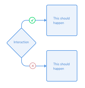
Based on simple flowchart components, you can create a flow based on yes and no of any interaction. This would help developers identify what to do in case the designed interaction does not take place.

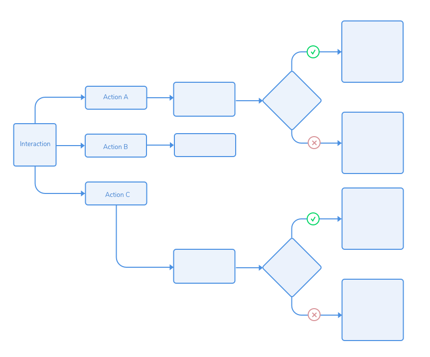
You can use this as a building block to create an entire flowchart for the UX flow. It could look something like this.

Here, we are not really replacing the UX flow or wireframes in the design. This flowchart serves as a logic tree for the entire interaction, which makes it easier for developers to implement the design.
Also, this flowchart really helps to understand and think about edge cases as a designer. By doing this, one can easily figure out whether an error state/empty state would be required, or an alternate solution should be provided when the user does not do the intended action.
Okay, so what is the difference between this and UX flow?
While UX flows are meant to be used to tell the story of an action, like going from clicking on a button to opening a menu, this flowchart is intended to tell the story of NOT pressing a button, thereby accommodating edge cases of unintended actions.

Wait. Are you talking about edge cases?
Not really. Edge cases are more broadly defined and could range anywhere from overflow of text to multiple option selection. It could entail accessibility issues. Unintended user actions are really a subset of edge cases.
To conclude
Think about unintended actions.
The deviation from happy path.
The unexpected behavior.
The road not taken.
