UX features where the iPhone X falls short (to an S9)
The last part of the sub title above is in brackets because it is not about whether an S9 is a good phone; many other phones, most notably the LG range, also offer impressive features that have advantages over their Apple counterparts. So again, this is not a iPhone X vs. S9 shootout. With that out of the way, let’s at five areas where the S9 trumps the iPhone X:
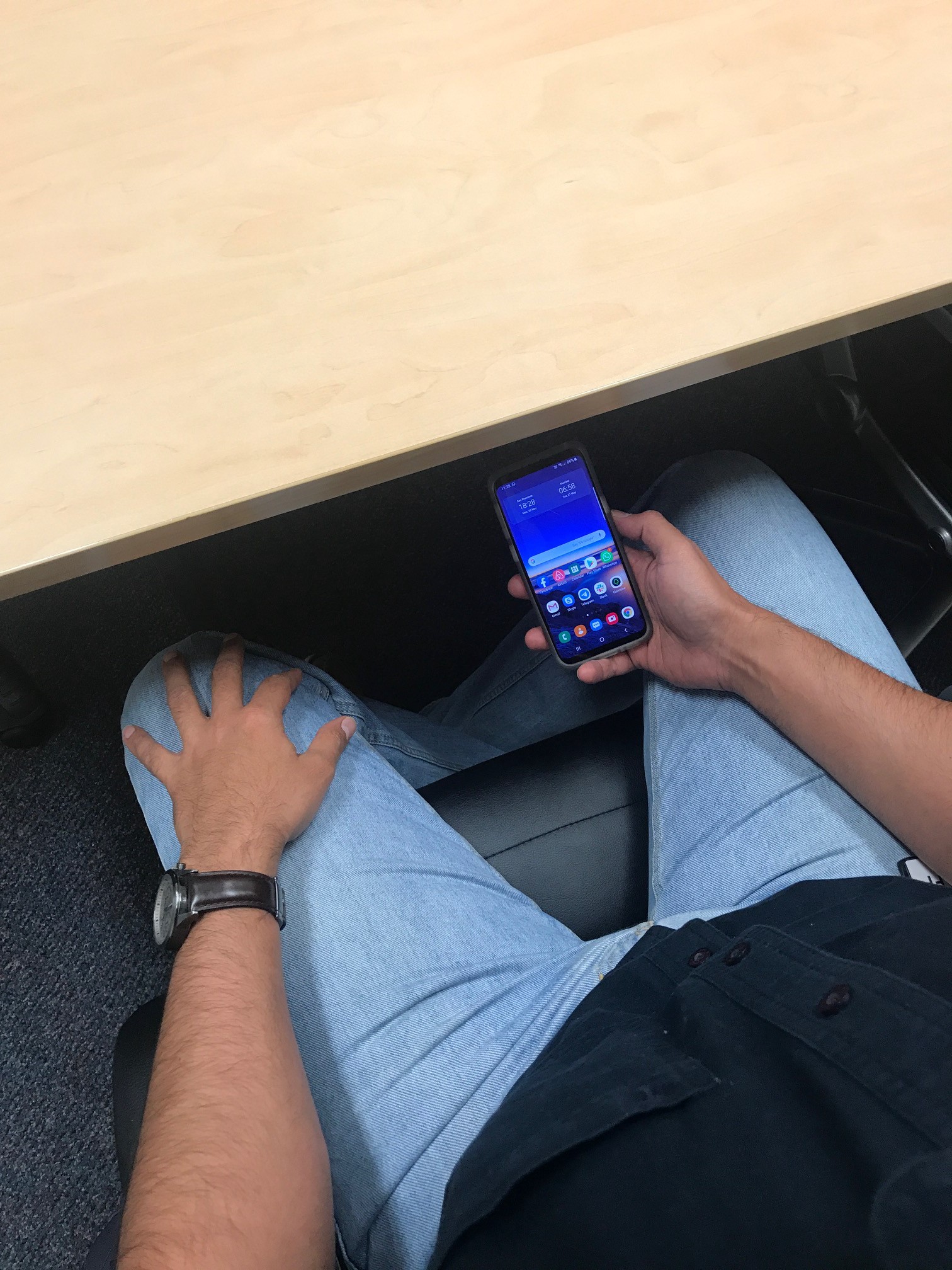
Voice & gesture controlled camera
While the iPhone X has a great camera in terms of optical quality, the UX around operating it, especially while taking horizontal selfies, is disappointing. I often have to change my hand grip to make sure my finger can reach the on-screen button without covering the screen or compromising my grip (it’s a bloody expensive and delicate phone). I can use the buttons on the side to trigger the shutter, but often, I forget which one does what and more importantly, pressing the button (often through a cover) results in camera/device shake. The only way around this is to set the timer to 3 seconds, tap/press, and the quickly re calibrate the phone to an optimal shooting position.
Compare this to voice and gesture controls offered on the S9 (in fact, offered first in the S7). I can simply hold the phone focusing on what matters, which is the composition of the photo, and trigger the shutter with a variety of brilliant and user friendly options. For example, I can just say “Cheese” or “Smile” and the phone initiates a capture in 3 seconds, while showing a countdown on screen automatically so that everyone in the photo can see (and therefore make any last second adjustments). I can also raise my palm ( see below) and the phone will detect the gesture and do the same as detailed above. The second method also comes in handy when you are in a shared space and don’t want to say something aloud (such as “Cheese”) to trigger the photo to avoid any awkward glances.

This is such a superior experience than trying to manually trigger the shutter, and no matter how ergonomically placed the buttons are, will deliver a better selfie experience. You can also use voice commands when using the main camera, and yesterday I wanted to take a picture of my TVs label at the rear, and I just held my S9 behind it, approximated the frame and used a voice command to trigger the camera. Worked like a charm. In a world that is rapidly moving towards conversational interfaces, it is surprising and disappointing that the most expensive phone in the market doesn’t have something as basic and important as this.
Customisable home and lock screens
Quite surprisingly, Apple continues to not allow its users to personalise their home and lock screens. This hampers the UX as it inhibits users from being able to add important widgets, such as one for weather or a world clock, that they frequently need, to the home screen. In fact, the whole concept of a widget doesn’t exist on an iPhone. Similarly, iPhone users cannot have anything showing on their locked screens.
S9 users can easily add widgets for frequent tasks and the ‘always on’ display feature allows for the clock and a notification feature to be shown on the lock screen, even when the phone is ‘sleeping’. This is incredibly helpful as it does away with the need to pick up the phone to check if there are any unread notifications or emails, a task that users are habituated to performing. In fact, the S9 has a brilliant, configurable feature that allows you to double tap the phone when facing up to light up the display, allowing you to quickly peek at time, date or notifications.

Additionally, the S9 allows for other things, such as the swipe down menu, to be customised. For example, I have Wifi, Sound, Bluetooth, and Auto Rotate as the first four items I see when I swipe down. I can then extend the swipe to reveal additional options, meaning that rarely have to go into Settings (which I can from the top right of the same screen).
High effort for entering Wifi or Bluetooth settings
One of the frustrations I encounter with an iPhone X is that there is no way to quickly enter detailed Bluetooth or Wifi settings. You can swipe down from the top right and toggle these on of off, but if you need to choose which device to connect to (which happens quite often these days with multiple devices in a household) or add a new device (or unpair and repair a device to troubleshoot, which also is fairly common with connection issues cropping up from time to time), you need to go through a minimum of three steps (Home-> Settings->Bluetooth).
On an S9, I can simply tap and hold the setting in question to enter the respective settings menu and go from there. Simple, intuitive and effective.
Apple is notoriously poor at adopting good ideas that others have come up with (such as the tap and told to enter the detailed menu); they should park their ego and learn to learn from others, as it is impossible for them to be the best at everything.
On a side note, it is worth pointing our that when we first got an iPhone X, we could not figure out why the Bluetooth and WiFi on the device would turn on on their own even if we specifically turned them off. Later, we figured out that Apple, for some inexplicable reason, changed the system behaviour to restart these services if you turn them off from the swipe-down menu, and if you needed to turn them off fully, you need to go down the settings route. This behaviour violates basic usability guidelines with two seemingly similar actions resulting in differing behaviour with no feedback to that effect.
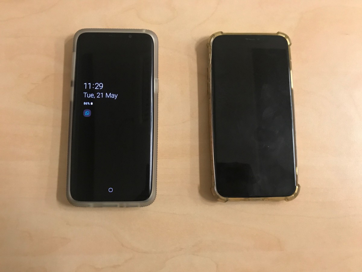
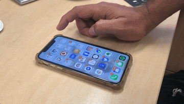
Face ID vs. Touch Sensor
Apple, once again, set a new direction by introducing the Face ID on the iPhone X. The technology was impressive from the onset, especially given that it was a new technology in Nov 2017. However, if we step back and evaluate from a usability perspective, Face ID is hindrance or a distraction at best.
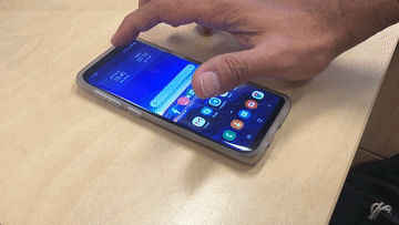
What user problem is Face ID trying to solve? Is it better than a well designed touch sensor? No. In fact, I ran some simple tests and found that S9’s touch sensor actually performed better in terms of how long it takes to unlock the screen. Not to mention that I’d say it is better ergonomically because I can unlock my phone on when it is on my desk or I am holding it a little low (like in a meeting) without having to align it to my face.
Another clear problem that Face ID introduces is that it only allows for one ID to be saved on the device. Compare this to being able to add multiple fingerprints (both my wife and I have our index fingers set up on my phone), which makes usage by a secondary user seamless. With my wife using an iPhone X these days, I am forced to first look at the phone, wait for it to fail in recognising my face, and then enter a six digit passcode! With iOS 12, Apple partially recognised this problem and added the ability to save an ‘Additional Appearance’ (which I can technically use to save my face), but this change was aimed at solving a different problem, where in people who wear certain types of sunglasses or heavy makeup could not unlock their phones using Face ID. My wife faced this problem for a long time and only recently did I tell her about this new feature, and now she has saved her ‘secondary’ appearance on her phone. I still have to struggle each time I want to use her phone, which is pretty often!
In a style that typifies Apple, not only did they introduce Face ID but also removed the touch sensor, which worked seamlessly on previous iPhones, as it does on an S9. Bear in mind that the S9 also has facial (and Iris) recognition , but thankfully, didn’t remove the touch sensor, which is so much more convenient (the S10 also retains the feature while introducing the ability to authenticate by touching anywhere on the screen; a nice reminder for Apple as to what is possible). Other Apple products, including the latest Macbook Pro and the iPad retain the touch sensor so clearly, the touch sensor still works fine!
So, once again, users are forced to follow Apple’s lead, even at the expense of the experience that they get.
Face ID is a solution looking for a problem. It is beneficial for Apple, as it helps it gather facial + emotional data, which is invaluable when combined with other data, but offers no clear benefit to the user, especially when there was a perfectly functioning, and probably better alternative in touch sensor already available.
Lack of 3.5 mm headphone jack and decision to use USB C
This one’s about hardware, but hampers my experience while using an Apple product nevertheless. Apple’s decision (was made with the iPhone 7) to remove the 3.5 mm headphone jack. This was done to promote the Apple AirPods, which are a great product in terms of innovation, but pretty average in terms of comfort and sound. But that is besides the point. What happens if you already have a good pair of wired earphones? Throw them? What if my earphone battery is low? Or like in my case, what if the sound quality I demand from my headphones isn’t easily available in the wireless range?
Bluetooth is not a new feature. All modern phones support Bluetooth/wireless earphones; however, Apple removed the 3.5 mm jack to ensure that you cannot use wired earphones any more whereas it would make for a better decision to retain the jack so that people can choose what they prefer, as is the case on my S9 (even the S10 retains it). At work, I use my wired earphones (because they are awesome and I don’t need the convenience of wireless) and at the gym, I use the awesome Jabra 65 Elite earbuds. Was there a problem with the 3.5 mm jack?
Apple’s design philosophy is based on simplification and the lack of choice. That is why their users pay a premium for using one, because a lot of energy is spent on making choices for you. If you want to make your own choices, you simply ought to not use an Apple product.
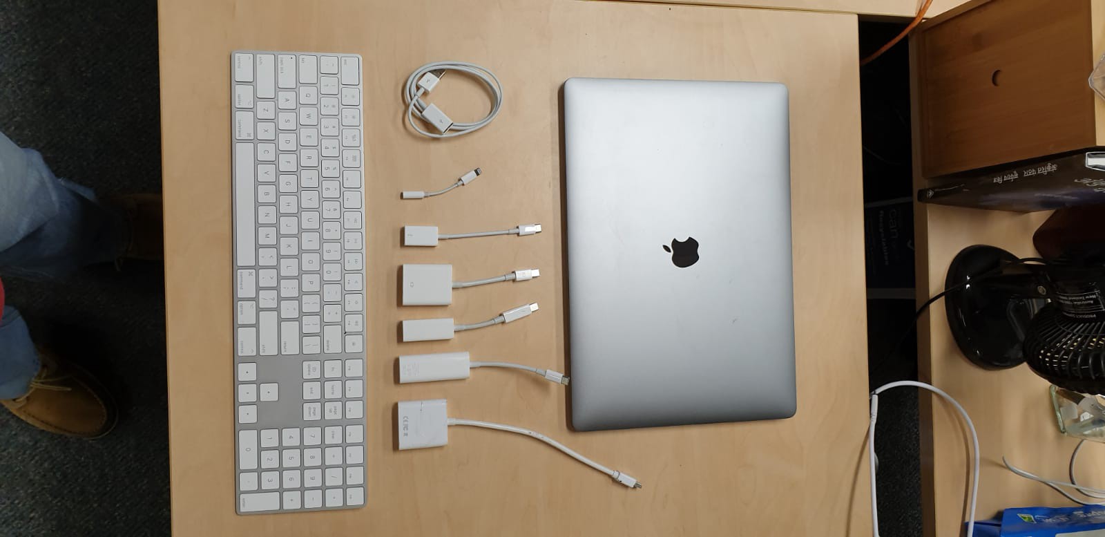
Another unrelated hardware change that they made was to switch to USB C, instead of battling against the tide and enforcing their own standards However, my colleague who has an iPhone 7 and bought a Lightning to 3.5 mm adaptor so he could use his earphones with his phone, cannot neither use his earphones nor the adaptor on his new iPad Pro. Now, he needs to either buy a USB C to 3.5 mm adaptor or buy wireless earphones. In some ways, Apple has betrayed him, because while I welcome the decision to move to USB C, his adaptor would have worked with his iPad if Apple would have stayed true to the Lightning port and not shifted to USB C.