This story is part of a serie that focuses on redesigning existing experiences and trying to bring new coherent features to them. Check out Youtube 2.0, macOS Newton, and iOS Mogi if you want to know more about this serie!
Apple introduced with iOS 12 Screen Time that allows you to know the time you spend on your phone on a daily basis. Eager to know how much of an addict I was (or not), I installed the public betas as soon as I could and headed directly to Screen Time to figure it out. Well, the results were not surprising at all.
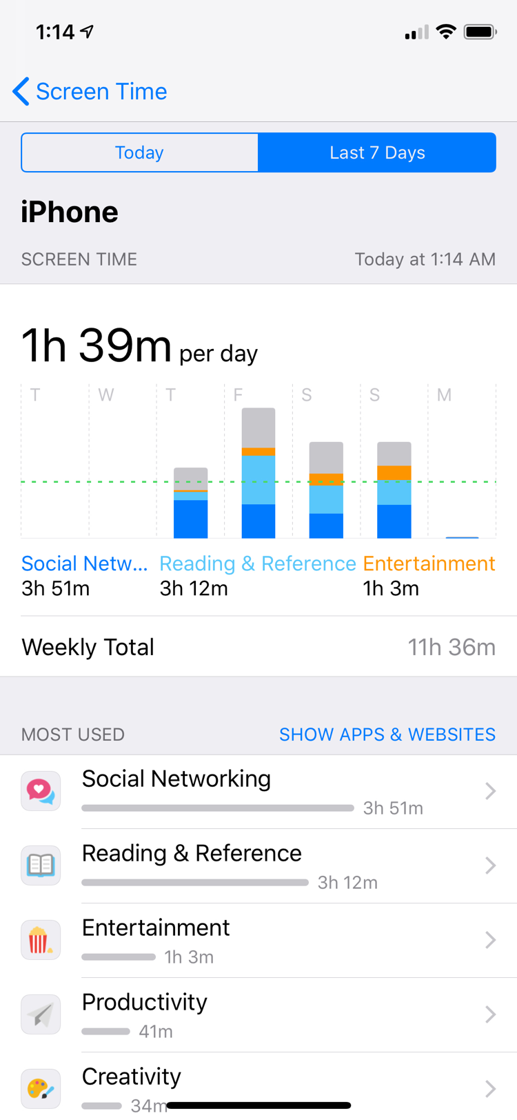
Social networking comes first by far. The gap with the “Reading & Reference” section is not that big only because I recently discovered some subreddits on reddit and I can’t help to have my daily dosis of cute cats and dogs yawning or failing at jumping on the sofa. Apart from that, I spend most of my iPhone time chatting with friends, sharing stupid videos or GIFs I find on the Internet, and so on.
In fact, messaging apps are top among the most popular apps on the App Store, and it shouldn’t come as a surprise. Our mobile devices seem to have been designed exactly for this purpose. They are with us anytime, anywhere, and notifications can keep us updated throughout the day as soon as something happened out there.
Back when messaging apps were introduced, they seemed like the big deal. We could send tons of messages without fearing for extra fees thanks to the Internet, know when the receiver saw the text or when they were typing, etc. So many features that tried to mimic a real-world interaction and to make the conversation feel as if it was happening in the room.
But it was ten years ago. In ten years, messaging on the phone has not come any closer to reproducing what a real-life interaction looked like. We are still stuck with the same three dots that pop up when somebody’s typing, with the same “Read” mention when a message is read, and overwhelmed with “X is online” notifications in a certain popular app, because, you know, if they are online, it certainly means they want to talk to you. 🧐
The thing is, today, messaging apps fail at reproducing the full scope of a social interaction that takes place in the real world. We are mostly limited to typing, recording audio, or filming. What about listening to music together? Or watching a movie, a video, commenting it in real time? How come it’s still so hard nowadays to do all of these things on our phones?
Buckle up iMessage, it’s time for an upgrade!

Introducing Chatroom
Chatroom has been designed to step up from traditional messaging and animated emojis or effects, and bridge the gap between digital and real-world interactions. I have spent a lot of time and energy trying to integrate it as well as I possibly could within the existing frame, so as not to disrupt anything that was already in place and worked well.
In iOS 10, Apple introduced iMessage apps. In my opinion, they are the most powerful extensions system for a messaging app available on the market, but I don’t use them that often (except for GIFs). Chatroom is interwoven with iMessage apps, and is located at the last stage of the interaction’s flow, which is after the object is shared to the receiver.
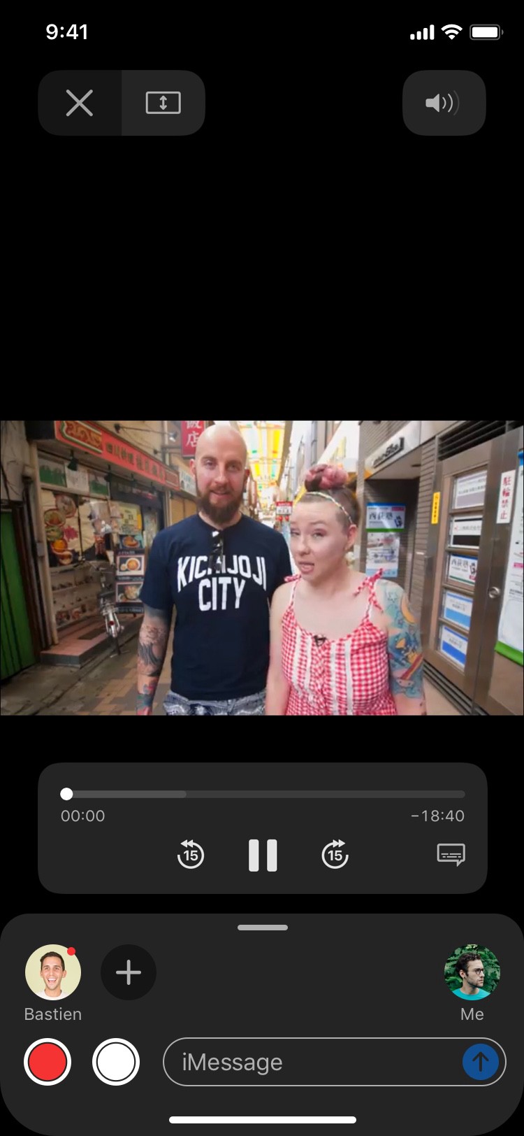
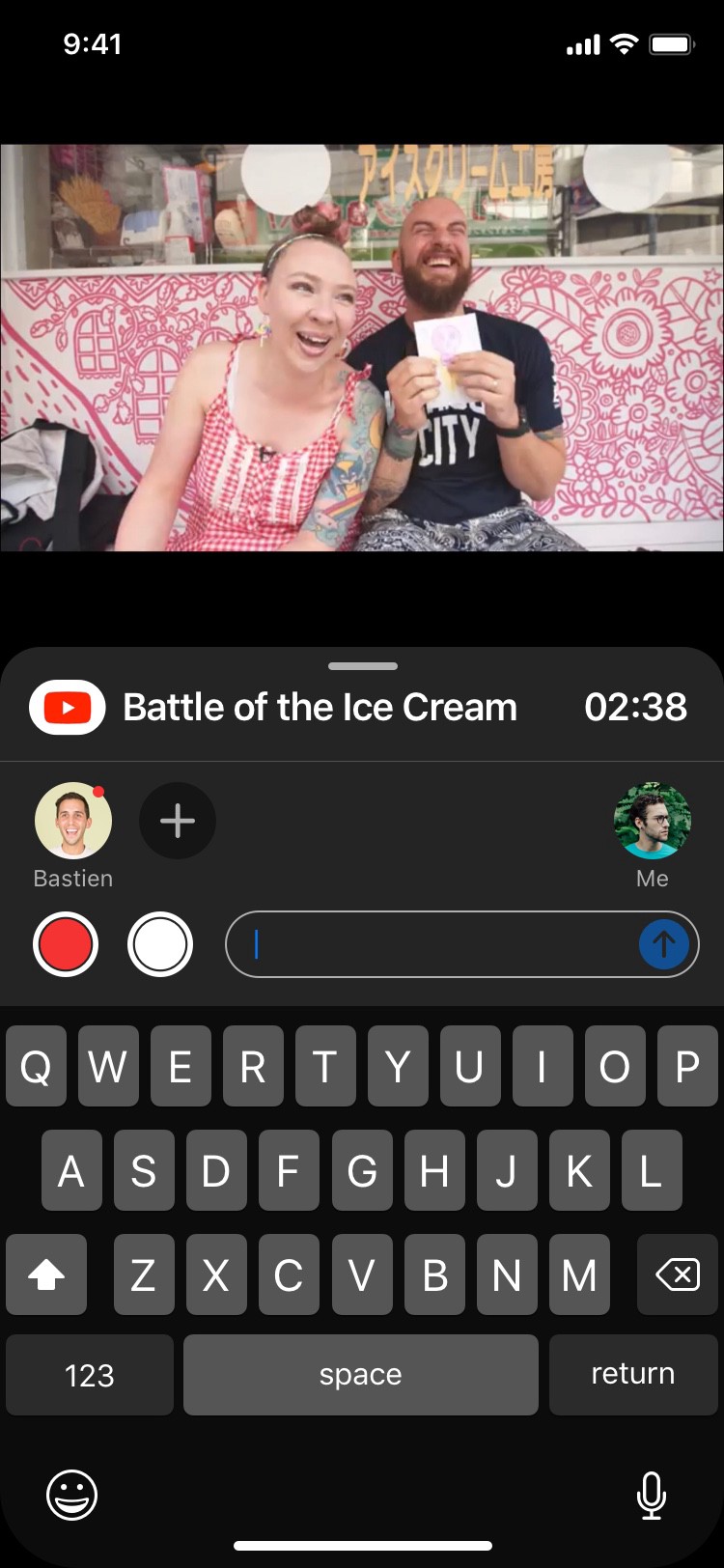
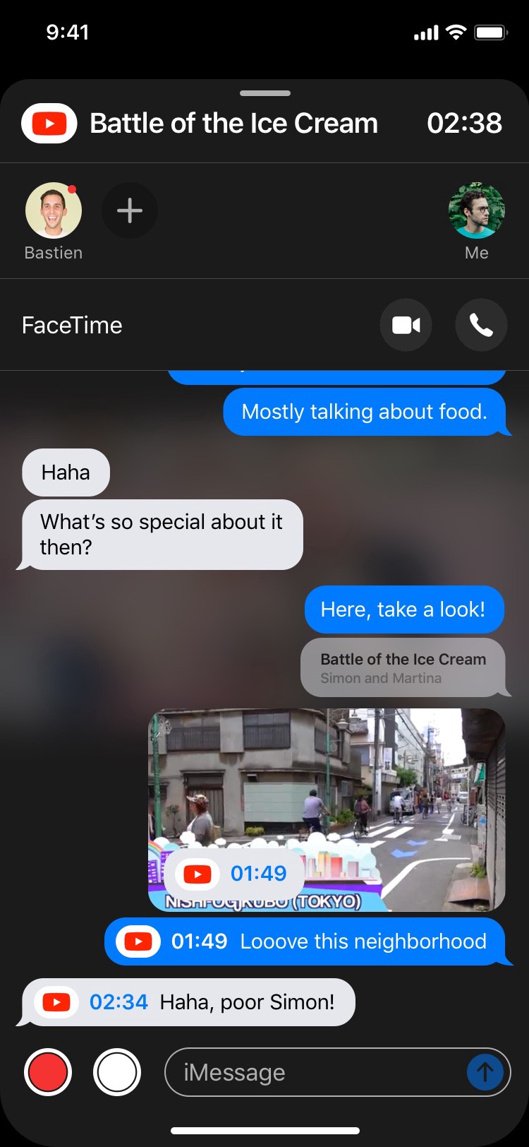
Let’s take an example. Here I am, sending a video to a friend, using the Youtube’s iMessage extension. Once it’s sent, here’s what it looks like:
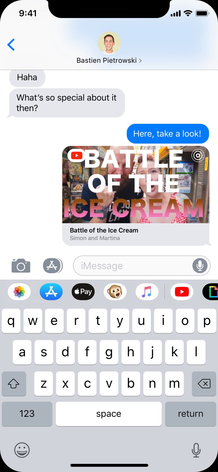
Up until now, nothing too new. Except this bit: for extensions where Chatroom is available, a little icon is displayed at the top right corner of the bubble.

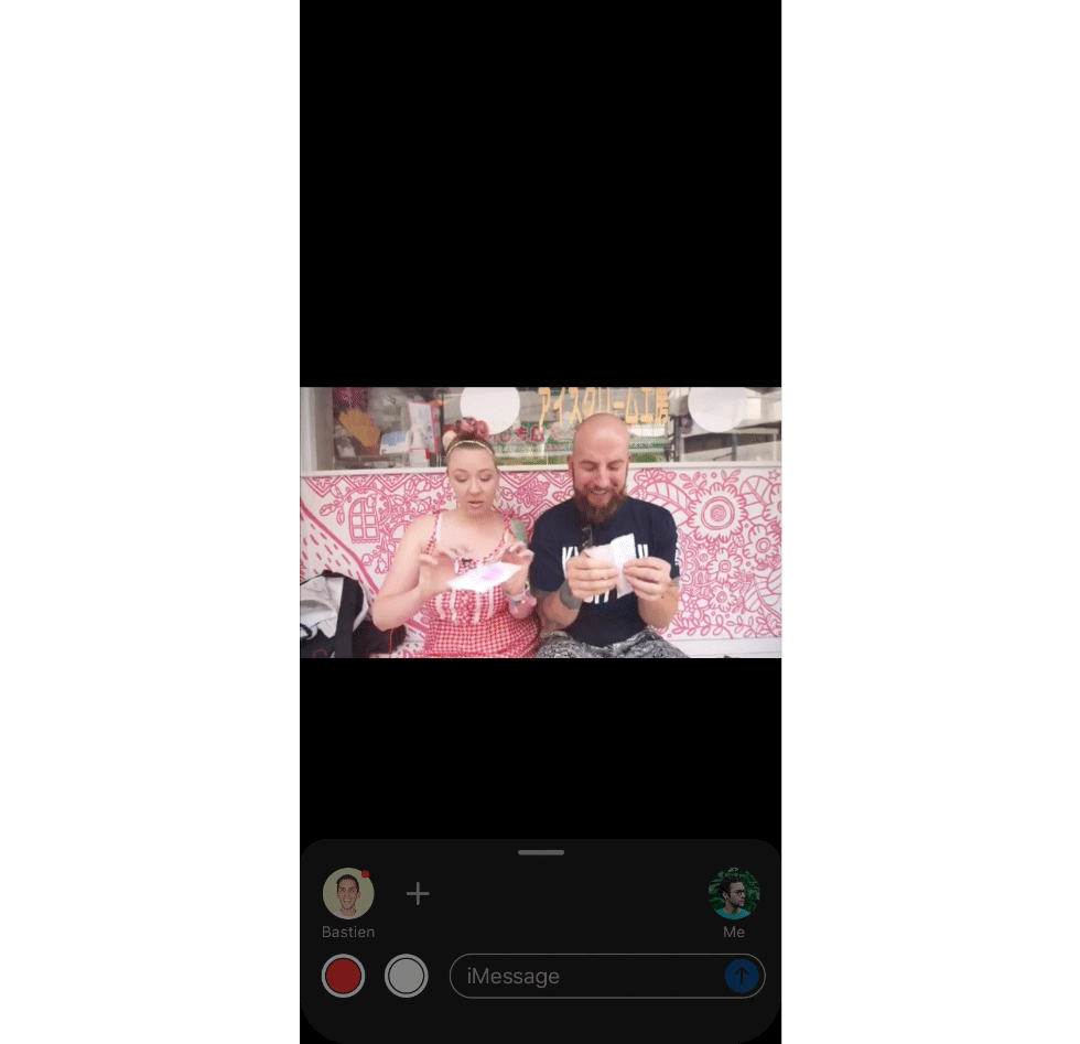
Once the receiver opens the link, watch what happens on the sender’s side:
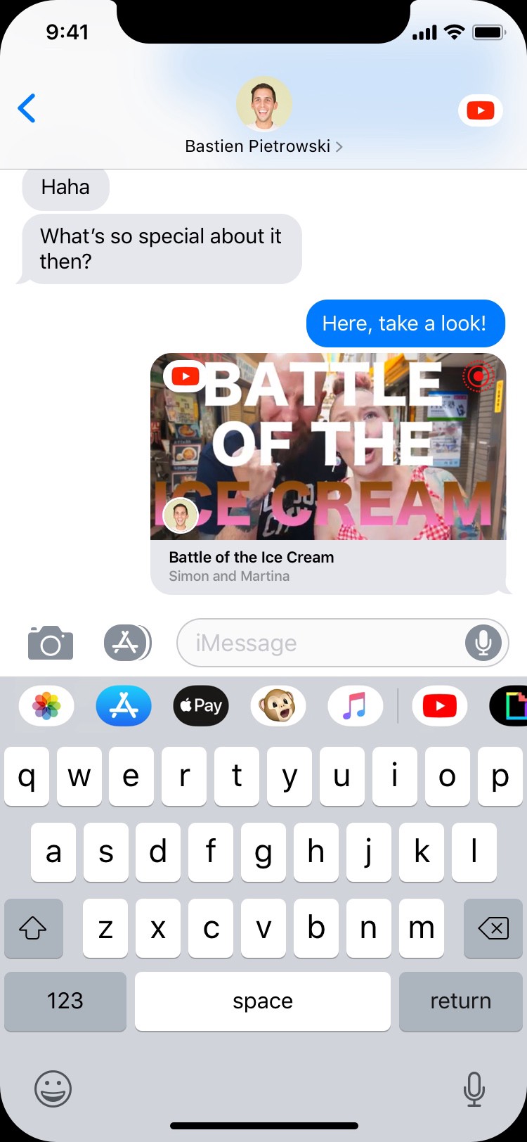
As soon as the receiver opens the link, the little icon turns to red, indicating that he is watching the video. His profile icon pops up on the bubble itself to signal his presence in the Chatroom. Finally, the app’s icon is displayed on the top bar so anyone in the conversation can quickly go to where the fun is happening — the Chatroom.
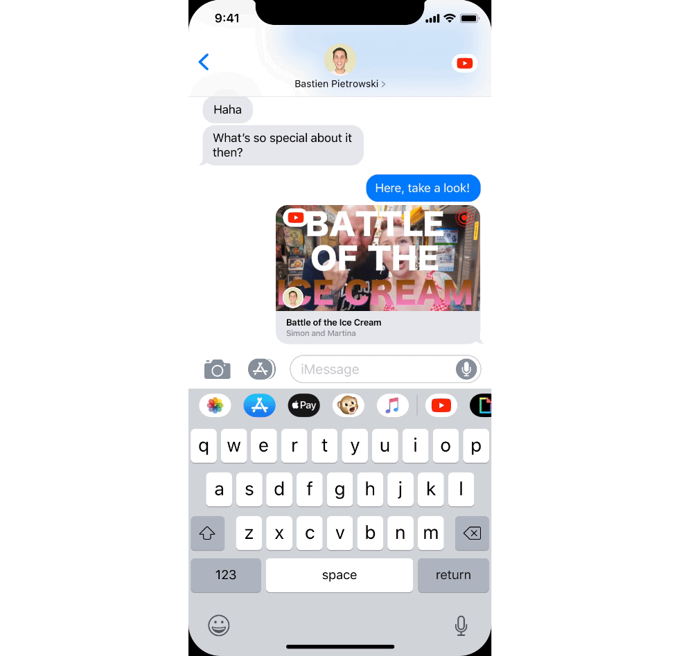
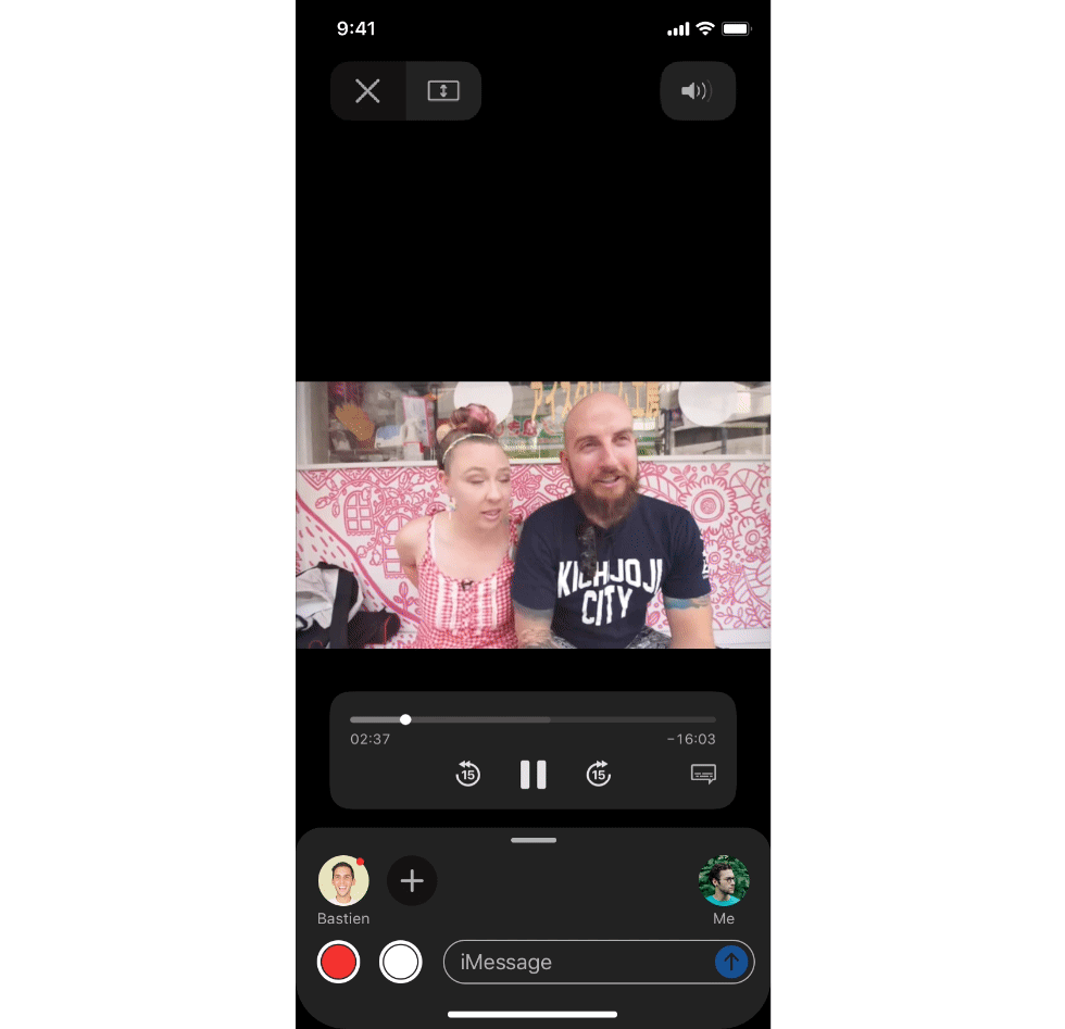
To join the Chatroom, simply tap the corresponding bubble:
Let’s break down the UI of the Chatroom before going further.
The first thing you’ll notice is the bottom drawer, inspired by Apple Maps. The drawer is very efficient at preserving the context while allowing to do other things in parallel. I thought it belonged very naturally in a place like Chatroom, where content is to be at the forefront. After a while, it loses opacity to let you fully enjoy the video and limit intrusiveness.
In the drawer, you can type your message just as you would in a normal conversation.
You can quickly send a screenshot or a video recording thanks to the buttons at the left of the typing bar. Sharing screenshots or screen recordings is indeed essential when it comes to commenting content, so I decided to put those buttons front and center for easy access, as these actions are bound to happen very often in a Chatroom session.

Now, let’s discuss the part above the typing bar. This is where the people present in the Chatroom or the conversation are shown. I tried to reflect the traditional layout of a chat by putting the sender (“Me”) on the right, and the receivers at the left. This layout was designed to be easily scalable to a big group conversation:

You will notice that some profiles have a red dot attached to them, and others don’t. The red dot means that the person is currently in the Chatroom with you, watching the same content as you do. The others are present in the conversation, but not in the Chatroom. Only persons present in the conversation can have access to the Chatroom.
You can add as many people as you want by clicking the + button; multiple people can be added to the Chatroom at once. When people are added there, the Chatroom is automatically transferred to the conversation where these people are (Chatrooms are children of conversations, so you can’t have a Chatroom with people that are not already in the conversation).
Tap a user icon with a red dot to reveal where they are in the stream. You can then tap the time displayed to synchronise with your friend:

When someone sends a message, the bubble appears on overlay:
The drawer can be expanded in order to have a full record of the conversation:
All these messages can also be found in the conversation itself. Messages that were sent within the Chatroom are marked by the extension that was in use then; tapping the icon will lead to the corresponding content.
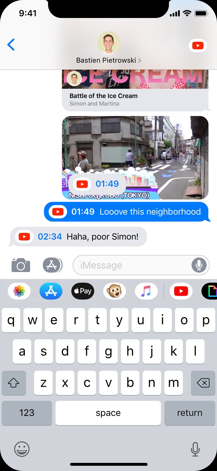
Moreover, messages sent within a Chatroom are tagged with a timestamp (when it’s appropriate; typically when streaming content). Simply touch the timestamp to go directly at the time indicated.
This design is compatible with landscape mode too:

Expanding the scope of Chatroom
Up until now, this concept has been focusing on a single use case of people watching a video together. But of course, the design introduced in the first part could naturally expand to other use cases as well.
The first one that comes to mind is music. I can’t even count the number of times I wanted to send a piece of music to a friend and got frustrated by the experience. Apple Music’s extension in iMessage is a good first step into making it easier, but it feels a bit limited. And please Apple, give us the possibility to share music with friends that are not subscribed to the service. The music could be available to listen to for 24 hours for instance, that would be enough.
With Chatroom, listening to music with friends becomes a lot easier.
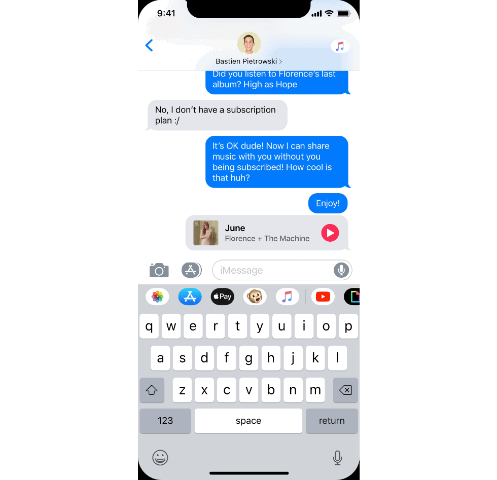
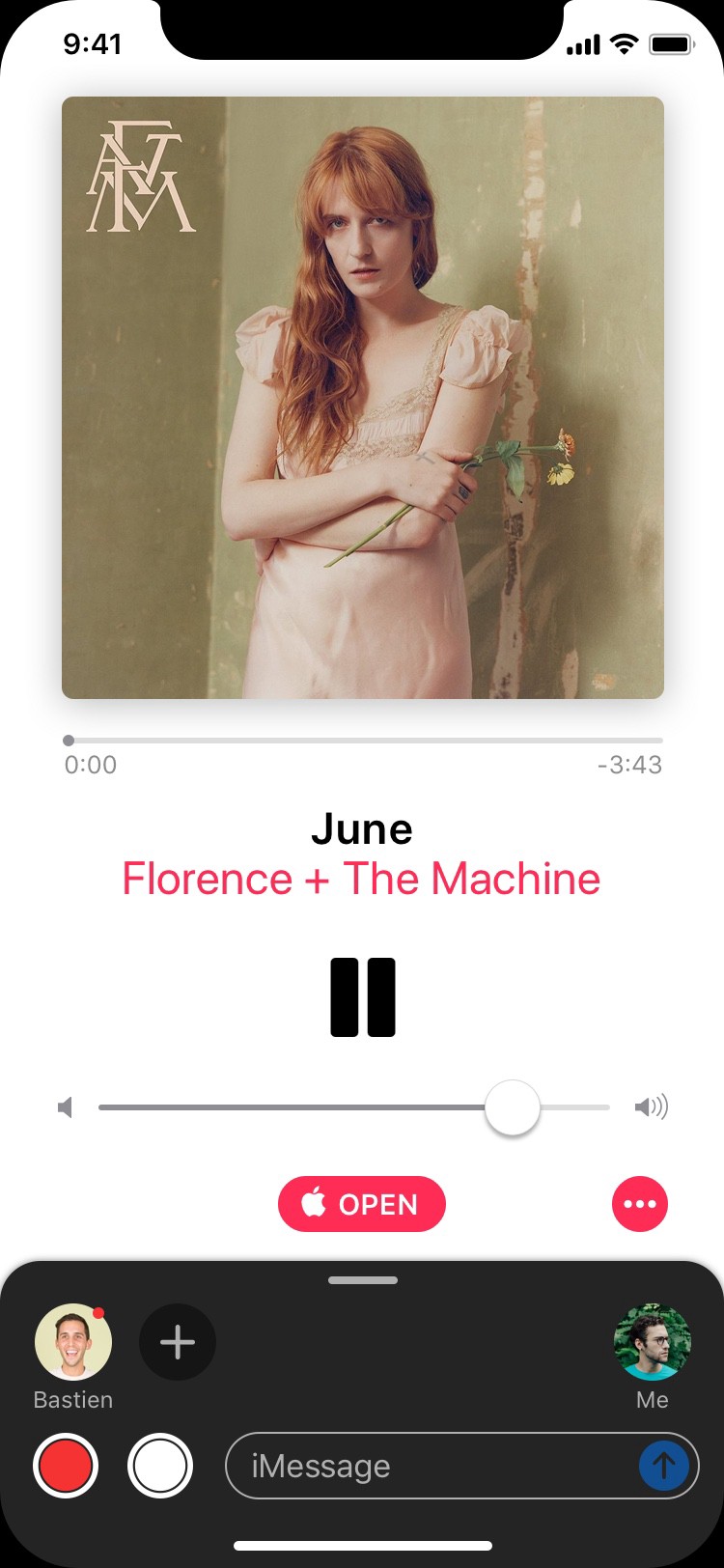
Tapping the record button will record an extract of the music you are listening to. You can then send it to your friend(s) to highlight a particular moment you enjoy in the song.
To quit the music player, just swipe down the page as you would for pictures or videos.
Chatroom is also tailored for collaboration. Similarly to Google Docs or Live Collaboration on Pages, you can share a document to a friend on iMessage and you’ll be able to work with them on it directly from there.
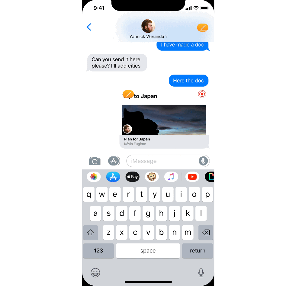
Each person has a different color, so you know in a glimpse what contribution is whose. Each time somebody modifies the document (highlights some parts, deletes paragraphs or add content like pictures or videos), everyone else in the Chatroom is notified with a small notification that pops up only in the document.
Moreover, thanks to Live Notifications introduced in iOS Mogi (if you don’t know what they are, please head to this article for a full explanation), you can even quit iMessage and drag onto the document elements found elsewhere:

After quitting the Chatroom, the Live Notification pops up and stays active for a few minute so you can still interact with it from outside. During that period, the others in the Chatroom will see you as present in the Chatroom.
In this version of iOS, there’s also a new iMessage extension for Safari, which allows you to share webpages with your relatives. Open the link in iMessage and from there, you will be able to highlight text or draw shapes on the webpage itself thanks to the Markup tools, as if it had been transformed into a pdf.
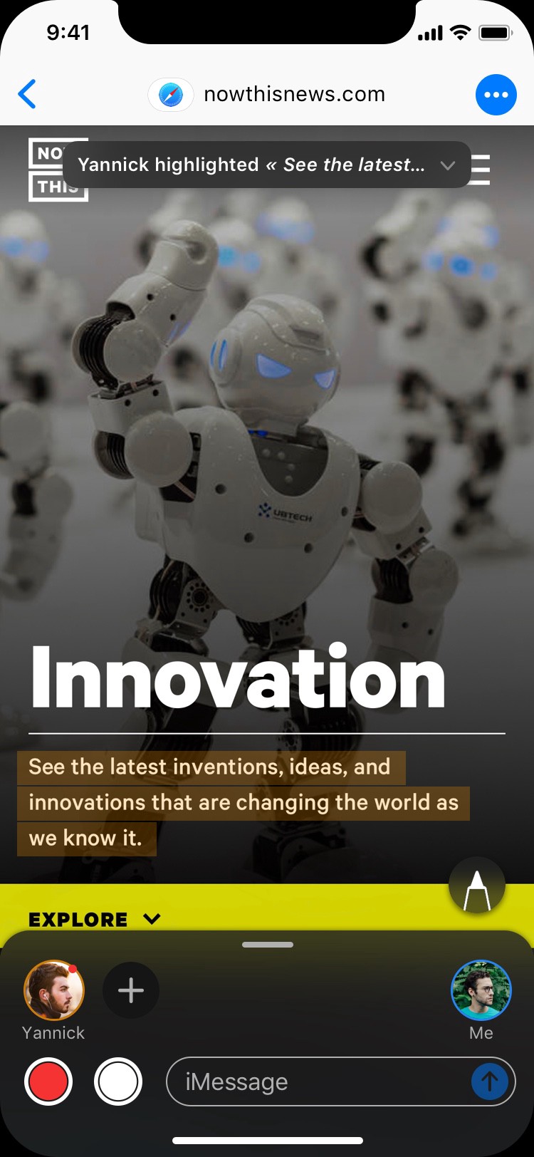
I see this extension as an evolution of current saved bookmarks on the Home Screen (you know, the ancestors of apps).
Highlights and comments will be added to the Notes app so as not to lose them and keep access to them. A new note will be created for each website.
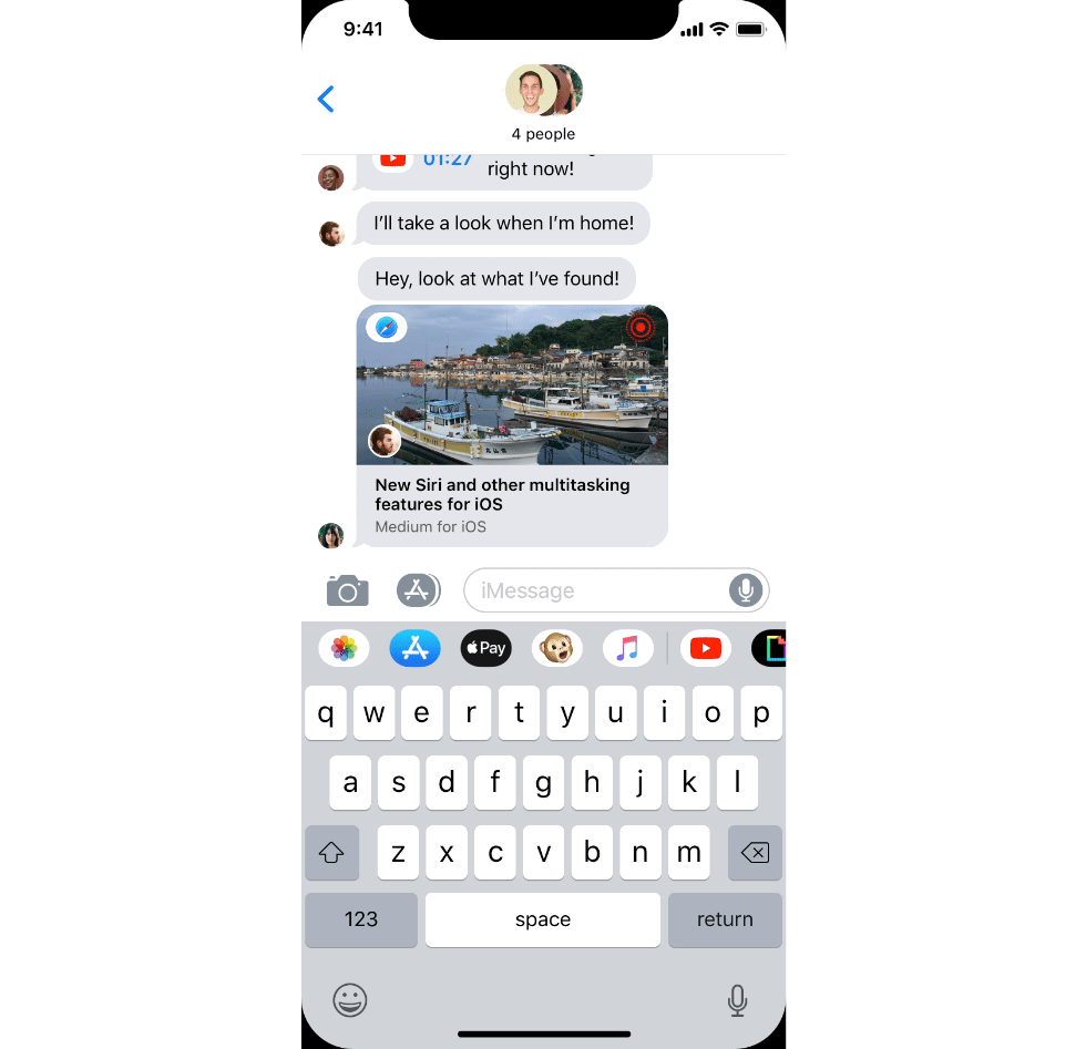
Group conversation
Chatroom really shines when it comes to group conversations. Each one of the persons involved can be in a different Chatroom, enjoying content on their own or in subgroups. Users in a Chatroom will be tagged with the extension’s icon. Tap on their profile to reveal more information and instantly join them in their Chatroom.
A small note on video conference
With Group FaceTime being a reality, Chatroom can also be used with video conferencing. Expand the drawer, and tap the FaceTime icon to launch a video session with your friends.

Drag the drawer to put an end to the session, just like for any regular FaceTime sessions in iOS 12, and go back to text messaging.
I have some other ideas for this part (like live reactions for instance) but let’s not clutter this concept with tons of features.
Breaking out of the shell of iMessage
While I was designing this concept, I really wanted Chatroom to be available everywhere in the OS, not just in iMessage. I am indeed particularly fond of the idea of having a messaging app that is not restrained to its own app, but rather that infuses throughout the entire system. And as iMessage is a native iOS application, it should definitely take advantage of it to really distinguish itself from its competitors and be at the heart of the iOS experience.
To pursue this idea, I decided to embed Chatroom directly in the native iOS video player. So, for every video you’ll be watching, no matter which app you’re using, you’ll be able to share it to a friend and directly comment it from there, with all the features that were introduced previously in this concept.

Tap on one of your favorite contacts to quickly share the video with them. You can also share the video via AirDrop if your friends are nearby. Chatroom will open: you can now comment in real time the video without having to switch back-and-forth between two apps.
This usage could also expand to other apps as well thanks to an API that would allow any developer to embrace Chatroom in their apps. For instance, whenever I read an interesting article on Medium, I take screenshots of the parts that caught my eye and send them to friends to engage a conversation. Switching back-and-forth between Medium and iMessage can be exhausting, but Chatroom in Medium could potentially make it a lot easier. It would probably require a bit of work on the developer’s side though, that’s why I’m not building more on this idea, merely proposing new leads for further developments of this concept.
Wrapping up
Chatroom is a feature that I have been wanting for so long. My past experiences of sharing content have not been very smooth on iOS. I hope this concept takes the system a step closer to making sharing content and collaboration convenient and easy. Limitations inherent to the mobile, such as the screen’s size, should not prevent the platform from allowing us to share real-time experiences with our relatives.
I also thought of adding features like speech-to-text or audio live streaming to Chatroom. Maybe those could be nice additions to the experience, but as I said, I didn’t want to lose the core of this concept by introducing too many ideas.
What do you guys think of this concept? Let me know in the comments! ;) Your feedback is deeply appreciated!