A journey that merges with the country’s history

The recent history of design in Portugal in general and graphic design, in particular, is certainly still to be written. In other words, it is a story that is written every day, thanks to the work, often in difficult contexts, of thousands of professionals and teams. It is a story that she is looking for her own story. From borders and styles in exploration and still dealing with the question of identity, whether or not there is a unique “national style” for Portuguese graphic design.
In addition to the identity debates on Portuguese graphic design, there is also a challenge to memory. History, whatever it is, not only has the mission of eternalizing thoughts but also, especially in an area such as design, to inspire the present.
Among the many historical readings that can be made of graphic design in Portugal, one of them will undoubtedly be based on the personal journey of many of the Portuguese designers, perhaps in times when even this name was not recognized as such. When talking about this history, its authors and movements, yet in discovery, one of the unavoidable names is that of Sebastião Rodrigues.

A journey that is intertwined with the country’s history
Sebastião Rodrigues lived in a time of great political changes. Born in Dafundo, on 28 January, a year after Salazar joined the Council of Ministers as Minister of Finance in 1928, he was the son of a middle-class family. Sebastião attended primary school, like many others at the time, where he started in 1936. There he would also find one of the figures, which he himself mentions as one of the most outstanding of his life, his primary education teacher, D. Clotilde. As a result of the economic difficulties that plagued practically the whole country at the time, Sebastião Rodrigues starts working at the age of 13 in the office of a Swedish company, Electro-Lux, while simultaneously helping his father in the advertising department of the newspaper “A Voz”.
At the same time that the Second World War ended, from which Portugal managed to stay away, Sebastião Rodrigues is invited to work at APA — Artistic Advertising Agency, we were in the year 1945. It was also at APA that Sebastião found, the one that would be practically his workmate, Manuel Rodrigues. The closeness between the pair remained for more than twenty years, a relationship that was only interrupted by the death of Manuel Rodrigues in 1965.
The National Secretariat for Information
Sebastião Rodrigues can easily be coined as a designer of the regime. Regime with whom he collaborated a lot, more specifically through the National Information Secretariat, the SNI, from the year 1948. In addition to much of his work during this period, he reflected a lot on the nationalist and patriotic values defended by the regime, it will easily be perceived by deeper knowledge of the figure of the designer, who was an extremely professional person, who was not involved in politics, maintaining his focus as a designer in solving the graphic problems that were posed to him. This close collaboration with SNI was also the opportunity for Sebastião Rodrigues to be able to embrace body and soul that craft that until then had been an occupation of free time, graphic design.
The Almanac
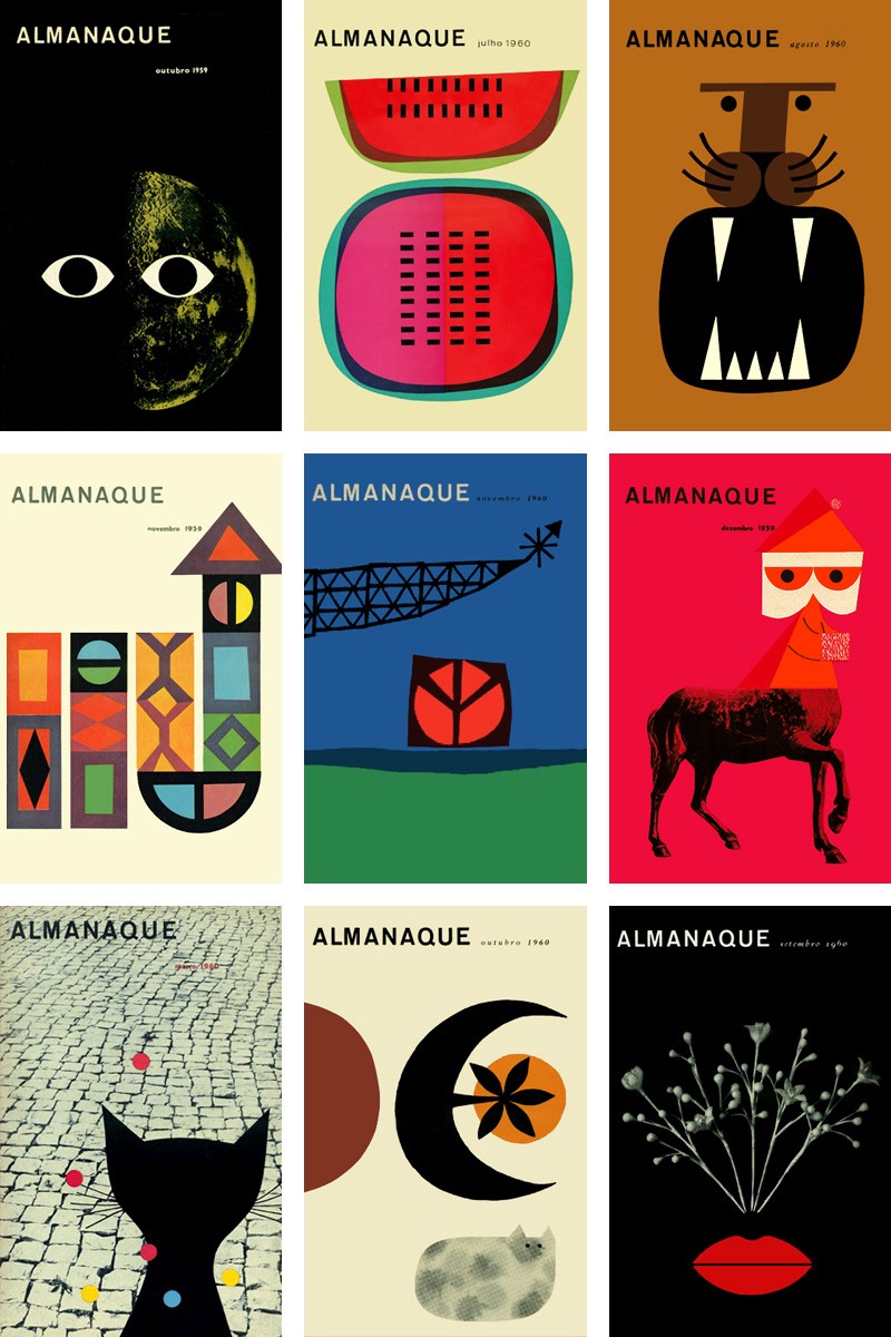
When we talk about Sebastião Rodrigues’ professional career, there are some completely unavoidable projects. Without a shadow of a doubt, one of these projects is the magazine “Almanaque” for which Sebastião Rodrigues was responsible for the graphics between the years 1959 and 1960. “Almanaque” was a small monthly magazine, emanating an aura, both of boldness and of interventive, who played with his reader using both written and drawn subtlety. The publication was on newsstands for 14 issues.
The importance of this magazine in the global work of Sebastião Rodrigues could easily be proportionally compared to the importance of the figures who were involved in it, such as: Figueiredo Magalhães, José Cardoso Pires, Vasco Pulido Valente, Sena da Silva, Pilo da Silva, Luís Sttau Monteiro , Augusto Abelaira, Alexandre O’Neill, José Cutileiro, Eduardo Gageiro and João Abel Manta, the latter, also a great figure in the history of graphic design in Portugal in the second half of the 20th century.
Trips through the north of Portugal
At the same time that Sebastião Rodrigues was involved in the “Almanaque” project, he became a fellow with the Calouste Gulbenkian Foundation, a fact that led him to travel for six months in the north of Portugal, carrying out several of his researches on popular graphic material. , which would be decisive in the construction of all his graphic work. Parallel to this extremely creative period for Sebastião Rodrigues, Portugal sees one of its most striking wars, the overseas war, taking place in its colonies in Africa, in 1961.
International recognition
Beyond the national panorama and all the collective and individual exhibitions in which Sebastião Rodrigues has been participating until then, the year 1962 definitely marks the recognition abroad, which was already one of the greatest references of Portuguese graphic design. This year Sebastião Rodrigues sees his work recognized and published in Who’s Who in Graphic Art and in the Graphics Annual International Year Book of Advertising Art.
The Calouste Gulbenkian Foundation
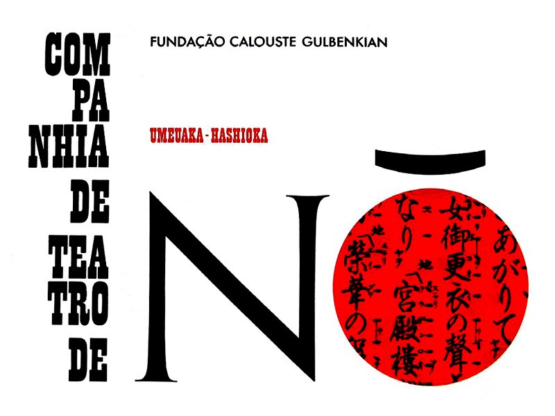
Sebastião Rodrigues, has always been a creator closely linked to dissemination and cultural propulsion. In 1963, he started one of the collaborations in this medium that would bring him more notoriety. This year, graphic production for the Calouste Gulbenkian Foundation begins, with the Portuguese designer in charge of the entire production of catalogs, posters, leaflets, exhibitions, etc.
There are clients who categorically mark Sebastião Rodrigues’ career and career. But, the role that the designer had in the design of many of the foundation’s communication materials at this time, is due to its complexity and multiplicity of applications, without a doubt, one of the most important milestones of his career.
The Portuguese Association of Designers
Practically ten years later, the year 1974 passed, Portugal on an April morning sees one of the longest days in its history begin. April 25, 1974 is the date on which Portugal is stirred up in its Carnation Revolution. A new chapter in the history of Portugal opens here, just as in 1976 a new course in Portuguese design opens, with the creation of the Portuguese Designers Association, of which Sebastião Rodrigues was a founding partner.
This year, 1976, also ended a troubled transition period for Portuguese society after the 25th of April. It is precisely this year, 1976, that the new Portuguese Constitution is promulgated, the result of a free electoral process that took place symbolically a year earlier, April 25, 1975. The Constitution promulgated in 1976 is the same that is still in force today, having over the years undergone several punctual rectifications.
The Monastery of Batalha
The same designer who had had intense work for SNI years before, Sebastião Rodrigues, created in 1977 one of the graphic icons of 25 de Abril, a poster alluding to the date, as a symbol of Portuguese patriotism and where the red of passion and the green of hope intertwine giving way to an enlightening lettring. If doubts existed, this is the most explicit demonstration, that Sebastião Rodrigues never had any ambitions and political superstitions and the only thing that moved him was the enormous passion he had for his profession.
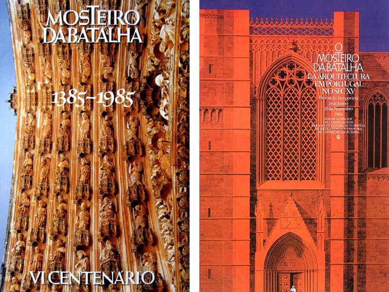
The end of the seventies and the whole eighties was for Sebastião Rodrigues the reverse of what it would be for Portugal. While Portugal, sought to recover from the backwardness and isolation it suffered throughout the previous regime, aiming to resume the pace of development, Sebastião Rodrigues sees in this period one of the most fertile of his work. He continues to develop a large part of the graphic communication of the Calouste Gulbenkian Foundation, starting work for one of its other clients of reference in the scope of heritage, the Monastery of Batalha. In addition to these two important clients, who are in the work of Sebastião Rodrigues, two milestones, the Portuguese designer develops in parallel a frenzy of other graphic projects, which make his work a highly complete and diversified collection, whether as a cover artist, paginator, exhibitor, etc.
National recognition
Before dying in June 1997, Sebastião Rodrigues still had time to see his work recognized both by the international designer community, through ICOGRADA (International Council of Graphic Design Associations) which in 1991 grants him the Award of Excellence, and by society civil, through the award in 1995 of the Medal of Grand Officer of the Order of Merit, awarded by President Mário Soares on the Day of Portugal.
Sebastião Rodrigues died in 1997, at the age of 68, victim of a prolonged illness but with an immense graphic work, spread over several political, social and cultural periods of the 20th century Portuguese society. He left behind a legacy of unquestionable value in the construction of the identity of contemporary Portuguese graphic design, by directly and indirectly influencing many of the designers of the following generations.
Four simple ideas in a work that is all plural
Sebastião Rodrigues exercised almost all his professional activity in Lisbon. A Portuguese in the broadest and most symbolic sense of the word, Sebastião Rodrigues, had a very special fascination for all Portuguese culture and folklore. The designer born in Dafundo, was one of the most tangible examples of how a creator can and should be influenced, by his ethnographic, archaeological and popular origins, without ever losing a sense of modernity and graphic freshness, well ahead of his time.
Characterizing Sebastião Rodrigues’ graphic work is not a simple exercise. Due to its multifaceted valences and inspirations, it can be a challenge to try to simplify this legacy in a restricted set of definitions. Even so, there are some premises in all of his work, which are completely decisive.
The Portuguese inspiration
Much of Sebastião Rodrigues’ work was developed during the Estado Novo, more specifically having SNI — National Secretariat of Information — as a client. Naturally, all these graphic creations would have to reflect the values that so commanded the Estado Novo, but in this view, Sebastião Rodrigues always knew how to impress a contemporary, intelligent and creative freshness of the popular identity of the country of Camões.
Sebastião Rodrigues was an extremely well-informed person of everything that was going on internationally. Although Portugal was immersed in itself, the designer always knew how to break this barrier, keeping up with the evolution of the world. To think about Sebastião Rodrigues’ work, without his graphic symbols and metaphors from Portuguese popular culture, is to think about everything, except the work of one who is probably one of the most important figures in the history of Portuguese graphic design.
Sebastião was someone who constantly sought to investigate and understand the world and culture in which he lived. It can almost be said that Sebastião lived with the atelier in Lisbon and thought in Portugal, mainly the so-called deep Portugal, where, not infrequently, he traveled in search of inspirations and graphic material that would later be the basis of many of his creations .
The maximum exponent of this demand occurs between the years 1959 and 1960, when for six months he travels through the north of Portugal, as a fellow of the Calouste Gulbenkian Foundation, looking for and discovering influences and illustrative graphic materials of a popular and ethnographic nature.
The design of the illustration
To think of Sebastião Rodrigues’ work is to automatically think of the smooth and strong forms of the works of Verde Gaio. It is thinking about the covers of linear and direct design of the magazine “Almanaque”. It is thinking about geometry transformed into form through simple figures on the covers of many of Sá da Costa Editora’s books, but also on all the characters that populated his posters, leaflets and leaflets.
Sebastião Rodrigues, like any other creator, had several moments in his work. He started to work still influenced by Victor Palla’s neo-realistic ideas, but he quickly started to look for a language of his own. Developed from the fifties, much of the language of illustration that later, from the sixties, would reach a state of purification and almost absolute simplicity.
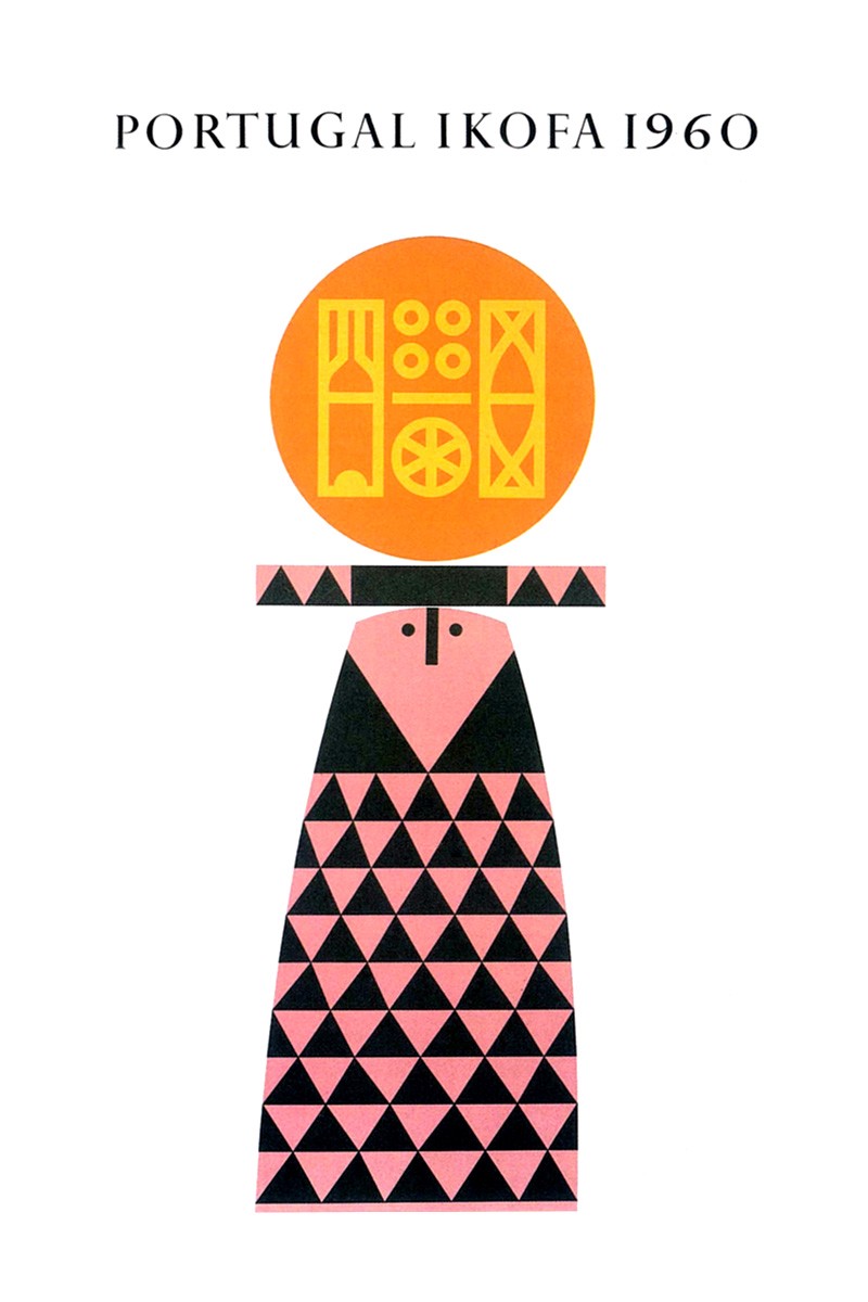
Looking at the poster “Visitez le Portugal” from 1953 and the poster from “Portugal Ikofa 1960” from 1960, one can clearly see two creative moments in the designer’s journey. Without a doubt, the language of the second poster is the one that most characterizes the Portuguese designer. A language that lives on geometry, transposed in simple forms and smooth colors, of an absolutely immediate communication but at the same time with a lot of humor and rigor in execution.
The work of illustration thinking is undoubtedly the most important milestone in the creation of this graphic designer, who even later, from the mid-seventies, would evolve towards the incorporation and exploration of photography in his work, as shown by many of the creations for the Calouste Gulbenkian Foundation and Batalha Monastery, already in the eighties.
Functional typography
Also in the typographic field Sebastião Rodrigues has undergone a mutation over time. It evolved from a use of purely functional typography, as for example it is common in many of his first book covers, to arrive at a use of typography already as an image, as in the example of the Retrospective Catalog of Eduardo Viana’s work. His titles and typographic works largely reflected his functional vision of communication, that is, typography was used without major compositions, but always at play, or as he used to say, in play, with all the elements of the piece.
In some cases we may even find a fusion between image and typography, as in the poster for the exhibition “Pintura Portuguesa de Hoy” held in 1973 at the University of Salamanca or else in the graphic composition in which Sebastião Rodrigues represents a friendly conversation between two efes, closely watched by an angel at the top of an iconic maze.
From a purely informative functional use, Sebastião Rodrigues has evolved over time, to an imaginary use in the sense that the letter and the word made up graphic stains, strengthening and interacting in some way with the message, which is always clear and immediate.
The mastery of typography and its continued exploration also largely led to his perception and deep knowledge of the techniques of reproduction at the time, where the designer’s work was built between photocompositions and manual drawing of all the elements.
The exquisite technique
Sebastião Rodrigues worked for some time with his father in the advertising department of the newspaper “A Voz”. There he would do small works of composition of types of metal that would later print the various editions of the newspaper. It will certainly not be the method invented by Gutenberg, but making all the time filters is in fact a method, in its very similar genesis.
This knowledge and mastery of most reproduction techniques, which at the time were making the transition between photolithography and offset, gave Sebastião Rodrigues an unusual but decisive knowledge, which would later translate into all the rigor that is recognized by his works. In addition to the atelier designer, Sebastião Rodrigues was also a workshop designer, one who, together with the masters, composed, retouched and adjusted all the pieces to exhaustion and the smallest detail. His incomplete training in a professional course in mechanical locksmithing, greatly contributed to his workshop approach to that, which would become his profession of body and soul, graphic design.
Beyond all the graphics and visual exuberance that the works of Sebastião Rodrigues emanate, his creations are also a push to the limit all the printing techniques of the time. The “manuality” and proximity to the workshop that all these processes implied and the fascination that this provoked in Sebastião, was one of the main causes that made the designer never take the new computer possibilities into account in his creations, although these also have came into focus already at a stage when Sebastião’s creative volume had decreased.
All the “facilism” that the Mac revolution would bring to graphic design, never seduced this designer, who in addition to the creation created was always fascinated by reproductive creation, thereby instilling an almost mathematical and scientific rigor in all his communication works.
A designer made by drawing
In Sebastião Rodrigues everything is drawing. More than the act of tracing any shape, in the graphic work of this Portuguese designer, everything is drawing and mental process. From the collection and idea to the finalization and printing of the piece. Everything is, everything must be, under the control of the designer, that in the true sense of the word and the term no vocation will have for mere decorator. As Sebastião himself defended: “the only thing that matters is the role, everything else is a joke, but always a joke with a role”.
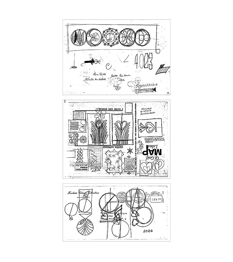
Sebastião Rodrigues’ work goes through a whole series of social changes in Portugal. He knew better than anyone to keep his work free at the time of the censorship of the Estado Novo. I knew like no other not to subordinate graphic design to values, which would have very little human value. He has always been a figure of high character and education, which translated into a close deal with all those he had the pleasure of depriving.
In Sebastião Rodrigues everything is drawing. Typography, illustration, photography, everything goes through a creative process that translates and at the same time is inspired by the ethnographic and popular origins of Portugal. Sebastião, in addition to his graphic work, knew how to “Draw Portugal” like no one else through his posters, leaflets and exhibitions. He knew how to respect the identity of all the peoples who were the motto of many of his works.
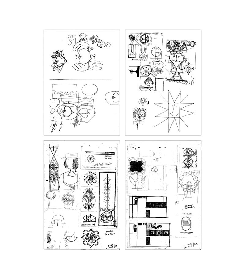
Everything that Sebastião Rodrigues represents is much more than the history of Portuguese graphic design. It is the solution found by someone who saw in his time traces of the future of his profession, graphic design that over time would “transform” into communication design. To a certain extent, one could consider Sebastião Rodrigues as a visionary, because if he were not, he would not be the target of study today, but also of fascination for all his work.
Read and share more about at www.dxd.pt

Portugal by Sebastião Rodrigues’ pencil was originally published in UX Collective on Medium, where people are continuing the conversation by highlighting and responding to this story.
