The onboarding for streaming services has become largely homogenous; why? What benefit do users get from copycat UX?

Onboarding is where user experience shines. Onboarding can serve as both an introduction and a tutorial, an important first impression that reassures users that they made the right decision in signing up for a service. Misgivings about the way a service works, how it bills the user, or what services are on offer might turn a prospective user away from an experience entirely. Why use a service if you don’t know how to use it?
In a 2020 survey by Wyzowl, over 90% of customers feel that the companies they buy from ‘could do better’ when it comes to onboarding new users. In turn, 80% of users say they deleted an app because they didn’t know how to use it. That’s a significant churn rate, one that can be avoided through giving due consideration to the quality of onboarding.
This is where the importance of user journeys becomes apparent. This research methodology walks alongside the onboarding experience of a user and examines the touch points where they might feel confused, reassured, anxious, or annoyed. With a user journey as reference, UX can step in to turn negative experiences into positive ones.
For example, during the onboarding process for a streaming app, a user might have misgivings about exactly how “free” their free trial is. To keep them from feeling tricked or slighted, microcopy about the terms of the free trial, how long it lasts, and what their first bill will look like is included on the same screen that encourages them to “start your free trial today.”
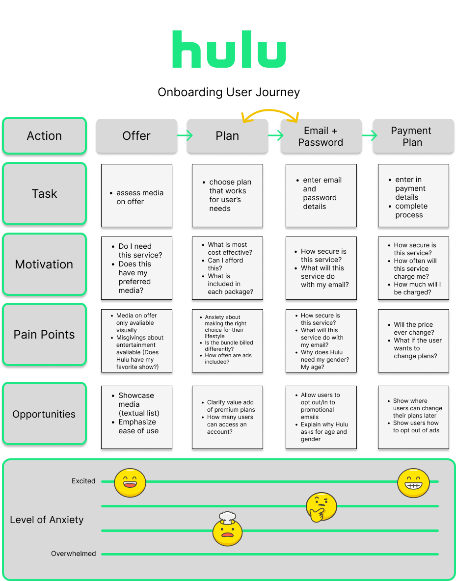
These journeys were based on the desktop sign up process — the mobile app, the smart TV, and/or “dumb” TV sign up might vary.
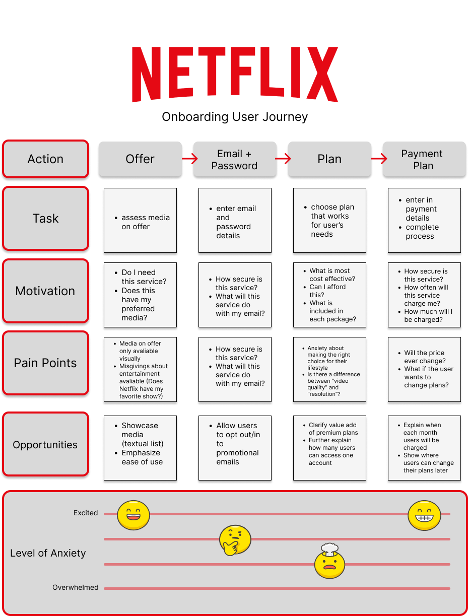
Some points in the Netflix sign up process that lead to a high level of anxiety (as represented by the “mind blown” emoji) is the confusion regarding the difference between “video quality” and “resolution.” Reassurances through microcopy or graphics could step in to clarify the value of each plan, how many people have access to the account, and if there is any difference in programming across the plans on offer.
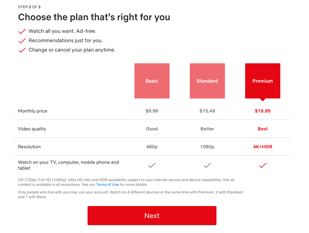
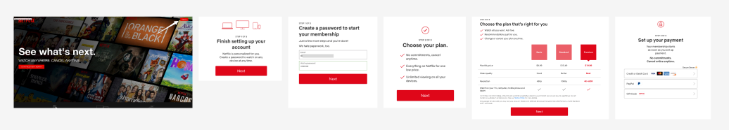
Netflix does make assurances of how long the sign up process will be. As you’ll see, all these streaming services show what step users are on. For the Netflix onboarding process, choosing a plan is step two of three.
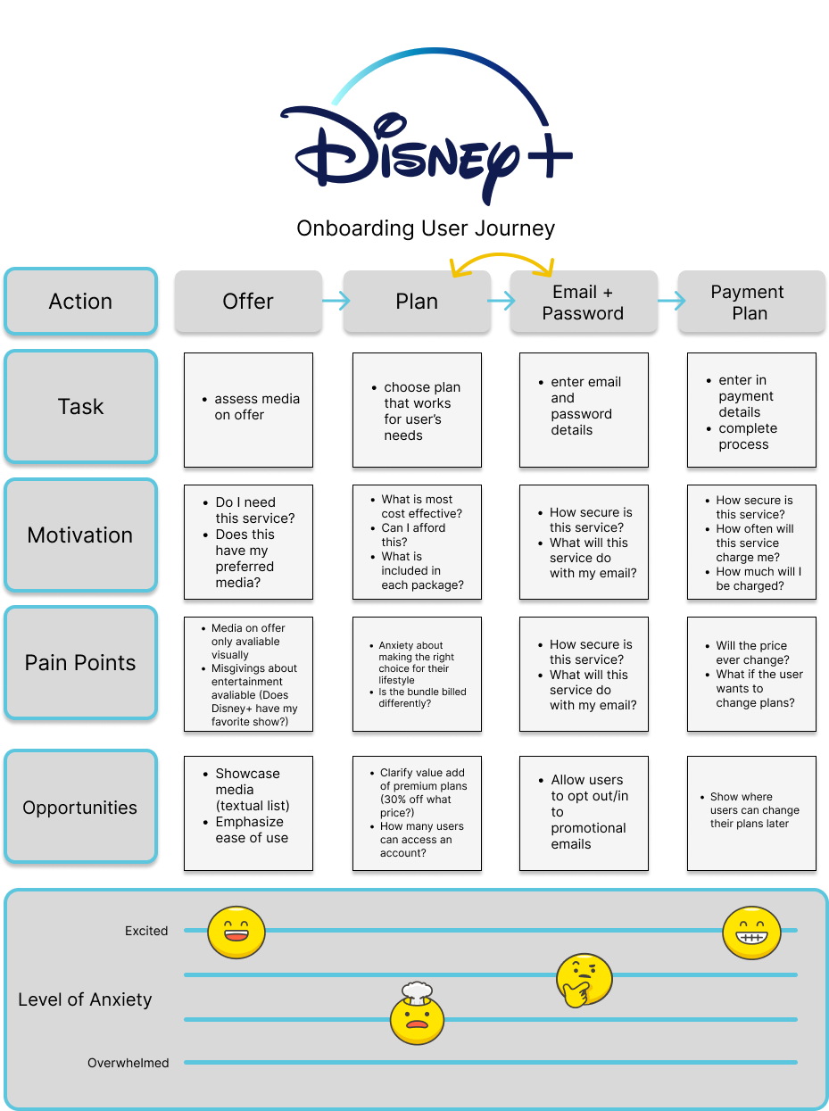
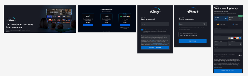
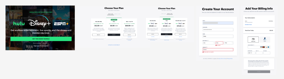
Disney+ and Hulu, being owned by the same company, both ask users to choose a plan before entering in their personal information.
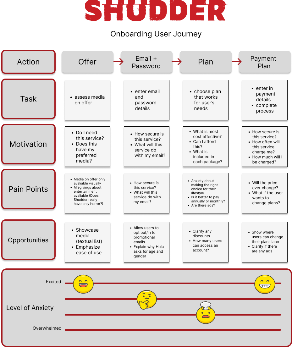
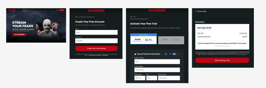
And then there is Shudder, which bills itself as the Netflix for horror fans right down to the visual branding. But more on that later.
See how similar these user journeys are?
There are several recurring features during the sign up process for streaming services:
- Description of number of steps (Step 1 of 3)
- Plans are design similarly (annual vs monthly)
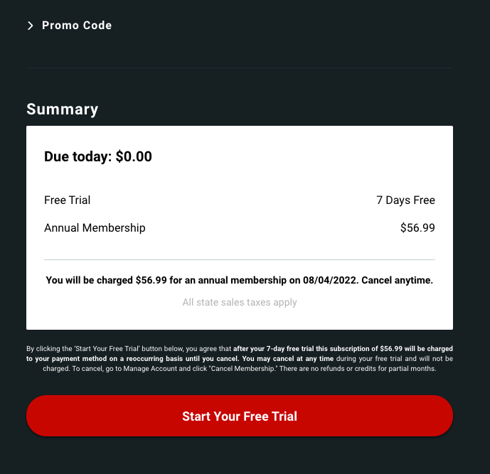
- Reassurance of free trial (due today: $0.00)
- Billing info entry designed the same
The reason these sign up pages look so similar is the same reason why most billing info entry pages look the same: there is now a basic standard to adhere to. Rather than asking users to familiarize themselves with a new system every time they go to pay for something, there is a time-proven design that designers use. There might be slight iterations (new designs adding in alternate payment methods, for example) and customizations of this design, but the fields asking to be filled are the same at a glance. Whether you are purchasing a product through Amazon, Steam, Walmart, or an independent Shopify storefront, the billing page will largely be the same.
Streaming services like Netflix and Hulu have similarly streamlined their onboarding experiences. It is assumed that users know what they are signing up for, namely the ability to access streamable entertainment, which is why the onboarding experience is nearly identical across all these platforms.
I chose Shudder as a comparison to the “Big Three” streaming services because of its small, niche nature. How would its onboarding design differ? Would it iterate on the onboarding in order to explain its specific offerings? Shudder doesn’t try to explain its offerings. It is presumed that the user already knows their goal when signing up for this service. The onboarding process doesn’t try to explain what users should expect from a streaming service. If anything, the branding of Shudder only differentiates itself by tying itself to a single genre: horror.
Shudder takes inspiration from Hulu, which takes inspiration from Netflix, which inspired Disney+. All these streaming services have become homogeneous because the baseline streaming service design works. The streaming service onboarding process has become so generalized that even niche cases like Shudder don’t try to reinvent the wheel, explain themselves, or differentiate the process.
Has it been perfected? Probably not. But by taking best practices that have been tried time and again, these services have created a frictionless UX experience.
Where they differ
There are a few places where the onboarding process differs: notably, Disney+ and Hulu have users pick their plans before entering in their email and password. This allows for users to have a better understanding of what they are committing to before entering in any personal information. That said, this can also serve to increase the anxiety users might feel while signing up–the plan pages have a huge amount of information about bundles, pricing, and possible ways to save a few bucks.
In consideration of the user journey, these feelings of anxiety can be assuaged by featuring reassurances of savings, how far users are into the sign up process, and a clear explanation of what services each plan offers.
What Shudder should copy
For niche offerings like Shudder, following the framework of the Big Three might hamper transparency and what makes it unique. Netflix and Hulu aren’t unique, not anymore. But a streaming service dedicated to a single genre? That’s still unique. And yet, Shudder presents itself as a horror-skinned Netflix right down to the graphic design.
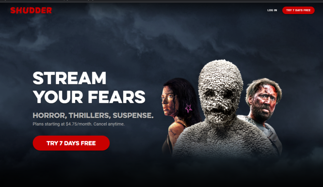
While Shudder emulates Netflix, it is missing a key component at the very beginning of the onboarding process: a glanceable reference to what programming is available. Each of the aforementioned streaming services entices potential users by showcasing its offerings. This is typically illustrated by showing a myriad of thumbnails. Shudder’s landing page has three characters from different films/shows (users might not even be aware that they are from different films/shows) that give the clear impression that Shudder is tied to bloody, strange stories. But which horror films are on offer? Are just films on offer? What shows are on the platform, if any?
Shudder can and should copy Netflix’s onboarding process as it has been proven clean, effective, and easy. Shudder shouldn’t content itself in mimicking the Big Three, however, because it loses some transparency with its users by assuming that they know what is on offer.
So let’s answer the question: Should streaming services be homogenous in the user experience of onboarding? Yes, in the same way that billing pages that have become largely the same. However, these experiences should vary in the case of unique offerings so as to really show how unique they are. Your streaming service is all about horror? Show that off. You can allow users to pay with cryptocurrencies? Your user experience should make that transparent. Embrace best practices but flaunt what sets the experience apart from the rest.
Happy streaming!