My Creative Monologue this time sends us to the realm of typographic ligatures. So, are any glyphs linked together in any way considered a ligature or not? Here’s what I found out.
Here’s a bit of a backstory: I held a little fun card-making workshop with my friends and decided to slip in a bit of a typography lesson along the way. I had to, considering one friend in the past already called me a “font freak.”
The topic was simple enough that an average person can wrap their heads around it. Instead of writing words on their cards normally, I told them to link certain letters together in different, special ways. For example, the ‘ae’ in maestro could be instead written as mæstro. I aimed to teach them this, and that is called a ligature.
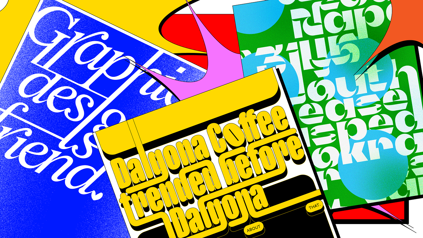
Ligatures come in many different approaches. The font Infini by Sandrine Nugue showcases a lot of various “links” you can do with alphabets, such as putting a small ‘i’ in an ‘O’, or letting an ‘E’ sit atop an ‘L’. One even fuses three alphabets by merging the strokes of ‘E’, ’N’, and ‘T’ to form one glyph. It’s a really fun way to stylise texts, and many recently marketed fonts have these offerings to beautify wordmarks or headlines.
The workshop turned out great and enjoyable. However, during one of my conversations with a friend who attended the workshop more than a month ago, she had a simple question about what we’ve learned. Showing me a card she made recently, she asked if what she’s done with the words has a ligature. I don’t have the exact card design she showed me, but it’s something like this:
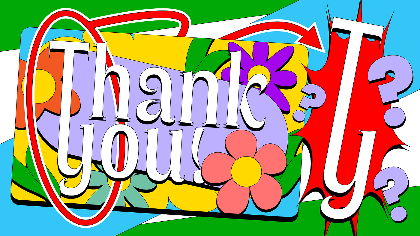
The vertical stroke of the ‘T’ of ‘Thank’ links to the bottom ‘y’ glyph (of ‘you’). Without missing a beat, I said: “Yeah, that’s a ligature!” But on second thought, I doubted my answer. Something doesn’t seem right.
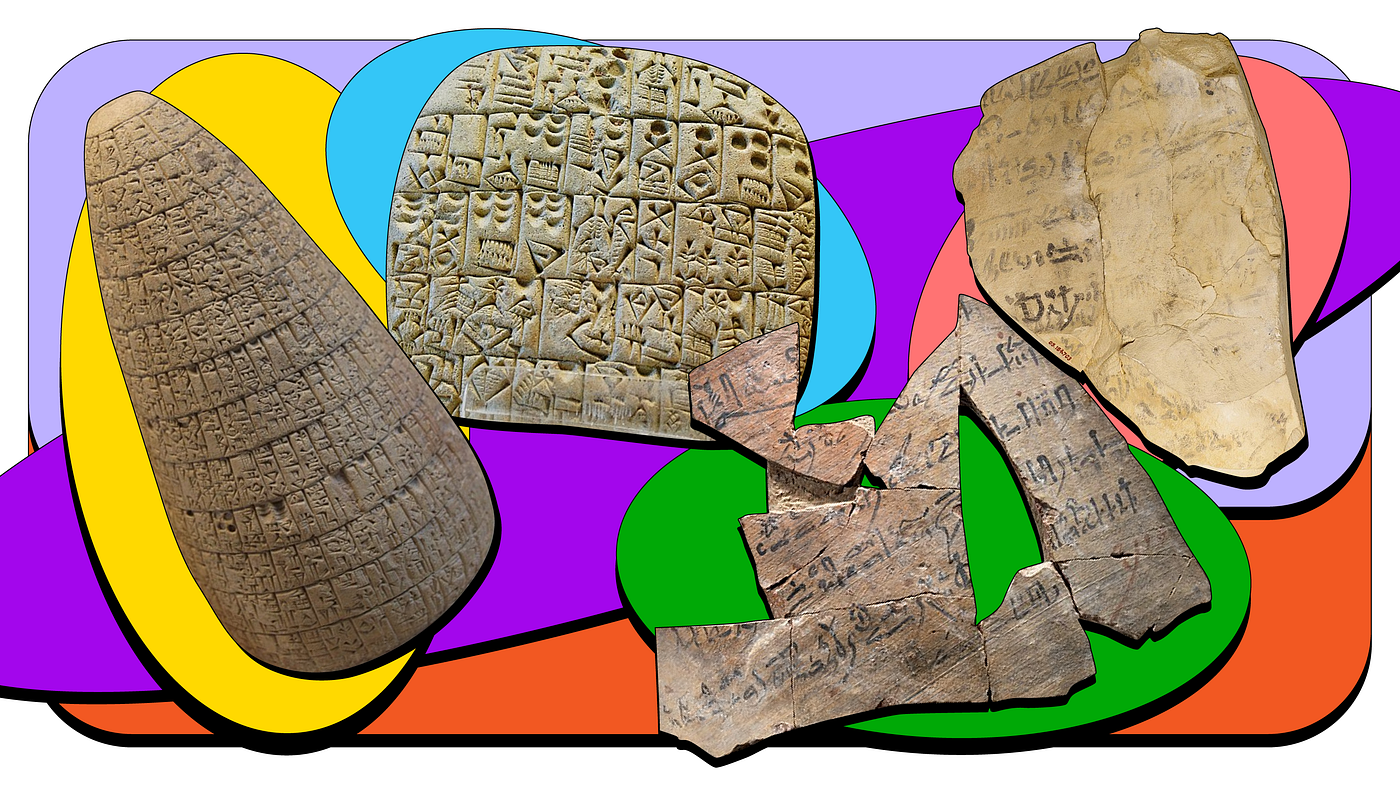
Ligatures have been found to already exist when written communication was first invented, as evident in Sumerian Cuneiforms dating as far back as 3200 B.C.E.. They were used more for practicality rather than aesthetic reasons. For scribes working on historical scripts, ligatures helped them to write quicker and it’s space-saving. These are valued during the medieval period when papers were costly.
When printing took over in the 15th century, time-saving ligatures came along. The Latin script through this evolution has introduced to us many different types of glyph combinations we are now accustomed to, such as ‘&’ and ‘@’. As this is an abbreviated account of how ligatures came about, I’d recommend you to read up more about this, if you’re curious.
(Matthew Butterick’s ‘Practical Typography’ has a section dedicated to ligatures. You can read his online publication by googling ‘practical typography ligature,’ and support his work monetarily via his website.)

If you’ve noticed in the various given examples of Latin-based ligatures, you may realise they have one thing in common. The letters that are linked together are all beside each other horizontally in a word. Of course, since this was based on a writing system, Latin ligatures naturally came about in this manner. But let’s get back to the question at hand. If we link alphabets from two different words together in a vertical (or any other) direction, is that still a ligature?
Upon initial research, the technical answer seems to be no. Movable types only recognise combined glyphs produced in a single printing block as a ligature. As for digital typesetting, a recognised ligature consists of only one drawn glyph. Even then, there are no documents making official recognised vertical “ligatures” in these cases, as far as I know.
What about written ligatures, then? Unfortunately, I’m also unable to find any ancient Latin writing that does vertical “ligation” of two glyphs from different words. Thus, it is inconclusive whether such a classification is considered a ligature in the past, at least in the realm of Latin languages.
If we move away from Latin, however, we can start to find ligatures that go beyond just horizontally-adjacent characters. For example, the Unicode Consortium through the years has made proposals and encoded Arabic honorifics as ligatures. This means that a whole written religious Arabic sentence can be typed as one glyph. Many of these written phrases even have words arranged vertically, with their strokes overlapping one another.
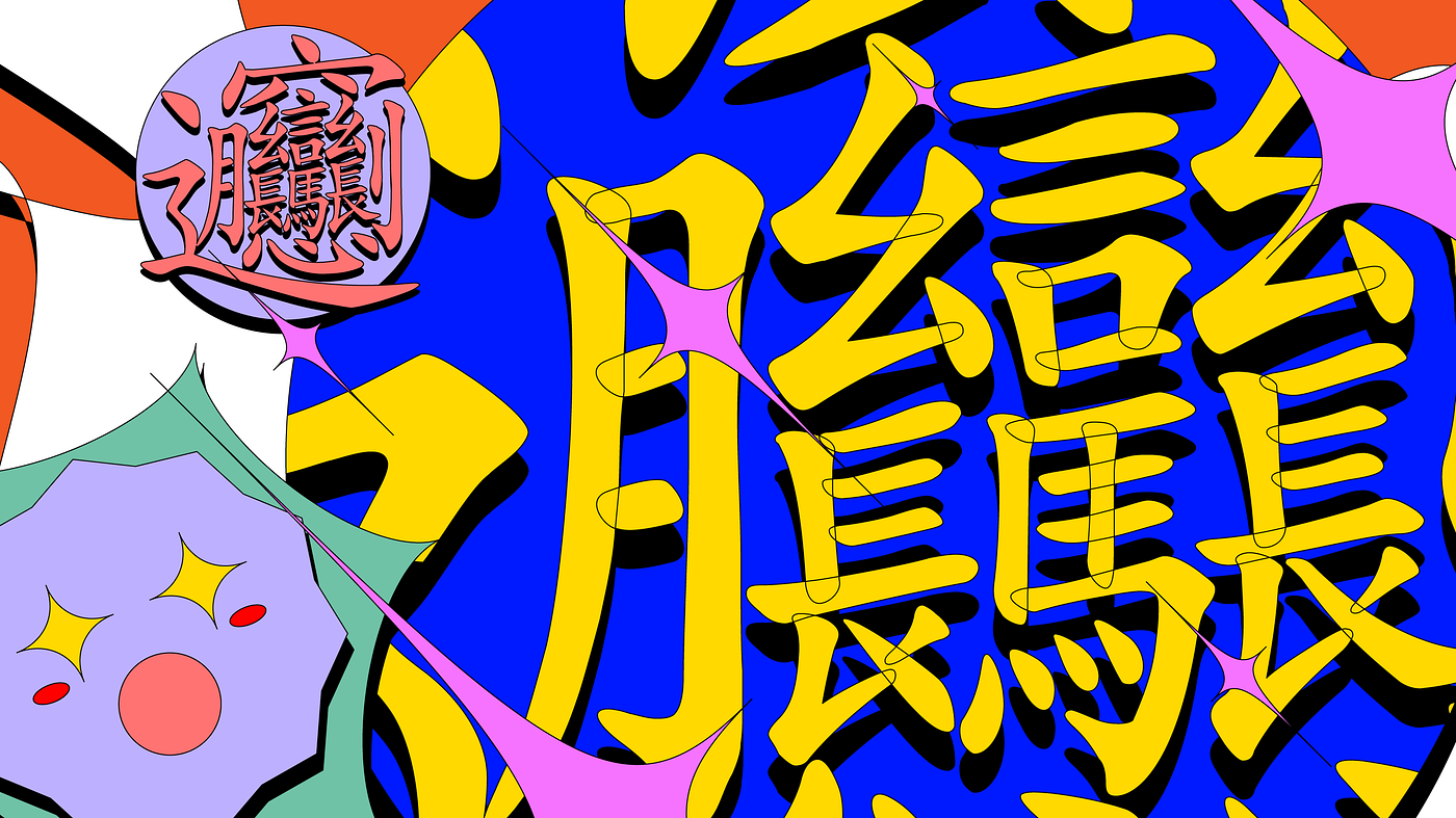
There are also uncommonly-used ligatures in Chinese where multiple characters (which a character could also be a word itself) would be merged into one single glyph, such as ‘kilowatt’ (瓩;千瓦) and ‘library’ (圕;圖書館). And similar to an Arabic honorific, there is even a superstitious Chinese idiom made into a ligature about beckoning riches into homes, albeit this character is supposedly not recognised as a Unicode character.
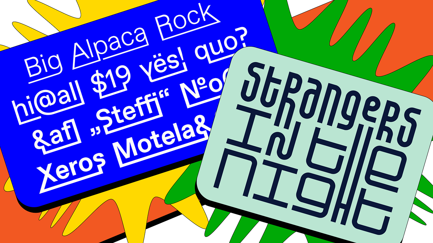
There have been modern examples of people linking Latin alphabets that are not right beside each other. A font by Dinamo, ABC Favorit Lining does this by using underlines.
The characters have extended strokes that reach to the underlined area, which creates a connection to other “extended” characters that needn’t have to be the ones beside them. This creates a container-like effect, with linked words being able to so-called carry other alphabets in between them.
Ekko by Jérémy Ruiz uses alternate glyphs to enable vertical connections of alphabets through strategic stroke placements. Not only does this create faux ligatures, but enables letters to go above their x-height or below their descender. This results in rhythmic-looking typesetting, where words seem to climb up and down visually while stacked vertically.

Designers themselves do play around with types to bind one non-adjacent character to another. But are any custom type-lettering (e.g. wordmarks, monograms) and alternate glyphs of these sorts considered ligatures in the fullest sense? The technical consensus still leaves a question mark for me. But for what humans have innovated in writing from the start till now, I feel that all vertical or any other dynamic forms of “ligation” should be validated. If Arabic and Chinese can recognise them, it isn’t a huge leap for Latin ligatures to be extended beyond just horizontally-adjacent characters.
Now, where’s my Unicode for the entire Miranda Priestly’s cerulean monologue in one glyph?