Key Differences
Before we dive into the examples, let’s brake down the major differences between Bootstrap and Material Design Lite:
Philosophy
- Bootstrap was originally built by Twitter with the purpose of making it easy to build responsive websites. It gives you a lot of components and customization options for making web apps.
- Material Design Lite is a way for Google to spread its material design concept to the web. It gives you only the base building blocks for building material apps. The rest is up to the developer.
Development Experience
- Bootstrap has a very detailed documentation. Development involves copy pasting from the examples and getting a usable result fast.
- MDL is built around BEM, and components are built by combining multiple classes. This approach gives a great deal of control, but can sometimes lead to unwieldy HTML.
Components
- In Bootstrap, almost all built-in HTML elements are styled and can fit nicely together in a layout. It gives you a great number of additional components for any type of design.
- MDL gives you fewer components than Bootstrap, but they are all focused on building modern Material Design applications. They come with animations and beautiful default styles.
Layout
- Bootstrap has an advanced grid system with offsets, column wrapping, hiding and reordering of columns.
- MDL has a more primitive grid that gets the job done most of the time, but doesn’t support advanced features.
Design
- Bootstrap gives you a passable default design which we have grown tired of by now, but there are plenty of wonderful themes to chose from.
- MDL looks fresh and features bold colors and animations. It dictates exactly how your web app should look like and gives you a limited opportunity for customization by choosing base and accent colors.
Community
- Bootstrap has been around for quite some time and has an enormous community, which produces themes, plugins and blog posts.
- MDL came out only recently but has already become quite popular on GitHub. However it is still in its early days, and most of the time you are on your own.
But how do these frameworks compare in practice? This is a more difficult question to answer. This is why we’ve prepared a number of examples implemented in both frameworks that will help you compare what they are capable of. Click the images to see the examples side by side.
1. Grid
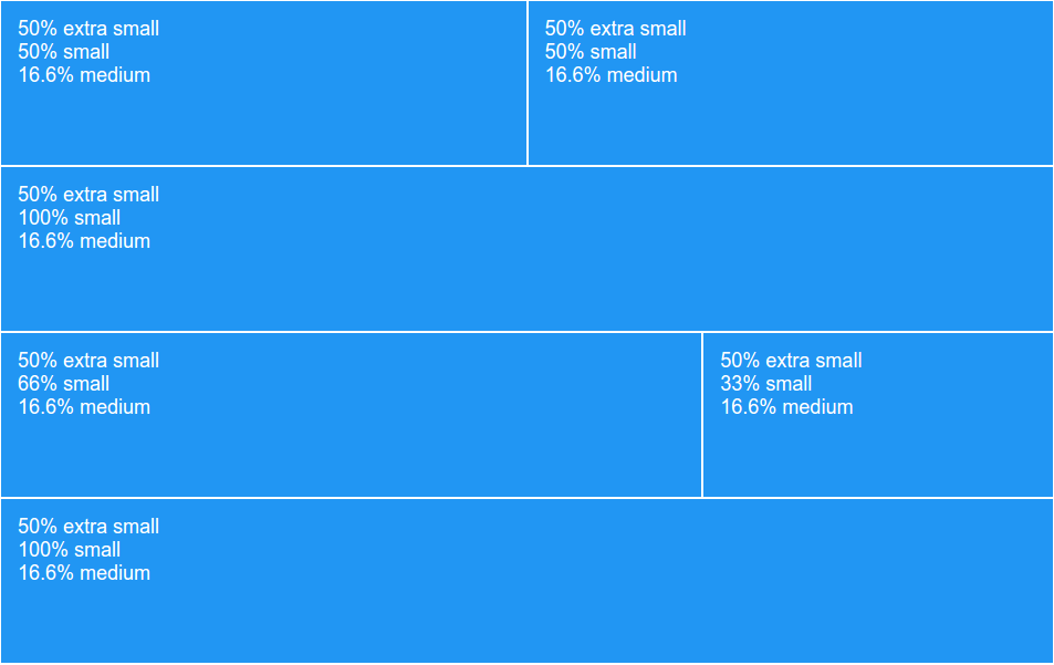
Arguably, the grid is the most important building block for a modern web page. It makes it possible for a design to scale from smartphones to large desktops.
The Bootstrap grid splits the page into 12 equally sized columns. Depending on the viewport width, four different size classes are applied – extra small (from 0 to 768px wide), small (768px to 992px), medium (992px to 1200px), and large (1200px+).
MDL has a similar grid system, but it only has three sizes – phone (0 to 480px), tablet (480px to 840px) and desktop (840px+). MDL desktop has 12 columns, tablet has 8 columns and phone has only 4 columns.
The Boostrap grid offers a lot more control. You can offset, hide and reorder columns, which helps with responsive design. In MDL we have to resort to empty columns to achieve offsets, but hopefully this will be fixed in the next versions.
Docs: Bootstrap Grid | MDL Grid
2. Header Navigation
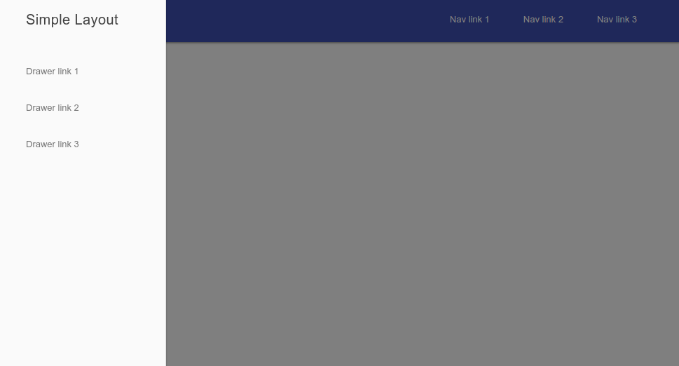
Headers in Bootstrap are called Navbars. They begin collapsed in mobile views and become horizontal when there is enough space for them. Inside, you can nest an array of different elements that can be positioned with the help of classes.
Similarly, MDL header navigations start off collapsed behind a hamburger menu and expand with the growth of the viewport. They too have different stylings and possible positions.
Docs: Bootstrap Navbars | MDL Navigation
3. Footer
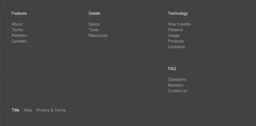
Bootstrap doesn’t actually have separate footer components, while Material Design Lite has two options, a mini and a mega footer. For this example, we’ve translated the default MDL design to Bootstrap, using the grid and a bit of extra CSS.
Notice that on small viewports, MDL’s columns collapse and can be toggled one by one. For this effect to work, they’ve used a CSS only checkbox hack, instead of going for a JavaScript solution.
Docs: MDL Footers
4. Tabs
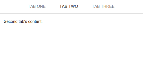
Both frameworks use pretty simillar syntax to create selectable tabs with different content. A number of links for swapping between the tabs, and an array of divs, selectable by id, for storing the content. They also both require JavaScript to work (Bootstrap requires jQuery as well).
Docs: Bootstrap Tabs | MDL Tabs
5. Buttons
Bootstraps default buttons are rectangular and have a bunch of size options. They can have their color changed via CSS or with the modifier classes (Danger, Warning, Success,…). Another unique feature to Bootstrap is the split button which is half button, half dropdown.
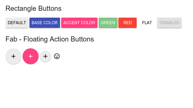
MDL offers both rectangular and circular buttons. Google has a guide on how and in which situations to use the different types of buttons. All buttons in MDL support the ripple animation effect.
Docs: Bootstrap Buttons | MDL Buttons
6. Tables
Tables are generally hard to make responsive. Bootstrap has overcome this problem by making a scrollbar appear when the table doesn’t fit. MDL’s developers haven’t added responsiveness to tables yet, but what they’ve done is add amazing styles making tables look super cool.
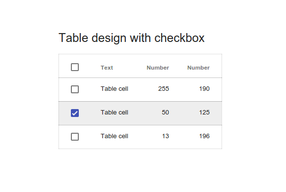
In bootstrap you can also make tables striped, bordered and condensed. MDL offers a default style (which again, looks very neat) and a design with selectable rows.
Another cool feature that MDL brings to table is the option to align content according to it’s type by using classes. This works similar to Excel sheets, text in the middle, numbers to the right.
Docs: Bootstrap Tables | MDL Tables
7. Forms
Bootstrap’s forms support more types of input elements and have classes for making different alignments to the labels and inputs. It doesn’t come with validation out of the box, you will need to use a library like Parsley for that.
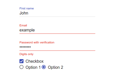
MDL has few supported input elements, but the ones that are supported have the material animations added to them making them pleasing to interact with. They also have integrated verification and pattern matching. This allows them to show an error message and turn red when the data isn’t valid.
Docs: Bootstrap Forms | MDL Text Fields
8. Dropdown Menu
Here the approach of the two frameworks is the same. A button or anchor element to toggle the content, and an unordered list of items for the drawer.
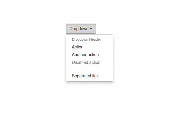
The bonus of Bootstrap is you can add a separator line or a heading and do split buttons.
The plus of MDL is again a smooth animation compared to Bootstrap’s “display: none/block” technique.
JavaScript required in both cases.
Docs: Bootstrap Dropdowns | MDL Menus
9. Tooltips
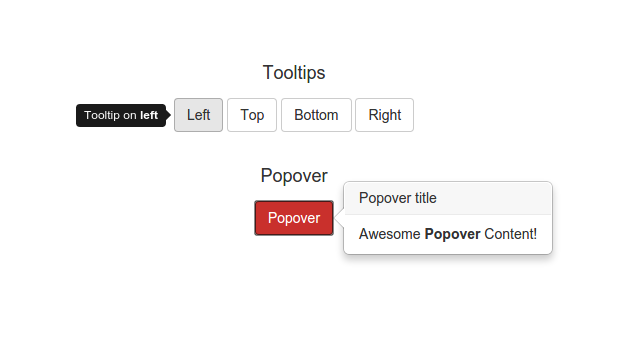
Bootstrap’s approach to tooltips is to add data-attributes to a button element, which then shows the tooltip on hover and click. The framework also presents two separate components: a simplified tooltip and a more advanced popover with a title.
MDL have achieved this with a different model. A button for toggling and a span element for the tooltip’s content. Two alternatives are given, a small and a large design. A negative here is that these only go downwards.
JavaScript is required in both frameworks.
Docs: Bootstrap Tooltips | Bootstrap Popovers | MDL Tooltips
10. Icons
Bootstrap comes with the Glyphicons icon font, which gives you over 250 pretty icons to choose from. They come bundled with the bootstrap CSS file and no special setup is needed.
MDL uses a set of icons that Google released some time ago called Material Icons. This is a huge set of nearly 800 icons. They are not bundled with MDL so you need to link it in the HEAD section of your page:
<link rel="stylesheet" href="https://fonts.googleapis.com/icon?family=Material+Icons">
Conclusion
Overall Material Design Lite is shaping up as a good frontend framework. Go with it if you want your web application to follow the Material Design guidelines, but you find Google’s other framework, Polymer, too complex. It is still the early days, but the fact that it is made by Google gives you confidence that it will always conform to the latest material design spec.
And if you don’t find Material Design appealing, there is Bootstrap with its large community. You can even get the best of both worlds by using one of the material themes that are available for it.

