Adobe Photoshop, one of the most popular computer-based software, has fans and users spread all over the world.
Many of them think to be able to use the program in the best way possible but, they may be committing some common and easy-avoidable mistakes.
In this article I have listed some errors that are generally made by the new designers as well as by some more skilled Photoshop users.
Not Using Layers and Folders
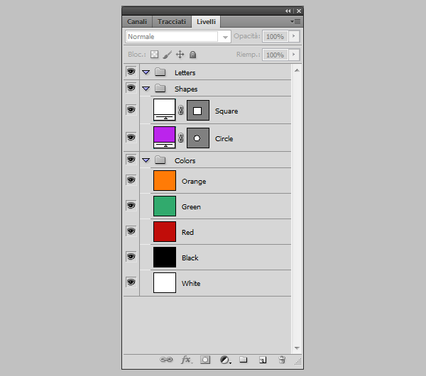
A very common mistake that many new Photoshop designers do, is not to create enough layers in their work.

At first, this may seem a useful technique to save time, but, as soon as the project grows and becomes more complex, you will realize how insane it was not to use the proper number of layers.
Layers can make your life easier. Indeed, they give you the possibility to edit, modify, duplicate or even delete only some parts of your “.psd” files. In this way, you won’t need to restart everything from the beginning just because you made an error.
Through the use of layers, you can work on your original project without directly modifying it, and, thanks to the “multiply” function, it is possible to have several versions of a same layer to see how different effects or colors suit your design.
The use of folders is important too: thus, you will always have an ordered project, and , in the long term, you won’t waste precious energies to figure out what you have done earlier.
So, when you are working both on easy jobs and on more structured ones, I suggest you using layers and folders, because they definitely can boost your workflow.
Not Using Shortcuts
Many designers are able to get wonderful results but they do it in a lot of time. To be a good Photoshop user, not only you have to know how to create amazing gradients or how to arrange shapes and lines, but you also must be able to use shortcuts.
At first, learning them may sound like useless, but, on the contrary, shortcuts are a fundamental mean through which you can save valuable time.
Indeed keyboard commands and combinations of keys provide a great way to circumvent some redundant clicks or repeated actions.
Here you can see some of the most important Photoshop shortcuts you should keep in your mind:
- “B”: select the “Brush Tool”;
- “Alt+ Mouse Wheel”: it gives you the possibility to zoom in or out;
- “Ctrl + Shift + N”: create a new layer;
- “Ctrl + J”: duplicate layer;
- “Ctrl + Alt + Z”: it goes one step back in history;
- “Ctrl + Shift + Z”: one step forward;
- “Ctrl + O”: open a document;
- “Ctrl + Shift + E”: merge all the selected layers;
- “Ctrl + Shift + I”: invert the selection.
If you prefer, you can also create your own shortcuts in Photoshop: you simply have to go to “Edit” and then click on “Keyboard Shortcuts”.
Not Using Grids and Guides
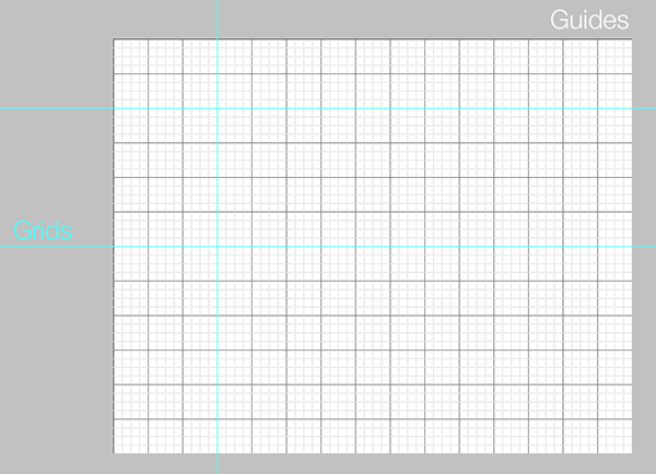
You should avoid aligning your texts, shapes or images casually. This is a frequent mistake that can make your final work look worse than it really is.

The solution to this problem is the use of guides and grids. These tools were thought to help the designer in lining up the objects and to make the most of the document space without getting a messy result, so use them!
Furthermore, grids are extremely important when turning a “.psd” file into a responsive website. Indeed, the HTML developer can see, with high precision, where every part of the design needs to go and he can even have an easy view of the footers, body and headers size. In this way, he can avoid many unnecessary calculations and percentages required to determinate the widths of good layouts.
One more good reason to use grids and guides is their versatility: they can be set up in pixels, inches or centimeters to be completely adapted to your needs.
Using Photoshop for Almost Everything
As you know, Photoshop is a very flexible tool that may help you in many of your projects. However, you ought to understand that sometimes Photoshop may not be the right software you need and that it may be better to use other kind of programs according to the task to do.
For example, if you are creating an animated “Gif”, I will suggest you taking a look at online gif-creators or at programs such as “Gimp”. Otherwise, if you are creating a vector logo, you should consider the use of ”Adobe Illustrator”.
Mixing too Many Fonts
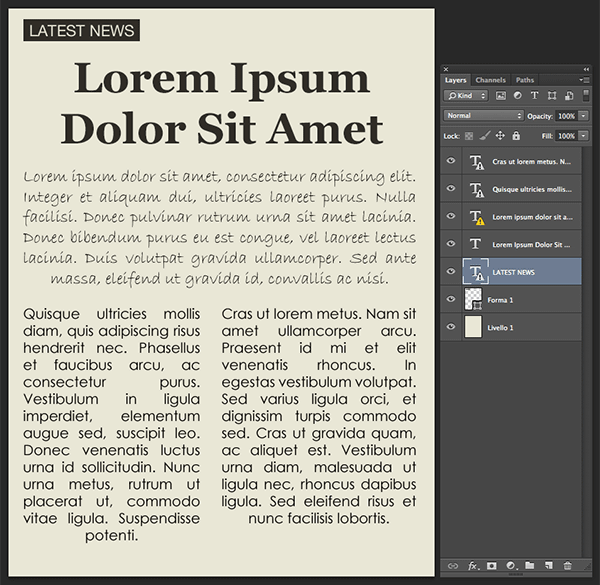
Another mistake committed by several designers is to mix too many fonts. Indeed, every typeface has its own story along with its features and the viewer needs time to recognize them. Thus, if you use an excessive number of different fonts in a single work, the only result you get is to distract the spectator from the target.

So, the general advice I give you is to choose no more than two typefaces: for example, if you are creating a flyer, you should select a first one for the header and a second one for the body.
Abuse of Filters
When beginners approach Photoshop, they are amazed by the great amount of available filters and they immediately start applying them on their works. One of the most widespread mistakes consists in overusing Photoshop filters. You should not think that, just because they are intuitive and easy to handle, they are also going to make your project seem more professional. Differently, if misused, filters can damage your final result.
Indeed, it may not always be possible to find the proper filter that suits our needs: in this case, you shouldn’t force it to be adapted at your design.
I’d suggest you seizing the moment to act manually on colors, saturation, contrast and all the other features to get your personal effect.
In conclusion, the message I want to leave you is that sometimes, as the German designer Mies van der Rohe used to say, “less is more”.
If you discovered that you are making one of the previous mistakes, it’s time to make some changes in the way you approach your work to have a better Photoshop experience.
