
Some time ago I published an article describing a workflow which supports and emphasizes human-centric thinking in web design. In today’s artical, we’ll examining websites that apply this methodology and see how human-centric design has contributed to their success.
Looking Back
First of all, here’s a reminder of how human-centric thinking can be applied to the web.
- Exploration: A website is a medium commonly used to solve something, both for the targeted audience and for the client. Exploration is about understanding stakeholders, even those who aren’t obvious.
- Design: Human-centric design is not about creating the perfect product, it’s about finding the best solution, which is often a compromise.
- Implementation: Each update is followed by a learning cycle. Iterate and improve.
Case Studies
Let’s critique some familiar websites.
Squarespace
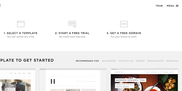
Squarespace succesfully aim to make the process of creating a website accessible and beautiful. They excel in understanding the problems of the stakeholders involved. They provide a product for the small photographer building his online portfolio, the online shop owner who’s looking for a sustainable platform and the expert developer looking for full control. They examined the common problems people encounter when creating an online presence and provided a solution.
This philosophy reflects in the design. The Squarespace landing page comprises different stories, as every website has a different personality and purpose. Instead of featuring a blank solution that the user can customize, they show different kinds of customisation, which triggers the user more easily as they discover the possibilities of the product.
Take a look at the screenshots below and see how they apply design intelligently.
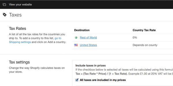
Shopify
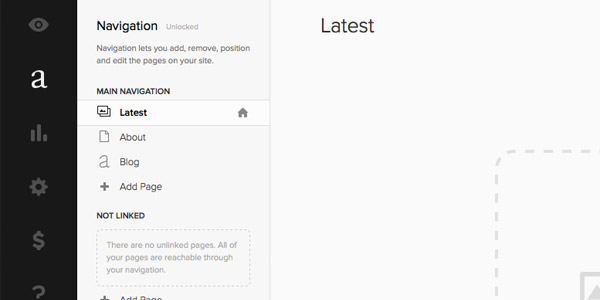
Shopify is another good example. They have made the process of starting an e-commerce website more accessible, holding the user’s hands as they take care of all the necessary steps.
Artsy
Bringing physical art to a digital space is a challenging objective. The Artsy team understands how art is very visual and this is reflected in the design of their website.
Both for experts and non-experts alike, it’s accessible to filter through artwork. It’s possible to filter on subject matter, medium and technique, style and movement, price and category. The ‘View in Room’ option is a perfect example of human-centric design thinking.
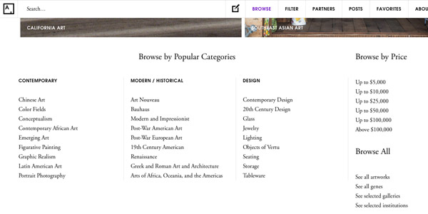
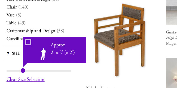
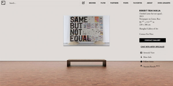
They’ve managed to make the same website easy to use both for experts and those with a slight curiosity in art. Take a peek and examine its flow and design choices.
Tumblr
If you ever have the opportunity to work with a platform that supports content created by a community, thinking primarily from the users’ perspective improves your product tremendously.
There are many websites that consider the community as their primary stakeholder (Tumblr, Twitter and Instagram for example). Without users, their business model is nothing.
Tumblr explores ways to make the use of their platform simple for users. This shows in the user interface design.
Additionally, it’s interesting to compare how Tumblr and Facebook work with advertisements. Many feel that Tumblr doesn’t disrupt the user flow with advertisements quite as much as Facebook does, which can be as much a design choice as a business choice.

Steam
This is probably a surprising website to take a look at. Although it might be outdated visually, they nailed the concept of providing an e-commerce and community website that is loved by millions.
The continuous development, deals and support for different kind of developers has attracted a large community. Recently, they added reviews for games, making it easier for people to make smart decisions when purchasing a new game. Including the amount of hours played to a game review improves credibility. This is both beneficial for users while assuring developers game reviews are fair. It’s one small design choice which has a tremendous amount of influence on the e-commerce behavior of users.
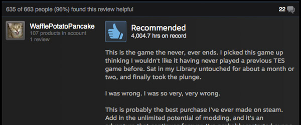
You could apply this idea to your next e-commerce website by adding a tag to the user’s profile if they’ve bought the product when they review it.
As much as Steam supports gamers, developers also have the opportunity to interact with the community connected with their game, or the steam community as a whole to get support for their next project.
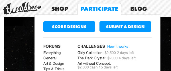
Threadless
Does #threadpics or #teestyle ring a bell? Threadless is a great example how you can make an e-commerce website with a focus on retaining and expanding a community, much in the style of Steam.
The design is streamlined to support both buyers and creators.
Finding this balance can be a tough challenge. Whenever you’re working on such a project, one way to make sure you retain this balance is by creating a user journey map. This will highlight potential weak points in the navigation flow when they are inconsistent and confusing for the targeted type of user.
Print the designs of your website, use a marker to make actual connections and think about your design decisions. Actually involve potential users and let them interact with a prototype. What feedback do you receive?
Tuts+
The latest incarnation of Tuts+ (referred to affectionately as “the Hub”) is the result of centralizing and improving the existing Tuts+ websites, and understanding, once again, the stakeholders. These stakeholders include you, the reader, authors and advertisers.
The release of Tuts+ courses is an example of how each product or service undergoes a learning cycle with each release, always recognising the opportunity for improvement.
When you compare the individual Tuts+ websites and the new hub, you’ll notice a couple of differences. The new hub is responsive, organized into topics relevant to your interest, and provides a cleaner interface for readers and advertisers alike. As authors, we have improved visibility and the related post section offers us the opportunity to showcase more of our writing.
Conclusion
Whenever I examine websites such as Threadless, Tumblr and Artsy, I’m continuously reminded how it’s perfectly possible to design something amazing for all types of users, all whilst keeping the non-visible stakeholders happy.
What should you keep in mind?
- Understand your different types of users and find the best balance in designing for those users: interface, branding, features. There’s no single perfect solution, only the best possible compromise.
- Compare the advertising techniques of Facebook and Tumblr. Ask yourself how their design choices make an obvious difference for the users and advertisers. What’s better for who and why? What can you learn from this in your next project with advertisers?
- Users will be triggered more easily when they feel familiar with your product through showing customised examples, Squarespace and #threadpics is a good example.
- Tiny but smart design choices can have a tremendous influence. Showing the amount of hours played in the review of a Steam game is a good example. What are users (or other stakeholders) curious about? Provide what users consider valuable, even if they themselves don’t recognise it yet.
- Respect that everything you create has the opportunity to improve based on how stakeholders interact with your product.