But just because it’s only a temporary landing page, that doesn’t mean it shouldn’t be thoughtfully designed. The quality of the coming soon page that you put up can have a huge impact on whether or not people sign up to hear more about it.
Generally, the best pre-launch pages all do three things well. They build excitement by giving a quick, short insight into what the product will do, and what problems it solves. They give some finer details about the features and benefits that it will have. And finally, and perhaps most importantly, they give visitors the ability to sign up and register your interest. That last step fundamentally crucial, as it means that – come launch time – you have a (hopefully large) list of potential users that you can email to let them know your new product has arrived.
As it’s so important to have a thoughtfully designed coming soon page, I wanted to bring together a list of some of my favourites. These are all recent, fresh examples of pages that I think do a great job of explaining the product and building hype and excitement for those people who would be the service’s target audience. If you’re working on a startup or are looking to create your own prelaunch landing page, I hope this collection gives you some inspiration and ideas.
Beautifully Designed Coming Soon Pages
Cinematec
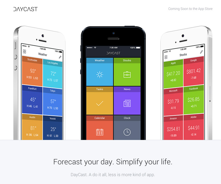
Daycast
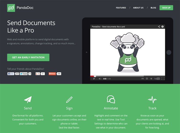
PandaDoc
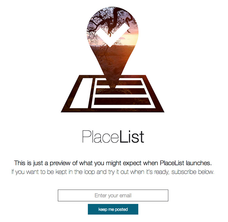
PlaceList
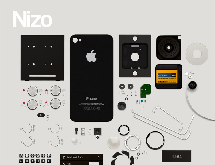
Nizo for iPhone
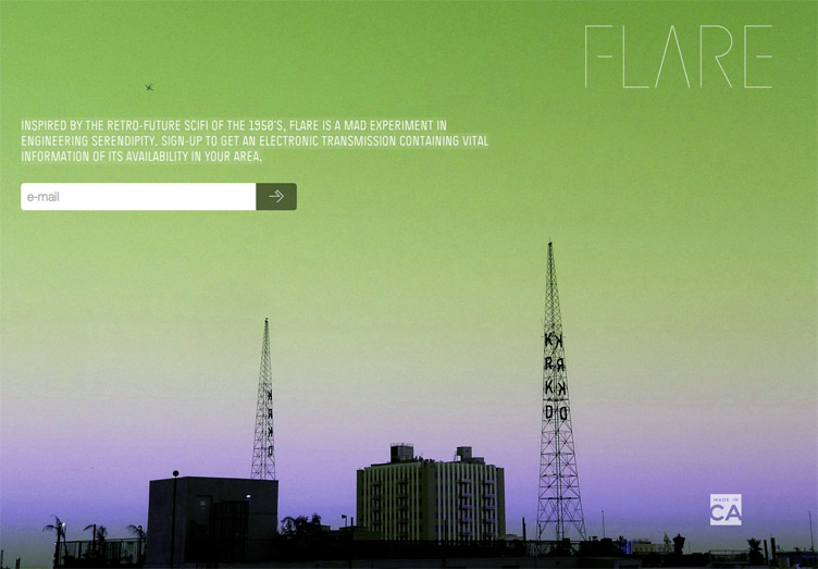
Flare
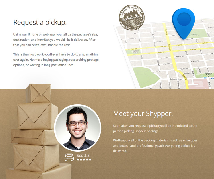
Shyp
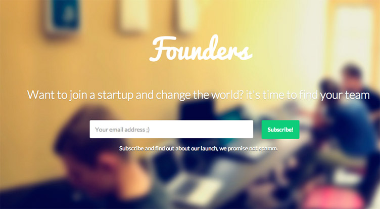
Founders
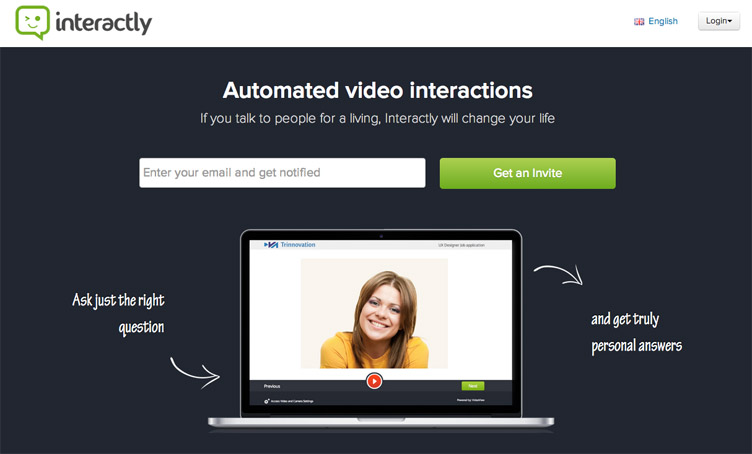
Interactly
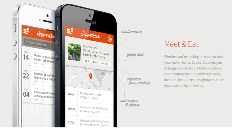
Supper Club
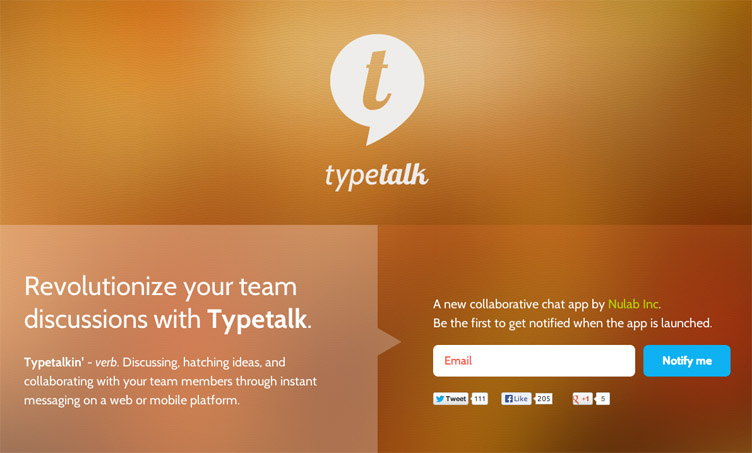
Typetalk
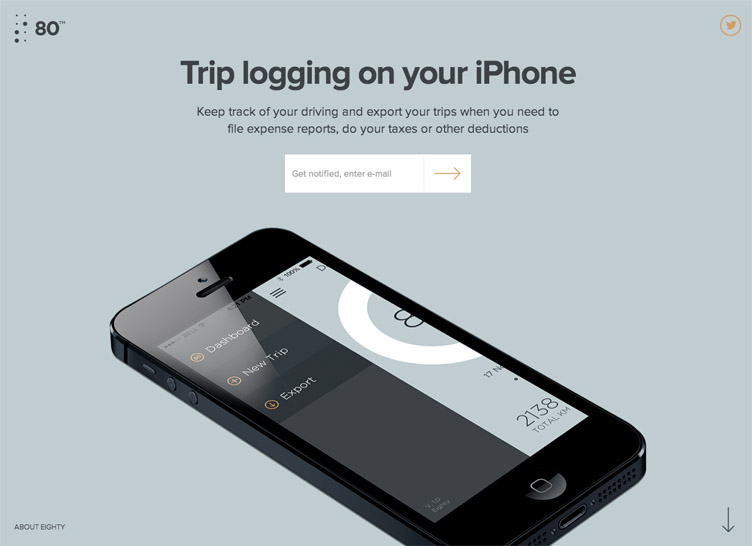
80
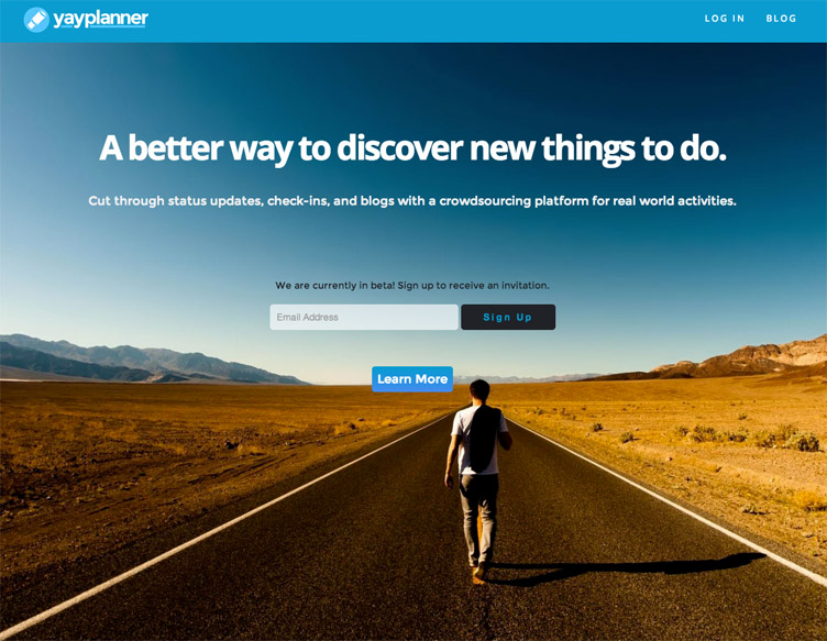
YayPlanner
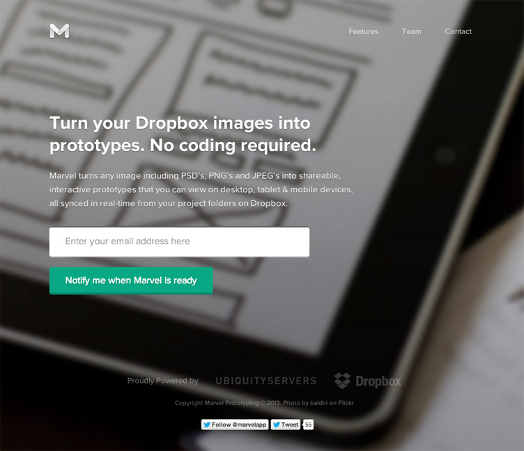
Marvel
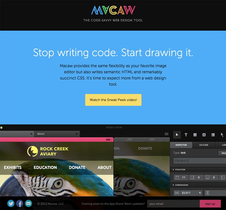
Macaw
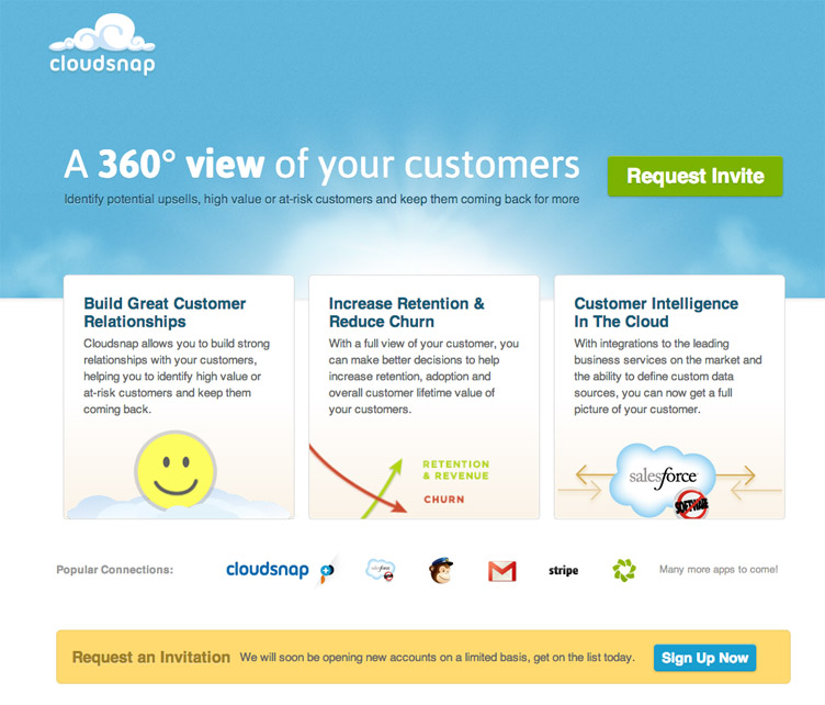
Cloudsnap
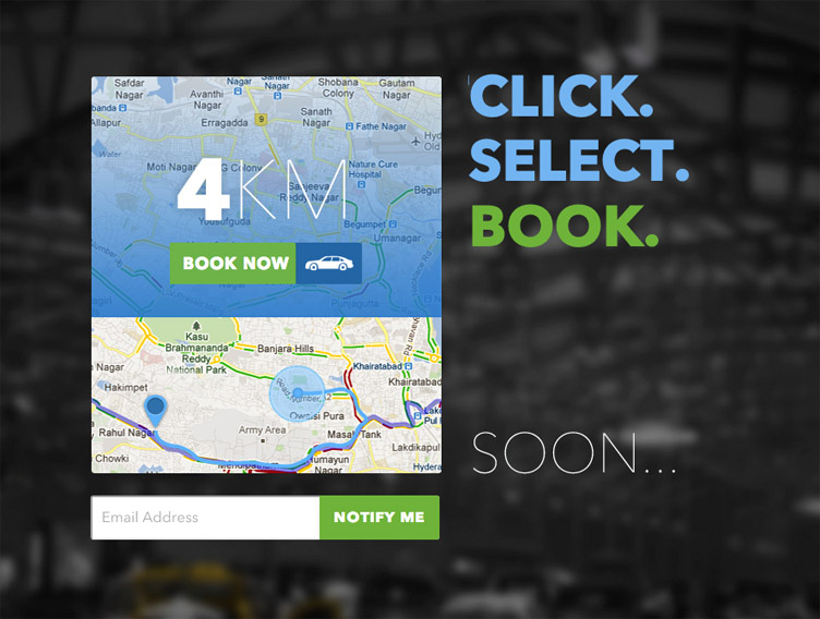
Tap a Cab
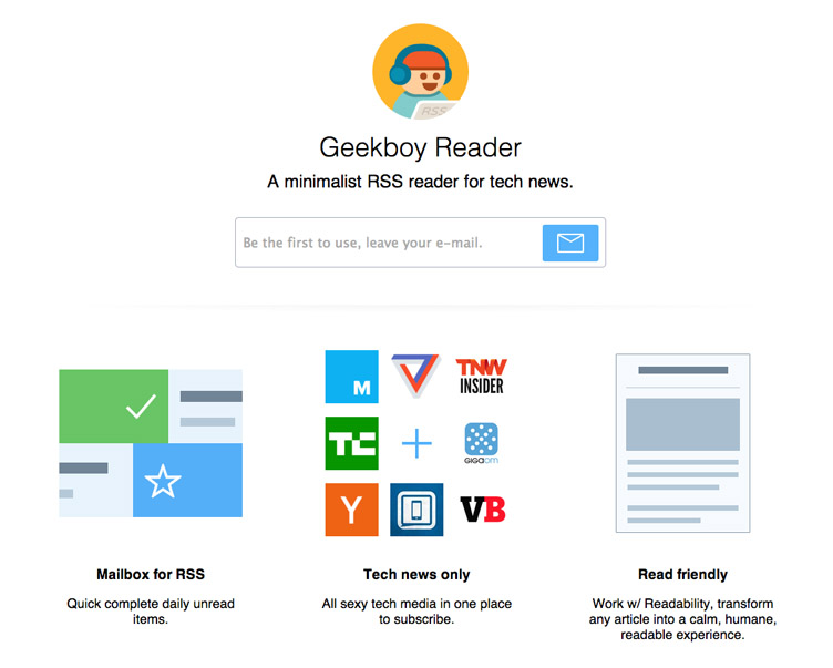
Geekboy
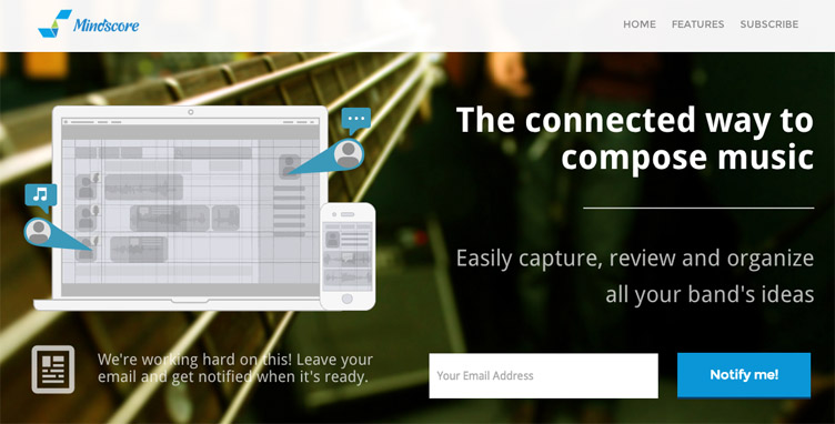
Mindscore
Are there any coming soon or prelaunch landing pages that you’ve found that deserve an honourable mention? I’d love to hear about it in the comments.

