Designers and developers are growing in numbers and plenty of these folks have outstanding portfolios. The common advantage of the Internet is that anybody from anywhere in the world can check out your projects during any time of the day! If you wish to land more freelance work then I would recommend taking a peek at your current portfolio to see if anything could be updated.
And to help with building ideas for your own website, I have collected 200 various portfolios of graphics designers, developers, writers, and other digital creatives. This is a massive showcase gallery full of design inspiration for unique portfolio layouts. I strived to include only designs which really change things up from the typical portfolio website templates. Plus in addition to these design examples, I would love to read other people’s thoughts on how to build a great portfolio site in the comments section.
Mathew Helme
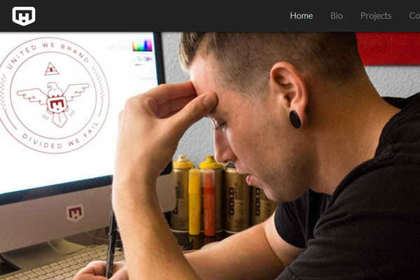
Mat has one of the nicest portfolio sites I’ve seen. The web copy is brilliant, his work is fantastic and the homepage is very easy to scroll through. Perfect example of showcasing work and keeping it simple.
Aaron C-T
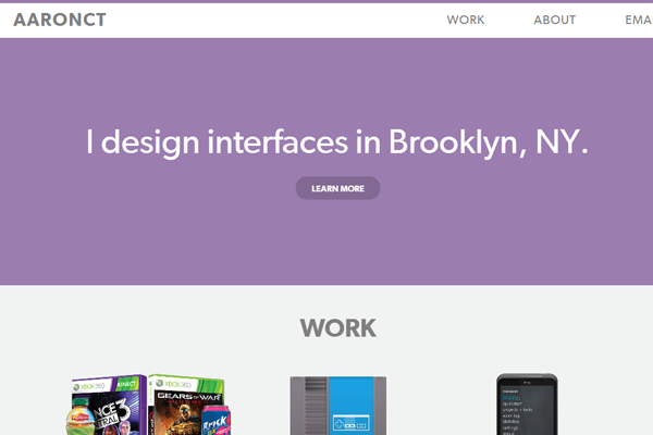
Clean and lightweight is a great way to get started. Especially if you’re new and just building a portfolio, this style is great to capture attention and focus on the work.
Becky Murphy
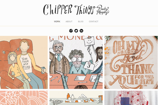
Becky is a writer and illustrator who has created some great pieces and her own book. Her website is a showcase of illustrations and not much else. Great for keeping visitors interested on the quality of your design work.
Nidhi Chanani
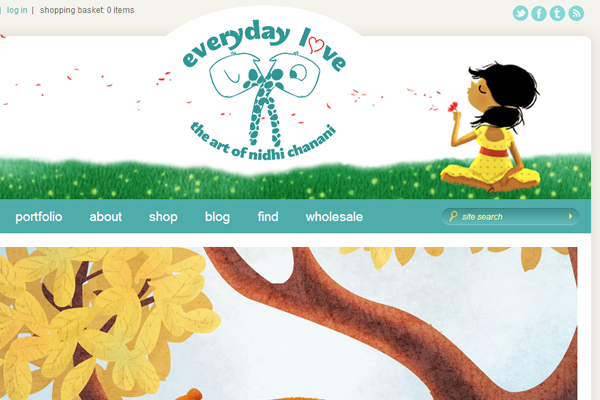
One of my favorite illustrators is Nidhi because of her style and context. The header banner is unique helps give the website a deeper connection to visitors.
Vitor
Aside from the beautiful animations this layout is futuristic and trend-worthy. I love this design because it focuses on so many different talents while keeping the content front-and-center. It’s a single page website but everything you need to know is right there in your face.
Kirk Wallace
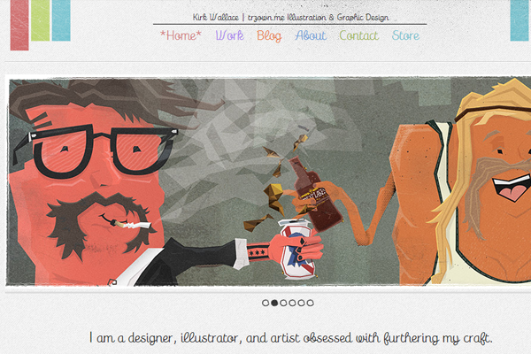
A simple setup with a clean display of work. Kirk links out to his online shop where you can buy prints and other designs. Very nice touch when trying to earn some extra cash on the side of project work.
Mary Fran Wiley
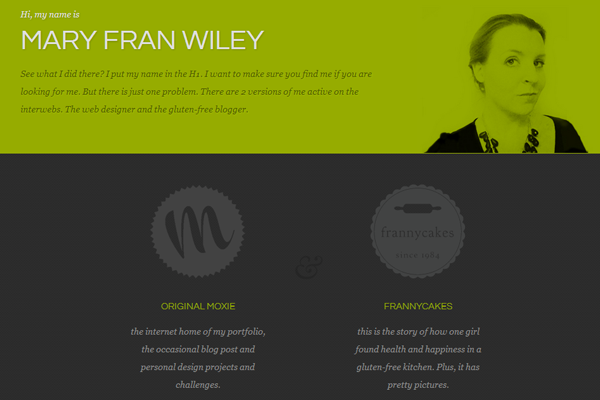
Here I like the clean colors and matching tones. It’s not the perfect theme but it does offer everything you’d expect in a portfolio layout.
Lilondra Ospina
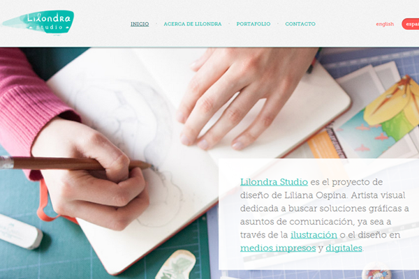
Lilondra uses a lot of textures and bright colors to evoke a more wondrous feeling. Towards the bottom you’ll find client testimonials which is always a smooth addition when freelancing.
Iris Eda Atalay
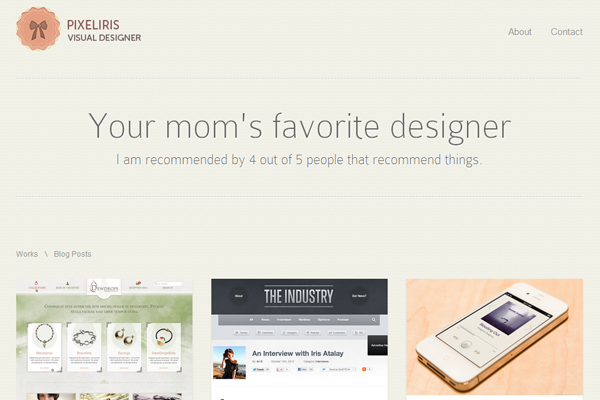
On this example I especially love the choice of typography. The font and the size makes everything crystal-clear. All of the work loads on a single page through AJAX without any other HTTP requests.
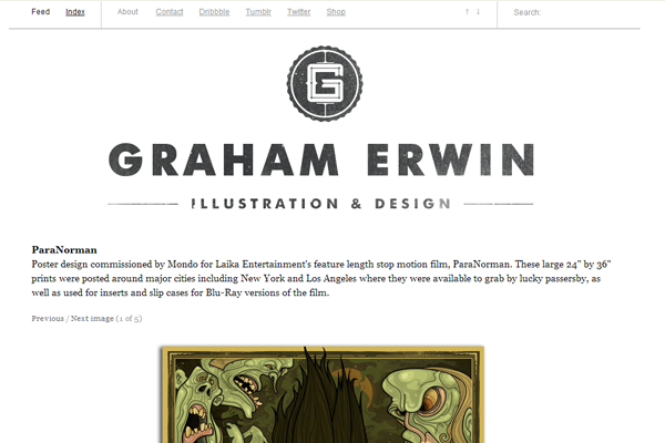
Graham Erwin
This simple portfolio is another example of white and clean. Showcasing enough work to catch people’s attention without extra distractions.
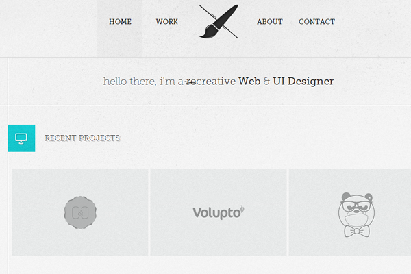
Alecks Faure
Alecks uses a very simple portfolio with just a bit of contact details and further links. In the world of Dribbble this can always be an option to give people a deeper look at what you do without needing a complicated website.
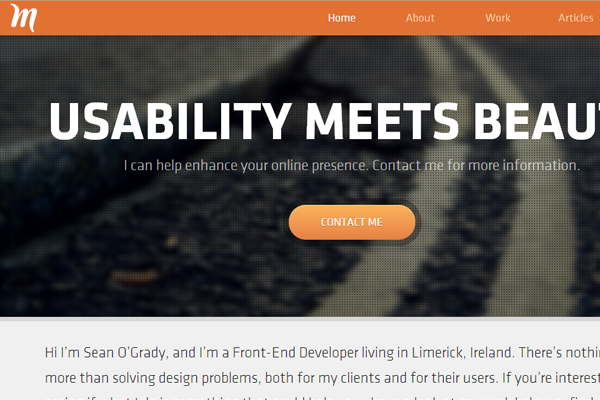
Sean O’Grady
Sean keeps it bright and vibrant which doesn’t always work – but when done properly it’s an exception choice for colors. Try to get a feel for why this design works so well and how it captures interest at a glance.
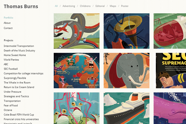
Thomas Burns
This 2-column layout is very common amongst illustrators. It’s an easy theme to customize and you get to showcase a whole bunch of creative work. If you do any type of drawing, painting, or digital painting this is a great portfolio style.
Kevin Kim
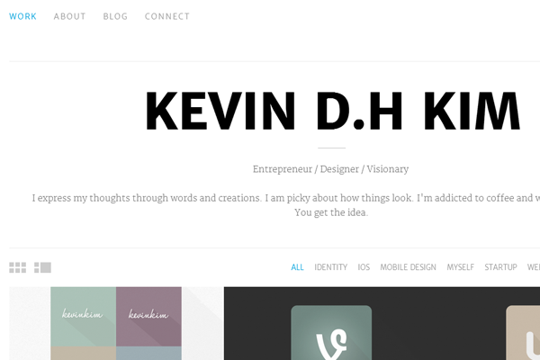
Kevin Kim focuses mostly on typography while drawing attention into the page. If you go this route I would even recommend subbing to Typekit and choosing your own fonts. It builds a little more credibility in the design.
Diogo Bessa
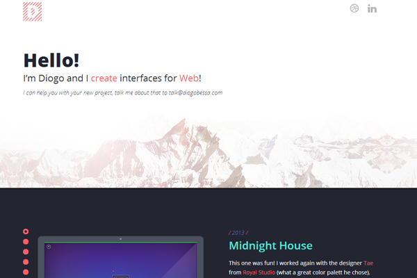
Diogo uses horizontal blocks to divide sections of the website. This crisp visibility helps users skim and quickly capture interest in different projects. I also really like the header design – simple yet efficient.
Dominik Rymsza
On this portfolio there’s a mix of icons, typography, and background textures. The site feels very professional almost like a studio. Great for a personal portfolio as long as you keep a solid branding like Dominik.
Mark Hendriks
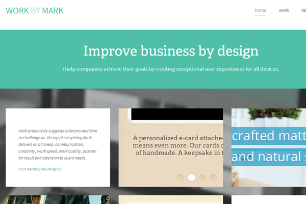
The background styles on this website also seem quite vibrant. It’s a tough system but I really like the design. Hard to pull off with a first layout, but not impossible if you know how to stretch or repeat backgrounds.
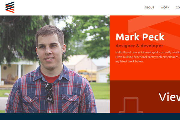
Mark Peck
Mark Peck does some excellent work and his portfolio is no different. The header using his photo is a nice way to present who he is to each visitor. Content is clean and readable, plus the work is energetically featured.
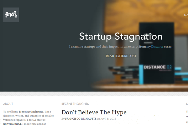
Francisco Inchauste
I really like the Finch branding as it’s always caught my attention. His older design was more typography-based while this design is a more of a balanced layout. Lots of great features and plenty of solid work to check out.
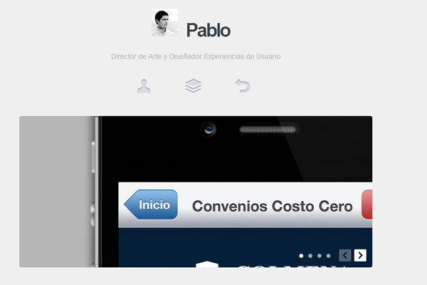
Pablo Vivanco
Here’s another simple portfolio without too much on the page. Pablo includes a link to his social networks where you can take a look at related works.
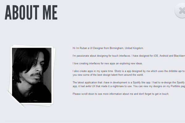
Rhubin Khalid
Rhubin makes his portfolio more about him and his skillset. If you have a crazy skillset & personality then visitors might find you to be quite interesting.
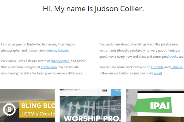
Judson Collier
Judson has a centered portfolio with just a few pages. Much of the design uses readable sans-serif typography and bright colors to attract the eye.
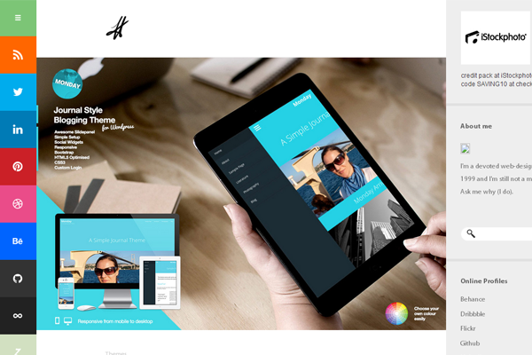
Derry Birkett
Derry has more of a blog-style portfolio with updates about new projects. I like the design because it’s unique and there are not many other portfolios using this style.
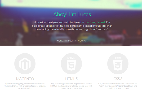
Lucas Perdidao
What I like most about this portfolio is the fading hover effect over links and icons. His project work is easy to understand while leading right out to Dribbble shots.
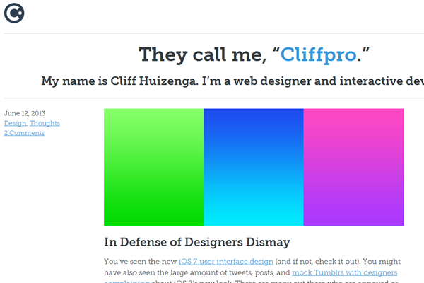
Cliff Huizenga
Cliff has a very simplistic design using a top header along with a plain white body section. Few distractions and most of the content is focused on design work. Another good example you could study when building your first portfolio.
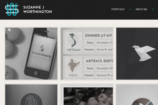
Suzanne J Worthington
Suzanne has a very interesting ornamental icon for the portfolios branding. This can be found in the header and favicon section of the site. It seems to provide a relationship between the content and helps draw the eyes further into her site.
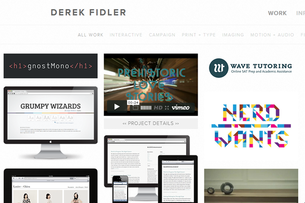
Derek Fidler
Derek performs a lot of different work and his portfolio showcases everything on the homepage. Everything is easy to maneuver and figure out exactly what you’re looking for.
Dennis Kramer
I especially like the initial loading effect you get on this portfolio layout. Each project is separated into horizontal blocks which draw attention quickly. Derek performs some exceptional work and his portfolio is an example of professional mixed with creative.
Dan Toth
Dan uses a very simple style with some basic navigation and page designs. Mostly white and minimal, keeping the focus on his work seems to be most important.
Dan Mall
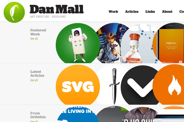
I simply love this portfolio because it has so many dynamic elements. Dan Mall does a lot of interaction design and it shows through brilliantly in his website.
Ryan O. Hicks
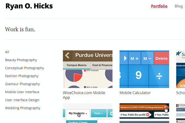
Ryan uses a fixed scrolling bar on the website’s header design. It keeps attention and really does stay out of the way of primary content. It’s a clean style with plenty of screen real estate.
Chad Mueller
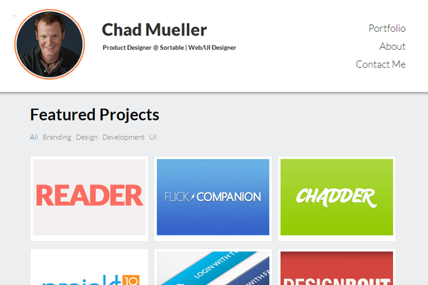
Grey and white along with bright colors mix together in this portfolio. His work is featured on individual pages which lead back & forward like blog posts. Easy navigation for first-time visitors.
Sean McCabe
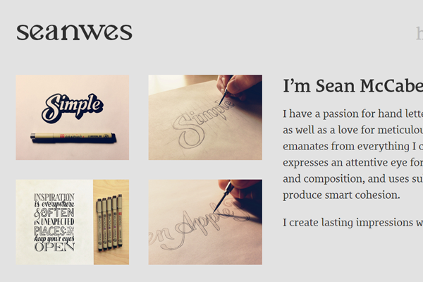
Sean’s portfolio seems to focus a lot on typography and space. He does custom lettering and the examples of his work take over much of the homepage. It’s a great website and typography lovers would enjoy this design.
Kemie Guaida
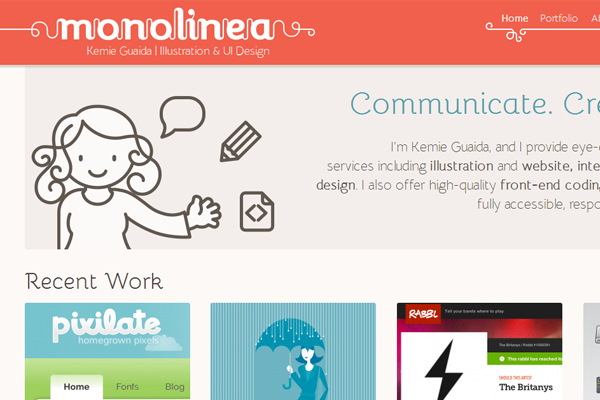
Kemie includes plenty of illustration work on the site. It showscases both her design style and the website’s layout perfectly. If you have talent as an illustrator this is a great idea to keep in mind.
Muhamad Ulum
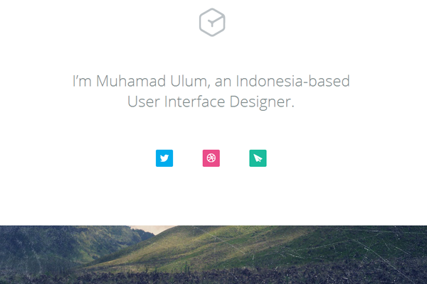
Muhamad uses parallax backgrounds and fixed horizontal blocks to showcase work and his social networks. It is a very simple portfolio and may work for new designers who want more than a minimalist layout.
Carl John Spencer
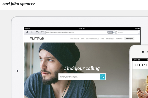
Carl has one of the fanciest animations I’ve seen in portfolio designs. His fonts and layout add onto this fancy & decorative style.
Naiara Abaroa
Naira has a funky portfolio showcasing more of a developer’s point-of-view. It works perfectly and looks very different from most portfolios. Yet all the key elements are in place to make this an excellent website.
Gregoire Vella
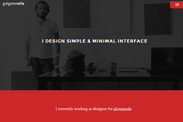
This portfolio features another header photo along with some clean interface features. Some of the portfolio entries utilize GIF animation to catch your attention. Overall is a clean yet detailed layout with some nice color choices.
Tommy Beemsterboer
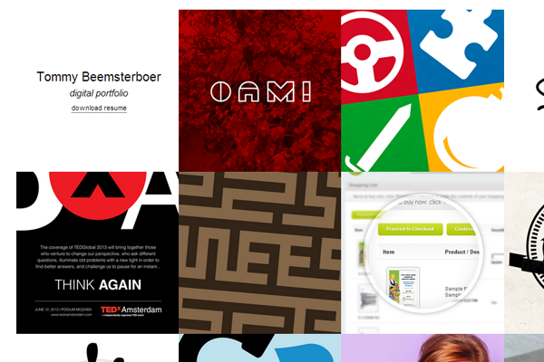
Tommy has an exceptionally basic portfolio with links and some self-explanatory info. Worth checking out just to see how it works and what you might consider regarding a simple design.
Joshua Raichur
I really like Joshua’s design although it comes across more like a blog. It is a personal website so it does feature his work along with some writing. If a blog is crucial in your portfolio then consider adding those posts onto the homepage.
Jared Nickerson
Jared’s dark background helps each portfolio item snap off the page. This uses a similar 2-column system featured each portfolio item right on the homepage.
Jessie Sima
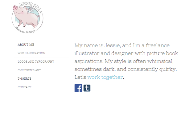
Jessie uses another 2-column style but has more padding between items. There is also more personal information along with portfolio entries. Great example of a talented individual with a very cute website.
Adam Becker
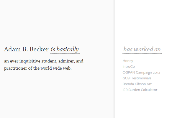
Adam Becker has a strange portfolio which doesn’t fit into a typical layout archetype. It looks swell but may not be something others think works for their own site. It’s definitely a unique concept, that’s for sure.
Helena Harvey
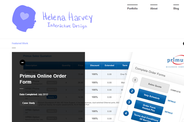
Helena fixed a rotating image slider on the homepage to showcase work samples. It’s a simple portfolio using the fixed header and other minute page details.
Thomas Pomarelle
I simply adore the colors and textures found on this portfolio. It shows how you can mix simplistic text along with a colorful design to achieve one hell of a layout.
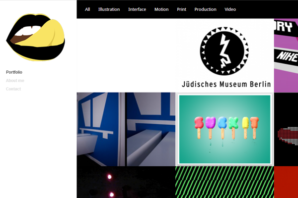
Ariel Braverman
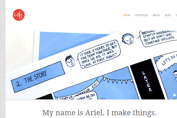
Ariel’s site is centered and sweet. The homepage uses a filterable portfolio list where you can sort through comics, illustrations, print work, and other categories. Very nice design and some great dynamic features.
Megan Louise
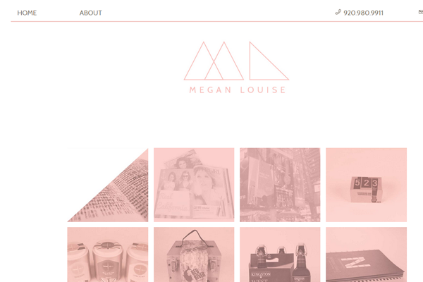
Megan’s site is very quick to load because there aren’t too many resources on the page. It’s simple yet efficient – one type of color scheme that gives off a certain branding of her work.
Seth Lunsford
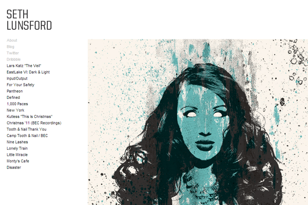
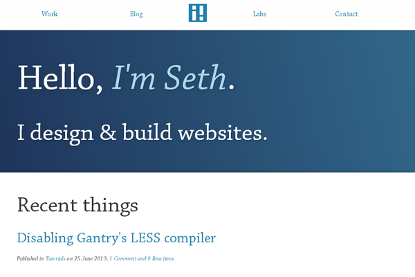
Seth has another 2-col design with more of a simple interface. Each project is featured solely on the page and you can rotate through individual projects from the vertical navigation.
Jordan Flaig
Jordan uses a fixed background that looks really nice coupled with a sidebar menu. A lot of the portfolio seems dynamic but it’s more of a fixed content layout. The site features outstanding animations with a lot of different techniques.
Jason Stone
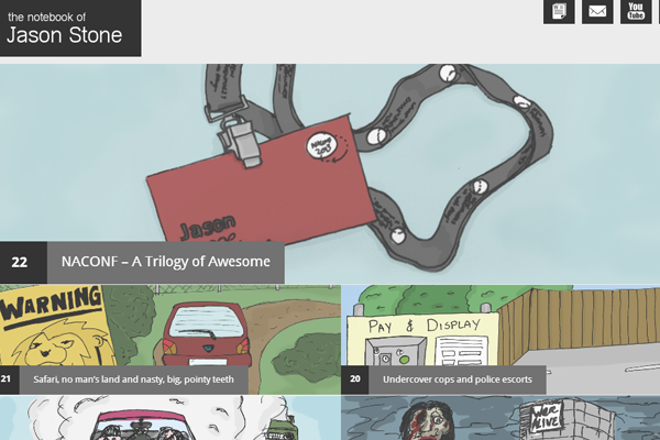
This site uses other parallax interface features along with a simplistic homepage. Everything is featured clean and center on the page. It also has a lot of work details and job history like you might find on a resume.
Kate England
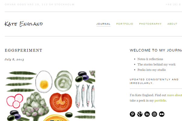
I really like the design style here but some of the text can be difficult to read. Her portfolio definitely feels like a fullscreen website design. It’s creative and just screams “digital designer!”.
Whitney Miracle
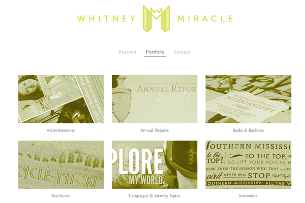
Here’s another layout which features a very simple color scheme and page layout. Quick load times are important, and in this case she has done a flawless job.
Chris Dasie
Chris’ website implements a number of horizontal blocks splitting content along the page. It’s easy to skim and provides a quick reading experience.
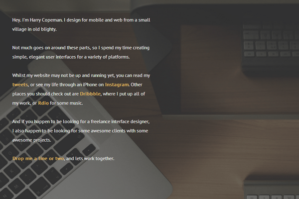
Harry Copeman
What I like about this site is the simplicity of both colors and typography. It can work for any type of freelancer and his style is impeccable.
Los Montoya
The branding is what should immediately catch your attention on this portfolio. Great way to make a name for yourself and keep up with modern trends.
Keen Ethics
Keen has a more simplistic approach to branding. You’ll find his name along with plenty of work featured right on the homepage. Clean and simple, yet perfect for anyone looking to browse his stuff.
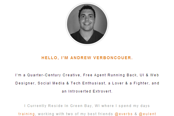
Andrew Verboncouer
Andrew can do a lot of different work and his website is more of a placeholder for these jobs. You can find contact information along with some external links to his profiles. Great example of a minimalist style when starting to build your name online.
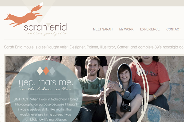
Sarah Enid
Sarah has a very cute layout with lots of space on the page. It was featured in the CSS Awards gallery and I’d say it’s rightfully so. The fox icon is quite adorable.
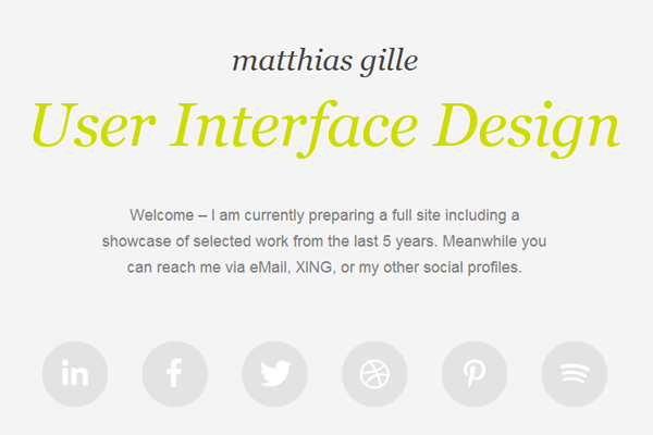
Matthias Gille
Matthias uses a simple set of social icons along with a brief description of his work. These types of portfolios are what you need when just getting online, or when redesigning your portfolio to update with a new layout.
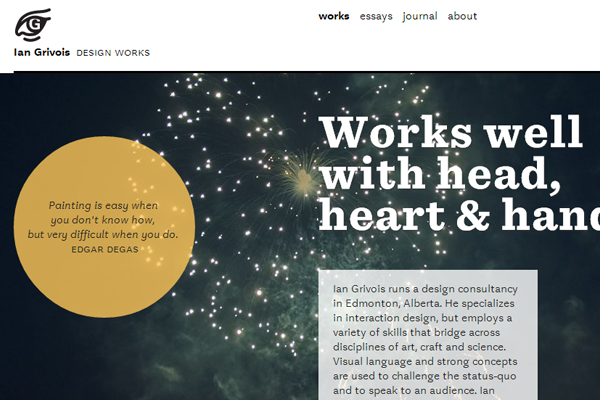
Ian Grivois
Ian uses lots of great typography mixed with various typefaces. The style is very elegant which makes everything easier to read and consume.
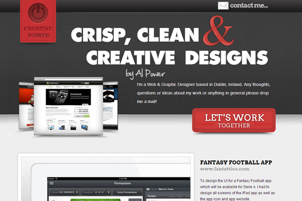
Alan Power
Alan also includes some big typography which is thicker and more attentive in comparison. But I’d say it works for his style of portfolio, and it certainly does get attention.
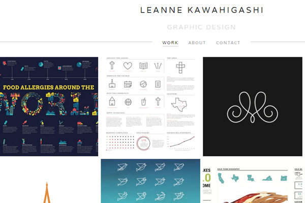
Leanne Kawahigashi
This is a very simple responsive layout designing with a grid in mind. It comes back to numbers and ratios when designing a portfolio in this style.
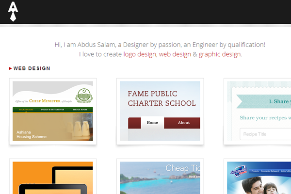
Abdus Salam
I really like the header and content style on this page. The only qualm I have is the navigation can be tough to use, but it looks nice mixed into the color scheme.
Andrew Lucas
Andrew focuses mostly on typography and details on his work to gather attention. It’s a great example of simple design coupled with a personal connection.
Stuart Regan
Stuart has a very similar website featuring social links and some details about himself. It’s probably the most minimal website you could expect for any creative designer.
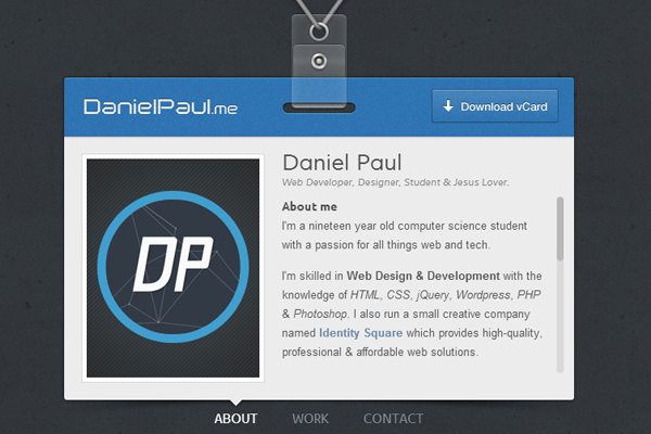
Daniel Paul
Talk about a unique experiene! Daniel’s portfolio is like a v-card design where you switch between pages using Ajax. Everything is right on the homepage and easily accessible.
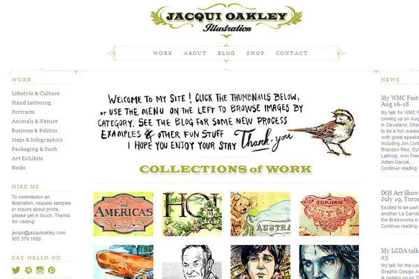
Jacqui Oakley
Jacqui uses ornamental borders to divide between this 3-column layout. She is an illustrator and I feel this style reflects perfectly on the type of work she does.
Michelle Ouellette
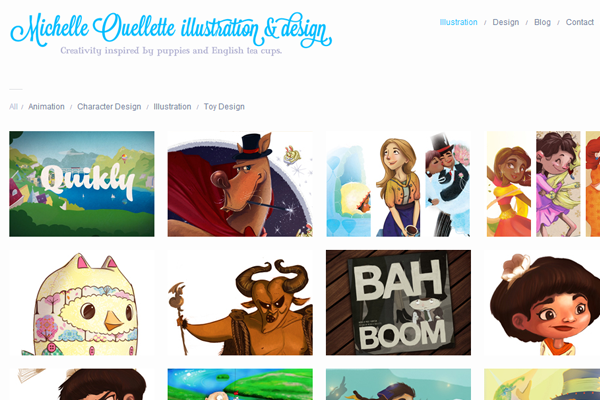
Michelle also does illustration work and her site uses more of a creative typography. It’s much simpler yet the work is still centered and easy to access.
Neil J Rook
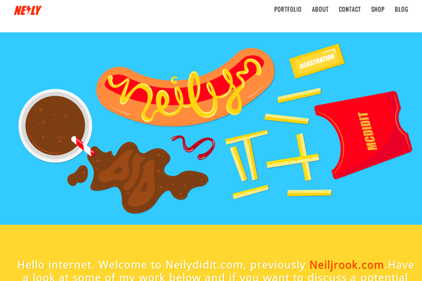
Neil has quite a different idea mixed into traditional portfolio layouts. Vector icons and colorful backgrounds help the content bounce off the screen. It almost feels too real and the textures are phenomenal.
Lauren Bearpark
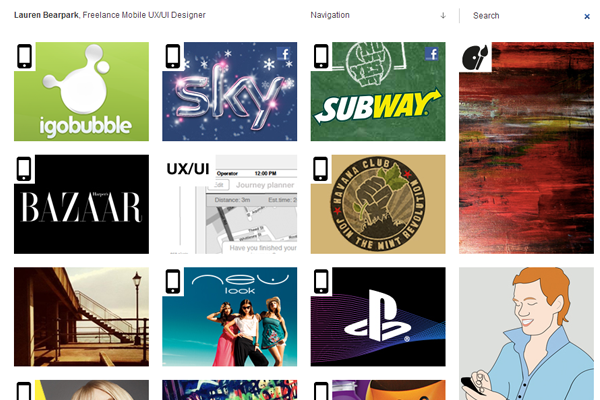
I like this design for a more personal touch. Lauren has a fixed left sidebar with information on herself and her work. Then the right sidebar scrolls down with her projects and preview shots.
Clint Tabone
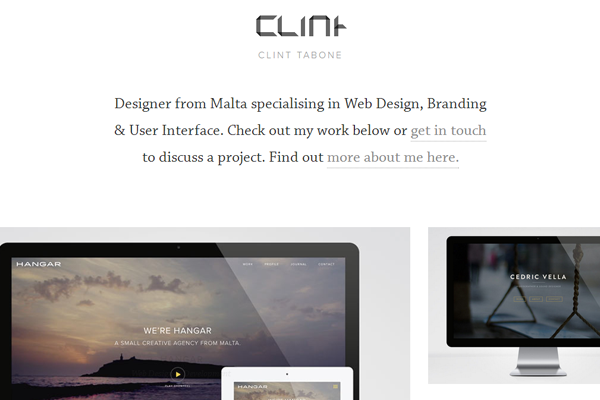
Clint’s fading effect is natural and elegant. Everything comes into view at an even tone and looks spectacular. I would recommend taking a look at his style to see how it compares with other portfolios.
Galynka Boychuk
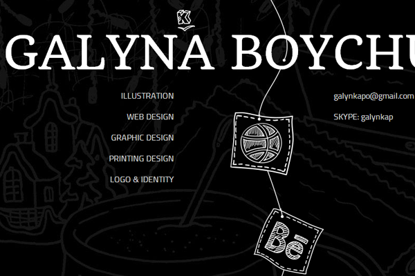
Dark yet intriguing – this portfolio has a number of handdrawn elements that look spectacular. If you love that hand-drawn style you should take a look at this site to gather some ideas.
Kevin Halley
Kevin’s website is clean and very easy to navigate. Only a couple links in the sidebar while all his work is showcased right on the homepage.
Nat Al-Tahhan
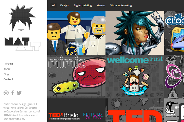
Nat has some really crazy work and uses a nice portfolio to show it off. Clean text, nice backgrounds, lots of work samples and plenty of information on what he does.
Huseyin Yilmaz
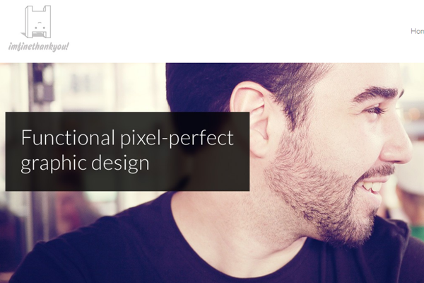
A similar style can be found here by Huseyin Yilmaz. He includes a photograph of himself along with more details on the homepage. This is always a nice touch to make each visit more personal.
Jon Rundle
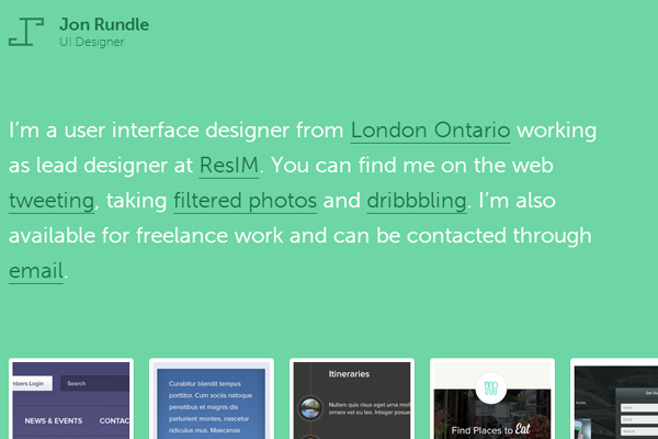
Jon uses a green color scheme with dark and light text mixed onto the background. His work is stunning and looks fantastic in the grid display.
Ryan Downie
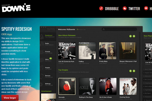
This darker portfolio seems to focus entirely on the work itself. The navigation is simple and while the content may seem crowded, the style works for this setup.
Martin Gorol
Martin keeps freelancing in mind with his portfolio design. It showcases what he can do and what materials he uses for each project. Great design style that I really enjoy.
Mark Bird
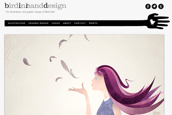
Mark Bird does some creative illustrations which litter the homepage. White and plain in style, it’s perfect for capturing focus right onto the important areas.
Andrew Colin Beck
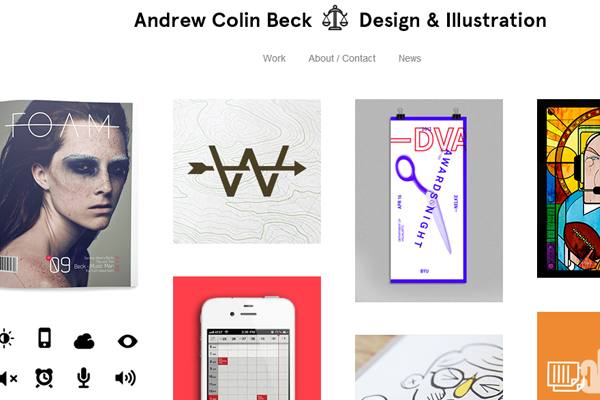
Andrew’s website is simple yet elegant in nature. Each of the projects are listed in a grid and stacked onto the homepage for easy access.
Mirco Chen
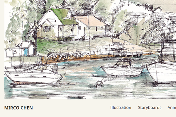
Mirco has one captivating homepage with a very unique illustration. If you have design anything in your own style it may be worth keeping as a background or header.
Charli Prangley
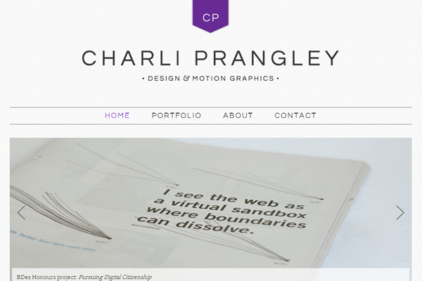
It’s a much simpler design than you might expect, but it does work exactly as you’d expect. Navigation flows and the text is easy to read.
Sasha Lantukh
Sasha’s logo is very creative and I really like the typography. It may be a little small in the header, but the page itself features everything you would expect. And the header will auto-hide when scrolling down only to reappear on your way back up.
Seth Warburton
This portfolio layout is pretty basic and features a lot of text on the page. Great for including blog posts and links to social networks, while also keeping a hold on the work itself.
Nils Vögeding
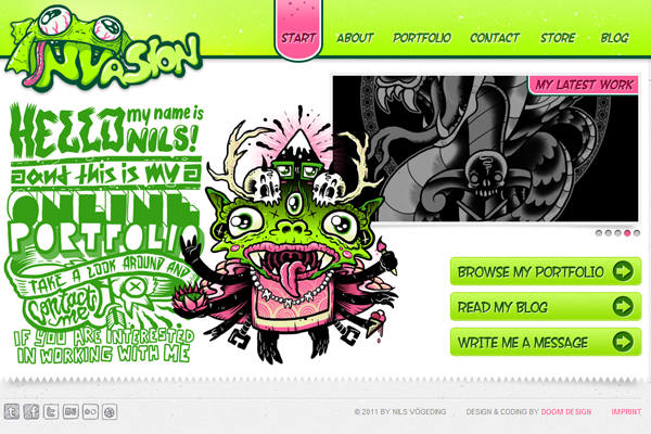
Nils uses a watermelon texture for the navigation and the green color scheme continues throughout each page. Very cute and very unique in the world of portfolio websites.
Michal Galubinski
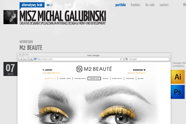
I certainly like the tooltip bubbles and unique styles on this website. It’s a cute design that catches my interest almost immediately.
Michael Berger
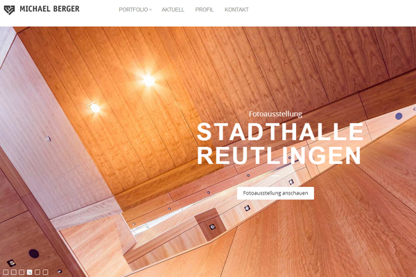
Brilliant homepage with a lot of eye candy. It takes up the full screen and behaves in a responsive manner on smaller devices.
Pulak Bhatnagar
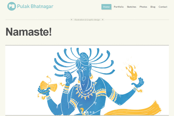
Pulak uses some creative drop shadow effects on his navigation and slideshow. It’s cool website that almost seems retro in design style.
Beate Siljan
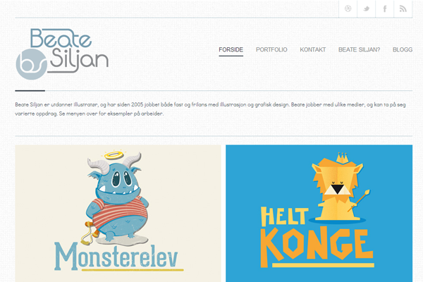
I’d say the projects section on this portfolio brings it home. Featuring multiple examples on the same page is a flawless design trait.
Rob Sutcliffe
Lots of typography and linked portfolio entries. I love this page because it demonstrates a perfect example of how nice a certain typeface can look within headers and content text.
Mustafa Kurtuldu
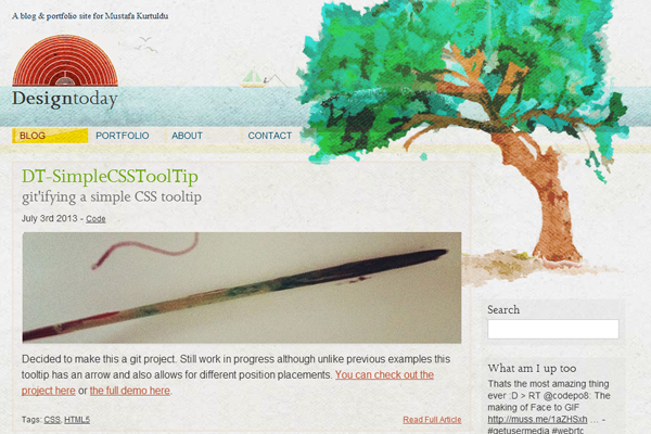
Beautiful illustrations that almost look like watercolor fill up this homepage. Another perfect example of unique portfolio design ideas that fit right into any website.
Friolaugur Jonsson
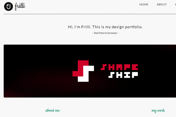
Frilli has some creative branding that I really enjoy. A few dynamic elements on the page along with an easy-to-navigate header section.
Chris Wharton
Chris has embraced the flat design trend with much success. His portfolio is clean but not too minimal, and uses lots of colors which blend together nicely.
Burak Donertas
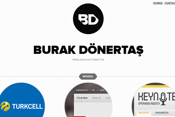
Animated branding is what first catches my attention. Burak wants visitors to know it’s his website and how it functions is a great example of this desire.
Alex Eckerman
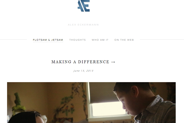
Alex has a perfect example of simplicity in typography. Some of the text is thin, some large, but it all fits and looks great on the page.
Kerem Suer
Kerem is one of my favorite designers because he has worked on so many projects of outstanding quality. His portfolio frequently undergoes an updated design – but each iteration is fantastic and worth checking out.
Tony Mack
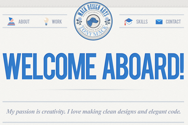
I love the big typography and unique icons found in this portfolio. The work is featured in it’s own section divided by horizontal blocks. But the typography is what really brings this home.
Sjoerd Dijkstra
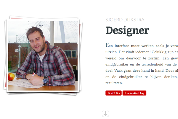
The parallax style on this website can be a little intimidating. I think it could use a bit more space, but overall it’s a very neat effect which showcases creativity.
Wes West
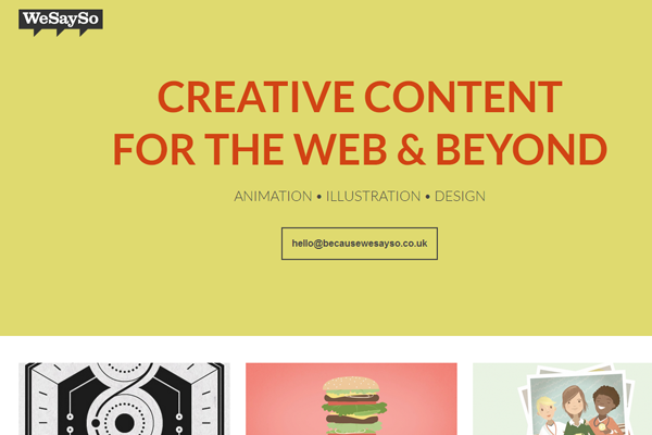
Cool name, great website, and brilliant design work. Wes has done a number of cool things on this website including the branding and footer design. Take a peek to see what else he’s done.
Willem Pirquin
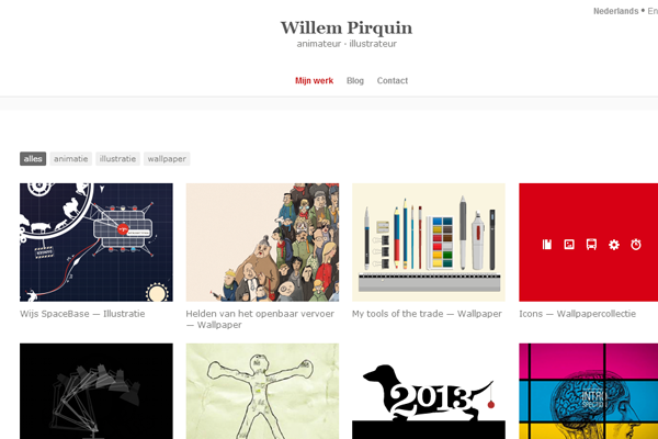
Willem mostly does illustration along with animation and his portfolio shows this. It’s simple yet features exactly what you want to see – great work.
Si Maclennan
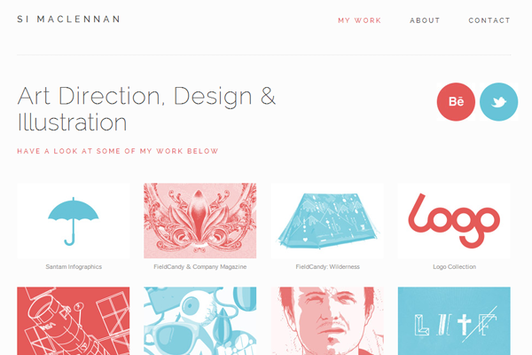
My favorite part of this website is the responsive design style. Oftentimes navigation can be a pain but this is one great example I’ve found. Also the style is clean and works to really showcase his work.
Tsuchi Noko
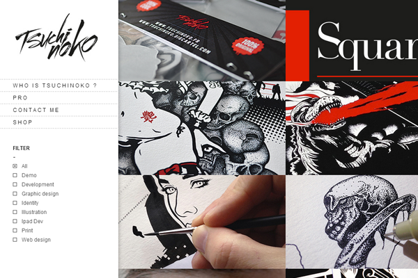
Tsuchi has some cool typography used in his logo design. It immediately caught my attention and demonstrates how the fixed-sidebar design may provide more than easy navigation.
Mariusz Ciesla
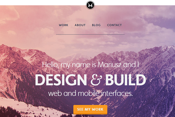
My favorite part here is the large header background. It uses some nice colors and stands out from the rest of the page. Nice design style and very easy to navigate.
Gibran Villela
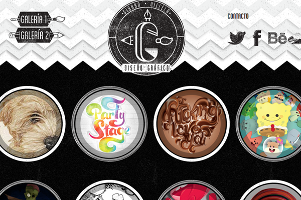
Probably one of my favorite illustration portfolios for the animation effects. His texture and colors are brilliant, and his portfolio is full of amazing work.
Boris Lechaftois
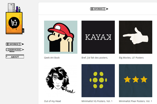
This portfolio takes a new shift on the idea of left-hand navigation. The main site is separated from the sidebar yet it all seems to flow naturally into one layout design.
Robin Sheldon
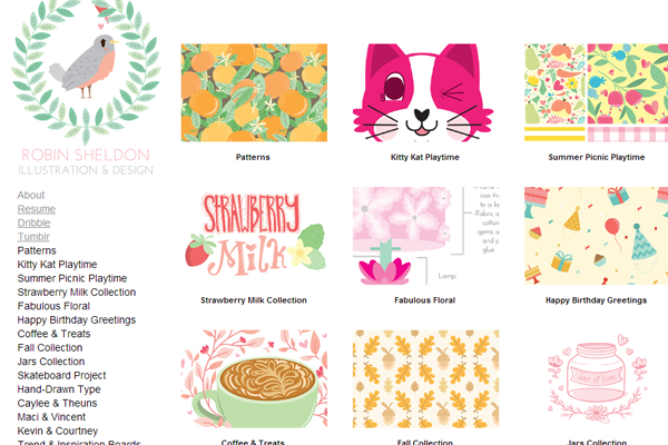
Robin Sheldon uses the more traditional 2-col layout for his illustration work. It’s focused on Ajax while still offering pages for contact information.
John Costello
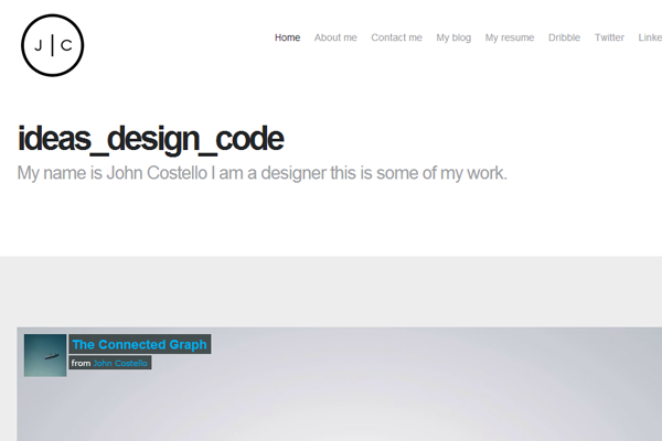
John’s website is minimalist with a focus on typography. The light color scheme is easy to distinguish and provides a simple background for the dynamic content.
Lauren Wunderlich
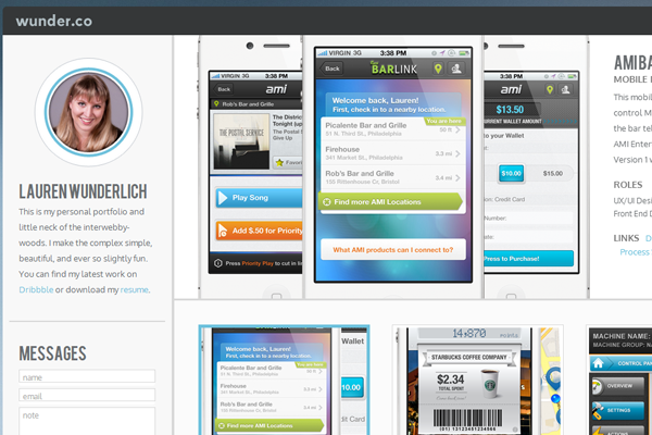
Lauren’s portfolio is very creative, although it may not seem so right away. There’s a slider button to switch between portfolio & personal content, not to mention the fantastic icon work.
Jamie Heuze
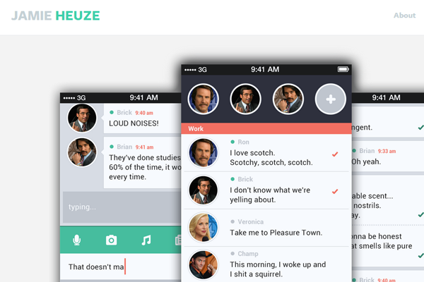
Jamie’s website is dark and crisp. Clear text with a clear goal of attracting attention for the work.
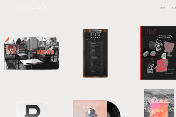
Valentina Sanders
This is a much more free-flowing portfolio layout without a whole lot of structure. I like the design because it’s simpl but certainly not for everyone.
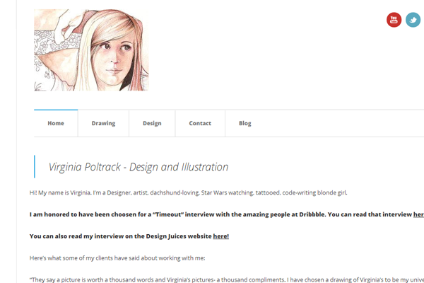
Virginia Poltrack
Virginia has some great work samples and the website color scheme is beautiful. Not too loud but not too quiet, either. And her homepage includes other details like a photo and contact links.
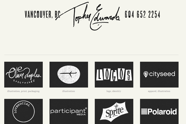
Topher Edwards
Topher uses a dark signature right at the top as a way of branding the layout. His work speaks for itself and litters the homepage in a grid-column system.
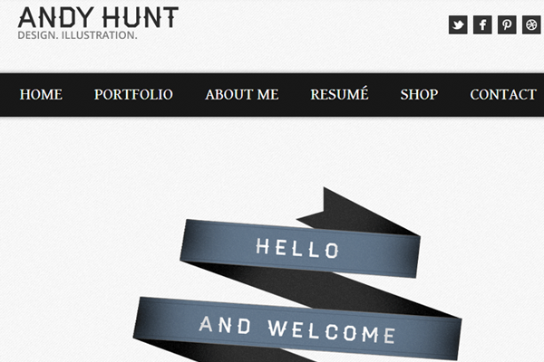
Andy Hunt
Andy Hunt has one of the coolest portfolios with a focus on dark colors and textures. The homepage is all you’d need to see to understand he does great work.
Kevin McCarthy
Kevin’s portfolio has some nice vector artwork to stand out from other websites. It features a bit of work along with social links and a contact form.
Jeffrey Zepeda
Jeff’s portfolio listing has 2 columns of rectangular preview images. Hovering onto each will provide some more information along with a followup link.
Chris Piascik
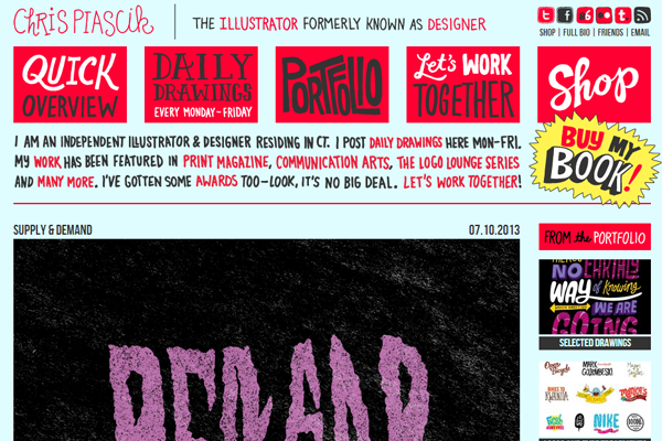
Chris takes unique typography onto a whole new level. While it may be better to keep that in written text, the website does stand out and gives off a crazy creative attitude.
Rovane Durso
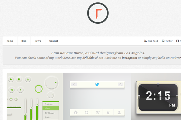
Rovane demonstrates some digital design concepts on his animated homepage. Very simple yet dynamic where you may not expect.
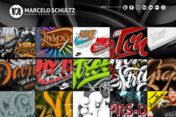
Marcelo Shultz
Marcelo’s work is simply outstanding. His portfolio really showcases the work nicely, although it may appear too squished. The style keeps me interested and makes me want to learn more about him.
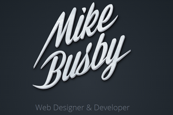
Mike Busby
Mike’s typography is something to write home about. The dark layout provides an excellent backdrop for his style.
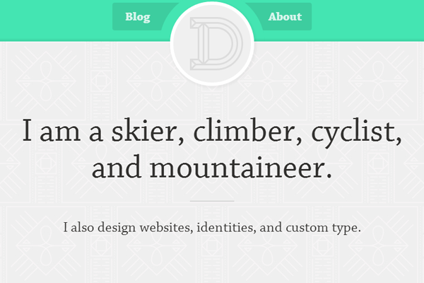
Derryl Carter
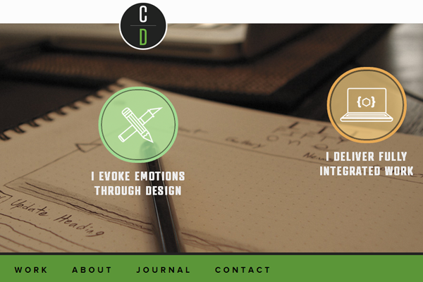
This design looks like it would be created for a developer or programmer. Very crisp text with lots of space for skimming. I like the simplicity as it’s not something you find in many portfolios. Also his “D” logo is pretty cool.
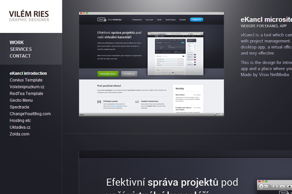
Vilem Ries
Very professional and easy to catch your attention. The dark background seems more like a studio than a freelancer. But it’s a terrific portfolio example among many others.
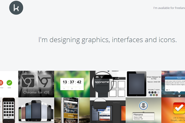
Kai Halfinger
Kai has a wonderful portfolio layout with some easy and clean navigation. I love the design style – it’s so minimal yet detailed at the same time.
Buatoom
The logo and header designs immediately scream creativity. His icon work is some of the best stuff I’ve ever seen. I’d say this portfolio really speaks for itself.
Luke Drozd
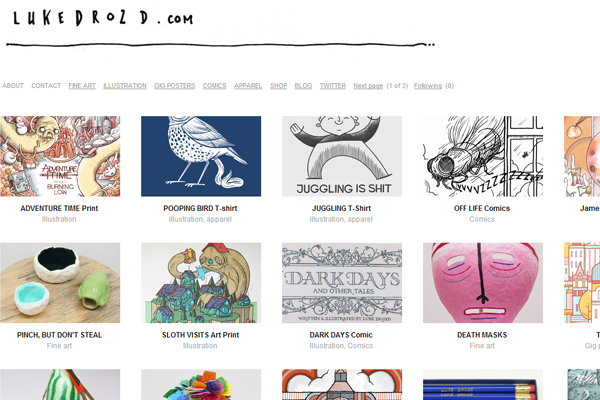
Luke’s website can expand quite large to hold 4 or 5 columns of work. He uses a white minimalist design while keeping his work as the primary focus.
Simon Rae
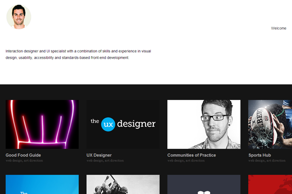
Simon has some great design techniques and his website seems true to character. He’s an art director who has done a lot of different projects – each focused in a clean thumbnail grid.
Tin Nguyen
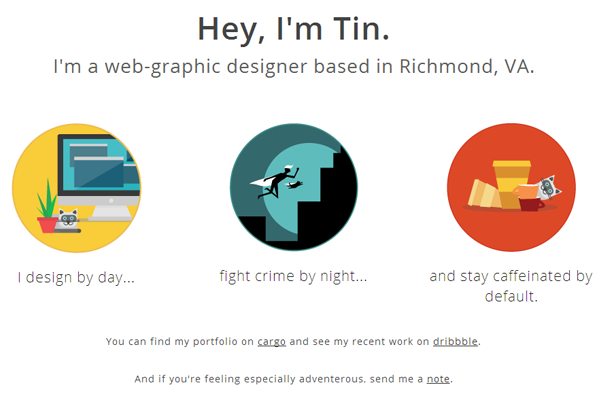
Tin’s icons are phenomenal and encapsulate the flat trend nicely. He includes links to his resume and some further details about his work ethics.
Quek Teng Wan
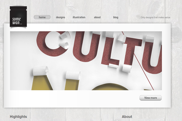
The header design is what really catches my attention. The colors flow from dark to light in a very natural manner. His work is also exceptional and looks great on the page.
D. Moore
I’d say this is a more simplistic design which also includes detailed aspects. Colors, tone, backgrounds, and some work samples to boot.
Kyle Wayne Benson
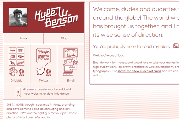
Wacky text coupled with a wacky layout! This is certainly one unique portfolio worth remembering. I like this style because it’s clean yet a little messy without any confusion.
Dave Keller
This site uses a simple color scheme and simple webpage layout. Everything seems to fit nice and easy into the webpage. His portfolio pages are certainly worth a peek.
Jake Holzman
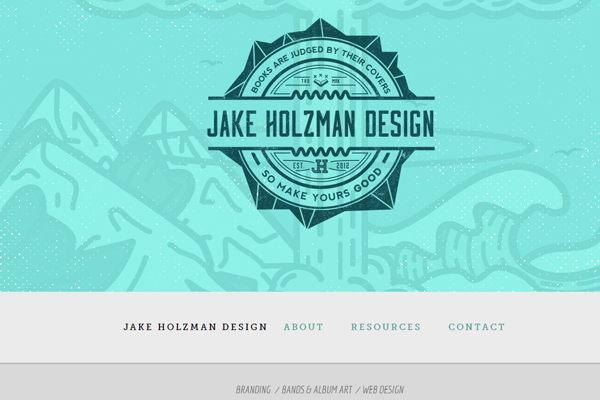
Jake uses a large badge design for a branding effect. His colorful background is captivating and leads visitors down further into the site.
Tim Denee
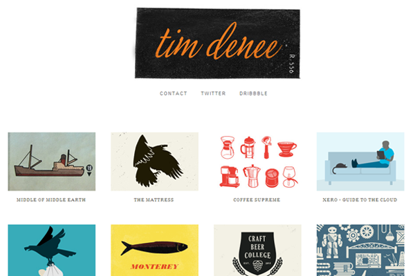
Another set of simple thumbnail portfolio entries with a wide array of work. Tim’s website is clean yet efficient. I love his basic design style and really appreciate how it looks on a larger monitor.
Jason kendall
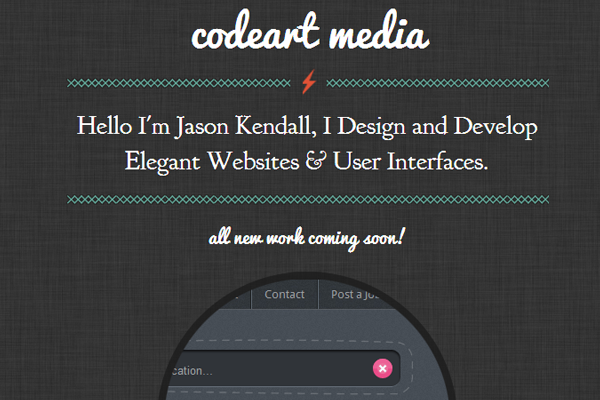
Jason’s use of dark texture really stands out from other dark websites. His typography is also unique and provides a fun viewing experience.
Michael Walchalk
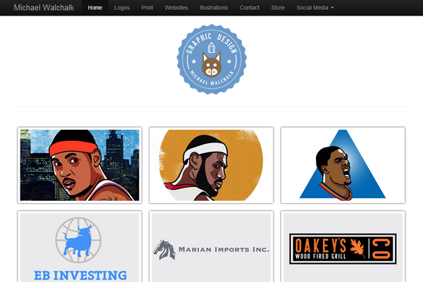
Michael has some outstanding work and it completely takes over his homepage. Right from the get-go you know what this guy can do and how good he is. I really like this blunt style of portfolio design.
Zachary Vandehey
This portfolio is a bit smaller than it could be. The design is responsive because it’s so simple and clean. I would expect it to expand further, but everything looks cozy in it’s place.
John Jackson
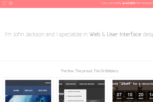
John does some great work that stands out on his website. I love his style and it’s very creative compared to other simpler websites.
Alexander Vidal
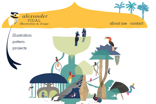
One nice facet about this website is the addition of illustrations in the header. They seem to be more vector-based artwork but it still provides a unique branding for the portfolio.
Angel Acevedo
Angel has some really funky stuff on this portfolio. It’s very creative and features dozens of work samples. I really like the design and suggest taking a peek.
Jason Stanley
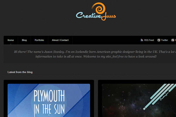
Simple dark portfolio with a blog, about section, and lots of work examples. These homepages are the best when you can easily scroll through work to check out what you like.
Sarah Surrette
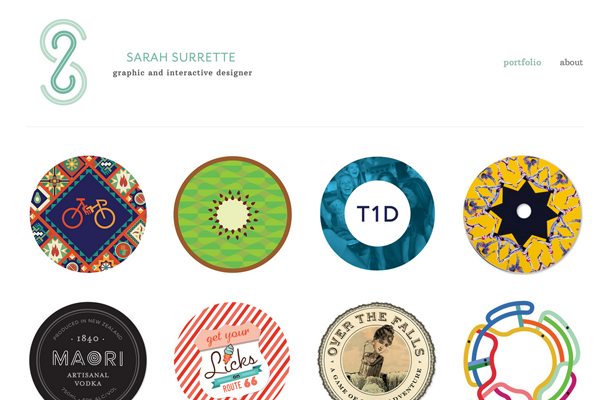
Sarah’s website uses a very cool logo design. Also her portfolio entries are rounded into circles – a newer design trend that looks phenomenal when done correctly.
Miguelcm
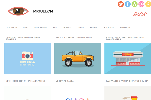
Great icons, simple colors, and a fantastic logo. Not as much design work featured on the homepage but it’s all easy to navigate.
Rafe Goldberg
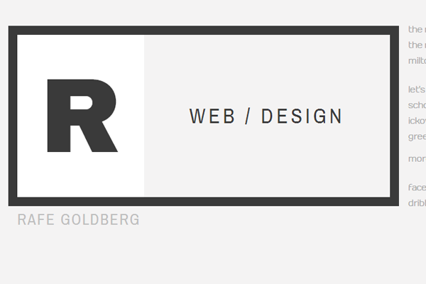
Rafe’s website uses a dark orange and grey mixture to stand out on the white background. It works as a simple idea, but the homepage could probably use some more examples. Still a fine website that’s easy to read and easy to skim.
Tomas Hustoles
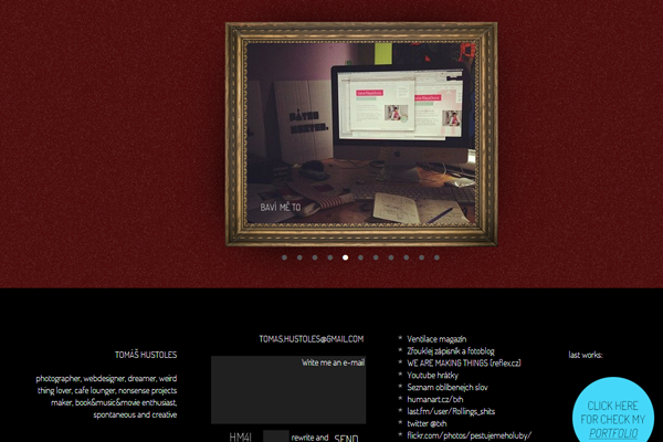
Very cool yet simple textures found in this portfolio. I like his style of breaking down page blocks into sections.
Keith Frawley
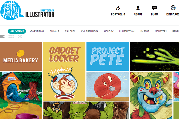
Keith uses another creative logo with custom lettering. His portfolio entries are nothing short of amazing – definitely one talented illustrator.
Steve Czechk
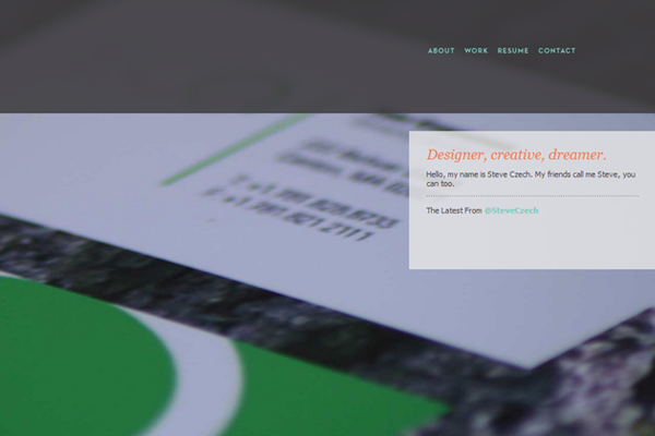
Steve has a really simple layout with contact details and some further links. Going beyond the basics he also has a fullscreen background to catch attention.
Cameron Walker
Cameron uses a flame logo for branding which fits very nicely into the site. I really like the homepage and header sections which contrast brilliantly.
Dan Cotton
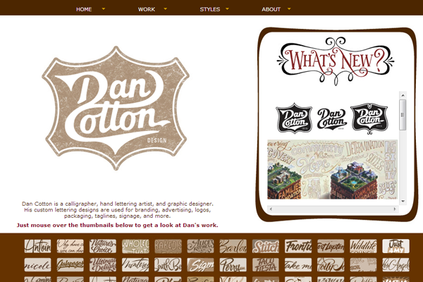
The logo here is something to marvel at. Dan’s homepage is easy to skim yet includes dozens of great work samples.
Victor Coreas
Victor has gone for a more subtle color scheme with a basic homepage. It’s not as easy to go through his work in a slideshow but the site loads quickly and does include too many features.
Nikki Galvan
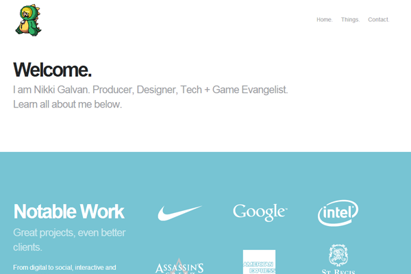
Nikki’s website is very basic and focuses on the fundamentals. Great portfolio style when just building your website for the first time.
Dennis Salvtier
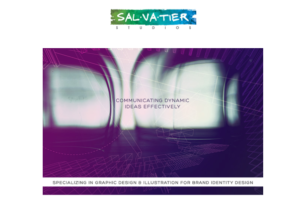
Dennis uses colors and painterly effects to stand out from the sea of portfolios. His work is great yet must be found in the navigation off the homepage. His style is clean and orderly – gotta give respect for that.
Craig Watkins
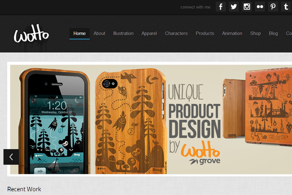
The Wotto logo doesn’t use crazy text, but it does stand out against that header. I really like the homepage because it includes thumbnails along with a fullscreen slider.
William Gilbert
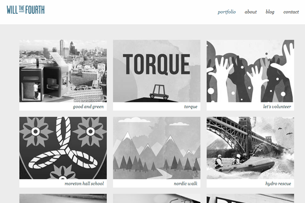
Will keeps his portfolio entries in grayscale which only change on hover. It’s a nice effect which can work on a subtle website like this one.
Jessie Wyatt
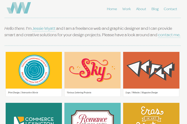
Jessie has the typical intro text along with a grid-based portfolio layout. Nice homepage with all the meat and potatoes you’d expect.
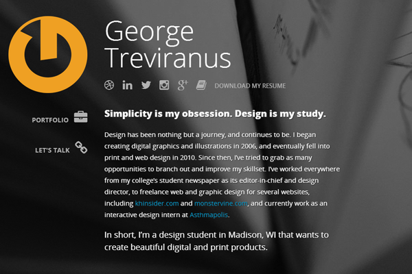
George Treviranus
George puts some focus on his blog entries along with portfolio work. It’s a nice homepage with some excellent design skills.
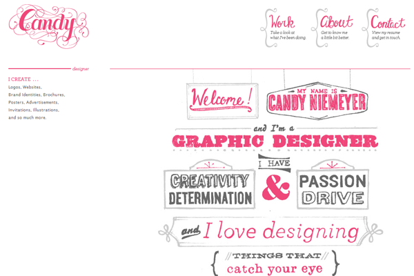
Candy Niemeyer
Candy’s site uses some damn creative typography. It sure reminds me of pink sugary jawbreakers and similar goodies. Her work is presented right on the homepage without many distracting elements.
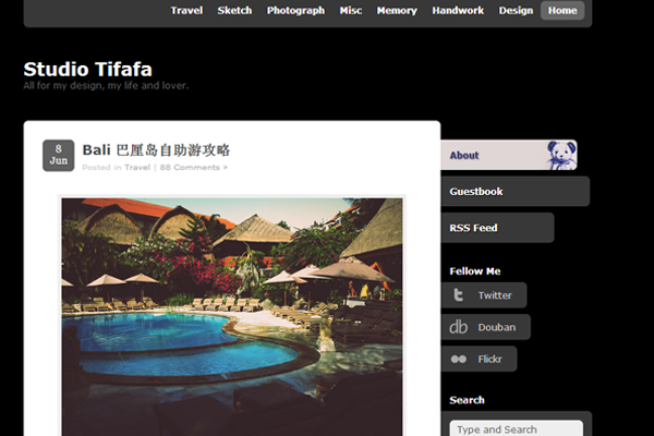
Tifafa
Tififa is branded as a studio website to feature works and contact details on the homepage. It’s a really simple design but it does work nicely.
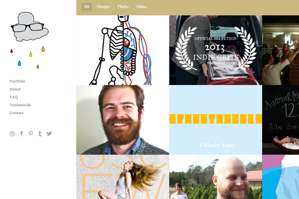
John Rainwater
Here’s a 2-column layout featured another header at the top. Those links filter out portfolio entries from the right gallery. It’s a homepage with everything you could ask for.
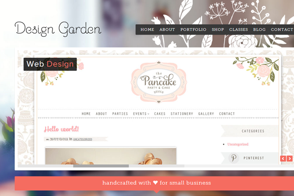
Design Garden
The background is my favorite part of this portfolio. It’s a fullscreen photograph along with a centered website. Text is easy to skim and the whole page really looks quite flawless.
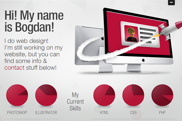
Bogdan Rosu
Icons and pie charts are featured on this portfolio. You’ll also find links to freebies and other types of work.
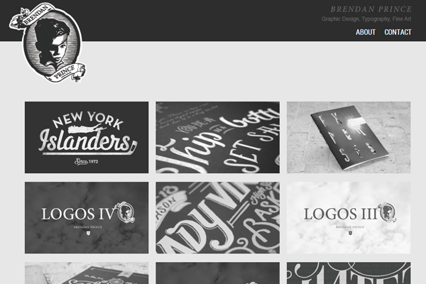
Brendan Price
Brendan also seems to like the B&W design style of colorless images. The portfolio is very clean and easy to skim without much of a struggle.
Cody Sielawa
This is definitely one of the crazier animated websites that features a lot of dynamic content. The initial loading sequence is quite interesting, along with the portfolio entries.
Frederique Matti
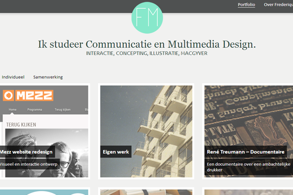
Frederique has one very clean interface which is snappy and responsive. Great design featuring some great work.
Xavi Ramiro
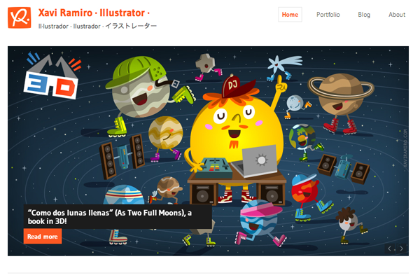
Xavi has a cool portfolio featuring a lot of his illustration work. Lots of vectors keep you interested and draw attention further down the page.
Samuel James Oxley
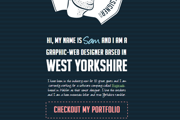
Sam has some nice typography and effects on his portfolio. It takes a little while to load as there are lots of images and textures. But the design is fantastic and his portfolio work is great too.
Eric Smith
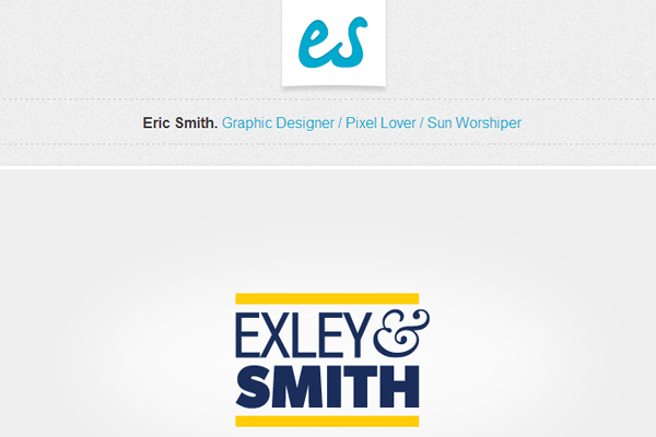
Eric Smith has some clean branding along with a very clean webpage. The homepage itself could include a few more examples but the links into his portfolio do work.
Mathieu Croset
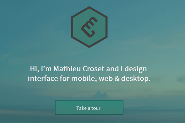
Here’s a really cool example of branding. The icon on his homepage is very unique and stands out quite a bit. I love his artistic style and his work is very intriguing.
Tim Smith
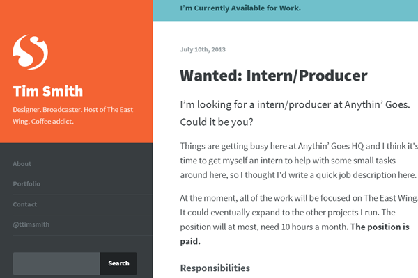
Tim’s website seems very clean yet efficient with space. His colors work great and I give him a lot of credit for the simple design. It’s not just plain white, but it’s not overly complicated either.
Peter Deltondo
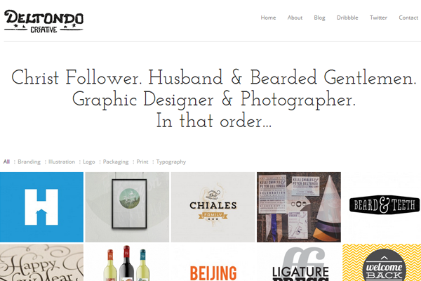
Cool text in this logo which does draw your attention into the page. His creative work is featured right on the homepage with a prominent view of other links.
Ninetofive
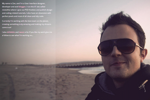
Here’s a more personal portfolio featuring a photo along with some details. This page includes links out to his social profiles along with some info describing what he does.
Sahan Eken
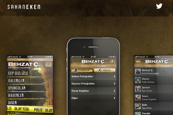
Very cool textures for a brown portfolio design. The homepage is split into horizontal sections which detail various project work over the years. Cool interface with some great aesthetics.
Hyemi Oh
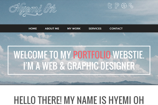
Here’s a strange portfolio style with odd yet fascinating typography. I really like the design and it’s got some true spirit in this layout.
Ryan Harrison
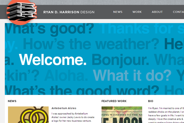
Ryan’s portfolio just oozes branding. His unique design style really comes through on his website and just feels overtly confident. Excellent way to showcase a sample of portfolio work.
Vanessa Fahy
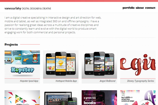
Vanessa uses a lot of smaller text and bigger thumbnails on the homepage. It’s a simple design but stays focused on the primary objective.
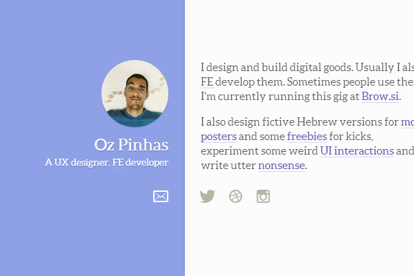
Oz Pinhas
Oz has a 2-column portfolio which also includes some descriptive text and social links. Very basic but not too basic – it’s got a nice feeling for simplicity.
Lin Chervenkova
The Mindful Pixels website has a lot of cool features. I love the header and the rotating slideshow. All the work is great and the layout is designed with such elegance.
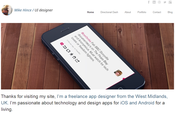
Mike Hince
Mike simple UI showcases the type of work he can do. Definitely a clean yet simple portfolio, it’s fully responsive and works great on any screen size.
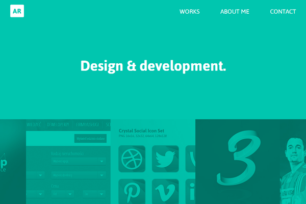
Arkadiusz Radek
A lot of green on this page which works in unison to the B&W style portfolio. I like the design because it’s odd, yet captivating. The portfolio items are right where you expect them to be.
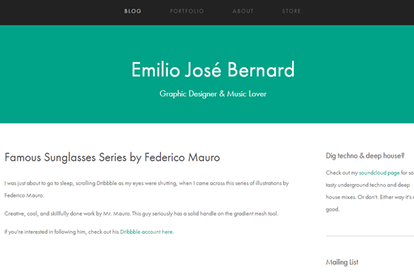
Emilio Jose Bernard
Emilio uses a bit more green but keeps it all quite simple. His design is easy to browse and the text is a little bigger, too. Nice split between header and content.
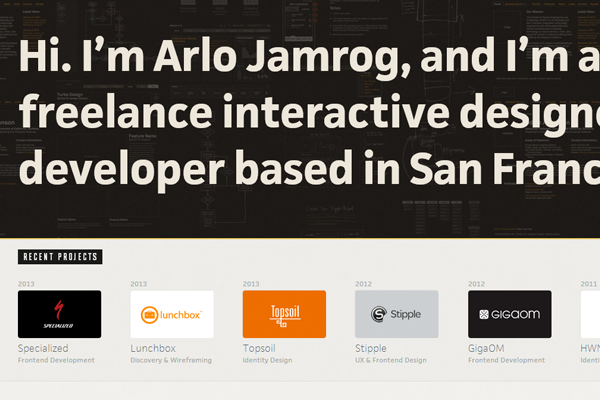
Arlo Jamrog
Arlo uses a lot of big text to get his point across. The site loads quickly and features a great number of his portfolio items right on the homepage.
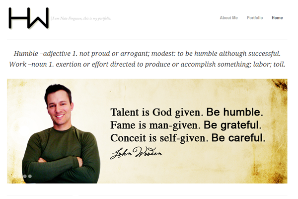
Nate Ferguson
Nate does have a cool website and it seems a bit personal in regards to his work. I like the style and the unique page layout – it’s fair to say this is a one-of-a-kind design.
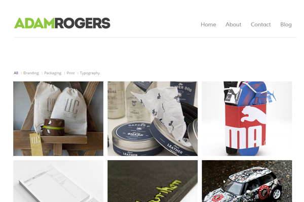
Adam Rogers
Adam’s logo is another example of great typography. The homepage uses filter links to sort through portfolio entries. For a minimal portfolio this design works very well to showcase his talents.
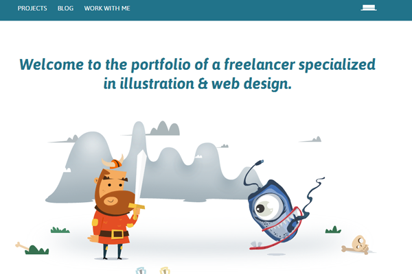
Catalin Boroi
This is a portfolio that shows illustration experience by example. The homepage doesn’t just feature project work – it uses vectors and illustrations to decorate the layout. Keep this in mind if you have any Photoshop or Illustrator expertise.
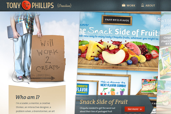
Tony Phillips
Very cool logo design fitted right into a nicely-textured header bar. Tony does some great work and his branding show this perfectly. It’s a unique portfolio layout with a lot of cool features.
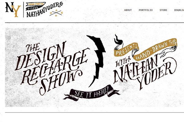
Nathan Yoder
Some creative icon work coupled with typography brings this portfolio to life. It’s a simple layout with some explosive design trends.
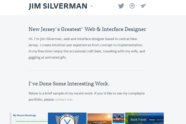
Jim Silverman
Jim’s website uses a fixed header and some very clean text. Great example of a light blue portfolio including lots of work samples on the homepage.
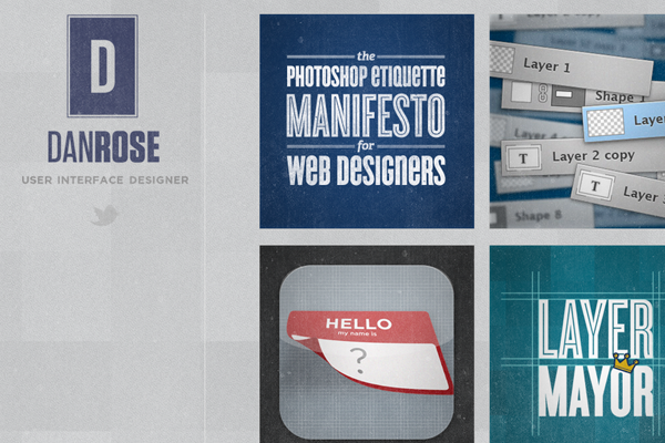
Dan Rose
Dan has a very simplistic portfolio with a lot of pizzazz. His text is big, loud, and easily readable. Also his work is phenomenal including a lot of Photoshop talent.
Daniel Tiller
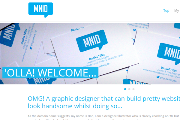
Here’s a really cool site with branding in mind. This includes a few projects on the homepage along with some further details about the design work.
Geri Coady
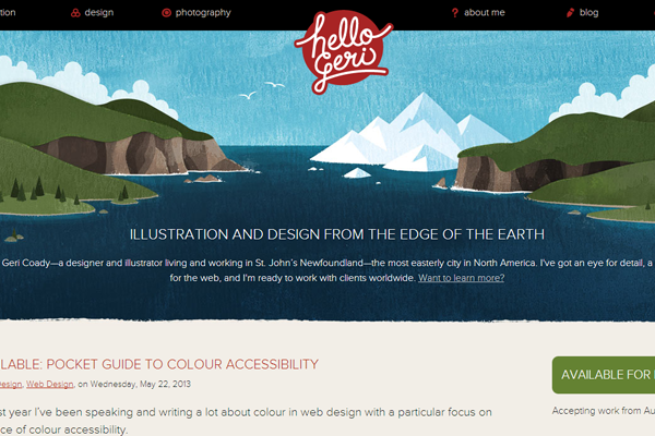
A large expansive header is always something which catches my attention. I love this type of vector work and it looks beautiful when placed onto a website. Geri’s portfolio is one such example.
Andrew Hoffman
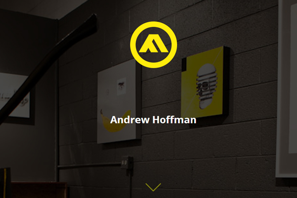
Andrew’s website behaves more like a CV or resume listing his past education, work experience, and skillset. It uses very small yet simple typography and bright yellow highlights to stand out from the page.
Anil Tortop
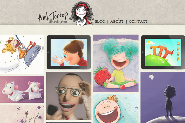
Anil is a wonderfully creative illustrator using her talent to design such an awesome portfolio. All of her work samples are extraordinary and the header design is especially pleasing.
Pascal Gartner
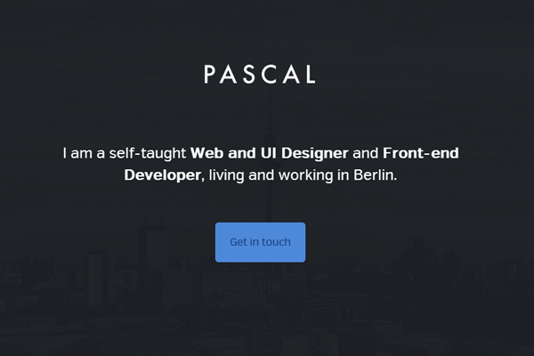
Pascal has a real simple flat website layout using animated page effects. He primarly does development work but you can tell he has a good taste in design. The website is simple and very easy to skim through.
Erik Frick
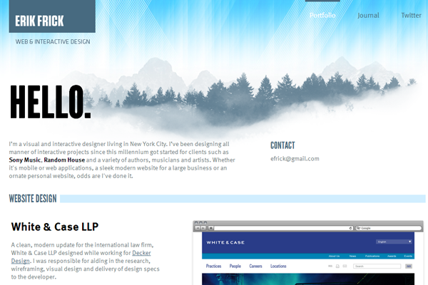
Erik’s homepage uses an infinite loading effect to add more entries onto the page. Once you reach the bottom more portfolio items will be loaded into view. It’s a tricky effect which doesn’t always work – but I really like it on his site and it could work well on yours, too.
Edmund Reed
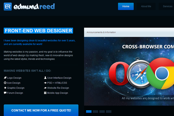
Here’s a very dark yet detailed website including a lot of animated effects. At some points I feel there is too much dynamic content to the point where is slows down the website. But overall he’s created an outstanding effect and the layout does look extravagant.
Ilias Sounas
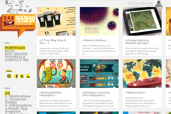
Ilias has a 2-column illustration portfolio which has some cool CSS3 animations. I really like the responsive layout as you resize the window smaller. He doesn’t need too many navigation items so it’s an easily responsive design.
Pavel Macek
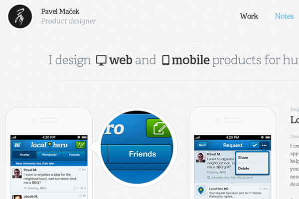
Pavel’s homepage is small yet poignant. The header includes a bit about himself and the other 2 panels feature his portfolio work. It’s really a simple design but it appears more complex with the color scheme and layout structure.
Chris Fernandez
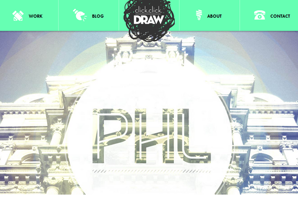
Chris’ fixed header uses a very creative logo “Click Click Draw”. He does some outstanding character work and his design quality is impeccable. Great portfolio with a great sense of design.
Piper Lawson
Piper has a real clean website featuring dozens of great portfolio entries. I really like this style because the header flows naturally into the body. Page typography differs with each section and it creates a more desirable effect.
Laura Noll
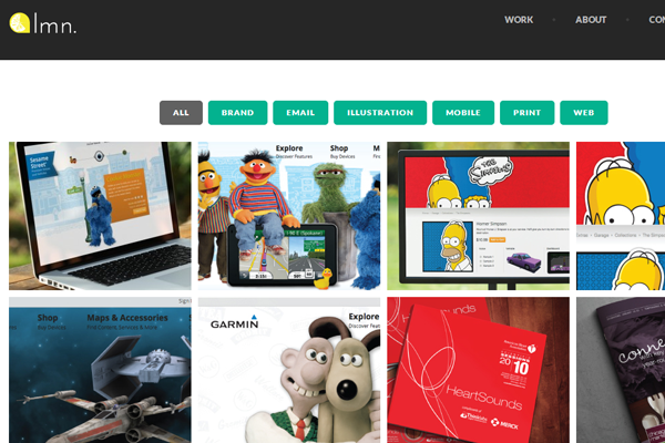
Laura’s webpage is very basic with easily-accessible content. Her homepage also features a filterable portfolio with web design, print design, illustration work, and other categories.
Marcus Eckert
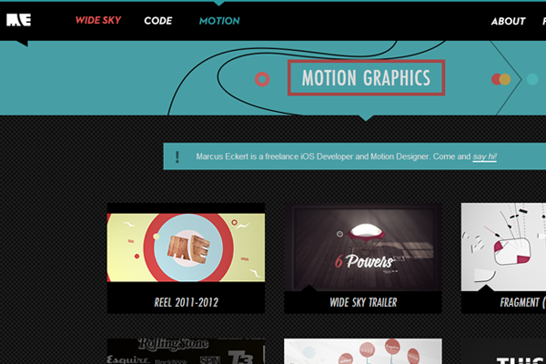
Beautiful typography fitted onto a very interesting layout. The use of textures and colors seems odd yet pleasant. This freelance portfolio has a lot to offer and the layout relies heavily on customization(ex: FAQ blockquotes).
Marilyn Rose
Marilyn’s portfolio website is as clean as they come. Easy navigation, easy content, and deep contrasting text. It may not have fancy bells & whistles but it does work, and it works good.

