Perhaps it would be best to start here with the why. About a quarter of all websites run on WordPress, the online blogging platform. This makes it by far one of the most popular open source content management systems on the planet.
The vast majority of web designers still use Photoshop to design a website, although there are alternatives. This means that a lot of website designers need to find ways on how to convert PSD files to a responsive WordPress theme!
Now, this might seem fairly straightforward. However, converting a PSD file into a WordPress website is not exactly easy. It requires a lot more than just Photoshop skills! In order to turn your PSD file into a responsive theme that can be used on WordPress, you will need knowledge about front end web development languages such as HTML, CSS and JavaScript, as well as the backend programming language PHP.
Now that the why is out of the way, it’s time to proceed to the how! Although the how certainly is not easy, it can still be accomplished in five fairly simple to understand steps!
Step One: Create the web design
Skip to step two if you’ve already designed your site.
There is a lot more to making a website than simply creating a logo and putting in a menu, a sidebar, a footer and the content together. The pieces in this puzzle need to be created in the first place, and the process of this creation is something that not everyone can do so easily.
The web design you create needs to be that perfect balance between form and function, a web design that caters to a great user experience.

Research
In order to create a web design that successfully meets the criteria of looks and functionality, you will need to do some serious research. First of all, who is your target audience and what does your target audience want? These are obviously key aspects of your research.
Learn From Others
Another aspect of web design that you need to research is the techniques your competitors have applied. These competitors are most likely better established than you are, so you’d certainly be able to learn a lot from the design that they use! Once you’ve done your research and you have a good idea about how your website should look, you should start thinking about functionality. What functions do you want your web design to possess?
Wireframe
Once you have everything sorted out, get it down on paper. Draw & sketch what you envision your site to look like in order to have a visual aid as you move forward!
Design
Once you have finished making the physical sketches / wireframes, you’re ready to hop into the captain’s chair and fire up Photoshop. The first thing you need to do before you start in earnest is to make sure that you are using a column based grid such as XXgrid. This will make your design look really tidy and aligned! This isn’t just for aesthetics. Using a column based grid to create an aligned design will make it easier for you or your front end developer who will be developing the HTML and CSS to create an optimized, responsive layout for tablets and smartphones!
Before you move on to the next step, remember that you need to keep your PSD design files organized in layers, i.e. each section should have its own folder with corresponding titles!
Step Two: Slice the PSD
Once you have created a web design that you are completely satisfied with, it’s crunch time. Basically what you need to do now is the PSD to WordPress process.
Websites these days are all built using HTML5 and CSS3. These are far better than XHTML and CSS2, because instead of all of the buttons, borders, gradients, rounded edges and all of the other features being created using images, they are created as functional parts of the CSS3 coding. Hence, slicing the PSD file will basically now only involve slicing the background images from the PSD!
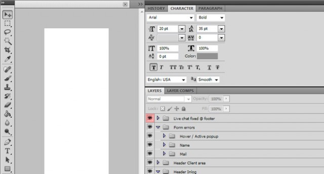
To do this, you will need to open the file in either Photoshop or Illustrator, depending on which software you used to create the design. If the designer had done his job right, he would have created a well-structured design file with folders and layers, making it easy for you to find what you need. Study the web design and look for images that you think would need slicing. These are basically any images that can’t be created using CSS3, usually the logo and background images. Read how to slice images here.
Once you replace these background images using CSS, you will see an enormous drop in load times. This would attract a lot of users to your site, because the average internet user can’t stand long loading times!
Step Three: Create the HTML, CSS3 and JavaScript (jQuery)
Once you have sliced the images from your PSD file, it’s time to create the HTML5 and CSS3. The first thing you need to do is create a new folder in which you create index.html and style.css. Also, create a sub folder called images or img (whichever you prefer) and place the images you’ve extracted in this folder. Create another folder called JavaScript or js. This is for later, so you can store all of the JavaScript and jQuery files in a well-marked location. Once you are done creating all of the folders, files and subfolders, it is time to start building the HTML5 and CSS3.
HTML5
HTML5 is a relatively new language that possesses both XHTML as well as HTML functionalities. This language is essentially used to create the basic structure of the document, as well as appoint all of the elements of the page. HTML5 has separate elements for the different sections of your website, such as the <header>, the <nav>, the <aside>, as well as the <footer> elements (and much more), which enable you to create a neat, well-structured document that is universally readable. Here are some excellent resources that you can use to learn or refresh your memory about HTML5.
HTML Resources
W3Schools is the number top website for learning the basics of HTML5. Every element and attribute of this language is explained and taught using demos, making for an easy learning experience.
Mozilla Developer’s Section – The folks behind the popular browser Mozilla Firefox have a developer’s section on their website. You can use this section to learn a lot about HTML5 through the tutorials they have there, whether you are a beginner or an advanced coder.
Web Design Tuts – This website has a lot of different HTML5 tutorials, some of which are free and some of which are paid for.
W3 – This website is responsible for the development of all of the open web standards that have been created in order to ensure the longevity of the web. Here you can find in depth information about HTML5 as well as all of its latest developments.
W3 Validator – Once you have completed your HTML5, put it through this validator. It will tell you if your HTML5 meets the w3 open web standards!
CSS3
CSS refers to Cascading Style Sheets, and CSS3 is the latest version of this front-end language. CSS3 is used to take the bare bones of the elements created using HTML5 and shape, position and style them. This allows you to create a consistent web design in which all of the elements confirm with the site’s overall design. Once you have used CSS3, you will find that your HTML5 will be a lot cleaner and more well-structured, which in turn will allow it to load a lot faster as well as allowing it to be indexed faster by search engines. Below are some resources to help you learn or refresh your memory about CSS3:
CSS Resources
W3 CSS – W3 is on the most well-known and renowned resources for CSS3 tutorials and examples of the various CSS3 selectors, properties and values. The best part about this is that every tutorial has a ‘try it yourself’ page, which lets you apply what you have learnt.
Learn CSS3 – Mozilla isn’t just the creator of the Firefox browser. It is also an excellent place to get yourself familiar with CSS3, as well as update your knowledge regarding the language.
CSS Web Design Tuts – This website contains a whole cornucopia of tutorials that you can go through. Some of these tutorials need to be paid for, but others still are completely free, and can teach you a lot about CSS3 selectors, properties and values.
W3 CSS – This website is a great place to stay updated with the latest CSS3 news, because this is the very community that develops the CSS3 web standards. It’s also a great place to find out technical information about the language.
CSS Validator – This is the validator through which you should run all of your CSS3 before you make the website public. This is in order to make sure that your CSS3 meets the web standards set by W3!
Responsive Design
The internet has come a long way since its inception. This is due in part to the advent of smartphones and tablets, and the proliferation of these types of technology into our everyday lives. As a result of the immense popularity of these devices, a significant chunk of the total users of the internet look at websites on significantly smaller screens than the average laptop. Additionally, they interact with these websites not by using cursors, by using their fingers. Hence, the modern website needs to be able to adapt to the various types of devices that are out there. This is where responsive design comes in. Using responsive design, designers are able to make a website that can adjust its entire layout based on the type of device it is being viewed on.
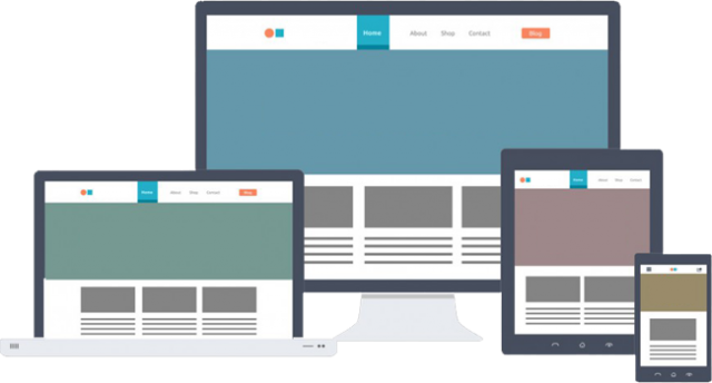
It is a good idea to decide beforehand whether you want your new website to feature responsive design or not before you start building the HTML5 and CSS3. This is because when you code the responsive part of your website’s design, you’ll need to work with CSS3 media queries. Using these media queries, you can define different textures and styles for different screen resolutions.
Remember never to use fixed widths, use percentages instead. This is referred to as fluid or liquid layout design, which allows you optimize your website not just for the resolutions defined within your media queries, but for all of the resolutions between them as well. This is a huge advantage for your website since the smartphones, tablets and computers that are coming out today have so many different sizes, and therefore resolutions, and you need to accommodate all of them.
Responsive Resources
Here are some great resources you can use in order to refresh your memory or learn about responsive design and all related coding:
Google Responsive – This is a great resource for those of you that are new to responsive design using CSS3 media queries.
Principles of Responsive Webdesign – Read this article to understand the difference between responsive web design and adaptive web design. It has some great examples to help you understand things in detail!
Fluid Grids – You can use this excellent article by Ethan Marcotte to learn about fluid grids and how to use them. Try use the examples provided in the article yourself!
Responsive front-end framework
If you are unwilling to learn the ropes as far as CSS3 media queries are concerned, or perhaps you simply don’t have enough time for it, try using a responsive front-end framework instead. If you decide on using a grid framework, keep in mind that you need to apply the same framework to CSS as well as the HTML, since you will be working with pre-defined classes and IDs to connect the framework created using HTML5 to CSS3. Using a responsive front-end framework will certainly allow you to develop your website a lot faster, but on the downside it will also slow down your website’s load times due to the large amount of code that you won’t be using.
Some of the most popular front-end frameworks are:
Bootstrap – This responsive framework is fairly easy to implement, and an added bonus is that it uses a CDN to reduce the impact of your website’s loading speeds as well.
LESS – This is an adapttive CSS grid framework rather than a responsive one which allows you to create an adaptive layout.
Foundation – This is a front-end grid framework with a file size that is absolutely tiny in order to minimize the impact it will have on your website’s loading speed.
JavaScript (vs CSS3)
JavaScript is one of the most popular programming languages in the world currently. This is due to the fact that it is supported by a wide range of browsers and also due to the fact that it contains libraries such as jQuery, and backend systems such as Node.js as well as frameworks like AngularJS. It’s no wonder that so many developers swear by this programming language! However, in recent times JavaScript has started to become obsolete, as many of its functions have started to be taken over by CSS3 animations, which allow you to animate transitions between styles.
Javascript Resources
W3 – This is an excellent place to start if you are new to JavaScript, thanks to the excellent tutorial that is available on this website.
jQuery – Once you have some experience with JavaScript, you can start using libraries like this one in order to program a lot more easily. jQuery is the most popular JavaScript library by a mile.
NodeJS – If you prefer backend systems but at the same time love JavaScript, check out this website.
AngularJS – Combine the formidable forces of HTML and Java by using this framework and get some dynamic views.
Be sure to check out the follow resources before you start using JavaScript to animate elements on your website while you can probably also use CSS3:
CSS3 Animations – Once again we turn to w3schools for our CSS3 tutorials. Peruse the demos available on this website in order to understand all of the different CSS3 animations.
Mozilla Animations – Further your knowledge of CSS3 animations with the nine samples and examples that Mozilla has provided.
Step Four: Build the WordPress theme files
Now that you have successfully converted your PSD designs into HTML5, CSS3 and JavaScript, it’s time for the major conversion: turning your HTML into a full responsive WordPress theme. Remember to follow the WordPress template hierarchy in order to make sure your themes will actually work. The general order is to start with header.php, followed by index.php, footer.php and style.css. You will be using these four templates on all of the pages of your website.
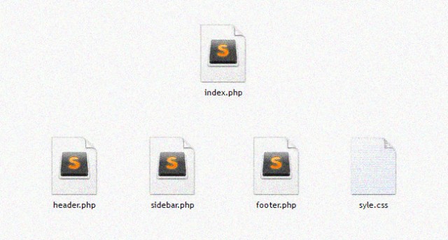
Once you have a full understand of how the template hierarchy works, you need to start breaking the HTML files into pieces. You can start off by creating a folder in the themes folder that you can find in your WordPress installation, the address for which is /wp-content/themes/. Create the file header.php in this folder. This file is what you will use to declare the document type as well as all of the items that belong in the header of your page, such as the metas, title, stylesheets, javascripts and so on. Once you are done with this, create footer.php and paste all of the footer elements into your HTML document. If the design of your website includes a sidebar, create a file named sidebar.php as well and include all of the pertinent coding within this file.
Once you have completed the creation of all of the elements of your website in these files, you need to start creating your homepage. There are several ways you can do this. For example, you can simply create index.php, frontpage.php or page-home.php, any of these files will be suitable for what you are trying to do so the final choice is entirely up to you. Now that you are done creating one out of the three templates for your homepage, include all of the .php files you have just made. Now that you have your top, bottom and side ready, paste the HTML5 of your homepage in between and you will have successfully created the homepage of your website. Simply follow the same process for all of the pages of your website and you can move on to the next and final step.
Step Five: Use WordPress inbuilt tags and functions
Once you have successfully created the theme for your WordPress, you now need to make sure that you are able to edit your website from within the admin panel rather than having to alter the theme file every time you want to change something. Possibly the most popular WordPress functions to make all of your content editable via the admin panel is by adding the add_meta_box function. Simply set up meta boxes for the content on each page and you are good to go!
Creating the core functionalities of your website is pretty easy using WordPress. For example, displaying information such as links on your websites can be done easily using WordPress functions. Simply check the function reference page for WordPress to see all available functions.

Similarly, WordPress also offers template tags. These are essentially functions themselves, with the only difference being that they were created specifically for specific themes that make them more efficient.
WordPress menu
When you log in to the admin panel of your website, you would probably want to change the menu items in Menus and Appearance so that you won’t have to edit it using the admin panel. This is fairly easy thanks to the fact that you are using WordPress, all you need to do is replace the menu list of the template file with one line of PHP, after which you can simply start adding menu items.
There might be situations in which an inner page has a different header or footer. To add this functionality to your website, all you need to do is add conditional tags. These allow you to apply different code for selected pages or posts.
Once your WordPress website is up and running on your development server, all you need to do is get it on your live server. Here is an article where it is explained in great detail how you move a WordPress site, step by step. Simply follow all the six steps provided and you will have your website up and running on a live server in no time.
–
This article has been contributed by PSDtoWP.net who specialize in the PSD to WordPress process. Twitter: @BRoesink
