Want a flawless-looking website? Start with web typography, the secret to a killer website.
Do you ever feel overwhelmed by the thought of designing a website?
With 100,000 different fonts and 16.8 million colors on the web, the possibilities are virtually limitless.
For some people, your imagination might soar as high as the Burj Khalifa. For others, you might feel so paralyzed, you’d rather binge-watch a season of House of Cards.
If the thought of designing a website is overwhelming to you, you’re not alone.
Together, we’ll go through a step-by-step guide on web typography that will take 10 minutes. If you follow it step by step, you will apply web typography best practices to enable clear communication. You will design a beautiful, comfortable reading experience.
Let’s get started.
1. Select a font
Every sentence you read on a screen uses a font. It controls the mood and visual appearance. Here is a list of the top 7 best flat ui design web fonts.

What are your favorite web fonts?
2. Modify the font size
Traditionally, the web has tortured us with teeny fonts. Research studies show that large font size evokes stronger feelings and convey meaning.
So how do you determine font size?
Start with the body text, change the font size to 15–25px.
Here’s an example of the opening chapter of Harry Potter and the Sorcerer’s Stone. The font is set to Proxima Nova.
On the left, the font size is set to the default of 12px. Such a small font size will strain your eyes. After increasing the font size to 15px, reading Harry Potter is much better.

Doesn’t the 15px font size feel so much better on your eyes?
3. Scale your headings
Headings serve as signposts for readers so that they can quickly digest the overall structure of you articles. Limit yourself to two levels of headings.
Change the primary heading to 180–200% of the body text. If you have a secondary heading, modify it to 130–150% of the body text.

4. Set the line-spacing
Sometimes it’s super stressful to read text because there’s a lack of white space to let it breathe.
To make a block of text easier to read, set the line spacing to 120–145% of the point size.

Within Sketch, go to the left-panel: Spacing > Line
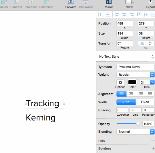
5. Add tracking and kerning to make the text look more roomy
Tracking affects the space between the characters in a group of text. What should you use? Within Sketch, I eyeballed it by using these two rules:
- Use less spacing for larger font sizes
- Use more spacing for headlines

Within Photoshop, Scott Butterick swears by the “Metrics” option.
Kerning is the amount of space between two characters.
Within Sketch, you can use the “Character” input field. Here’s a quick GIF of how to change tracking and kerning:
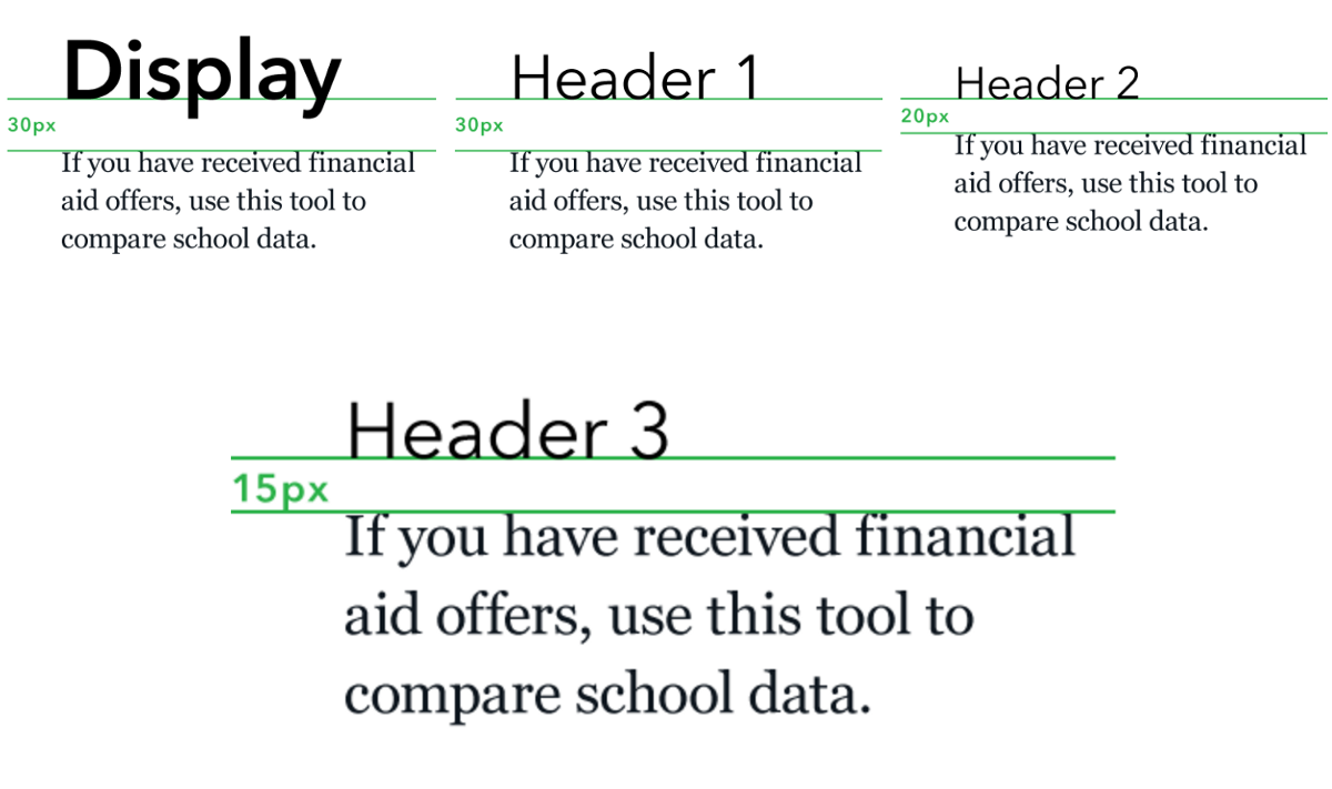
6. Add white space between the headers and the body text
Negative space affects how you focus your attention on content. The spacing between the header and the body text should feel open and light, but not tight enough to signal a clear relationship between the elements.
When you set the headers and the body copy, the white space should be 15px, 20px or 30px.

7. Use a line-length of 45–90 characters
Another best practice is to limit the width of a text block.
The optimal length of a line for a single column page is 45–90 characters. The ideal width of a text block is 66 characters.

If you use over 90 characters per line, your readers will feel overwhelmed. They will abandon the text.
Psychologically, your subconscious mind gets excited each time you move to the next line.
At the beginning of each new line, your attention is focused. However, focus slowly wears off as your read the words down the line.
Conclusion
Even as a design professional, I always consider myself a design student. The most challenging part of working on visual design is recognizing spacing and deciding what to do. I’ve made it a personal goal to focus on this topic and write about it here so that together we can make design decisions without the anxiety.
With these 7 tips, you are on your way to beautiful web typography!