Screen reader basics
I use a screen reader on my mobile device every day, so it’s a technology I’m very familiar with. But I know it’s new and strange to most people. So let’s go through the basics!
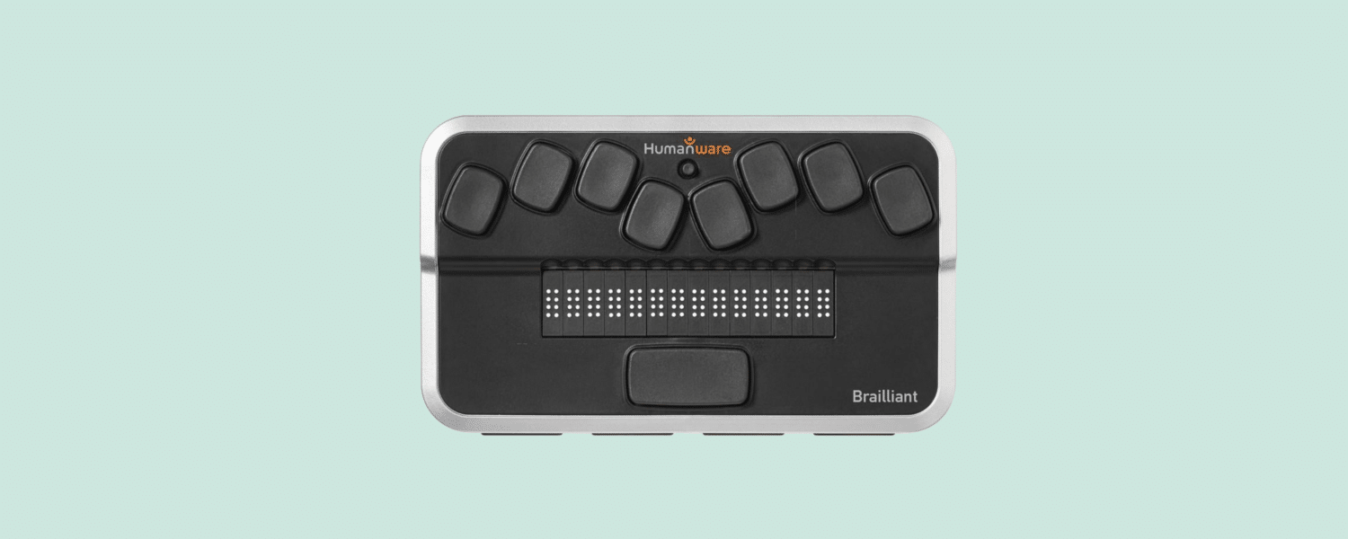
Screen readers are mainly used by people with no or limited vision to get information in a way accessible to them: braille, speech or both.
The best way to understand is to watch it in action. So here’s Marc Sutton showing a desktop screen reader.
At the end of this article, we’ve added a few more videos with screen reader users, showcasing different screen readers on different devices. So scroll down and check them out if you’d like!
Fasten your seatbelt – they are quick!
The first thing most people comment on when meeting a screen reader user is the speed at which the synthetic voice speaks. The Finnish developer Tuukka Ojala has his set at 450 words per minute. Here’s a 5 second audio clip of what that sounds like:
Pretty awesome huh! For reference, most sighted people read at about 150 words per minute, so he’s able to read at 3 times that speed. You should check out Tuukkas own article on this topic, where you’ll also find a longer audio clip of the screen reader speaking at lightning speed:
Software development at 450 words per minute
How are screen readers used?
One thing that most people I meet haven’t thought about is that many screen reader users, like myself, have some remaining vision. So we often use a screen reader in combination with sight. For instance, I’ll sometimes rely on my sight for general navigation using a screen magnifier. Then I’ll turn on the screen reader when reading longer texts. On smaller devices I’ll rely more on the screen reader and on larger devices more on screen magnification.
A great resource to understand screen reader users better is the Screen Reader User Survey by WebAIM, which over a thousand people respond to about once every other year. The survey goes through things like:
- Screen readers most commonly used
- Web browsers
- Operating systems
- Reasons for inaccessibility
And much more! So head on over to that site and learn all you need to know. But below is a summary of how desktop and mobile screen readers are used.
Desktop screen readers
On a desktop, users will usually navigate using their keyboard. Either stepping from object to object or by jumping between different types of components, like headings, forms, links or landmarks.
Thanks to the awesome Screen Reader User Survey mentioned above, we know that most desktop screen reader users navigate between headings when they arrive at a new page. For instance by pressing the h-key in JAWS – one of the most used desktop screen readers.
There are many keyboard shortcuts for screen readers that lets you do everything from searching content to identifying the font of the text you currently are reading. Here is a list of around 100 shortcuts for the JAWS screen reader.
Mobile screen readers
Even though it’s possible, most screen reader users don’t connect a keyboard to their mobile devices. Instead, we navigate by moving our finger on the screen in one of two ways:
- Touch navigation: dragging our finger across the screen, and getting what’s under our finger read to us.
- Swipe navigation: Swiping left and right to move to the next or previous item. Kind of like using the tab-key on a computer keyboard.
It’s very common for people to switch between these modes of navigation. I myself prefer using the touch method most of the time, but then I’ll switch to swipe navigation if I suspect I’m missing something on the screen. Swiping is a more thorough way of navigating, since it sets the focus on every item, even on the smallest of click targets. But it usually takes a bit more time than the touch method.
A super handy feature for people who know braille is the braille keyboard in iOS devices. Here’s a video showing how that can be used.
Try it yourself
A great way to learn about screen readers is to try one yourself! It takes a bit of training though. Rob Dodson has made a few great 7-12 minute tutorials for Mac, Windows, iPhone and Android!
Let’s start with the iPhone!
Moving on to Talkback for Android.
VoiceOver on MacBooks.
Finally NVDA for Windows!
Making screen reader friendly interfaces
Creating screen reader accessible interfaces is a lot about coding correctly. However, you also need to think about making it intuitive, usable and easy to navigate. These ”softer” factors is something many people forget about. But only focusing on the technical aspects will not by default make your interface accessible to screen reader users.
So let’s start with some usability tips!
Make touch targets large
Large touch targets are crucial for people who navigate on mobile devices using the touch method that we explained about earlier. If touch targets are too small, there is a big risk of the user missing them.
Limit the number of links in the site banner
A lot of screen reader users get stuck trying to get through what feels like a million links before the main content of a page. These links are usually in menus, headers and social media share functions. Keep these to as few as possible to enhance the user experience of a screen reader user – and everyone else!
Include skip links
Even if you limit the number of links in the site banner, it can be nice to provide a skip link. A skip link is a way for all keyboard users – including screen reader users – to jump straight to important parts of a web page.

Skip links should be the first focusable elements on a page, and can be visually hidden but shown on focus; in other words: show when the user tabs to them. Here’s an article we wrote all about skip links and what could go wrong with them.
Keep paragraphs short
Short paragraphs make it easier for a screen reader user to go back and read something on a page again. The most common way to read with a screen reader is one paragraph at a time. So huge paragraphs at a time will be harder to skim through.
Use a lot of headings and subheadings
While on the topic of skim reading, it’s important to divide content into many headings and subheadings. Screen reader users will often jump from heading to heading. In fact, the majority of the respondents to WEB Aim’s Screen Reader User Survey say that jumping between headings is their primary way to navigate when they encounter lengthy web pages. If there are too few headings this method will not be effective.
Short paragraphs and a good use of headings and subheadings will also help many people with reading impairments like dyslexia.
Of course, there are more things to think about when it comes to screen readers and usability, but this is enough for this introductory article. Let’s move on to the more technical arts!
Code headings correctly
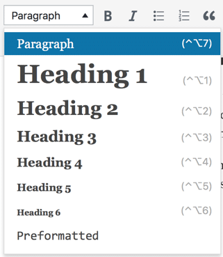
For screen reader users to be able to jump between headings, the headings must be coded as h-elements according to the HTML-specifications. That is: <h1> , <h2> and so on.
If you’re an editor, the thing to remember is to choose headings from the dropdown in your content editor. Do not create headings by styling normal text, like increasing the font size and making it bold.

Also, make sure the heading structure is correct. We see mistakes with this all the time.
A screen reader will tell the user what level the heading is at. So don’t follow a heading on level 1 (h1) with a heading on level 3 (h3). It can confuse the users: “Did I miss a heading on level 2?”. And don’t make all your headings on the same level.
Think of it as an essay you’re writing in Microsoft Word. If you’d make a table of contents, you need to make sure the heading structure is correct. The same goes for webpages.
Give images alt-texts
When coming across an image, the screen reader will read the alt-text of that image. This is supposed to be a description of the image that editors or developers have added. Sadly, many don’t write alt-texts or add keywords to the alt-texts hoping to increase their search engine optimization, which becomes an accessibility problem.
We’ve got an article all about alt-texts you should check out if you’re interested in this topic:
Careful with modals
It’s almost frightening how many times I’ve seen modal windows exclude screen reader users from interfaces. What usually happens is that a modal window opens up but doesn’t receive focus, so the screen reader user is trapped behind it and can’t find it. These modal windows are often crucial confirmation dialogues, asking things like “Are you sure you want to go through with this purchase?”. So not being able to access those components can completely shut users out.
Luckily, there are great resources out there to help you build accessible modals. Here are two:
Accessible Modal Dialogs – A11ycast (YouTube)
Creating an accessible modal dialog (bitsofcode.de)
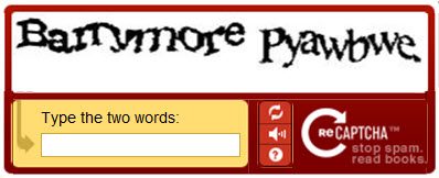
CAPTCHA’s

Don’t use them. Just don’t.
Why? We have dedicated a whole article to that topic: Captchas suck.
Follow coding standards
A really great way to make your interface accessible is to use standard components and follow coding standards. For instance, if you make a checkbox, use the input element with type checkbox, just like the HTML-standard says you should.
It seems really straight forward, but people create custom components like checkboxes all the time. If you create a custom component – for instance by styling a div and adding an onClick-listener with javascript – you don’t get accessibility built-in. You can add it yourself, but it’s often tedious and you need to know what you’re doing. So just use standard components as much as possible.
Learn to test with a screen reader
As a developer, it would be unthinkable to release a website without first looking at it in a browser. Take this notion and apply it to screen readers as well. Learn the basics of screen reader usage, for example by following the video tutorials earlier in this article. And make a habit of always testing your product with a screen reader before releasing it.
Videos of screen reader users in action
Last but not least, the best way to learn is from screen reader users themselves. So here we have collected a few great videos for you to enjoy.
Gayle Yarnall showing how braille displays work.
Saqib Shaikh shows us how he codes using Visual Studio and a screen reader.
Molly Burke showing all her Apple products with the screen reader VoiceOver:
Aaron Cannon demonstrates surfing on the web with JAWS, including both good and bad examples of web content.
Thanks for reading, and if you need any support on this topic, we do training, workshops and other accessibility services that can help you take an inclusive leap forward! Get in touch at [email protected].
If you liked this article…
You might also enjoy these:
Get notified when we write new stuff
About once a month we write an article about accessibility or usability, that’s just as awesome as this one (#HumbleBrag)!
Get notified by following us on Twitter @AxessLab or Facebook.
Or simply drop your email below!
