Neu…what now?
Neumorphism is a fancy word for a user interface design trend. It derives its name from skeumorphism – a way of integrating real-world objects into user interface design. The classic example is the trash can. Neumorphism is basically “New Skeumorphism”, so skeumorphism with a modern twist. It’s got a bit of a “soft” look and feel that reminds a bit of flat design. For a good in-depth article on neumorphism, check out: Neumorphism in user interfaces (uxdesign.cc)
Anyway, it’s causing quite a hype in the design community at the moment, which was sparked by a design created by Alexander Plyuto, posted on November 5th, 2019 on the design community Dribbble:
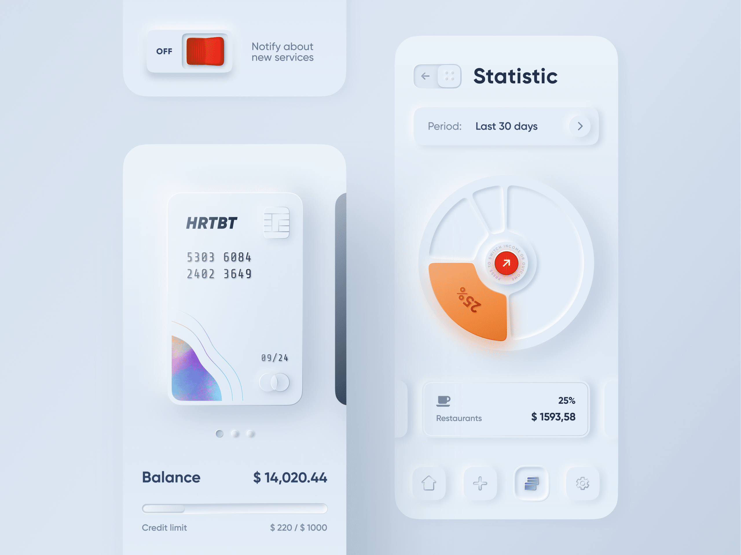
This design went viral, with over 220 000 views and 4000 likes. It also set off a whole bunch of designers who had a shot at the new design technique. Here are some of the most popular designs to date on Dribbble:
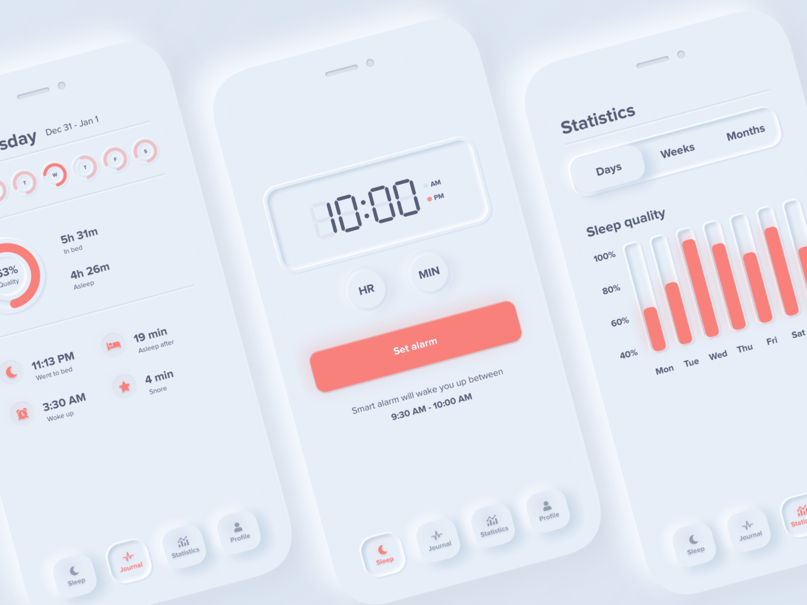
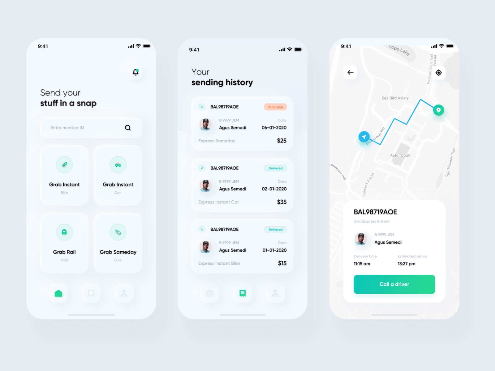
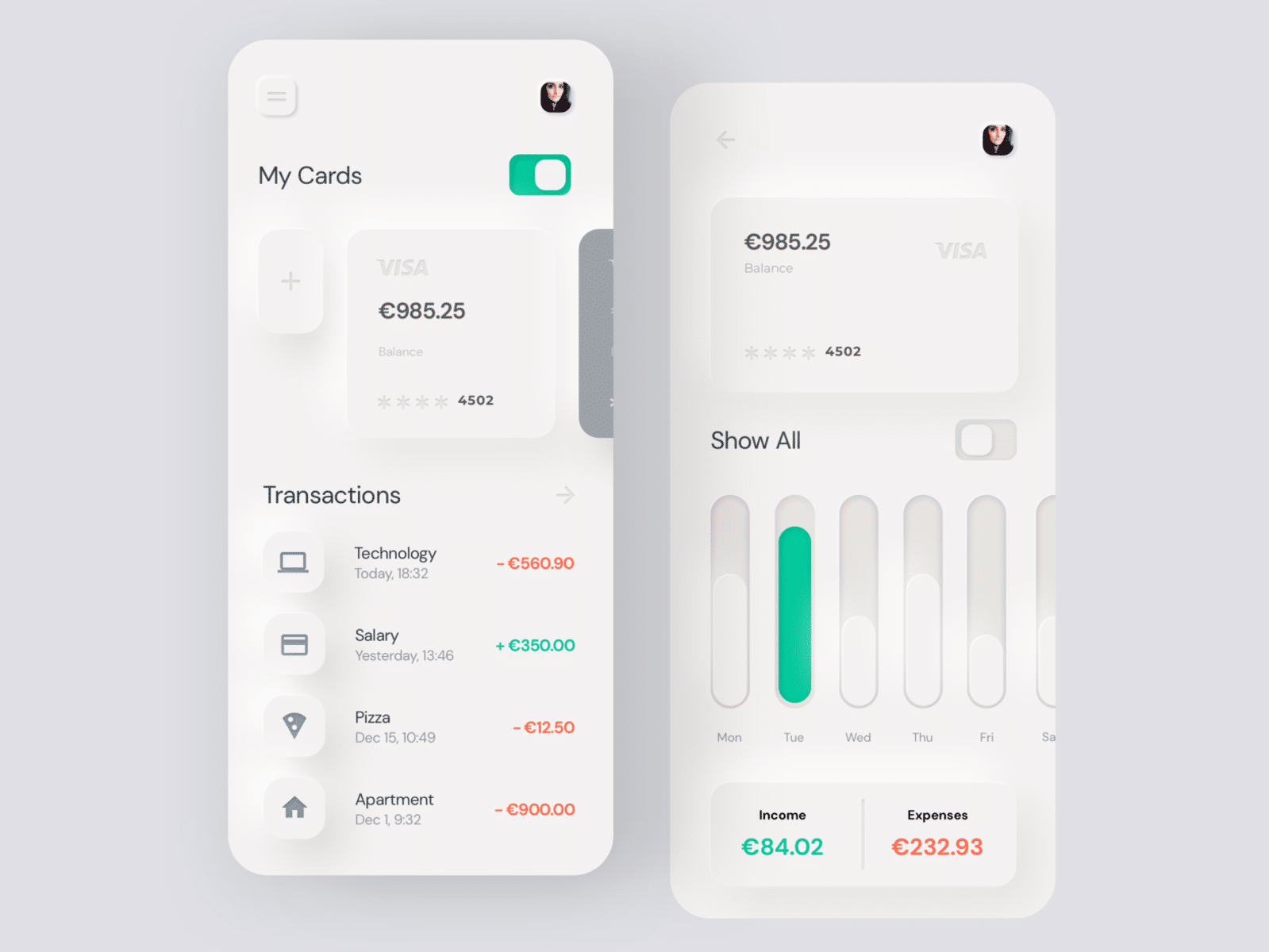
You can find a lot of more designs on Dribbble with the tag Neumorphism.
Hey look, we’re trending!
Many people are pretty excited, predicting neumorphism to be a big trend ahead.
Just discovered the #Neumorphism UI trend and I love it SO MUCH! 😍 pic.twitter.com/piqrHZdwNE
— Javier Salcedo 🇺🇦🌻🐍🏝 (@LudusEstArs) January 9, 2020
Is '#Neumorphism' going to be the hottest UI design trend of 2020? #skeuomorphism #webdesign #uidesign #ui #uxhttps://t.co/iqNA5eGc83
— Webwide • Web Designer & Developer Community (@webwidechat) December 22, 2019
Gary Simon, who has half a million subscribers to his Youtube channel DesignCourse, made a tutorial video named Could this be the BIGGEST UI Design Trend of 2020? #Neumorphism.
The great thing about Gary Simon is that, even though he’s not an accessibility expert, he always has accessibility in mind and regularly talks about the importance of inclusive design. Like in the video above, where he mentions the importance of color contrasts. Which leads us perfectly to…
The potential problems with neumorphism
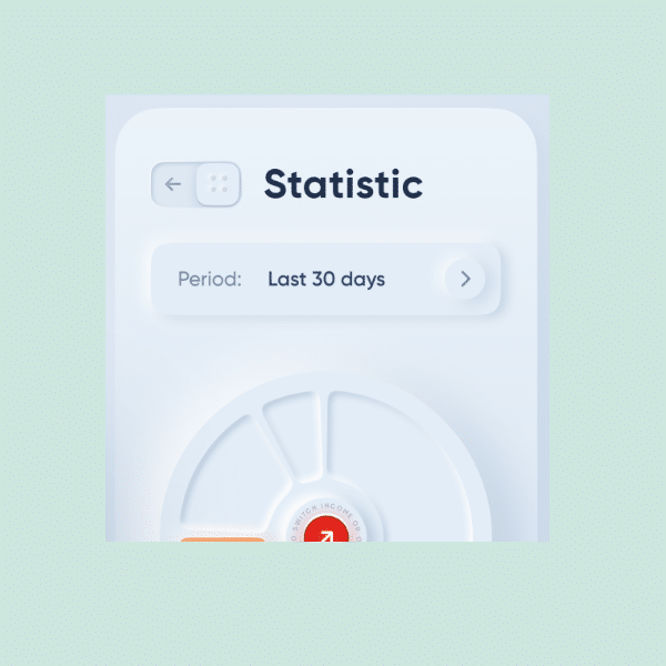
The main problem with this trend are the poor contrasts in almost every design out there. As you probably noted when scrolling through the neumorphism designs above, most of their color schemes are very light grey on white. Many of the interface elements are barely possible to see, even if you have perfect vision. Now imagine what this does for someone using their device in sunlight or users with vision impairments.
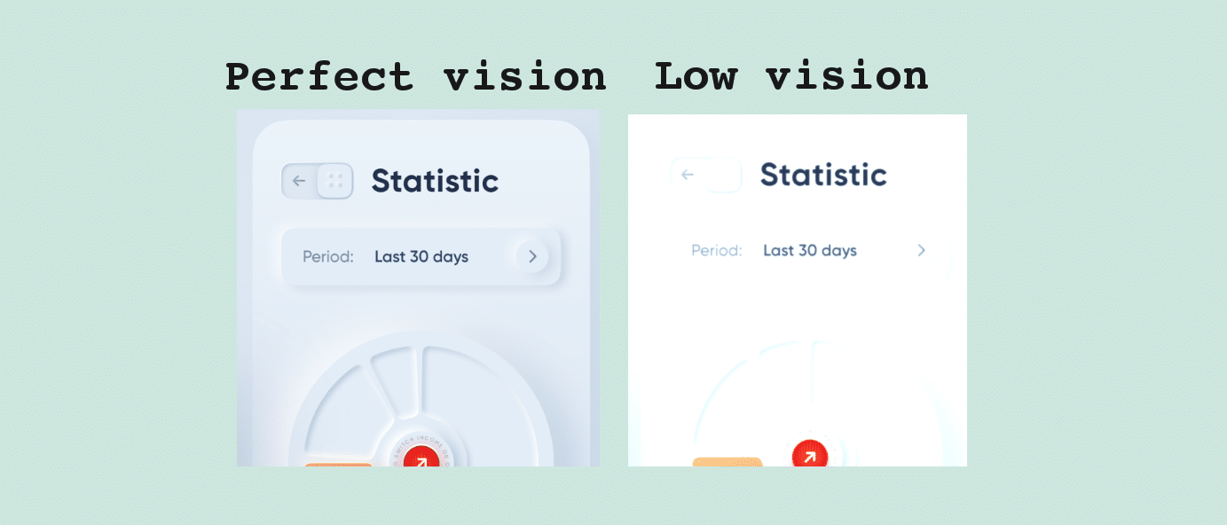
Let’s use the disability simulator Funkify – a browser extension that we are proud to have been a part of creating – to view the original design through a low vision filter:
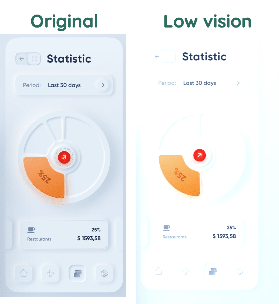
Even though you can still glance much of the text and icons, it’s still quite frustrating to barely be able to identify any of the interface elements, like buttons, cards and charts.
Neumorphism is often referred to as “soft UI (user interface)”. Looking through the designs on Dribbble, it would almost be better to call it “ghost UI”.
Apart from the contrasts, two other accessibility issues are:
- Lack of labels.
Many of the designers seem to remove labels for icons when having a go at neumorphism. Maybe because they’re doing all they can to create a soft, stripped off interface. Icons without labels is something that hurts both the accessibility and usability of interfaces, which we’ve written about earlier in How icons are ruining interfaces. - Understanding what’s clickable.
Users should not need to guess what is clickable and what is not. This is extra important for many elderly users, who will often avoid clicking things that they are not totally sure are clickable. This is the same problem flat-design battles a lot.
Get out of your bubble
Yesterday, an 80-year-old man told me he was stressed. He’d been trying to understand how to pay for parking his car on the street outside here in Stockholm, Sweden. He tried really hard but could not read the text on the parking machine interface, not even with his reading glasses on. He ended up getting a 750 kr (80 dollars) fine.
I believe I’m speaking for most people in this world when I say: we don’t need less legible interfaces. We should go in the other direction.
Judging by the designs on Dribbble, the world’s top designers don’t agree with me. So it’s time to get out of the designer bubble and realize a few important facts.
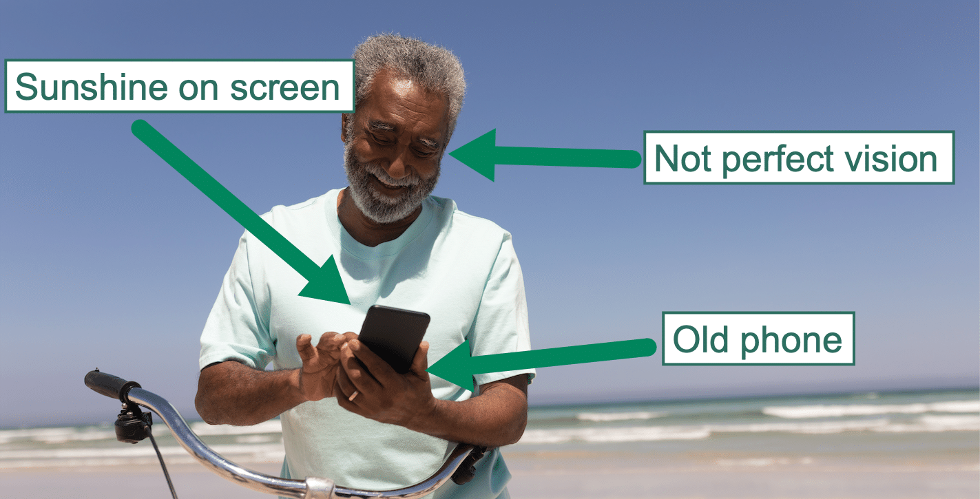
Most people in this world are not young, tech-savvy with perfect vision. Most people don’t experience your interface on 32-inch ultra HD monitors. And you might want to sit down for this last one: most people don’t even care much about how your app looks.
They just want to get something done. And to do that, they need to see what’s on the screen. Even if they’re out in the sun. Or use a small, old phone. Or have low vision.
Is accessible Neumorphism possible?
Definitely! There’s nothing in neumorphism that forces designers to use light grey on white all over their designs. Or that prohibits text labels by icons.
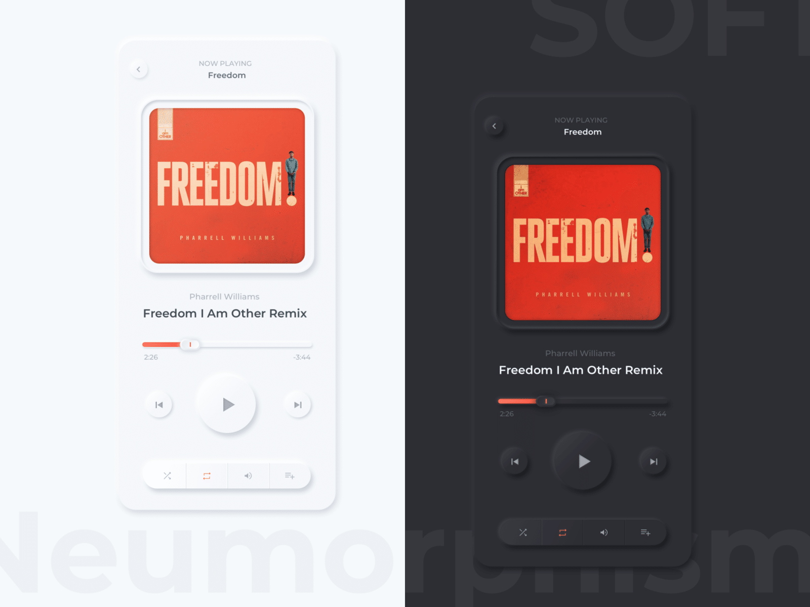
In fact, many of the dark mode designs on Dribble are much better (although not perfect), like the dark version in this one.
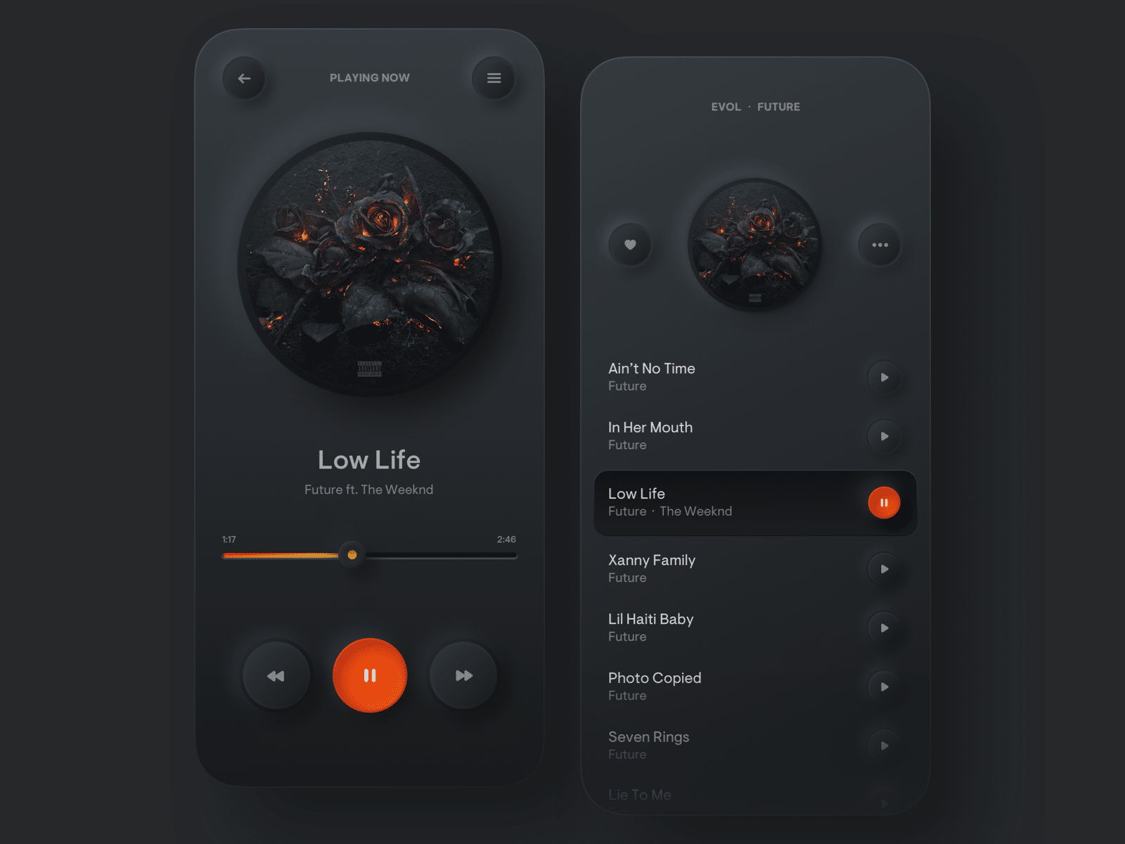
Here’s another dark design where contrasts are better.
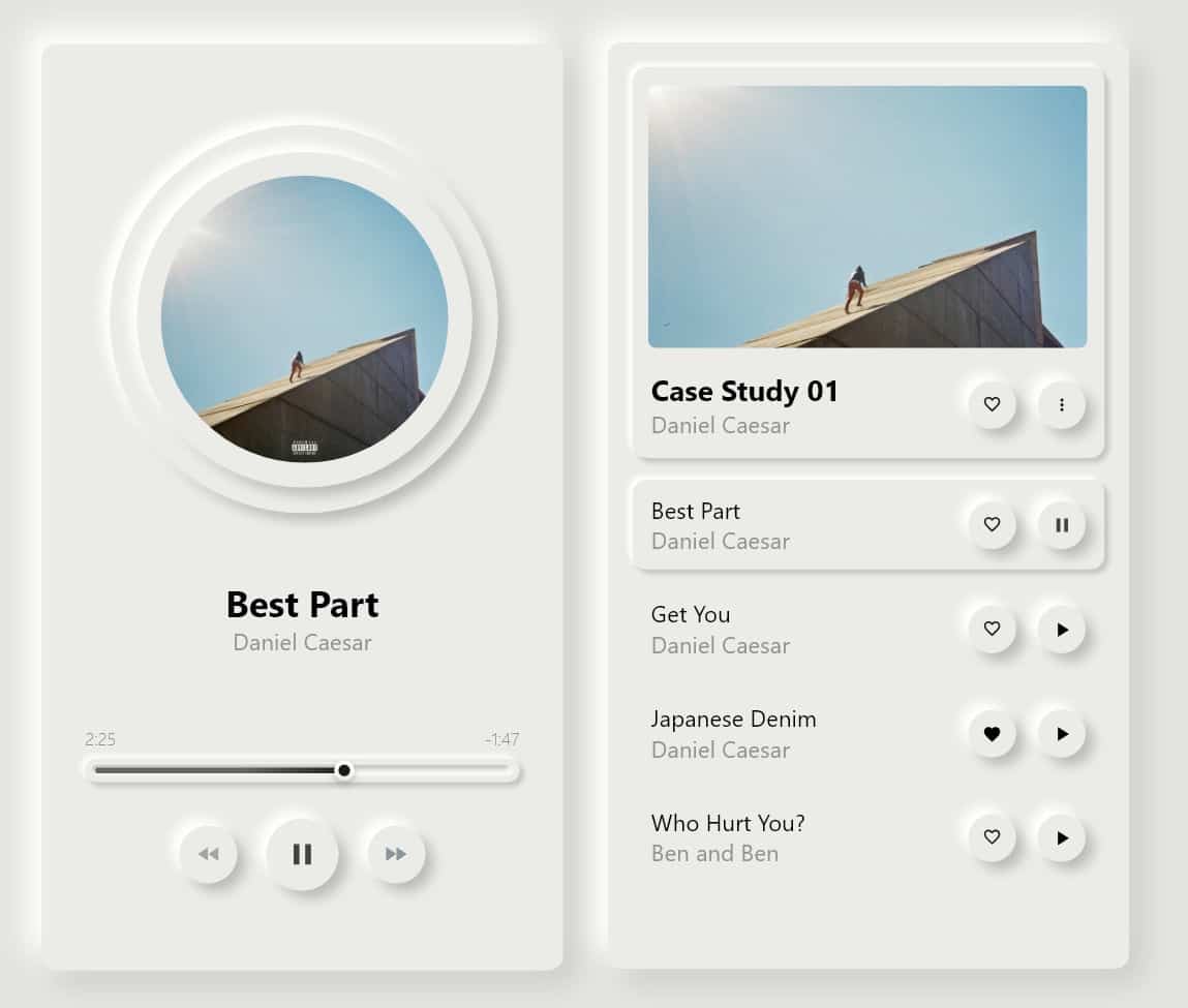
And I even found a bright with okay contrasts – although the borders around the buttons could be made clearer.
So if you’d like to design accessible neumorphism, make sure to comply with the Web Content Accessibility Guidelines (WCAG 2.1) criteria on contrasts. Specifically this one: 1.4.11 Non-text contrast. It basically requires icons, borders and other interface elements to have contrasts of at least 3:0:1. It’s a bit lower than the requirement for text content, which needs a contrast ratio of at least 4.5:1.
Here are some great free tools you can use to measure contrasts: Top seven free color contrast checkers.
In addition to sufficient contrasts, make sure that your design makes it clear what’s clickable and that you label your icons. Then you’re all set!
Wrapping up
The overall goal of creating a soft and clean interface is super positive from an accessibility point of view. Especially when you consider all the users with cognitive impairments who are extra sensitive to cluttered designs. This could be users who are stressed, tired, are on the autism spectrum and so on.
To go all the way, and make neumorphism really inclusive, make sure that:
- Contrasts of text is at least 4.5:1
- Contrasts of button borders, icons and other interface elements is at least 3.0:1
- It’s easy to understand what’s clickable
- Icons have text labels.
Then you’ll have done your part to steer this design trend in the right direction!
If you liked this article…
You may also enjoy these:
Get notified when we write new stuff
About once a month we write an article about accessibility or usability, that’s just as awesome as this one (#HumbleBrag)!
Get notified by following us on Twitter @AxessLab or Facebook.
Or simply drop your email below!
