
Style guides have a long history in the writing process. They’ve always affected more than what counts as good content. They affected our writing process and behaviors, our sense of community, even our egos. As AI pushes the style guide another step, how will it push us along too?
Stacking style manuals
The early style guides came in the form of manuscripts and books, mainly out of academia and journalism. They were made for print, in print.
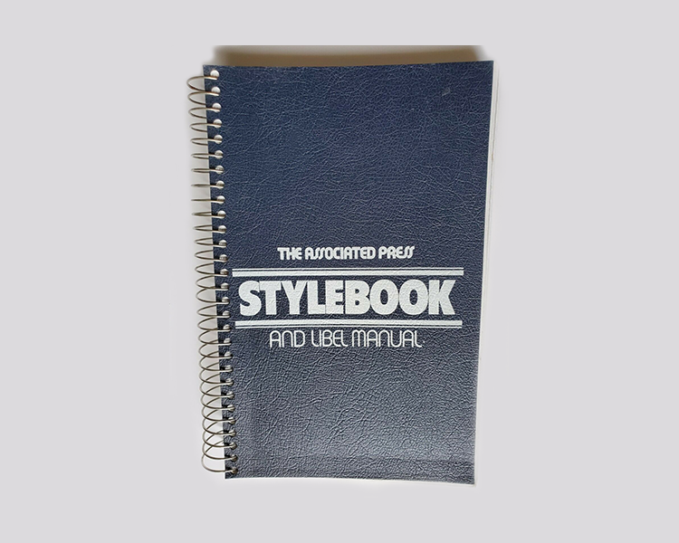
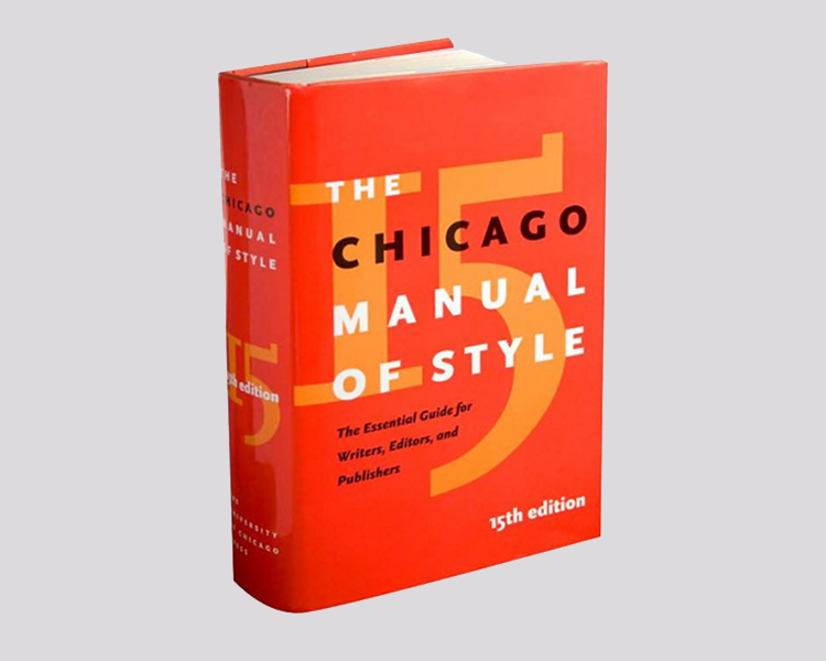
Some mysterious crew would sit within a flickering fluorescent den and make decisions for the masses. Updates were published infrequently to a lot of anticipation.
With thousands of pages, I had to use PostIt Notes and considered buying a laminated sheet of quick tips. Back then, the stack of editions on my desk made me feel legitimate, like I had a real job and a specialization. Honestly, those style guides made me special, okay?
That software on CD
The software installed on our computers gave us the first grammar checkers. We used them together with the printed style guides.


Spelling and grammar checks, reading level, word and sentence count, all added shine to word processing applications. Helpful as that was, it missed things or made wacky suggestions when the language was too intricate. It was easy to feel like the boss, even though I’m a terrible speller. Spell checks gave me cover and a pass. Did it even matter that I couldn’t spell? Who’d know anyhow? At this point I gave myself permission to let the machine handle it.
The house of style
What was left out of the manuals and software — for specialized subjects, customer needs or editorial tastes — went into a grand PDF of house style (“house” as in “publishing house,” an early term borrowed by companies creating content for their products as if it were a magazine).
I mistakenly believed “house” had something to with “drag family.” Why not? Deciding on our own unique guidelines was group activity that contributed to our brand and our team’s identity.
Online style guides
When the web happened, we got an “e” version of the book. Younger folks: “e” was the abbreviated “electronic” and synonymous with “exciting.”
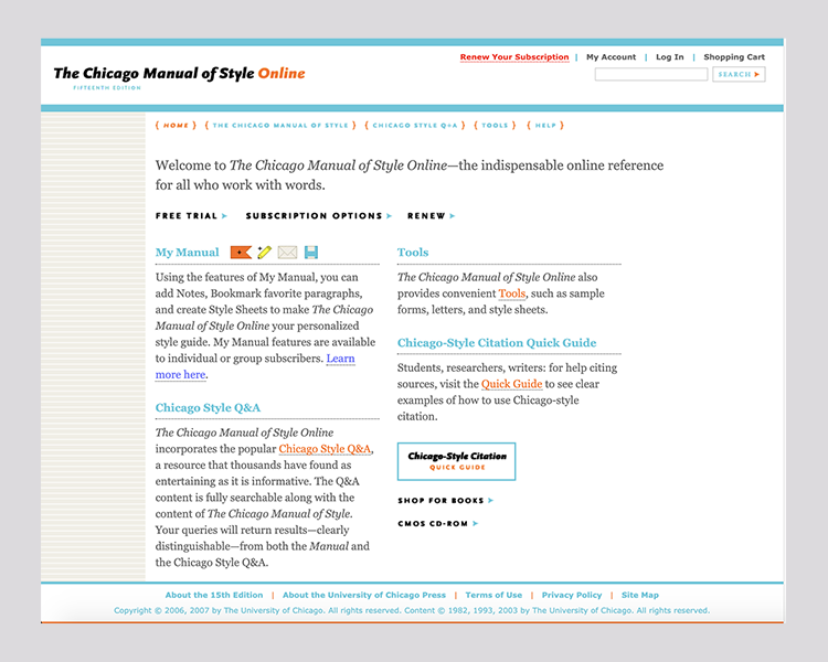
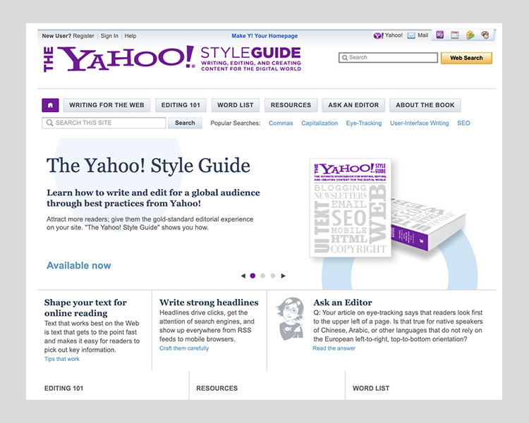
These were literally a digital version of the book with a search box and hyperlinks between entries. To find what I was looking for, it helped to have a general idea of what was in there. Every team had someone who memorized the entry titles and numbers as a service to the rest of us. Also to show off.
My interest grew in the experience of using style guides, how search worked, the classification and tagging of guidelines. We needed to think of the guidelines themselves as content and as part of our scope.
Copy-paste all over the place
Next came web sites known as “auto checkers.” They offered a growing variety of features like keyword extraction for tagging. Though, a whole website was dedicated to one feature alone. I had to leave Google Docs and bounce between a ton of browser tabs to catch everything.
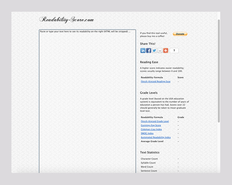
Back then, I managed our “very affordable” content marketing agency’s work. It required a heavy editing process. This involved taking their draft from Google Docs and pasting it into a plagiarism checker. Then pasting it into another site for reading level, making edits until it hit the target. Then to another for proofing and comments. By pure luck, I checked plagiarism first. Had I edited their content first, I would have missed that section they lifted from The New York Times. (I know!)
Knowing where to go and in what order was part of the job. We exchanged and recommended links to these checkers like insiders.
AI writing assistants
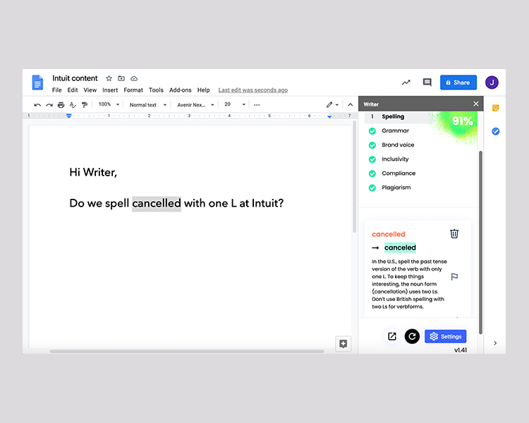
The next generation style guide is here now. Grammarly and Writer, formerly Qordoba, have the best of everything that came before plus AI. AI improves the quality of automated language checks in the context of what the content means. The suggestions are delivered out to teams as they write, where teams write across Intuit.
My team manages Writer. In return, it extends the expertise of our style council and its decisions to folks all over the company who create content, especially to non-writers who shouldn’t be making those decisions. With its help, our style council doesn’t have to spend tons of time promoting the style guide, communicating updates, providing training and pleading for adoption.
What’s the same
Fussy writers define style. A lot of history sticks with us as content creators: having the luxury to debate, caring about tiny elements, knowing a preferred answer, thoughtfully diverging. We still accept or reject what the assistant suggests.
The interaction hasn’t wildly changed. Comparing the first software checkers and today’s writing assistant, you could time travel in either direction and comfortably use either.
I wouldn’t hate it if the assistant also had a bit of a chatbot feature. As part of my writing process, style questions come to mind. Tangential thoughts, but help me get it done all the same. My hack for now, typing those questions into the document to get my answer roundabout.
What’s different now
Language models are new and better. The machine learning is semantic. Writer learns how writers write as we feed it more content and interact with corrections. It outperforms the first checkers.
Style decisions scale automatically. In the past there was a rush to add almost anything writers discussed as if the style guide were a notepad. Now decisions go out to anyone creating content as an automated check. Are you comfortable with them making a call in any context? Deciding what stays out of the writing assistant is as or more important than what goes in.
The style guide is a thing we do rather than a thing we deliver. Our responsibilities now include managing users, tweaking settings, creating feedback loops, troubleshooting and reporting.
The style guide site as we know it today will change. Publishing a site for style won’t be needed. They may morph to richer, descriptive frameworks, knowledge sharing and community. What’s the relationship between that and the writing assistant?
You don’t have to know guidelines or remember where to look for them. If the writing assistant provides just about everything proactively, how much do we really need to know? You can debate whether basic competency is required as a user. With technology, is style falling the way of spelling and handwriting? Don’t freak out.
What do we leave behind?
When tools evolve, the old mentalities and behaviors get exposed. Older technologies make them easy to spot. For example, how does the fountain pen or typewriter define me as a content person, the problems I take on or how I do the work? The same should be asked of style guides.
My friend, Michael Haggerty-Villa often says, “Decide on the serial comma and move on.”
Tip: Internet Archive’s Wayback Machine is a fabulous place to look up historic web sites. It provided some of the dated screenshots used here.

The evolution of style guides to AI writing assistants was originally published in UX Collective on Medium, where people are continuing the conversation by highlighting and responding to this story.
