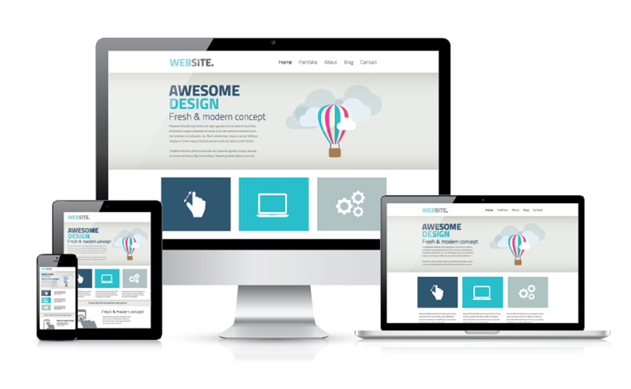
Technology is advancing on a daily basis, and more and more people are using their smartphones to browse online rather than their PCs or laptops. Tablets have become much more streamlined than heavy laptops, and users can access everything they need from wherever they are. If you run a small business you should be very aware that potential customers are looking at your website for information from their mobile phones.
In fact recent studies show that over 80% of the population search for local businesses on their mobile phones. This article outlines why responsive web design is a small business must have.
What is Responsive Web Design?

Responsive web design is the way the website is built to respond to different screen sizes. A responsive website will adjust its content, images, and call to action features depending on how it’s viewed. For example a responsive website will optimise the text size and image size when viewed on a mobile phone to make it easier for people to read. It allows users to view a website easily without having to zoom in and out. This can make website browsing a much more enjoyable experience for potential customers and clients.
What Are the Benefits of Responsive Web Design?
In 2014 mobile internet usage took over desktop usage so it’s quite obvious that any business who generates potential sales from their website, needs to make their website friendly for mobile users. The main benefit is that users who have a better browsing experience are more likely to visit your business, and visit your website again. If your website is not mobile friendly you may find your potential customers may click off the page and go straight to your competitor’s website instead.
Responsive websites are quick to load, and since 16% of mobile users will click off a website if it takes too long to load, this can be an incredibly important benefit. Google has also announced that they offer preference to mobile optimised websites. They now show up in the mobile search results as a priority over non responsive websites.
The Future is Responsive
If you are still not convinced that you need a responsive website then you may want to take a look at the facts and figures. Over 61% of adults now own a smartphone and that number is going up by the day. The speed of mobile internet is increasing each and every year making it more and more accessible for people to search via their mobiles. Android and iPhone are now releasing smart watches and smart TVs so there is no limit to how and where your website may be viewed.
From these statistics it’s very clear that the future of business is increasing with the use of tablets and smartphones. Simply having a website that’s only accessible on desktop screens is not enough to keep up. So the second after you have purchased your hosting from bestwebhosting.co.uk, your next step should be to choose a responsive theme or hire a designer skilled in responsive design. Don’t let your small business fall behind.
