One of the most important trends nowadays in web design are website hero images, which are generally defined as being a type of large banner that is typically located at the top of a website. Oftentimes, these images are the very first things that people see when they log on to a website.
This, in turn, causes most people to think of hero images in web design as forms of introductions, as this will give them an idea of what they can expect as they browse through the remainder of the website.
For example, if your website’s hero image is one that is rather elegant in nature, the user will expect to see something that is somewhat cultured. On the other hand, if your website’s hero image is one of playfulness, then the user may expect to see something of a more wacky-type nature.
What’s the fuss with hero images?
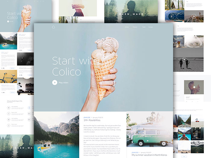
Image source: Barthelemy Chalvet
One big thing that your website’s hero image can do is help to promote your specific brand, which is something that can have a major positive effect on your business in the long run. If you decide to go this route, be sure to include useful information that can help tell the story of your brand.
Another important thing that can be done with hero images is to explain the overall value proposition of your brand, which means that you will be educating all of your existing and potential customers about the kind of value that your products can offer to them. By using your hero image space for this very thing, visitors to your website will be able to obtain this kind of information right away.
You can also use hero images to help showcase a certain product or service that you may currently be offering, or that you may soon be offering. This is perfect because it will help draw a great deal of attention to newer products. In addition, you can also use this area to highlight a product that has been selling rather well, as well as any particular products that you may be looking to liquidate as soon as possible.
What to include in a hero image
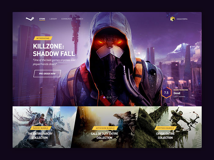
Image source: Aaron Sananes
There are three different elements that are essential to composing an effective hero image and which increases the chances that your website’s users will take the action that you want them to take. These elements are as follows:
A beautiful high quality image

Image source: Igor Savelev
Images that are big and bold are things that a lot of different people enjoy looking at, and applying this to a hero image is certainly no different. Whatever kinds of images you wish to include, you will want to ensure that they are of the highest quality possible, which is something that you will be able to obtain suggestions for before finalizing everything with your design.
Good copy
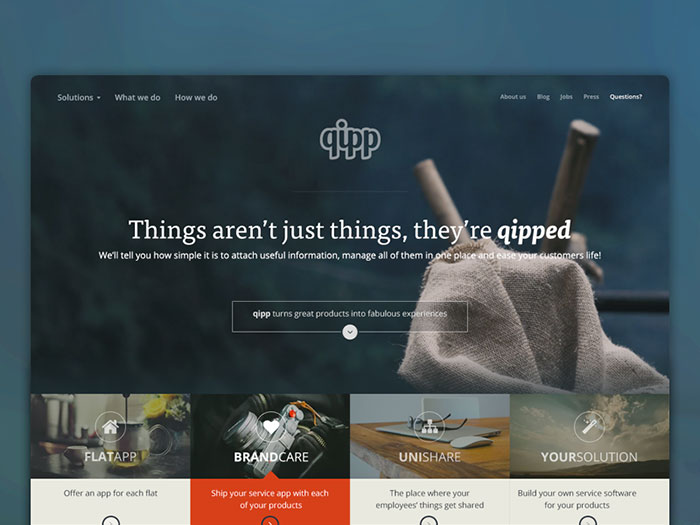
Image source: Michael Henning
All of the wording that you use to help get your message across is what represents your copy. Be sure to keep all of your wording both very concise and direct.
A good CTA
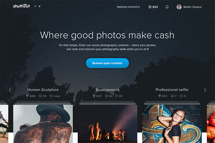
Image source: Maciej Żelaznowski
Calls-to-action are essential parts of any hero image, regardless of what kind of content is contained in them. This can include anything from simple text to a button that can be clicked on. Whichever method you decide to use, your users should always be able to take advantage of a good CTA.
Tips and techniques
Regardless of the type of content a hero image contains, it should always be displayed in a rather prominent nature. However, at the same time, these images can also be rather challenging for some designers and developers. They often wonder how they can use hero images for such tasks as capturing attention. Here are some useful tips and techniques that should be highly considered in cases such as this:
Toy around with such effects as contrast, saturation, etc. when you begin the photo enhancement process. This will help to bring out tones that are warmer and/or cooler, depending on what exactly you are hoping to do and achieve. You could also choose to utilize various filters to help make your hero image even more striking than it may have been previously.

Image source: Dawid Domański
Consider using the “leading lines” technique, which is something that refers to leading the eye to certain areas of a specific design.
Make your hero image even more outstanding and meaningful by introducing a sense of movement into the design. You can achieve this by using an image that you may find exciting before punching it up with a great and meaningful mission statement.
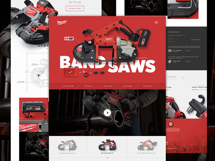
Image source: Taylor Perrin
If there’s one tool that is absolutely essential to virtually all kinds of designs, it’s color. Use color to help get your message across even further; however, pay careful attention and be aware of exactly how much color you use.
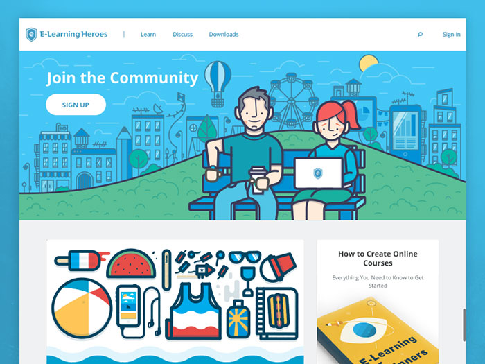
Image source: Greg Christman
Illustrations can also help to get your message across to a great deal of people. Consider experimenting with different aspects of animation in your hero image until you find just the right styles that fit what you’re looking for.
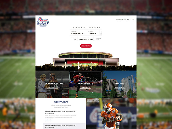
Image source: Alex Torres
One other aspect you should highly consider utilizing in your hero images is the aspect of symmetry. This is something that the human eye is always naturally drawn to, which makes it incredibly useful to be included in your design.
If you really want to make your hero image pop quite a bit, consider mixing up different fonts and photos to help the eye of your users become more drawn to it.
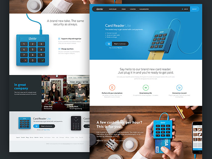
Image source: Daniel Hilding
If you aren’t a big fan of including a wide variety of things in your hero image, consider taking the minimalism route. Oftentimes, including very little in a hero image can sometimes be the best option, and it can still help to get your message across.
Utilize flat lay photographs in your hero images. This is an aspect that can also give your website’s users an idea of what they can expect as they continue viewing your content.
Some designers and developers aren’t very happy with a lot of the colors they have to end up using, which is where gradients can come into play. You can overlay a soft gradient over your hero image while, at the same time, having complete authority over exactly what colors are used in it.
Most modern design nowadays is all about things such as clean gradients and sharp lines. Try to include as many of these qualities in your design as possible.
If you find that you are designing something for a particular company or brand, always try to include any colors that are associated with something such as their logo.
