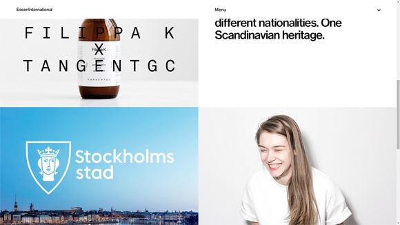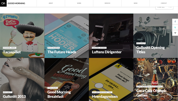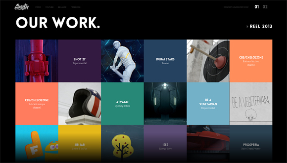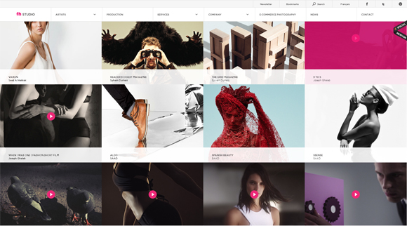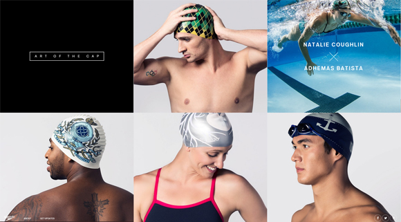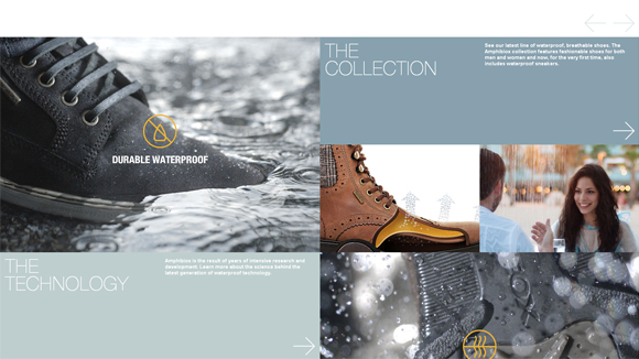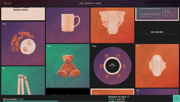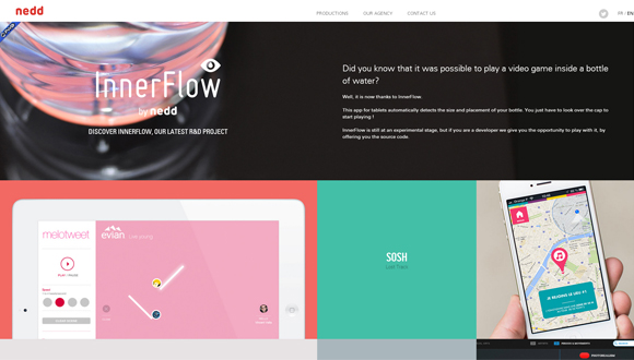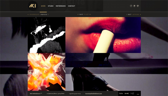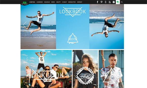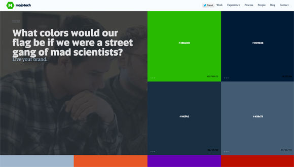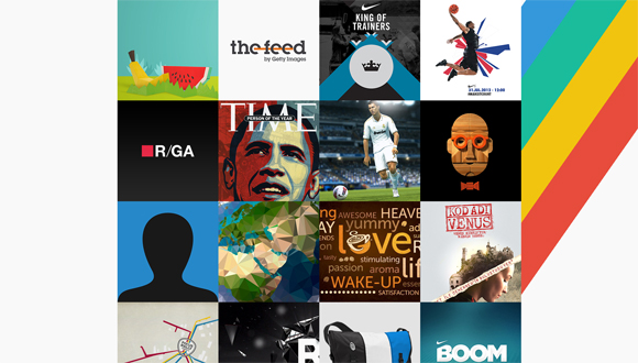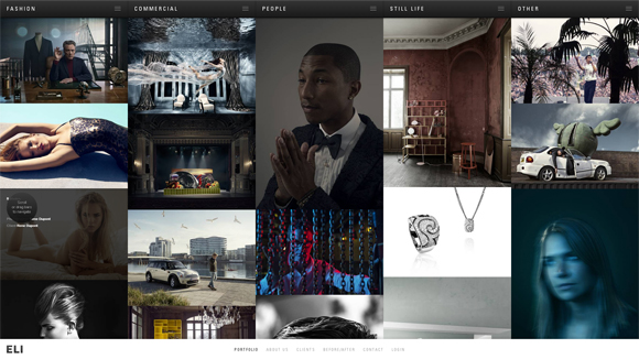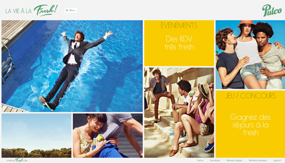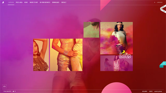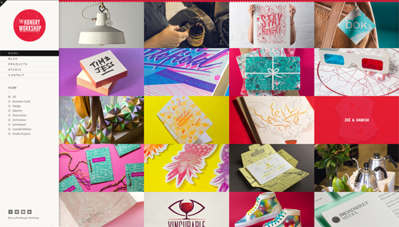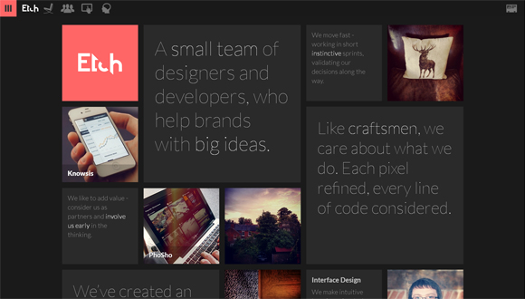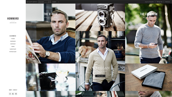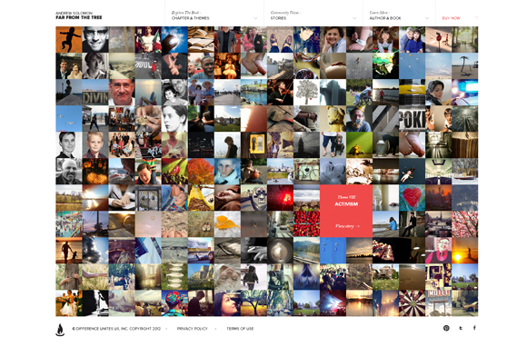
There are so many ways to present website content to the public. Let’s take a closer look at websites that feature square and rectangular elements. As a rule, square blocks are used in portfolio and e-commerce websites as it’s one of the best way to organize and showcase a big number of works, such as designs, photographs, products, etc. Squares and rectangles make things clear and intelligible.
Boxed shapes on a website can also be interactive, meaning they react on mouse over or mouse click. It will add more usability and emotions in your design. Users love websites which respond to them somehow, even if it’s just highlighted in a different color when you hover over the picture. It’s better to see than to hear – a picture paints a thousand words. So, take a look at these 20 creative websites featuring square elements to get inspiration from.

