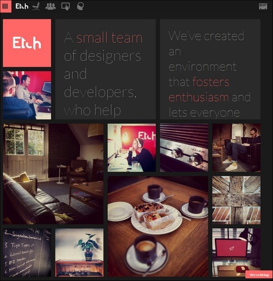
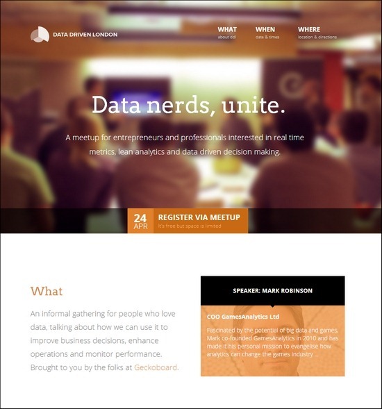
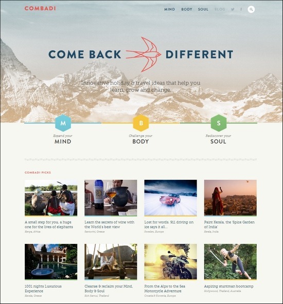
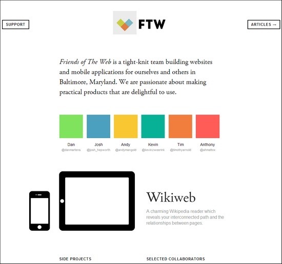
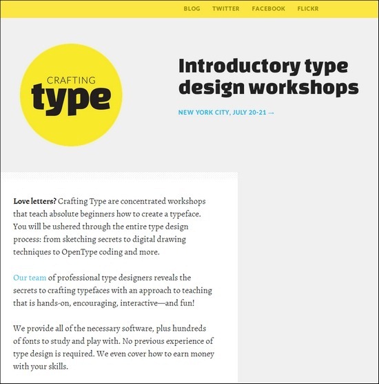
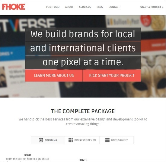
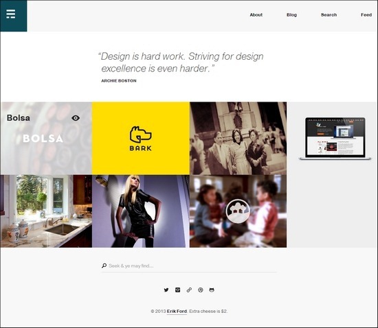
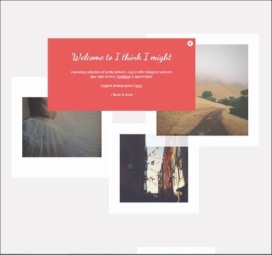
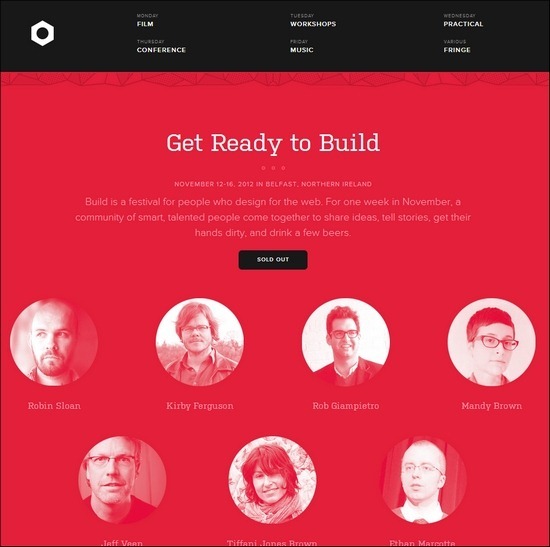
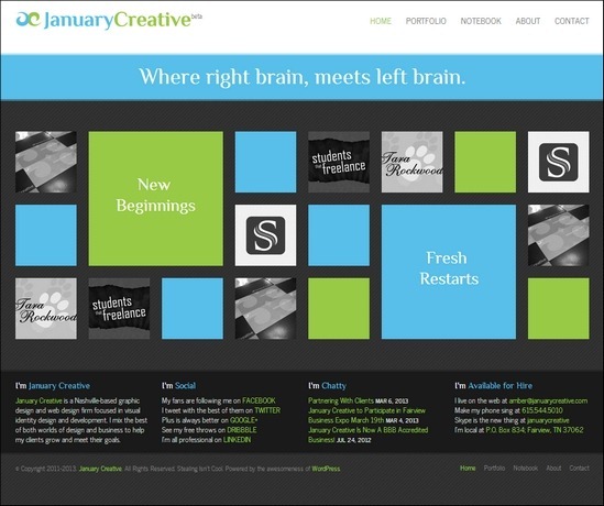
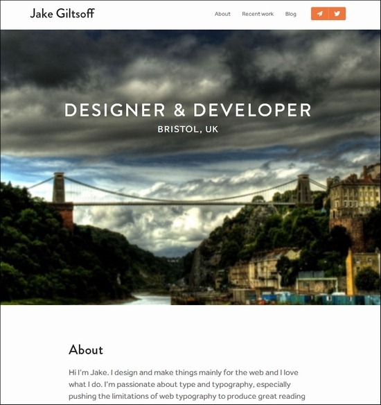
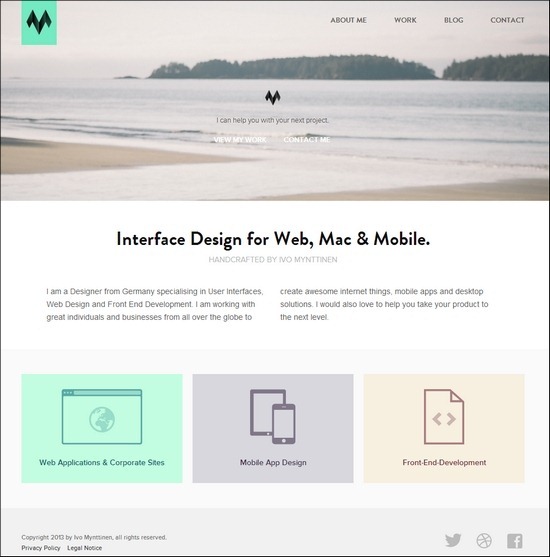
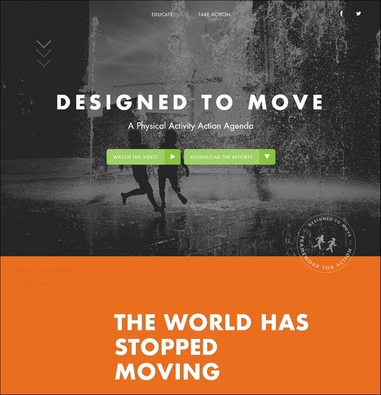
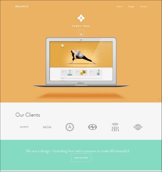
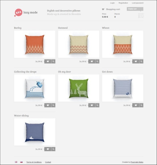
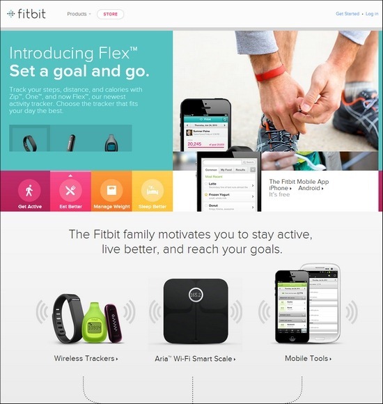
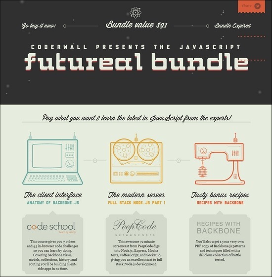
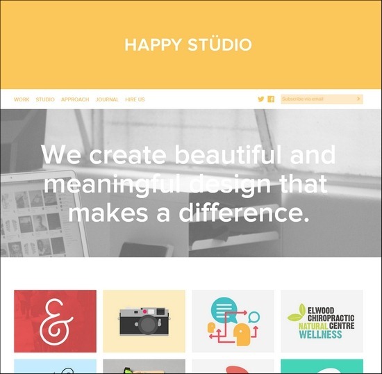
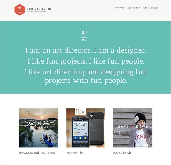
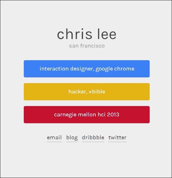
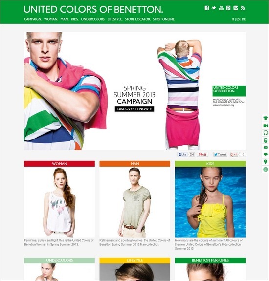
Flat web design is a real trend buster right now, and this comes with good reason!
Not that long ago the use of 3D effects, textured surfaces, light and gradient effects were trending elements in web design. However, with the changing times so comes new trends within web design.
The tendency right now leans towards simple web design layouts that especially Microsoft’s Metro interface is a famous example of. The use of simple, flat and typographical design elements such as high contrast colors, square corners and straight lines has become essential elements today. These simple, yet powerful elements of flat web design allow web designers to build website that focus solely on the content. Using these simple flat design elements makes it easy for visitors to read and interact with the content.
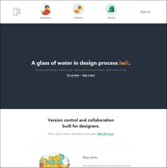
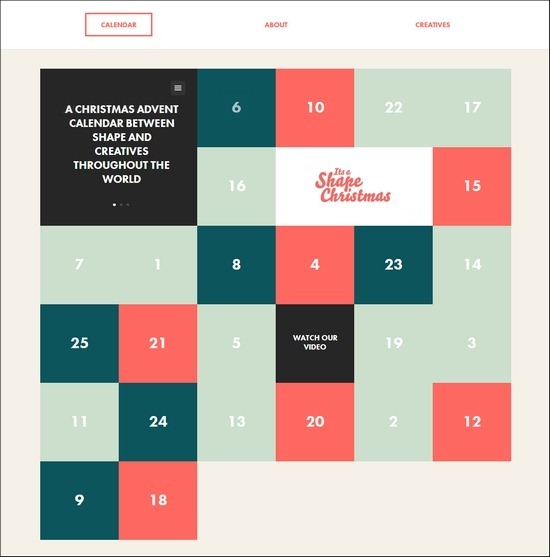
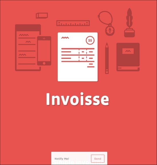
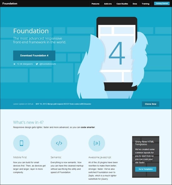
For this post, I have found some excellent examples on how different web designers have used flat web design. When browsing this collection you might find inspiration for new elements in your own designs. Either way I hope you will find this collection inspiring and helpful in your web design process. Enjoy!


