In this Photoshop tutorial, we’ll learn how to create a fun 3D pop-up effect, similar a children’s pop-up book, where the main subject of your photo appears to be standing up and popping right out of an otherwise flat image.
To add even more of a 3D look to it, we’ll be curling the edges of the photo using Photoshop’s Warp command and adding a custom shadow underneath. There’s quite a few steps involved in creating the effect but they’re all very simple and easy. I’ll be using Photoshop CS6 here but any recent version of Photoshop will work.
Here’s the photo I’ll be starting with:

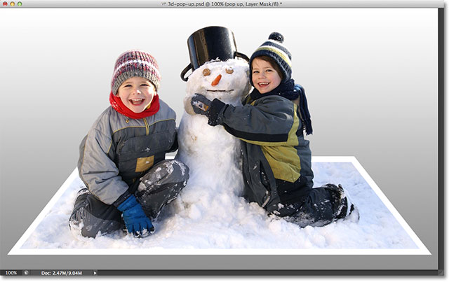
Here’s what the final result will look like:
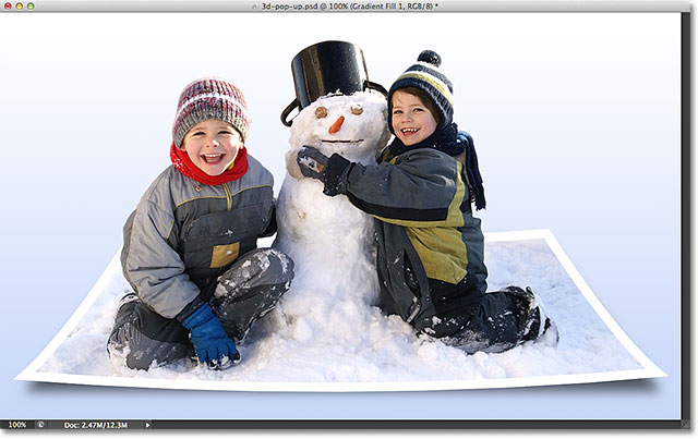
Let’s get started!
Step 1: Make Two Copies Of The Background Layer
With our photo newly opened in Photoshop, if we look in the Layers panel, we see our image sitting all by itself on the Background layer:
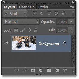
Let’s start by making a couple of copies of the layer. Press Ctrl+J (Win) / Command+J (Mac) on your keyboard to quickly make the first copy. You’ll see the copy, which Photoshop automatically names “Layer 1″, appear above the Background layer in the Layers panel. These default names that Photoshop gives new layers are not very useful, so since this first copy will be used as the “flat” version of our image, double-click directly on the layer’s name and rename it flat. Press Enter (Win) / Return (Mac) on your keyboard when you’re done to accept the name change:
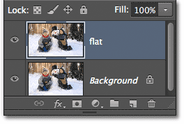
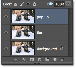
Now we’ll make a second copy of the layer. Press Ctrl+J (Win) / Command+J (Mac) again on your keyboard. Another new layer, this time named “flat copy”, will appear above the other two layers in the Layers panel. We’ll be using this layer to create our pop-up effect, so double-click on the layer’s name and rename it pop up. Press Enter (Win) / Return (Mac) when you’re done to accept the name change. You should now have three layers in total:
Step 2: Turn Off The Visibility Of The New Layers
We don’t need to see these two new layers in the document just yet, so click on the “flat” and “pop-up” layer’s visibility icon (the eyeball) on the far left of each layer to temporarily turn them off and hide them from view (even though nothing will seem to have happened in the document window since all three of our layers contain the same image):
Step 3: Select The Background Layer
Click on the original Background layer to select it (selected layers appear highlighted in blue):
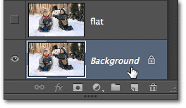
Step 4: Add A Gradient Fill Layer
Let’s add a layer to use as the background for our effect. We’ll use a Gradient Fill layer, since gradients are a bit more interesting than solid colors. Click on the New Fill or Adjustment Layer icon at the bottom of the Layers panel:
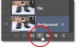
Then choose Gradient from the list that appears:

Step 5: Select The Black, White Gradient
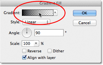
This opens the Gradient Fill dialog box. Click on the gradient preview bar at the top of the dialog box to edit the gradient:
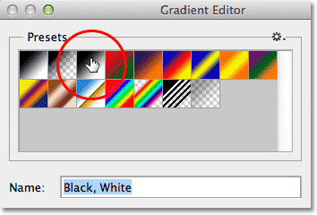
This opens the larger Gradient Editor dialog box, with a selection of preset gradients we can choose from at the top. Select the Black, White gradient by clicking on its thumbnail (third from the left, top row):
Step 6: Replace The Black With A Lighter Gray
With the Black, White gradient selected, let’s edit it and make a slight change. We can edit gradients in the bottom half of the Gradient Editor. Double-click on the black color stop below and to the far left of the gradient preview bar:
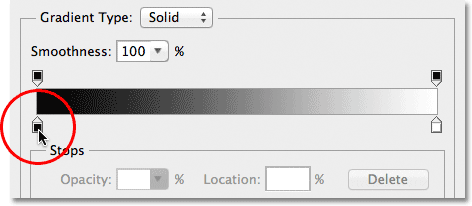
This opens Photoshop’s Color Picker, allowing us to change the black in the gradient to some other color. Black is a bit too dark for our background, so choose a lighter gray to replace it with, at least for now. We’ll learn how to go back and change the gradient colors if needed at the end of the tutorial:
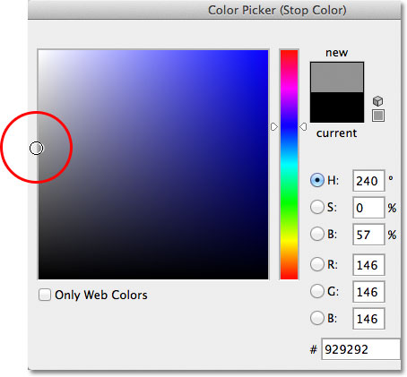
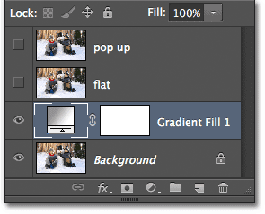
Click OK to close out of the Color Picker, then click OK to close out of the Gradient Editor. Finally, click OK to close out of the Gradient Fill dialog box. If we look in the Layers panel, we can see our new Gradient Fill layer sitting directly above the Background layer (but below the other two layers):
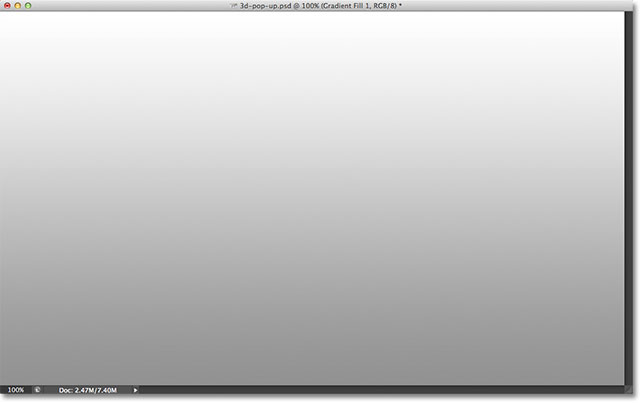
And if we look in our document window, we see the gradient background we just added:
Step 7: Select And Turn On The “flat” Layer
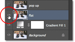
Next, we’ll create the “flat” version of our photo. Click on the “flat” layer in the Layers panel to select it (so it’s highlighted in blue), then click on the layer’s visibility icon to turn the layer back on in the document window:
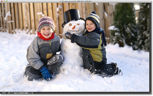
Your photo will reappear in the document window since the “flat” layer is sitting above the Gradient Fill layer and is now blocking the Gradient Fill layer from view:
Step 8: Select The Rectangular Marquee Tool
Grab the Rectangular Marquee Tool from the Tools panel, or press the letter M on your keyboard to quickly select it with the shortcut:

Step 9: Drag Out A Rectangular Selection Inside The Image
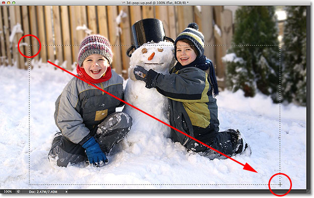
With the Rectangular Marquee Tool selected, click and drag out a rectangular selection inside the image around the area that will become the flat version of the photo. Don’t worry about getting anything exactly right for now. An initial selection around the general area is all we need:
Step 10: Select The Transform Selection Command
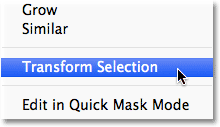
Let’s reshape our selection outline to give it more of a 3D perspective. For that, we’ll use Photoshop’s Transform Selection command. Go up to the Select menu in the Menu Bar along the top of the screen and choose Transform Selection:
Step 11: Switch To Perspective Mode
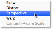
As soon as you choose Transform Selection, you’ll see transform handles (little squares) appear around the selection outline (one in each corner and one on the top, bottom, left, and right). We’ll use these handles to reshape the selection, but before we do, we need to switch the Transform Selection command into Perspective mode. To do that, Right-click (Win) / Control-click (Mac) anywhere inside the selection outline and choose Perspective from the menu that appears:
Step 12: Drag The Corner Handles To Create A 3D Perspective
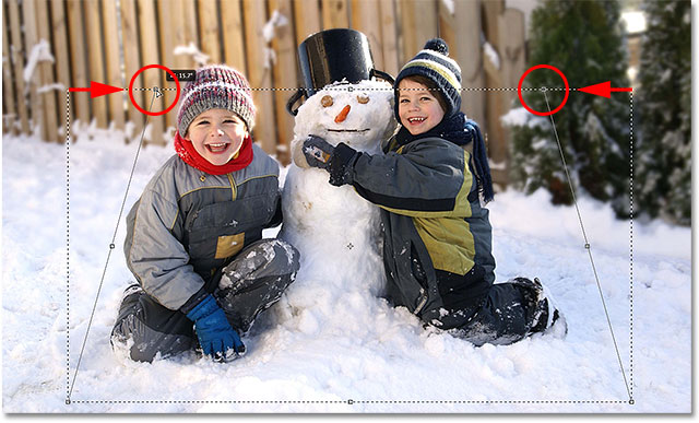
Now that we’re in Perspective mode, click on the handle in the top left corner of the selection outline and, with your mouse button still held down, drag the handle in towards the right. The opposite handle in the top right corner will move in along with it:
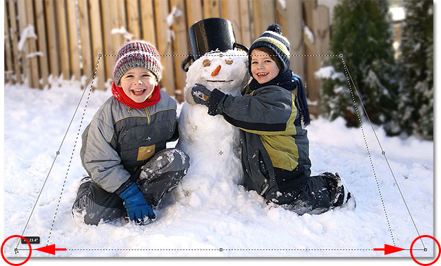
Then click on the handle in the bottom left corner of the selection outline and, again with your mouse button still held down, drag this handle outward towards the left. Since we’re still in Perspective mode, the opposite handle in the bottom right corner will move outward along with it:
Step 13: Switch To Scale Mode
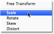
Next, we need to switch the Transform Selection command out of Perspective mode and into the more common Scale mode. Right-click (Win) / Control-click (Mac) once again inside the selection outline and this time, choose Scale from the menu:
Now that we’re in Scale mode, click on the handle at the top of the selection outline and, with your mouse button still held down, drag the handle downward:
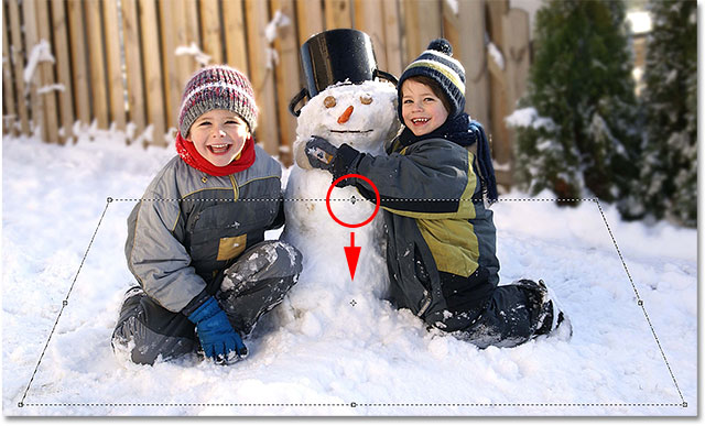
Finally, click on the handle at the bottom of the selection outline, keep your mouse held down, and drag this handle upward:
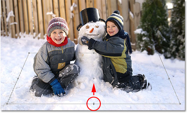
Continue dragging the handles to reshape the selection outline, switching between Perspective and Scale modes as needed, until your selection outline looks more like it’s fading off into the distance. When you’re done, press Enter (Win) / Return (Mac) to accept it and exit out of the Transform Selection command:

Step 14: Add A Layer Mask
With our selection in place, click on the Layer Mask icon at the bottom of the Layers panel:
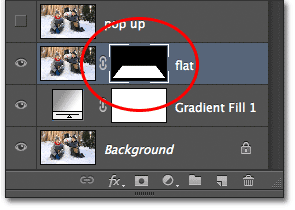
This converts our selection into a layer mask. We can see the new layer mask thumbnail that’s been added to the “flat” layer in the Layers panel. The black area in the thumbnail represents the part of the layer that’s being hidden from view in the document, while the white area represents the part that remains visible in the document:
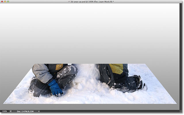
And if we look in our actual document window, we see that everything on the layer that fell outside of our selection has disappeared, leaving only the area that was inside the selection:
Step 15: Add A White Stroke Layer Style
Let’s use a white stroke to add a border to the photo. Click on the Layer Style icon (the “fx” icon) at the bottom of the Layers panel:
Then choose Stroke from the list of layer styles that appears:
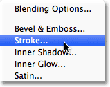
This opens Photoshop’s Layer Style dialog box. First, we need to change the color of our stroke, so click on the color swatch:
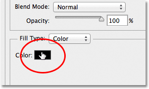
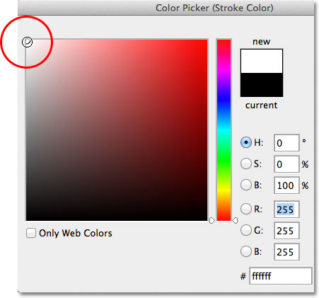
Choose white in the Color Picker when it appears, then click OK to close out of the Color Picker:
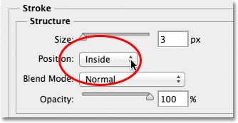
Back in the Layer Style dialog box, change the Position of the stroke from Outside to Inside:
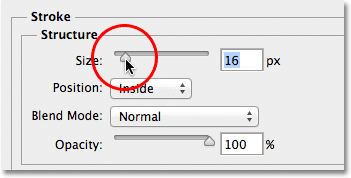
Finally, click on the Size slider and begin dragging it towards the right to increase the size of the border around the photo (keep an eye on the document window as you drag the slider). I’m going to set my stroke size to 16px, but depending on the resolution of your image, you may need to set your size even higher to get a similar result:
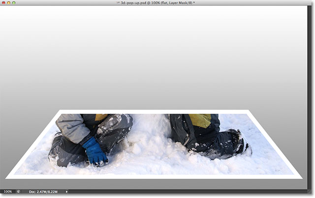
When you’re done, click OK to close out of the Layer Style dialog box. We now have our photo border:
Step 16: Select And Turn On The “pop up” Layer
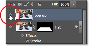
We’re ready to add our pop-up effect. Click on the “pop up” layer in the Layers panel to select it, then click on its visibility icon to turn the layer back on in the document window:
Step 17: Select Your Main Subject
Using the selection tool of your choice (Lasso Tool, Quick Selection Tool, Pen Tool, etc.), draw a selection around the main subject in your photo. Here I’ve selected the two boys and the snowman. Try to make your selection as accurate as possible around the areas that will actually be popping up out of the photo (in other words, the areas that will end up appearing in front of the gradient background), but it’s okay to draw a loose selection around lower areas that will appear in front of the flat version of the photo:

Step 18: Add A Layer Mask
With our selection around our main subject in place, click once again on the Layer Mask icon at the bottom of the Layers panel:
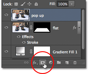
Just as we saw earlier, Photoshop converts our selection into a layer mask, displaying a mask thumbnail on the “pop up” layer:
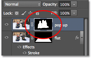
And with the layer mask added, the area we selected now pops up out of the image:
Step 19: Select The “flat” Layer
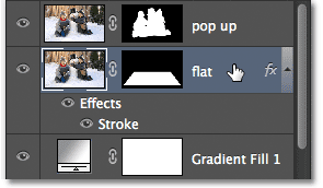
Let’s finish off the effect by curling the corners of the photo and adding a shadow. Click on the “flat” layer in the Layers panel to select it:
Step 20: Reload The Layer Mask As A Selection
Hold down the Ctrl (Win) / Command (Mac) key on your keyboard and click directly on the “flat” layer’s mask thumbnail:
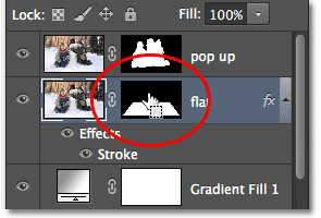
This reloads the layer mask as a selection in the document window. You’ll see the selection outline re-appear around the flat version of the photo:

Step 21: Add A New Layer Below The “flat” Layer
Hold down the Ctrl (Win) / Command (Mac) on your keyboard once again and click on the New Layer icon at the bottom of the Layers panel:
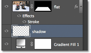
Normally, Photoshop adds new layers directly above the currently selected layer, but by adding in the Ctrl (Win) / Command (Mac) key, Photoshop places the new layer below the selected layer. In our case here, it places it below the “flat” layer. Double-click on the new layer’s name and rename it “shadow”, then press Enter (Win) / Return (Mac) to accept the name change:
Step 22: Fill The Selection on The New Layer With Black
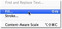
Let’s fill our selection on the “shadow” layer with black. Go up to the Edit menu at the top of the screen and choose the Fill command:
This opens Photoshop’s Fill dialog box. Change the Use option at the top to Black, then make sure the Mode option in the bottom half of the dialog box is set to Normal and the Opacity option is set to 100%:
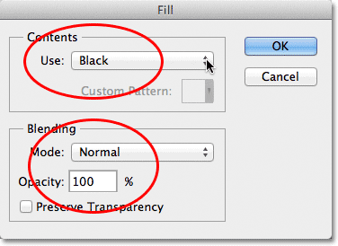
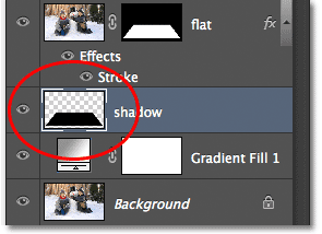
Click OK when you’re done to close out of the dialog box. Photoshop fills the selection on the “shadow” layer with black. We can’t actually see it at the moment in the document window because the photo on the “flat” layer above it is blocking it from view, but we can see our black-filled area if we look at the “shadow” layer’s preview thumbnail in the Layers panel:
Step 23: Select The “flat” Layer’s Mask
We’ll come back to the shadow after we’ve curled the corners of our photo, which is what we’ll do next. Click directly on the layer mask thumbnail on the “flat” layer to select the mask:
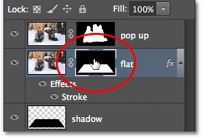
Step 24: Unlink The Layer From Its Mask
If you look closely, you’ll see a small link icon between the “flat” layer’s preview thumbnail and its mask thumbnail in the Layers panel. Click on the link icon to remove it, which will unlink the mask from the contents of the layer:
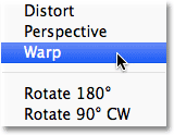
Step 25: Select The Warp Command
With the layer mask thumbnail selected and unlinked from the photo itself, go up to the Edit menu at the top of the screen, choose Transform, then choose Warp:
Step 26: Drag The Four Corner Points Upward To Curl The Corners
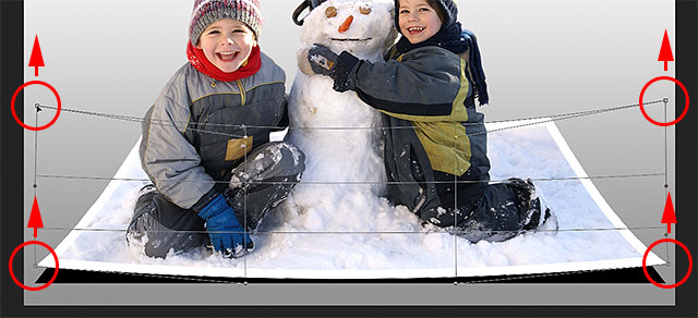
You’ll see a warp grid appear around the photo. Click on each of the four corner handles on the grid and drag them upward. As you drag each handle, you’ll see that corner of the photo curl upward, and you’ll reveal some of the black “shadow” layer below the photo. Press Enter (Win) / Return (Mac) when you’re done to accept the effect and exit out of the Warp command:
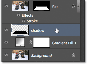
Step 27: Select The “shadow” Layer
Let’s finish things off by softening the shadow below the photo. Click on the “shadow” layer in the Layers panel to select it:
Step 28: Apply The Gaussian Blur Filter
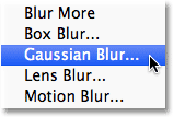
Go up to the Filter menu at the top of the screen, choose Blur, then choose Gaussian Blur:
This opens Photoshop’s Gaussian Blur dialog box. Drag the Radius slider at the bottom of the dialog box towards the right to increase the amount of blurring that’s applied to the shadow. The more blur we apply, the softer the shadow edges will appear. I’m going to increase my Radius value to around 10px, but depending on the resolution of your image, you may want to set your Radius value higher, so be sure to keep an eye on the image in the document window as you drag the slider:
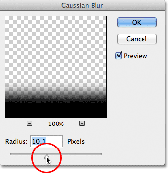
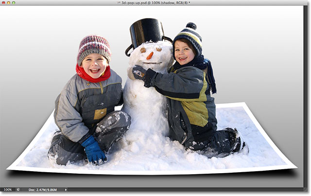
Click OK when you’re done to close out of the dialog box. Here’s what my shadow now looks like after applying the blur filter:
Step 29: Lower The Opacity Of The Shadow
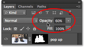
We’ve softened the edges of the shadow but it’s still too dark and intense. Go up to the Opacity option in the top right of the Layers panel and lower the “shadow” layer’s opacity from 100% down to 60%:
With the opacity lowered, the shadow now fades more into the background:
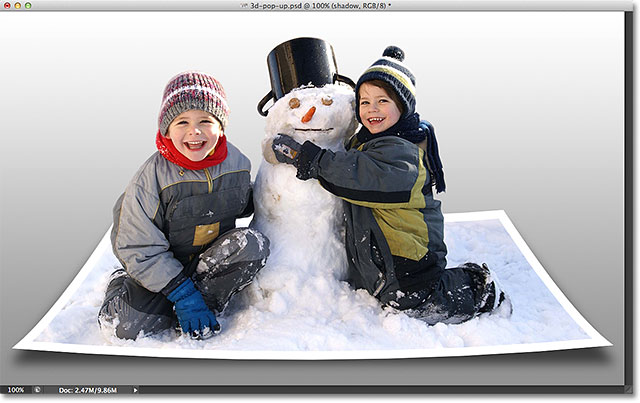
Step 30: Reshape The Shadow With The Free Transform Command
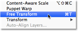
One last thing. Let’s tidy up the shadow a bit so it looks more like its actually under the photo. Go up to the Edit menu and choose Free Transform:
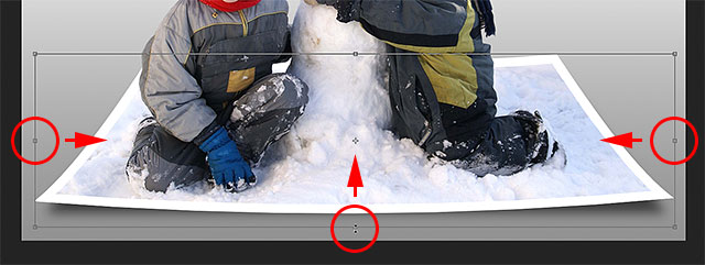
This places the Free Transform box and handles around the shadow. I’m just going to click and drag the left, right and bottom handles inward a bit so the edges of the shadow line up better with the edges of the photo:
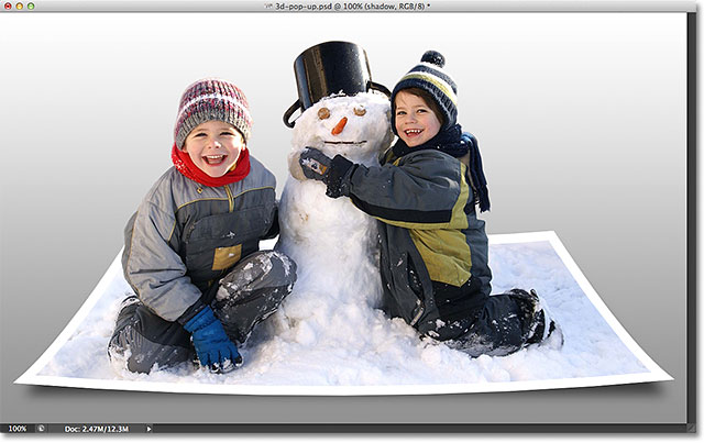
When you’re done, press Enter (Win) / Return (Mac) on your keyboard to accept the transformation and exit out of the Free Transform command. Here’s my effect after reshaping the shadow a bit with Free Transform:
Changing The Background Gradient Color
If you decide you don’t like the color of the background gradient, one thing you might want to try is sampling a color directly from the image to use for the background. Let’s quickly see how to do that. First, double-click on the Gradient Fill layer’s thumbnail in the Layers panel:
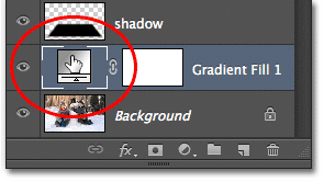
This re-opens the Gradient Fill dialog box just as we saw at the beginning of the tutorial. Click on the gradient preview bar to re-edit the gradient:
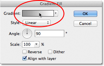
This will re-open the Gradient Editor. I want to change the gray color in the gradient to something else, so I’ll double-click on the gray color stop below and to the far left of the gradient preview bar:
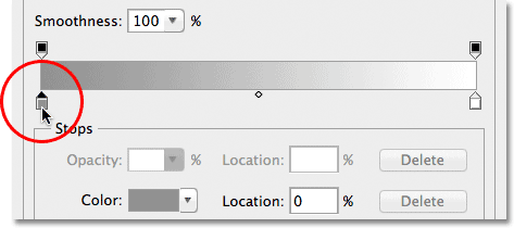
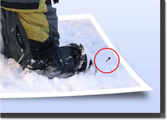
Photoshop will re-open the Color Picker, but instead of choosing a color from the Color Picker, I’m going to move my mouse cursor directly over the image itself, which will temporarily turn my mouse cursor into an eyedropper icon. To sample a color, simply click on the color you want in the image. I’ll click on an area of light blue in the snow. Photoshop gives me an instant live preview of what the new color looks like in the gradient:
Once you’ve chosen a color you like, click OK to close out of the Color Picker, then click OK to close out of the Gradient Editor and then the Gradient Fill dialog box. And with that, we’re done! Here, for comparison, is my original photo once again:

And here’s my final result after replacing the gray in the background gradient with a color sampled directly from the image:

And there we have it!