Taylor Swift, 2006
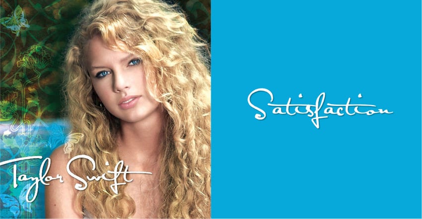


Taylor Swift’s eponymous debut album, released in 2006, introduced her early country sound and paid homage to female country singers like Dolly Parton, Bonnie Raitt, and Shania Twain by using handwritten fonts to convey authenticity. The font Satisfaction served as the Taylor Swift font early in her career. It served as a visual bridge between generations, showcasing a continuity in the genre’s storytelling tradition and signifying Swift’s unique contribution to the country music narrative.
If you’re intrigued by the Taylor Swift debut font and looking for alternatives, check out Souljah or Perfect Signature on Envato.
Fearless, 2008, & Fearless (Taylor’s Version), 2021


Taylor Swift’s album Fearless, initially released in 2008 and rereleased in 2021, shows a typographical evolution both in terms of the artist’s growth and the change in design trends over the years. The original Fearless cover uses a bold sans serif called ITC Blair for the title and reprises the Taylor Swift font from her debut album, Satisfaction, for her signature. The imagery is reminiscent of other country singers with a pop edge, particularly Shania Twain and Carrie Underwood. Alternatives for the Taylor Swift Fearless font include Knockout and Dublin.

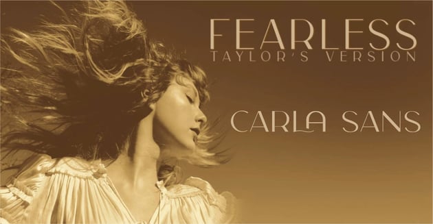

The 2021 rerelease cover adopted a sleek font called Carla Sans Light. Carla Sans has a particularly elegant mix of decorative curves and high-contrast strokes and would go on to be used on multiple covers.
In addition to the difference in font, the Fearless rerelease also introduced modular design techniques reflecting the industry shift to streaming. While the marketing material for Fearless (Taylor’s Version) uses Carla Sans Light, the album cover eschews typography altogether. Instead, all of Swift’s newer covers incorporate motion graphics that add visual interest on streaming platforms. All in all, Fearless and the rerelease reflect a substantial change in both aesthetic and design philosophy but clearly communicate Swift’s musical identity. Great alternatives include Carla and, for a lower-contrast option, Moora Light.
Speak Now, 2010, & Speak Now (Taylor’s Version), 2023


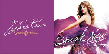
Taylor Swift’s album cover for Speak Now, released in 2010, is a colorful mix of painted textures and handmade typography. A heavily modified Sudestada serves as the album title, while Satisfaction returns as the Taylor Swift signature font for the final time. The shape of the title also visually references Dolly Parton’s “Dolly” signature. The move away from script fonts in her subsequent albums also reflects a move away from country. You can find an excellent alternative for the Taylor Swift Speak Now font in Bagitte and Bettarria.


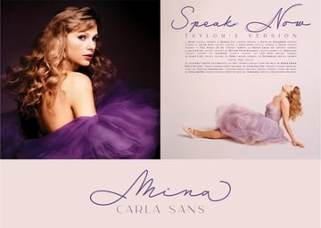
For the 2023 rerelease of Taylor Swift’s album Speak Now, Swift’s designers opted for an album cover devoid of typography. This time, the marketing material employed a sophisticated blend of fonts, with Mina and Carla Sans at the forefront and Dolly and Filosofia making up the small text. Carla Sans kind of replaced Satisfaction as the “Taylor Swift font” for the rereleases. Of course, Bagitte and Bettarria could work as alternatives for Mina, and Silhouetto would also work well.
Red, 2012, & Red (Taylor’s Version), 2021
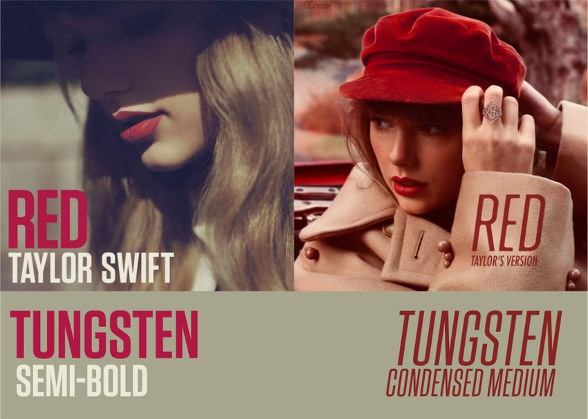
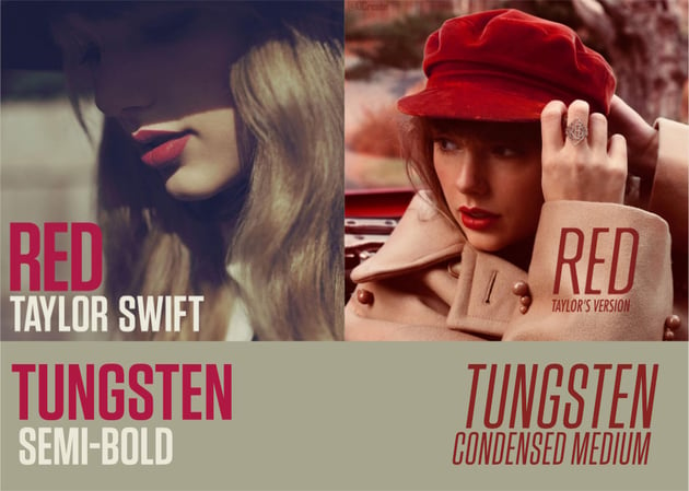

In her album Red, Taylor Swift ventured further afield from her country roots, but the influence is still apparent. Tungsten, a matter-of-fact sans serif, boldly states a departure from her previous style and the introduction of the strong pop and driving bass in the album itself. Visually, the cover of both Red and Red (Taylor’s Version) seem to pay homage to Bob Dylan covers from the ’60s in terms of color, font, style, and subject matter. While Red is known for the driving bass and energetic tracks like “22” and “We Are Never Ever Getting Back Together”, the album is full of melancholy and heartbreak. Tracks like “Red,” “Sad Beautiful Tragic,” and “All Too Well” recall Bob Dylan’s penchant for tales of discontent like “Tangled Up In Blue,” “It Ain’t Me Babe,” and “Don’t Think Twice It’s Alright.”
In the highly anticipated 2021 rerelease of Red (Taylor’s Version), Swift herself revealed feeling heartbroken during the recording of the initial release, and the design echoes the sentiment, though in a more elegant and elevated way. Again, the art draws parallels to Bob Dylan in both color palette and subject matter. Swift even dons a hat reminiscent of the one Dylan wore on the cover of his debut album, adding a layer of homage and intertextuality. Swifties are well aware of the musician’s penchant for smuggling Easter eggs into her work, and it’s hard to overlook the potential foreshadowing of the next step in her career, particularly as she referenced Dylan’s albums at the pivotal point in his career when he moved to New York.
When looking for a Red Taylor Swift font dupe, Portlin Display is a solid alternative. Try this and other Red Taylor Swift font options from Envato!
1989, 2014, & 1989 (Taylor’s Version), 2023


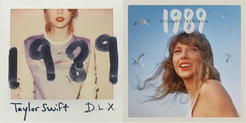
In her 2014 album 1989, Swift began a major genre and career shift, and we can see a shift in the Taylor Swift aesthetic in this period too. The album’s title references her birth year and serves as a symbolic rebirth of her career. Opening with the energetic anthem “Welcome to New York,” Swift, a Pennsylvania native, sheds the Nashville twang in her vocals, stating unequivocally that country Taylor Swift was in the past.
What is the Taylor Swift 1989 font? The artist contributed her own Taylor Swift handwriting font! It’s not a font at all but the artist’s handwriting. The album’s original cover evoked the nostalgic charm of a Polaroid photo, subtly paying homage to ’80s pop icons like Michael Jackson and Madonna. With its synth-heavy tracks, 1989 echoed the synth-laden resurgence of the ’80s sound throughout the industry in the early 2010s.
The 2023 rerelease of 1989 (Taylor’s Version) retains the handwritten font and Polaroid aesthetic for the cover. The visuals in the rerelease’s cover are particularly interesting. The seagulls that were confined to Swift’s shirt in the original cover are shown flying freely as if uncaged. Symbolically, the seagulls are like the rereleases themselves, being freed from the copyright disagreements with Swift’s former label, Big Machine. If you like the feel of marker in a typeface, Super and Billy Gates make for workable alternatives for the beautiful Taylor Swift 1989 font.
Reputation, 2017

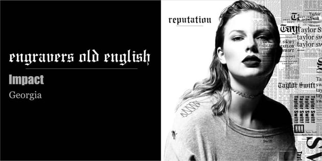
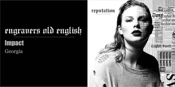
If 1989 was a soft reboot, Reputation was a hard reset. Released in 2017, Reputation introduces rap and R&B influences into Swift’s sound. As a response to multiple instances of highly publicized drama, Reputation firmly states that the old Taylor Swift sound is over in songs like “Look What You Made Me Do.”
The album cover refers to newspaper articles about Swift and also some of the rap and R&B influences and collaborations with artists like Future. If you’re wondering about the Taylor Swift Reputation font, the blend includes Engravers Old English, Georgia, and Impact, all newsprint fonts. The Gothic blackletter Engravers Old English font is also reminiscent of rap covers from the ’90s like Snoop Dogg. Reputation would be the final album with Swift’s former label, Big Machine. For the Taylor Swift Reputation font alternatives, Amika is a somewhat more modern option, while Cambridge is a more classic and highly decorative alternative.
Lover, 2019
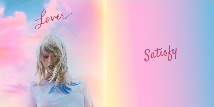


In Taylor Swift’s own words, her album Lover, released in 2019, is a heartfelt love letter to her fans. Marked by a return to positivity and the kind of energy from her formative country sound but with a decidedly pop aesthetic, Lover sees the artist come full circle.
The aptly named font Satisfy represents a return to script fonts in Taylor Swift covers and an embrace of her early sound. The Taylor Swift Lover font exudes a sense of positivity and warmth with its free-flowing forms, inviting listeners into Swift’s world of love, joy, and self-discovery. The color palette and aesthetic of Lover are reminiscent of early 2010s pop icons like Katy Perry. For the Taylor Swift Lover font similar options, the font Foundation offers similar line weight and movement.
Folklore & Evermore, 2020
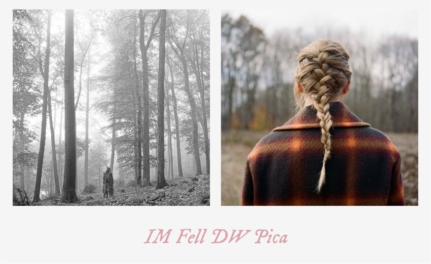
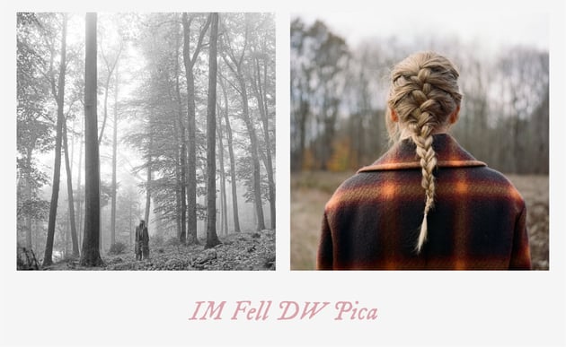

In 2020, Taylor Swift surprised fans with not one but two albums: Folklore and Evermore. Released just months apart, these albums served as an exploration of folk music that Swift has been inspired by in the past, and once again the covers are reminiscent of Bob Dylan in some ways. In these two albums, Swift collaborates with musicians like HAIM and Bon Iver.
So what font did Taylor Swift use for Folklore and Evermore? IM Fell DW Pica became both the Folklore font and the Taylor Swift Evermore font, which helped both projects speak with one voice. Alternatives for evoking the Taylor Swift aesthetic of this era include Slippery and Elgraine.
Midnights, 2022

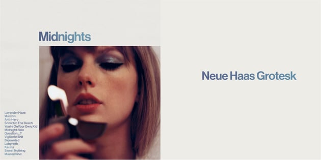

The 2022 album Midnights is an exploration of dream pop and electro-pop. Lush synth washes and club motifs would feel at home backing The Weeknd or Mystery Skulls. Swift managed yet another genre switch, though, winning multiple awards in the process. The Taylor Swift Midnights font is Neue Haas Grotesk. It’s reminiscent of Helvetica and perfectly encapsulates the contemporary and stylish aesthetic of the music within. Neuvetica and Helixa are excellent alternative options.
Eras Tour, 2023–2024


What font does Taylor Swift’s Eras tour use? Sequoia, prominently featured in Taylor Swift’s epic Eras Tour, is a high-contrast condensed serif font with a classic and timeless appeal. Its slender letterforms and pronounced serifs resemble the font lexicon of high fashion. The Eras Tour font condensed version allows for efficient use of space, making it ideal for headline and display purposes while maintaining readability. A very light version of Sequoia is available as an alternative, but Grischel maintains the high contrast and condensed look if you’re looking for Eras Tour font alternatives.
The Tortured Poets Department, 2024
Taylor Swift surprised her fans during the 2024 Grammys when she dropped some news during her acceptance speech. Swift announced she’d been working on a new album that debuted on 19 April 2024, called The Tortured Poets Department.
Following the announcement, Swift posted the album cover on her social media accounts. We see a sepia picture where the artist poses in a black top and shorts, with her arms around her body. In a nod to the original 1989 cover, the top half of her face is cut off.