When designing a dark theme, you should consider a few factors to maintain usability and aesthetic appeal.
Why to use dark theme
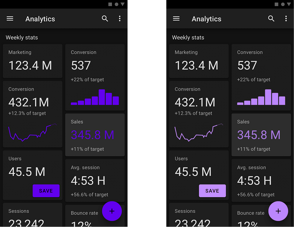
A dark theme reduces the luminance emitted by device screens, creating a more comfortable experience for a viewer.
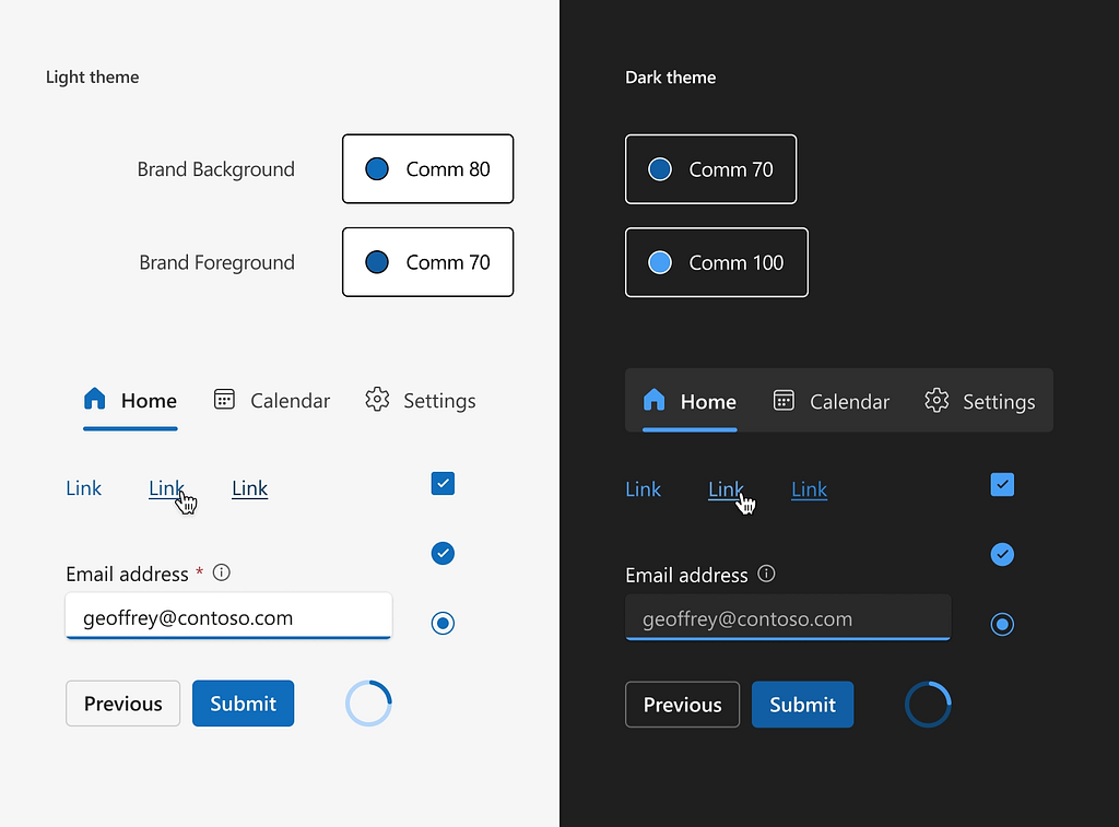
1. Avoid pure black (#000000)
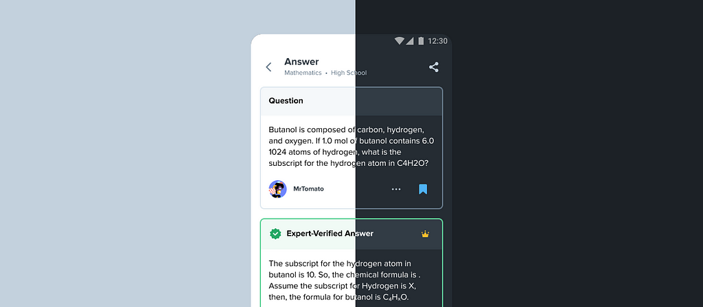
When designing dark mode, avoid using pure black as a background color, as it is too harsh for the viewer’s eyes. Instead, use a dark gray (#121212 or similar) to reduce eye strain. Dark grey surfaces make it easier to communicate depth in UI because it’s easier to see shadows on grey (instead of black).

2. Choose legible fonts
Text legibility can be a problem in dark mode. You need to choose fonts that are legible in both modes. Avoid ultra-thin fonts in dark mode, as they can be difficult to read against a dark background.

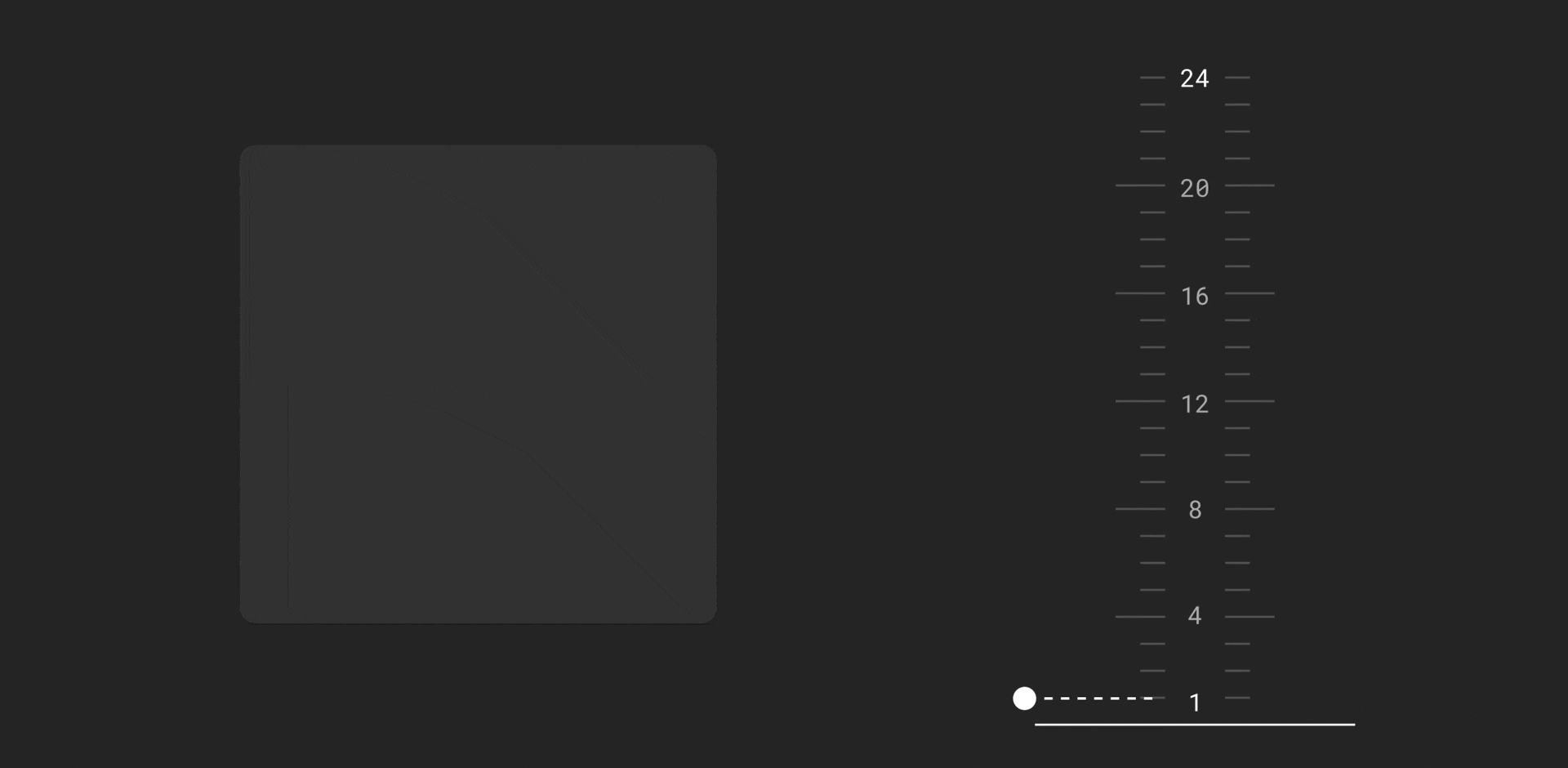
3. Adjust shadows and elevation
For light mode, shadows are generally more visible and can be used to create depth and highlight elements. However, for dark mode, it is recommended to reduce the opacity of shadows or use lighter shadows to avoid overly harsh contrasts. Use subtle glows or light borders to indicate elevation instead. The lighter the surface, the closer it is in Z-depth for a viewer.
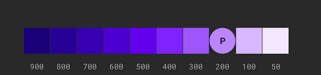
4. Avoid using saturated colors
It’s recommended to avoid using saturated colors, as they don’t pass WCAG’s accessibility standard (you need to maintain a contrast ratio of at least 4.5:1 between text and background behind it).
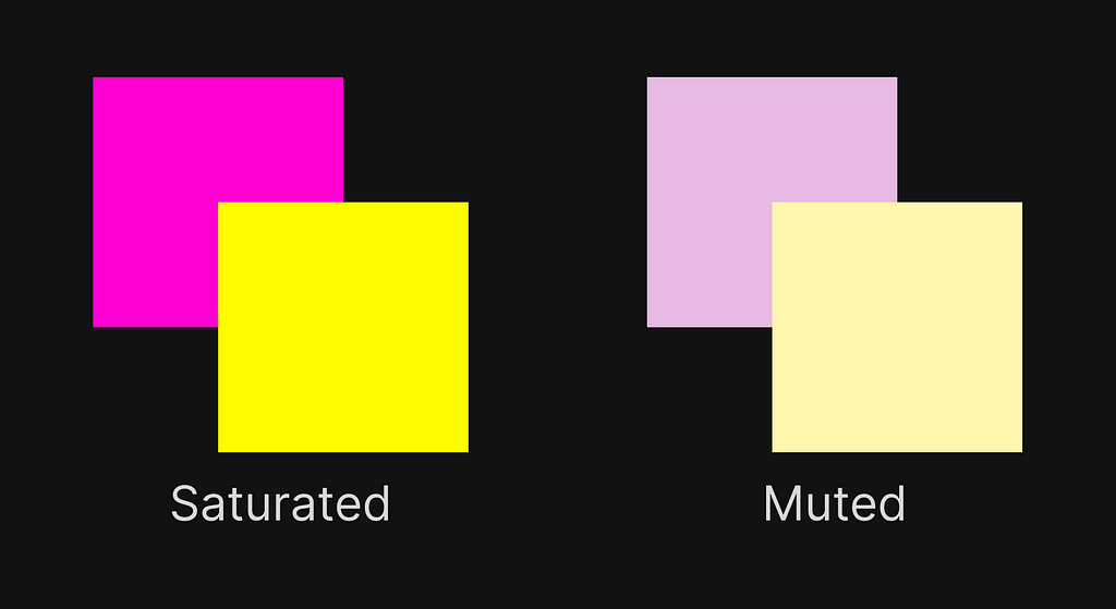
Also saturated colors tend to produce optical vibrations against a dark background, which can induce eye strain. Use lighter tones of the color (colors in the 200–50 range) for your color scheme.
5. Maintain consistency with a light theme
Ensure that the color scheme you use for the dark theme is visually aligned with a light theme.
How to create light and dark themes in Figma
https://medium.com/media/b9a897f3ac079a5c0c7823ff37d23a48/href
Want To Learn UX?
Try Interaction Design Foundation. It offers online design courses that cover the entire spectrum of UX design, from foundational to advanced level.
This post contains affiliate link(s)
Dark Theme: 5 UI Design Tips was originally published in UX Planet on Medium, where people are continuing the conversation by highlighting and responding to this story.