IKEA is known around the world for its well-designed, low-cost furniture and household goods, and the blue and yellow IKEA logo has also become iconic. Learn all about the IKEA logo history, colours, font, and more.
What Font Does IKEA Use?
Let’s start by answering the question: “What font does IKEA use?”
The IKEA logo font is based on a custom font called IKEA Sans, which was designed by Robin Nicholas.
According to the IKEA website, the IKEA logo font is based on an extra-bold version of the Futura typeface, with tiny serifs added to the letters for extra clarity and readability.


IKEA Logo History
Did you know that the original 1951 IKEA logo was red because its founder, Ingvar Kamprad, thought the colour symbolised low prices?
More IKEA trivia for you: the name is based on the founder’s initials, followed by the initials of the farm and parish where he grew up. And in Swedish, it’s pronounced “ee-kay-uh”, not “eye-kee-uh”.
Apart from a flirtation with brown in 1954 and a brief return to red in 1981, the IKEA logo has remained quite similar for decades, with the familiar blue-and-yellow colour scheme representing its Swedish origins. There have been a few minor tweaks, though—here’s a graphical representation of the IKEA logo history.


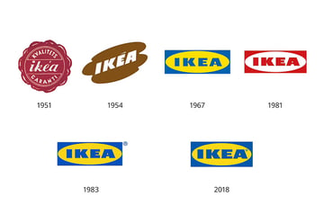
IKEA Logo Colors
We all know the basic IKEA logo colors: blue and yellow. But what if you want to match those colors more precisely? Here are the exact color codes, according to the Brand Color Code website:
| IKEA Blue | IKEA Yellow | |
|---|---|---|
| Hex Code | #0057AD | #FBDA0C |
| RGB | 0, 87, 173 | 251, 218, 12 |
| CMYK | 100, 50, 0, 32 | 0, 13, 95, 2 |
| Pantone | 2145 C | 108 C |
IKEA Logo Font Alternatives
IKEA Sans is a proprietary font that’s not generally available for the rest of us to use. But luckily there are some very close matches available on Envato Elements. If you want to download a font that looks like the IKEA logo, try one of these excellent alternatives.
Nofex Expanded Sans Serif (OTF, TTF, WOFF)
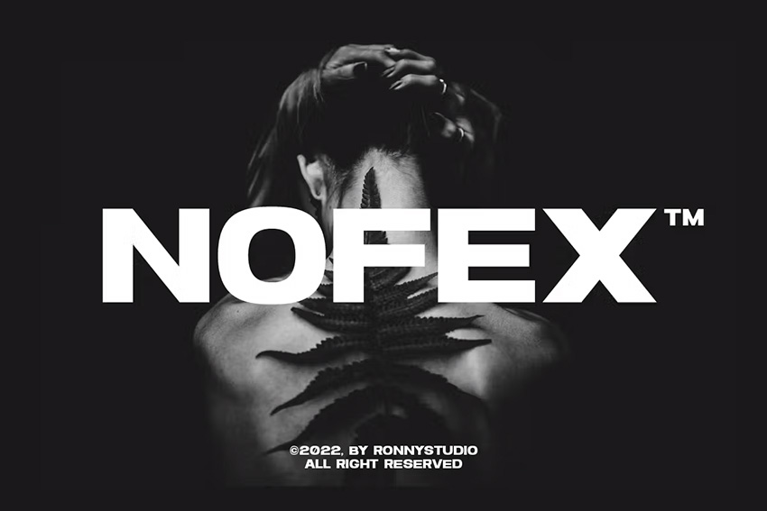

Nofex is a great match for the IKEA font because of its bold style and expanded letterforms. This clean, elegant all-caps font has high contrast and great readability, and it comes with ligatures and alternates for extra versatility.
Quart Headline Typeface (OTF, TTF, EOT, SVG, WOFF)
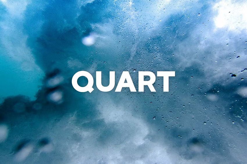


Here’s another bold display typeface that could be a great replacement for the IKEA font. Quart comes with both regular and outline versions, giving you plenty of interesting design possibilities for your logos or headlines.
Danson Sans Serif Font Family (OTF)
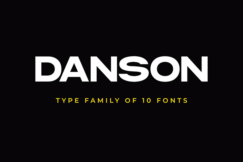
With ten different fonts included, Danson is a truly versatile font family. Danson Bold is the closest match to the IKEA logo font, but the lighter versions could be great for contrast in your subheadings and taglines.
Vaulto Extended Bold Sans Serif (OTF, TTF, WOFF)


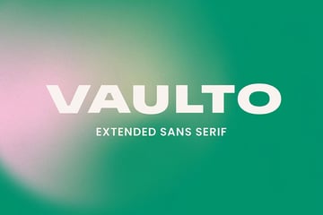
Vaulto has a slightly stretched look and bold letterforms with a strong impact, which makes it a great match for the IKEA logo. Use it for your logo design or as a display typeface in magazine and website design projects.
Vancouver Gothic (OTF, TTF, EOT, WOFF)


As you can see, the letterforms in the Vancouver typeface have a slightly different shape from the IKEA logo font—they’re more condensed than expanded. But we’ve included it because what it shares with the IKEA logo is a clean, simple design and a strong visual impact. Try it out!
Next Sphere (OTF)
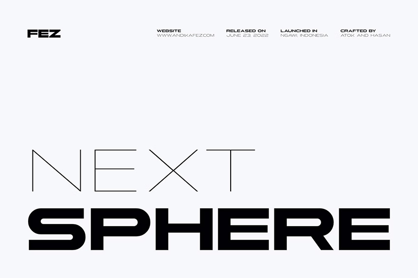
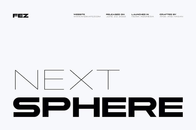
Next Sphere is like an exaggerated version of the IKEA logo, with the letterforms extended even further to create a futuristic look. It’s not an exact match, but it’s a creative alternative that will give your designs a strong visual impact.
Visage Bold & Regular (OTF, TTF, WOFF)

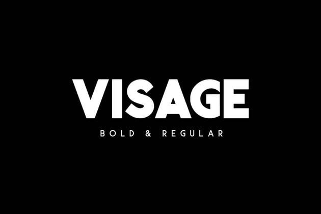

Visage comes with two versions—bold and regular—so you can use the bold version for an IKEA-esque logo and the regular version for a tagline. It includes uppercase multilingual letters, numbers, and punctuation.
Sovereign Typeface (OTF, TTF)

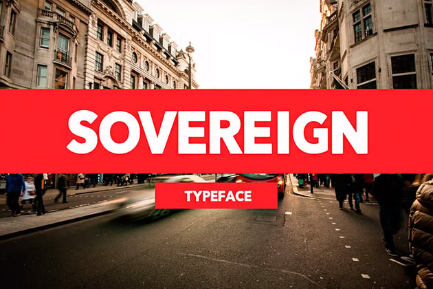

With its bold, modern look and clean design, Sovereign Typeface can give your logo that iconic appeal of IKEA’s. Try it on T-shirts, web banners, and more to see how it looks!
Conigen Modern Sans Serif (OTF, TTF, WOFF)
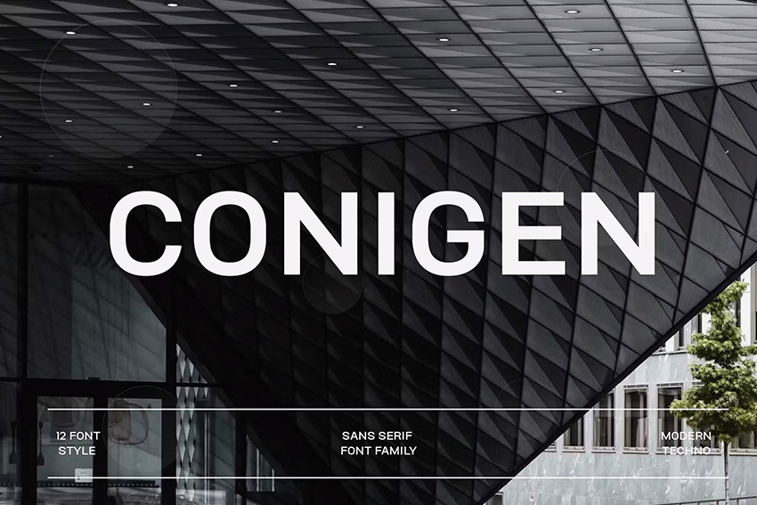
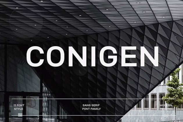
Conigen gives you 12 different styles, so you have lots of flexibility to work with. Try the Black version for the closest match to the chunkiness of the IKEA font, but also experiment with the others to see how they can complement each other.
Frank (OTF, TTF, WOFF, WOFF2, EOF)
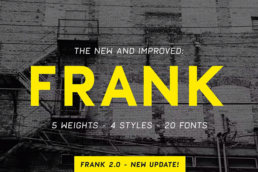
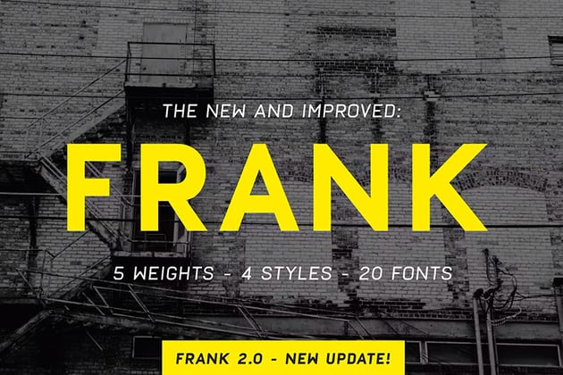
Frank’s designers trace its inspiration to DIN, Eurostile, and Futura, and it’s the Futura link that accounts for its similarity to the IKEA logo. With 300+ glyphs, along with five different weights in normal, oblique, and rough styles, you can let your creativity run wild.
Download Your Favourite IKEA Font Today
In this article, we gave a comprehensive answer to the question: “What font does IKEA use?” We took a brief look at the IKEA logo history and went through some similar fonts that you can download and use right away. Feel free to browse Envato Elements to discover more fonts and other creative assets.
Feel like learning more about fonts? Try these articles and tutorials next: