Are you searching for fonts similar to the Garamond font style? In this article, we will present you with 15 fonts that are similar to the classic Garamond serif font. We’ll also look at some fonts you can pair with Garamond in your web- or print-based projects.


The classic Garamond typeface is considered a timeless font, and it’s one of the most commonly copied and used typefaces in the history of printed books.
If you would like to discover alternative fonts to Garamond, with its classic touch, readability, and distinctive qualities, be sure to check out Envato Elements for its extensive font library.
What Does Garamond Look Like?
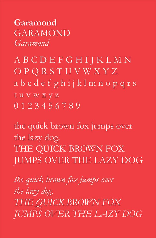
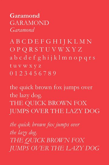
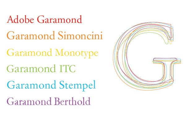
To check out what the Garamond font looks like, view the illustration below.
The Garamond serif font features elegant strokes and open negative spaces. It offers eye-pleasing legibility with its light qualities.

What Is the Garamond Typeface History?
Let’s briefly go through the Garamond font history and origin.
First, you should understand that Garamond is more a style of typeface rather than a type itself. Originally designed by the famed Parisian type designer Claude Garamond in the 16th Century, Garamond was the first to branch off from the traditional handwritten style to make readable letterforms ready for printing. The original font was called “Grec du Roi” because it was created for the Greek government solely for the purpose of Roman and Latin book printing.
The original, old-style serif typeface was designed primarily with text composition and legibility in mind. Garamond typefaces are elegant, with scooped serifs, and their simple letter recognition gives them an easy reading feel for long bodies of text. You can also take notice of their soft, rounded serifs, oblique stresses, and medium-contrast, flag-shaped top serifs.
Over the Garamond typeface history, many font variations have been developed over the span of many centuries. French printer Jean Jannon was one of the first individuals to create his own refined versions of the old-style Garamond font. Then other designers emerged, creating their own revisions based on the founding design.
The common Garamond variations used today include Garamond Simoncini, Garamond Monotype, Garamond Berthold, Garamond ITC, and Garamond Stempel. You can see a comparison in the illustration below.
Adobe Garamond and Garamond Pro are the most modern and commonly used. Adobe Garamond was released in 1989 and has become a typography staple throughout design. It captures the beauty of the original Garamond typeface, while offering a contemporary digital type family.
With the development of OpenType font technology, Adobe Garamond issued a Pro type family that takes advantage of OpenType’s features. Adobe Garamond Pro was designed by Robert Slimbach and published by Adobe, so that now the classic type family can be used in OpenType applications, such as Adobe InDesign. Fonts similar to Garamond Pro can be found on Envato Elements.

What Is Garamond Used For?
Have you ever noticed the use of the Garamond font in manuals, novels, or any printed material? The Garamond font has been used in Harry Potter, Dr. Seuss, The Hunger Games, the Abercombie & Fitch logo, and Apple’s “Think Different” campaign. You might also have spotted it in the original Google logo.
The font’s remarkable legibility makes it ideal for setting type in printing books. It is more often used in print, on large amounts of body text, rather than for on-screen or web use. Most classic fonts have on-screen limitations, so an alternative web-appropriate font like Georgia is typically used instead of Garamond. Modern web typography has certain restrictions compared to paper, when it comes to letterforms, due to the limits of our on-screen display technology.
So is the Georgia font similar to Garamond? Below is a pixel preview comparison sample of the two in the same 12pt font size. The Garamond font looks more pixelated and muddled in comparison to the Georgia font, which looks larger and more crisp. Georgia has sharper serifs and doesn’t blur on-screen like the Garamond font. Is Georgia font similar to Garamond? Yes it is, and you should use it for on-screen purposes.


Now let’s discover 15 fonts similar to Garamond.
15 Fonts Similar to Garamond
If you ask yourself what font is similar to Garamond, there are many fonts that possess the classic font style and readability traits of Garamond. Let’s look at a few fonts similar to Garamond Pro and Garamond styles. Below you will find 15 substitutes for the Garamond font style. They’re all available from Envato Elements.
1. Anko
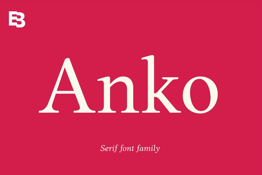
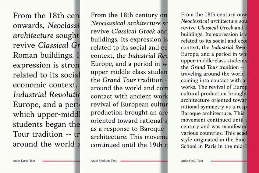
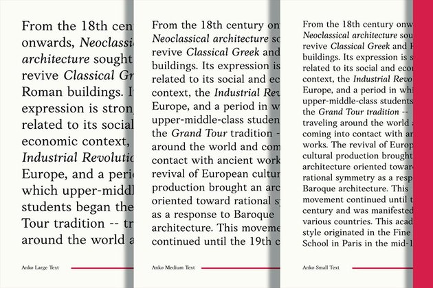
A mixed style of the Roman Old Style serif, Anko features organic forms, smooth strokes, and soft edges. This gives the font a flowy, readable quality and a warm aesthetic, similar to Garamond fonts.
This legible and clear typeface would make a great alternative to Garamond and can be used for books and magazines. Download it from Envato Elements.

2. Moetya (TTF, OTF, WOFF)
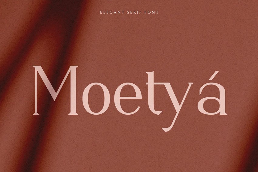
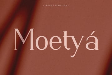
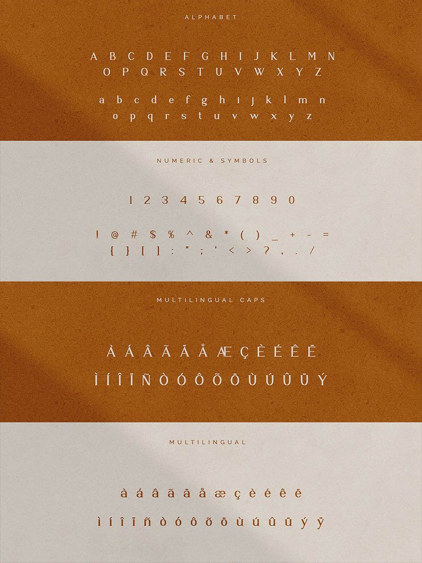
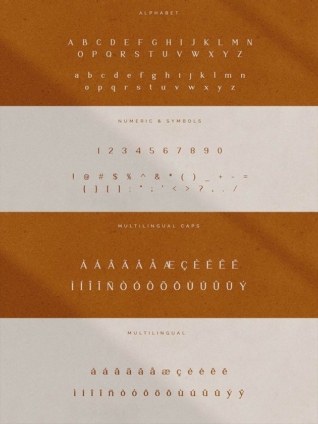
A modern and elegant serif typeface, Moetya is similar to Garamond with the thick and thin line lettering variation, and it’s also suitable for writing content. It possesses a feminine style letter form, which makes it ideal for beauty magazines, fashion products, and luxurious content creation. The Moetya font also features multilingual support for various languages including German, Swedish, French, Italian, and more.

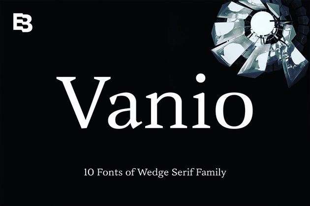
3. Vanio
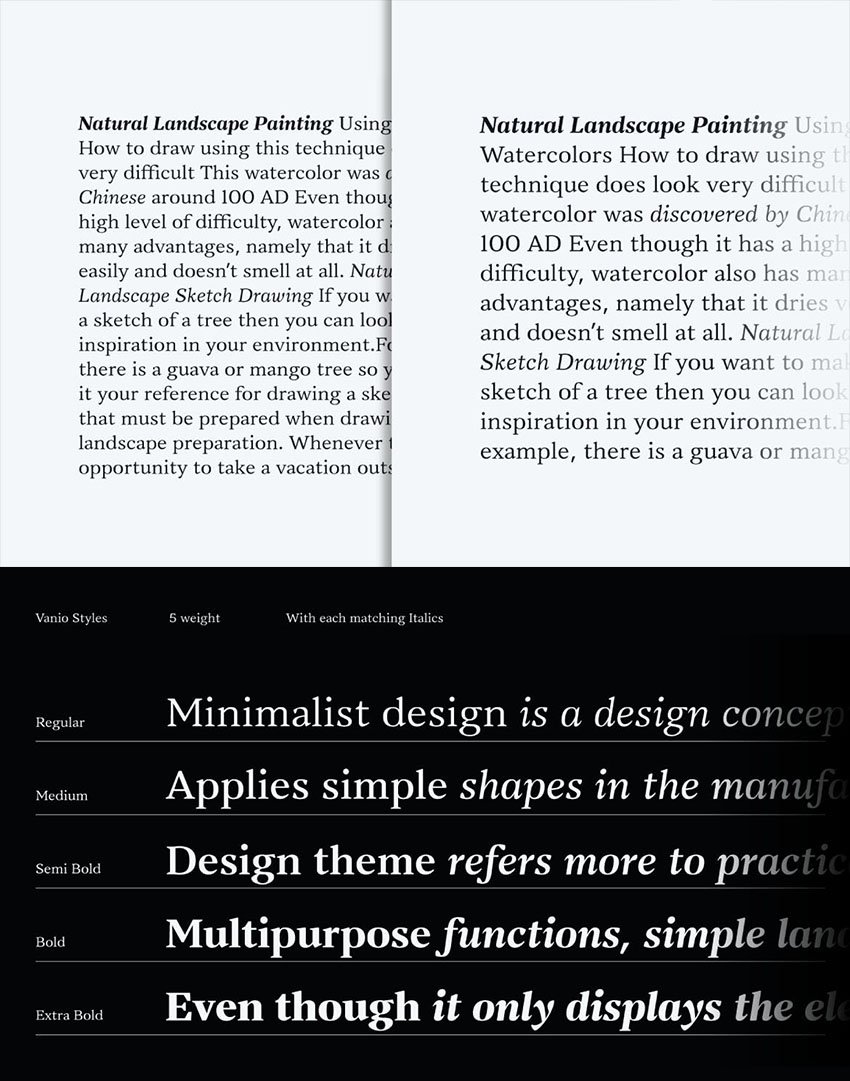
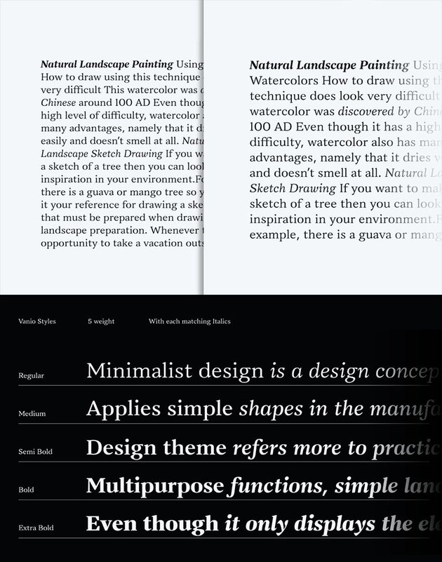
Vanio is a strong wedge serif font, focused on legibility just like Garamond. The classic type letterforms are designed to fit many typesettings, with readability in mind. This font consists of ten font styles, from regular to extra bold.
The Vanio font family is good for magazine layouts, books, and corporate and branding design elements. Vanio’s strong and highly legible style makes it good as an all-round choice for both body text and headlines.


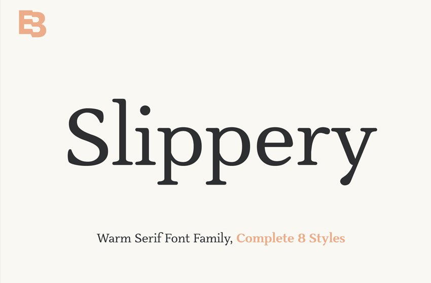
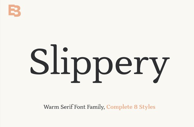
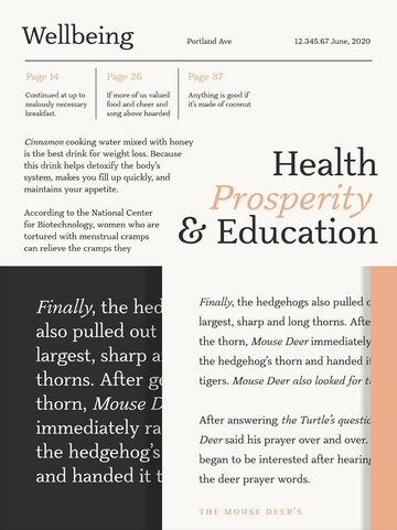
4. Slippery
The Slippery serif font family could also be used as an alternative to Garamond. It’s composed of eight font styles and features warm edges, slippery italics, and spacious letterforms. Its readability characteristics are optimal for use in small books, magazines, and branding.


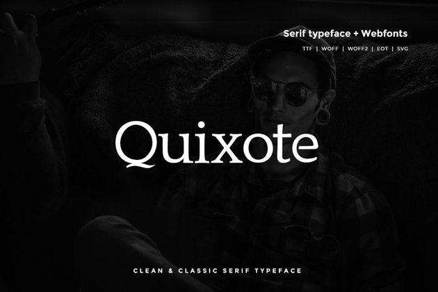
5. Quixote (OTF, TTF, Web Fonts)
A classic serif typeface, the Quixote font pack offers a clean and unique typography style, which can be used as a web font as well. Ideal for simple and minimal design, the Quixote typeface is optimal at any size and is recommended for graphic design elements, newspapers, and poster design.


6. Giveny (TTF, OTF)
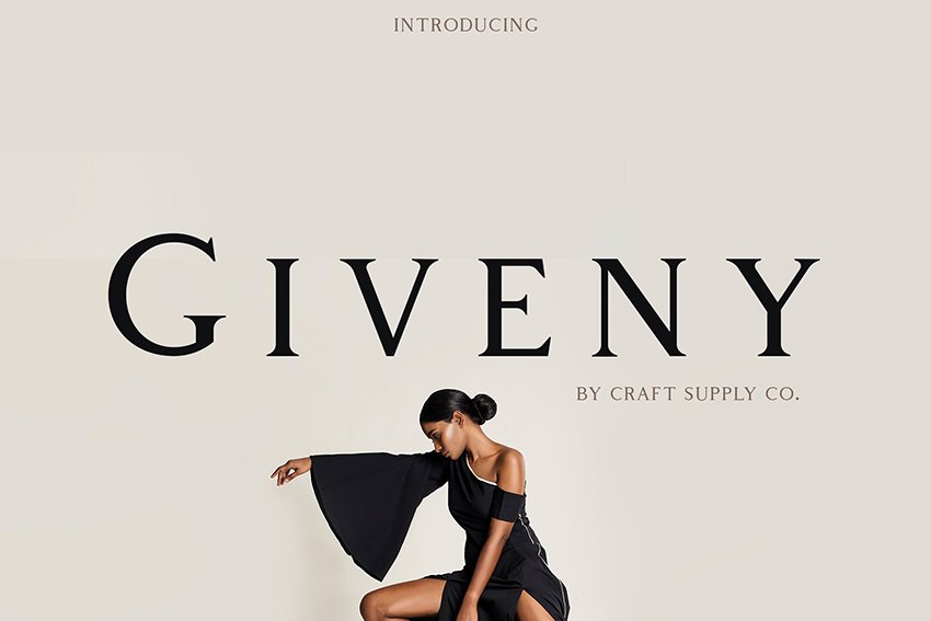
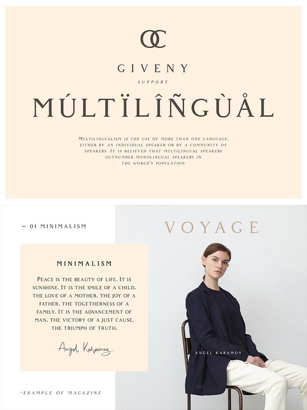
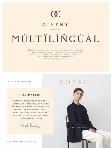
A more distinctive, business-like font with similar characteristics to Garamond is Giveny. It’s trendier and features squarish-like serif shapes as well as diminished contrast of strokes. This crafted font is suitable for graphic design, posters, stationery, merchandising, and much more. It supports multilingual characters, so you’re set if you work in various languages.


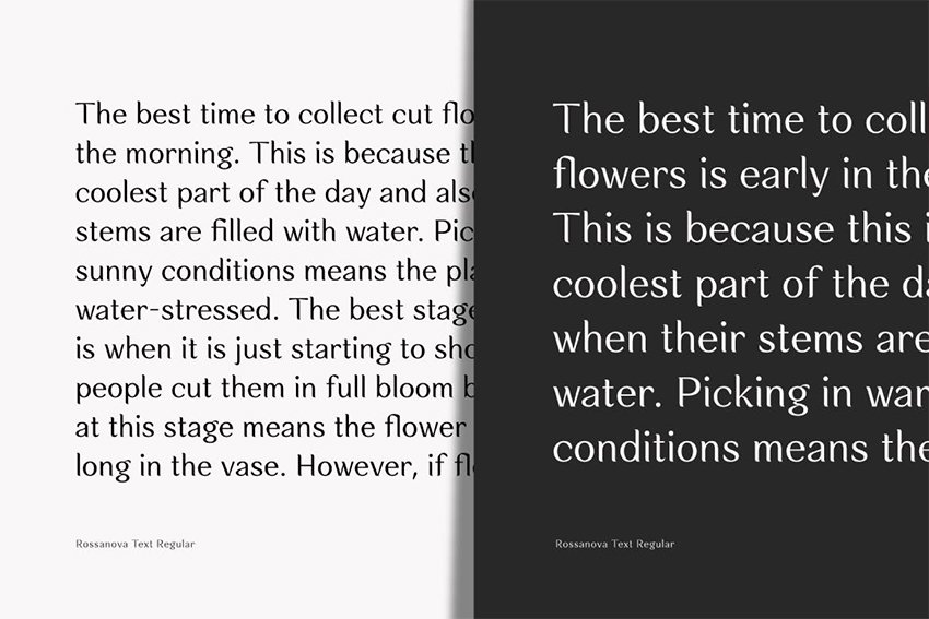
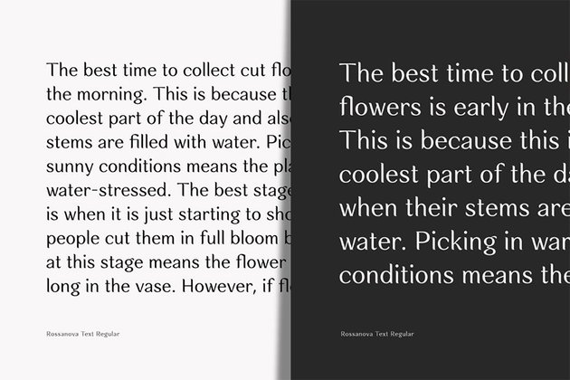
7. Rossanova
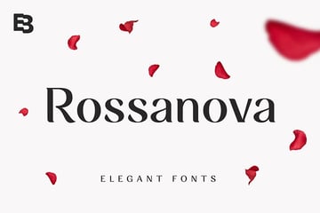
The Rossanova font family consists of 36 font styles. An elegant and beautiful font, Rossanova features vertical rather than slanted stress, has organic semi-serifs, and features leaf-like tapered terminals on the ends. Its optical style is fit for reading, as well as a display font for posters and headers.


8. Fraternite
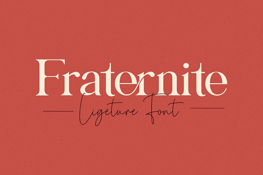
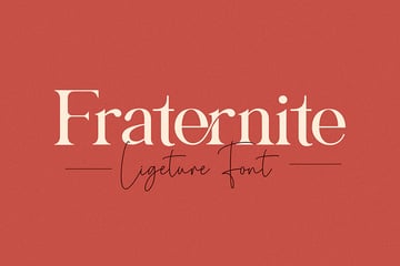
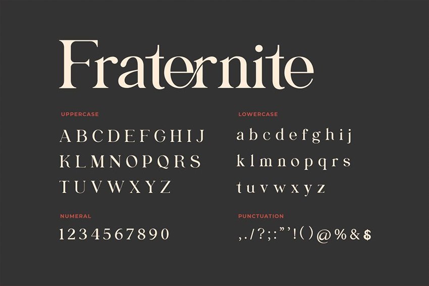
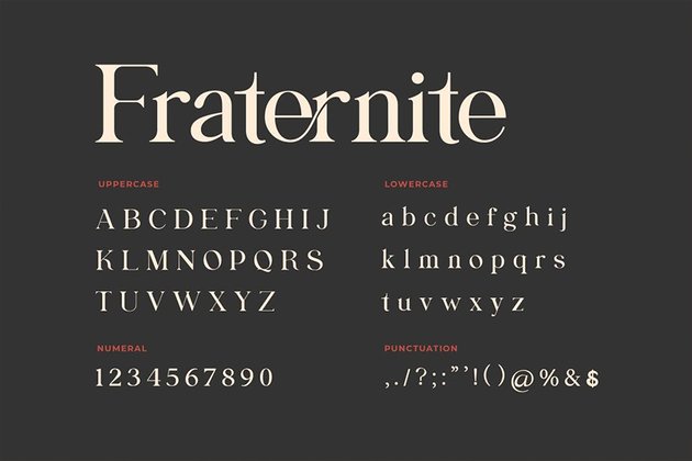
Fraternite is a serif font with a unique set of curves and decorative cut-ins, which makes it the perfect font for branding or editorial designs. Its display of masculine and feminine qualities makes it compatible with all types of design, from logos to apparel, advertising, and more. It’s a good alternative font choice to Garamond if you’re looking for a similar font with plenty of style.

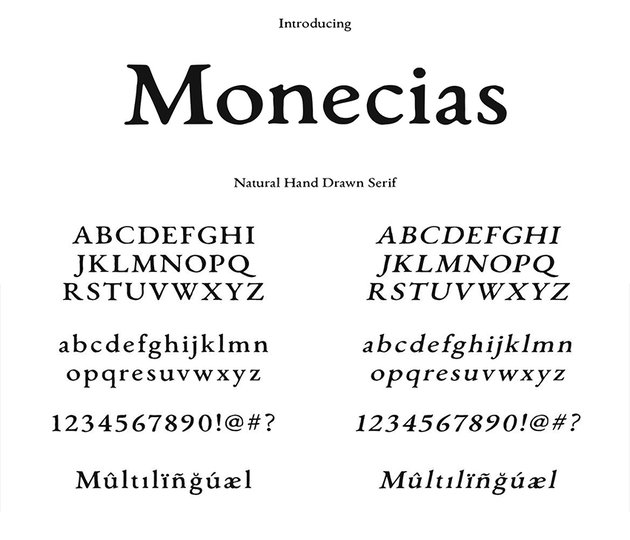
9. Monceias (TTF, OTF)
A more natural, hand-drawn font that’s still similar to the classic Garamond is Monecias. It’s a great serif font for almost all types of print design projects, as it features upper and lowercase letterforms, as well as multilingual characters. For a trendy, stylish look, Monecias works best for brand identity, craft work, packaging, fashion, and wedding designs.

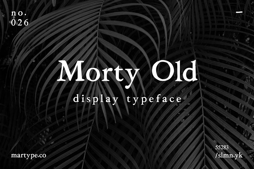
10. Morty Old (TTF, OTF)
Morty is a vintage, classic, and old-style serif typeface that resembles the Garamond style. It’s available in two styles, regular plus slanted, and is suitable for minimalistic and retro design.

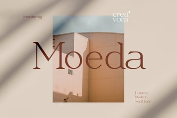
11. Moeda (TTF, OTF, WOFF)
Moeda features soft stresses and a thinner form than Garamond, but it is a luxurious and simple serif font, designed for formal or elegant projects. It’s perfect for logos, magazines, lifestyle designs, and more. The typeface features upper as well as lowercase characters and supports multilingual text, from French to Italian, Swedish, and more.


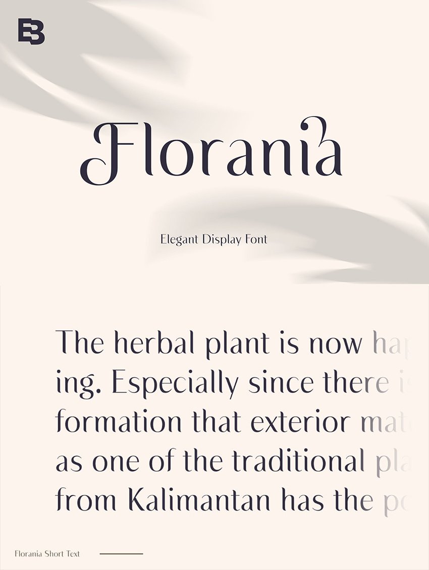
12. Florania
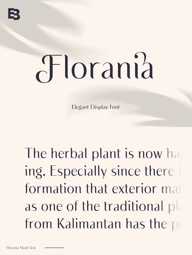
A luxurious and multifaceted readable font, Florania is fit for small and large projects. It works great on large and short text. It features a lot of alternates and ligature choices, which makes it a perfect fit for projects like beauty based designs, branding, logos, and more.
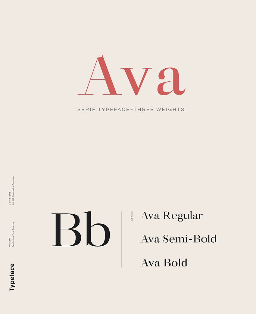
13. Ava (OTF)
This classy, feminine typeface family is great for headers as well as body text. Ava has slightly more exaggerated thicks and thins than Garamond. The serifs are thin, and the bases of the letterforms are wider. The font comes in three styles—Regular, Semi-bold, and Bold—and includes Latin characters, numbers, and punctuation. Optimal for editorial use, presentations, typographic work, and minimalist design.


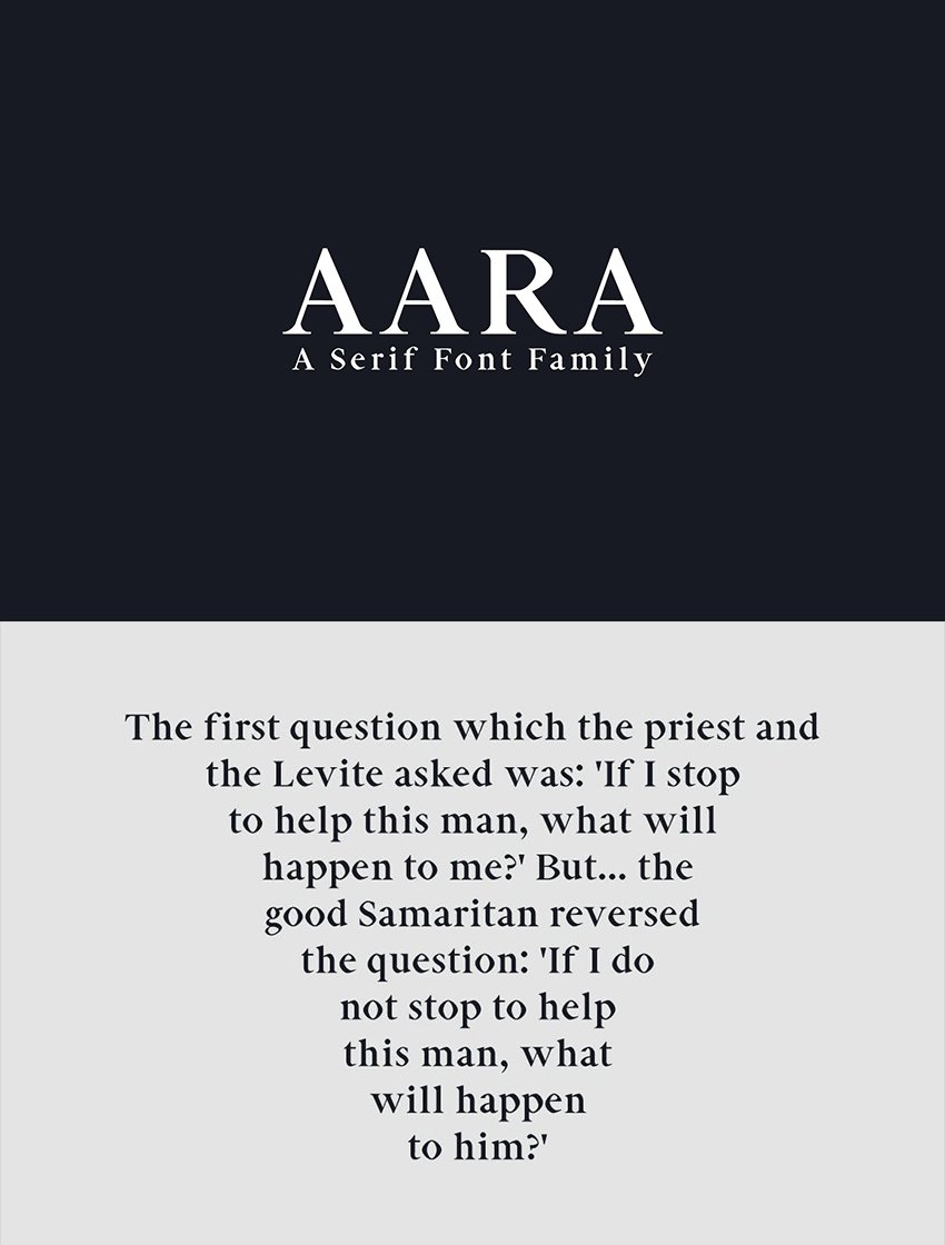
14. Aara (OTF, TTF, WOFF, WOFF2)
If you are looking to create something unfailing, Aara is a unique style font that will help you achieve winning designs. This font family consists of a pack of serif fonts of nine weights, ranging from bold to light weights. It features upper and lowercase multilingual characters, as well as numbers and punctuation. It suits modern, clean designs for logos, headlines, templates, and so forth. It’s beautiful on its own or in wide-set all caps.
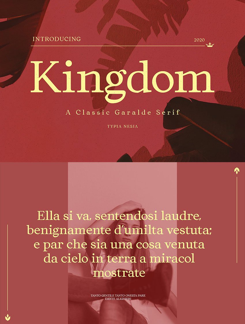
15. Kingdom
An elegant, modern serif font, Kingdom is wonderful for use in all types of projects, such as stationery design, branding home decor, boutique brands, luxury logos, etc. It features a bold and vintage-style design with a neat and authentic style.

What Font Goes With Garamond?
Now that we have discovered some fonts like Garamond, let’s see which fonts we can combine with the different Garamond styles. Here is a selection of five sans-serif fonts to pair with Garamond.
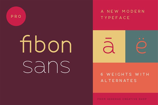
1. Fibon
The Fibon Sans font family is a perfect modern font to pair with the Garamond variations. The font is low in contrast, highly legible, and ideal for creating a dynamic combination.

2. George Sans (TTF, OTF, WOFF)
A clean and modern font, George Sans is the perfect companion for Garamond-like fonts. The font pack is available in eight weight styles. This sans-serif font is wonderful for editorial, branding, and print projects.


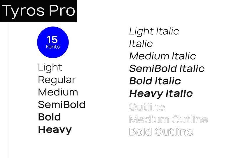
3. Tyros Pro (OTF, TTF, Web Fonts)
The combination of Tyros Pro and Garamond-like fonts goes well. This is the perfect sans serif typeface for designing all types of corporate identities, branding, web, and print projects.


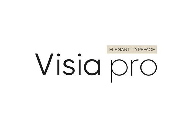
4. Visia Pro (OTF, TTF, Web Fonts)
Visia Pro is a sans-serif typeface. It features elegant and premium aesthetics that complement the Garamond font styles. Visia Pro comes with seven font weights and is a lovely choice when working with headlines, branding, corporate, web, and print projects.


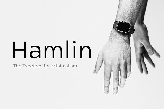
5. Hamlin (OTF, TTF, Web Fonts)
A clean, modern font to pair with Garamond is Hamlin. Its minimalistic style brings out the depth and uniqueness of your designs. Hamlin is useful for creating logos, headlines, or body text, and its simplicity complements Garamond-like fonts.

Discover More Alternative Fonts
I hope you enjoyed this article and learned something about the Garamond font history, typeface style, alternatives, and what font goes with Garamond. There are plenty of similar fonts to Garamond that you could use in your projects. If you want to look for more fonts like the Garamond serif font, then be sure to check out the hundreds of available serif fonts on Envato Elements. You will surely find a selection that will work for your projects.
And for more font inspiration, have a look at some of these articles:
