 2
2How The Feature Works
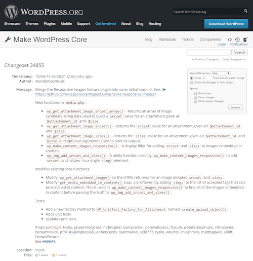
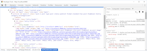
As soon as you update to WordPress 4.4, all of your content and featured images will have srcset and sizes attributes, which are filtered to ensure that every available image size is present while maintaining the dimension of the original requested image. It’s important to note that custom crops will be left out of the srcset attribute if the aspect ratio differs from the original requested image. Additionally, calling an image via the wp-get-attachment-image function will return a responsive image as well.
Responsive images is a background feature, meaning everything happens automatically whenever a user uploads an image in WordPress through the media uploader. When an image appears on a page, it will have srcset and sizes attributes as a result of that background process.
This means that the new responsive images feature has no visible user interface. There are no options to toggle, forms to fill, or boxes to be checked. That being said, theme developers should edit their theme’s functions.php file to ensure their images have an accurate sizes attribute. This is because when we talk about responsive images in WordPress, we’re talking specifically about the srcset and sizes attributes on the image tag.
While WordPress does an exceptional job at inserting all available sizes into the srcset attribute, the sizes attribute is slightly more difficult to predict. This is because the sizes attribute is responsible for telling the browser how wide the image will be at every available viewport. Since that information will be different depending on the styling of the user’s theme, the best we can do is provide the following reasonable default:
sizes="(max-width: {{image-width}}) 100vw, {{image-width}}"This default sizes attribute accomplishes two things. First, it ensures that a valid sizes attribute exists on the image, which recently became a mandatory requirement according to the specification. Second, it ensures that the browser doesn’t provide an image source that is larger than the original width requested. If there is any CSS manipulating the size of the image at different viewport widths, however, this default sizes attribute becomes less helpfull.
Since the default sizes attribute will only help with images that are not altered by CSS, filter hooks have been provided to allow theme developers to adjust the sizes attribute of every image, ensuring that a perfect sizes attribute can be delivered at every breakpoint.
It’s important to note here that, if at all possible, your theme shouldn’t rely on the default sizes attribute to provide accurate responsive images support. This is because the default sizes attribute doesn’t allow the browser to change the source of the image when the viewport is smaller than the original requested image size. It will also not be able to change the source if the image is altered with CSS at a breakpoint, when the image might need to be larger than the original requested size.
If you are a theme developer or have access to a WordPress code base, filtering your theme’s images to provide an accurate sizes attribute is one of the most important things you can do after the new version is released. The following is an example hook into the wp_calculate_image_sizes function, which you can expand on to fit your theme.
function adjust_image_sizes_attr( $  sizes, $  size ) {
    $  sizes = '(max-width: 709px) 85vw, (max-width: 909px) 67vw, (max-width: 1362px) 62vw, 840px';
    return $  sizes;
 }
 add_filter( 'wp_calculate_image_sizes', 'adjust_image_sizes_attr', 10 , 2 );
In this example, the hook will apply to all content and featured/thumbnail images. Additional logic can be added to ensure that different image types recieve different sizes vaules.
 4
4sizes vaules. (View large version5)Some new functions have been added so that srcset and sizes attributes can be added to any image that has been added to WordPress through the media uploader, in addition to images added to post content. wp_get_attachment_image_sizes will return a default sizes attribute, which can be altered by a filter in your theme’s functions.php file. wp_get_attachment_image_srcset will return a srcset attribute which will contain all available sizes of the requested image. Documentation and usage examples for these new functions can be found on the WordPress developer reference6.
Configuring Responsive Images For Your Theme
With the new functions introduced come several new hooks which can be used to provide a level of responsive image support that fits best with your theme. The max_srcset_image_width hook will allow the theme developer to filter the maximum image width to be included in a srcset attribute. Hooking into wp_calculate_image_srcset will filter the image’s srcset attributes, while filtering wp_calculate_image_sizes will allow the theme developer to customize the sizes attribute so that it best matches the image breakpoints in their theme.
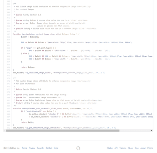
If you’re looking for an example of how best to filter the sizes attribute of an image, the new twentysixteen theme provides a perfect example7. In this theme’s functions.php file, the last two functions are filtering the sizes attribute to fit the various image breakpoints inside the theme.
 8
8sizes attribute to fit the various image breakpoints inside the twentysixteen theme. (View large version9)For content images, we’re filtering the wp_calculate_image_sizes function, while for post thumbnails/featured images, we’re filtering the wp_get_attachment_image_attributes function. We’re using two different functions because this theme changes the way its featured images are displayed at various breakpoints, which differs from the way its content images are displayed under the same conditions. Although this level of granularity isn’t always needed for every theme, it is possible to to filter your images in several different ways, allowing theme developers to be as specific or general as necessary.
Updating to WordPress 4.4 means that users will benefit immediately from responsive image support, allowing for crisp and clear images at every viewport size and pixel density. This will also result in a performance increase, since pages won’t spend extra time downloading larger images then they might need. While this is an automatic process for users, theme developers will want to adjust their images sizes attribute in their theme’s functions.php file.
Many Thanks
Building the plugin and merging it into WordPress Core was very much a team effort. With that in mind, there are several people to thank on both the WordPress and RICG core teams. Matt Marqis made all of this come together, facilitating the entire project and making sure development kept up a good pace. Joe McGill and Jasper de Groot from the RICG team helped to write the plugin into WordPress core, with assistance from Andrew Ozz. Helen Hou-Sandi and Mike Schroder provided plenty of support, advice, and insight throughout the lifetime of the project. Scott Taylor led the WordPress 4.4 development and release process, which involved plenty of discussion surrounding the responsive images feature. Chris Coyier spent plenty of his time at the earliest stages of this project, helping me to turn a few lines of PHP into a WordPress plugin that would ultimately become a permanent part of the CMS.
I’d also like to thank all who expressed interest in the plugin and core merge. Your usage, feedback, suggestions, and GitHub issues made all of this possible.
