Web design is a constantly evolving space. New trends keep on knocking while old practices keep tumbling and toppling over. With every New Year we have a round of predictions and promises, and 2015 is no different. If you are a web developer, it’s for your own good to keep a tab on these changes and stay up-to-date.
The start for the New Year is the perfect time for every business to pause, and look back over the happenings of the year that just passed. It is also the time when every CEO is building strategies for the prospective year, taking a bird’s eye view of the upcoming trends. Keeping the discussion limited to businesses that have a significant online presence, the biggest thing to consider and ponder about is the design of the website.
There are a lot of changes in store in 2015, and a lot of existing practices are being replaced with newer and better practices in web design. While the year is just getting started, it’s the right time to take a look at some of the web design trends that are going to dominate the online industry in the coming year and also the practices which have begun to fade out.
User experience is the most important thing that every web designer should care about.
Instead of pondering over the actual style of design, the best designers care about user experience, because that’s what matters in the end. Style of design is highly subjective and you can’t actually debate on the right or wrongs of every particular design, but it is the user experience that measures the actual success of every web design. Therefore, most of these trends are relative to the UI more than anything else.
1. What’s hot: Simple, flat design Elements
What’s not: 3D-graphics, drop Shadows
Flat design
Nothing is more obvious than the emergence of flat design. Whether it’s Apple, which shook out of its skeuomorphism and adopted an all flat design in iOS 7 or Windows, which came up with a complete operating system (Windows 8) designed on the principles of flat design, simplicity is the new “in” thing of web design. The concepts of flat design are pretty simple; strip the object off any design element which is not 100 per cent purposeful in its function. This includes removing any special shadow effects, 3-D graphics and using only flat shapes, buttons and indicators.
Flat design was all the rage in the last couple of years and it seems that the trend will keep pace with the passing year as well, however, in the form of what we now know as Material design. It’s something that Google came up with last year for the latest iteration of Android OS. According to Google, “Material is the metaphor. A material metaphor is the unifying theory of rationalized space and a system of motion. Our material is grounded in tactile reality, inspired by our study of paper and ink, yet open to imagination and magic.”
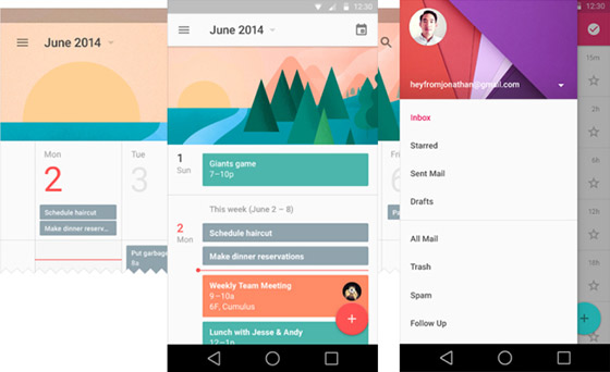
In short, Google’s material design is a higher evolutionary stage of flat design which retains a sense of tangible world through usage of subtle of gradients, animation and layering.
2. What’s hot: One-site-that-fits-all-screens
What’s not: A separate site for mobile
Responsive design
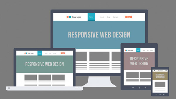
Okay! You already saw it coming. In fact, everyone has heard of responsive design and those who haven’t simply do not belong to the online industry. It’s not a new concept; however, it’s still important to reiterate that mobile-only websites will see their last this year. Anyone still trying to justify running multiple sites for different devices hasn’t probably dug deep enough into the benefits of responsive web design (RWD). Those who have are already rushing to embrace the one-site-fits-all-screens mentality of responsive design.
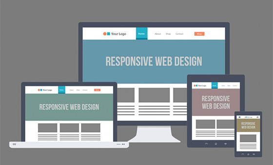
However, while implementing RWD, one must keep in mind that website’s user experience and simplicity remain intact. RWD is not about forcing the content fit onto different-sized screens, it’s about transforming your website in order to make it more accessible and effective.
3. What’s hot: Long scrollable web-pages
What’s not: Sites with too much navigation
Endless scrolling
It took a while, but we, as information consumers, have finally come to home with the idea of websites that do not require much navigation to read of posts. Instead, all it requires is endless scrolling. With new design changes such as RWD and white spaces, long scrolling sites have become the norm. This is simply because scrolling through a website is far easier than clicking on links to access different posts. These long-scrollable sites will be able to change layout and design as one scrolls, which makes scrolling an even lesser tedious process.
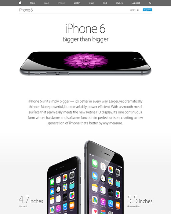
Apple iPhone 6 page.
One can find the long scrolling employed in places other than home pages as well, especially the product pages of e-commerce sites. The most notable example is Apple’s page for its iPhone 6, which is a long scrollable page that showcases all the product’s specifications and features.
4. What’s Hot: Rich Custom Background
What’s Not: Stock Image or White Background
High Quality Custom background
Gone are the days when stock photography would suffice the creative appetite of web designers. Most new websites today want to look different and unique from others and professional photography customized to the website’s theme and purpose helps them in the same. Using custom photography in your designs not only takes the web design standards a step ahead from others but it also ensures uniqueness for your site. Most of the time we find the home page background filled with custom high quality pictures. Another step forward in creating richer background is the use of HTML Video.
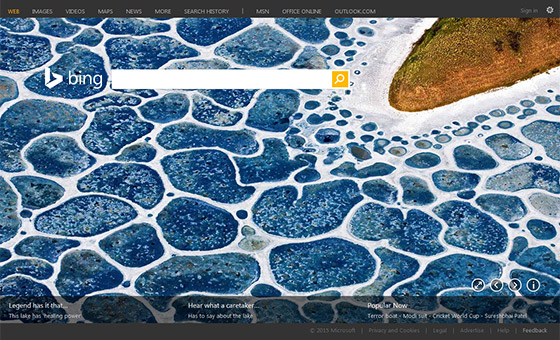
You must have seen the Bing search engine’s home page frequently using HTML5 powered video backgrounds such as one where you see a video of the Grand Teton Nation Park or another where penguins are jumping out of an ice hole one after the another. You can achieve the same effect on your site through the standard HTML5 <video> tag. Otherwise, you can also employ jQuery plugins like Tubular that let you use any video as background. A richer experience attracts visitors and can also initiate call-to-action.
5. What’s Hot: Interactive story telling
What’s Not: Plain-boring websites
Interactive Story Telling
While great content was always an important requirement for a compelling web design, being able to tell and sell your story through that content is what will drive a website’s success in 2015. The perfect example that is most commonly quoted in the web design world in this regard is the website of the famous electric car manufacturer Tesla Motors. The Go Electric page on the website uses large images, embedded infographics, and other elements to answer consumer queries about the cars and evolution of Tesla motors. The website is a successful example of all the latest trends of web design implemented at one place.
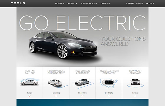
The Go Electric Web page
Another example of interactive storytelling implemented along with long scrolling is the eponymous website, startupthisishowdesignworks. When you implement interactive storytelling in your webpage, every element of the website, right from page layout to colors to fonts become narrative tools with which you can tell stories about your brand and its products.
6. What’s hot: Parallex scrolling
What’s not: Non-interactive backgrounds
Parallex scrolling is a new technique, where the background moves at a slower rate relative to the foreground creating an immersive 3D effect. Gaining immense popularity with magazine themed websites, it is certainly one big web design trend of the moment. Parallex in itself is not a new concept, as it has been used and reused by astronomers to calculate the distance of celestial bodies and also in sea navigation.
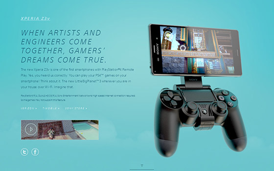
Sony’s website Be Moved page.
However, its usage in web design has become the talk of the town lately, and for a good reason. In an era where web designers are willing to go to any extent for creating an engaging experience for the visitor, parallex scrolling is just the perfect remedy for an ailing design. It can help you revive the fortune of your website by inviting your visitors to engage with the site. The interactive nature, plus the engagement that comes with it is possibly best that web design can achieve currently, especially when compared with any other technique. It’s a vivid way to present your product, tell a story, engage with visitors and initiate a call-to-action. Sony’s website is one of the best examples of parallex scrolling.
Bottomline
Iteration will be a big theme in web design in 2015. Trends like flat design, responsive design have been around for quite some time now and in 2015, there will be iteration on these trends. Instead of coming up with something radically different, most web designer would favor an iterative process for their new designs, improving the designs for latest technologies, and browsers. Window’s Project Spartan, Microsoft’s answer to Chrome and replacement of an ailing Internet Explorer is just around the corner and it might spark the quest for something new.

