Now 2015 is ended, many a times we look back and ponder on what took place and how the year turned out since its start almost 8 months back. Mostly, people would immediately think of a popular blockbuster movie or maybe a song that topped the charts. But for a specific group of professionals, web designers to be exact, the most interesting thing they can discuss about the year are the Web design Trends.
You see, over the past decades, web design has seen amazing improvements and has been introduced to amazing designs and innovative ideas to make a site look better. With 2015, unfortunately, the Web Design trend revolved around a single idea which struck popular to most of the website owners and led the world to believe it was the best among all. What I’m talking about, is the commonly used theme of a wide background with a seemingly unending vertical scroll and hero sliders included. This has no specific name but it has been adopted by almost everyone around.
You may be interested in the following related articles as well.
With over 55 Million images, Shutterstock has you covered – Save 12% on any image plan with code: GRAPHIC12
A wise man says the most honest thing according to the web designs we have been seeing over the past years, “We’ve reached a point where the majority of “pretty websites” all look the same”. This is very true. Now-a-days, any website owner who can afford a good web designer will ask for one thing: The unending scroll with a fluid background which fills up the entire width of the webpage. I don’t make it sound too flattering, but it is the cold hard truth. It is so ‘mainstream’ that now these web designs might just start to fade away. Let’s talk about how the trends might be affected in the next year or so. Though, I must say these are only predictions and not facts. These may happen or may not, but they sure are very likely.
Originality
Believe it or not, every website today, would basically feel the same as any other, except a few color changes at max. Basically, it would lack originality. It would not be unique or creative at all. It does look pretty to the average user still, but then again, if you want frequent users and clients to visit your website, you would require something that does not bore a person at all. It should be striking and something so beautiful that it grasps attention at every glance.
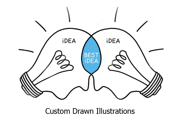
How would that happen? Simple. The most visionary of all might already know the answer to it. Since we need something better than what we have seen throughout the year, it can only be made more original, if it is custom made. By that I mean custom drawn illustrations and cheeky animations which never fail to impress.
Minimalistic Thinking
Truly, we are adapting minimalistic design in everything we do. From an interior design to a web design, minimalistic is the new fashion. With the introduction of Android 5.0, the new flat design has also been introduced and is being developed. We can safely assume that this design which starts off from mobile phones will someday be popular in the pc market as well.
On the other hand, websites also show increased adaptation of a minimalistic and simple design which is sleek and unique at the same time. Now, websites are preferred cleaner which makes them much easier to organize and use rather than the old cluttered up websites that have everything in one single web page. This makes it very hard to focus on what you want out of the website and thus, these types are usually neglected. This makes the previous trends clear to be fading away.
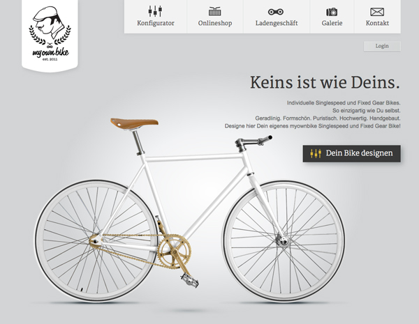
Lastly, there is minimalistic thinking in advanced animation which though complicated to the creator, is very easy to use for the user. This has again no name, but I will do my best to describe it. The prediction I’m talking about is like organizing everything and hiding it under a few general and broader tabs. This way, when you open a website, you would only see two or three options, like registration or home etc. This is more of an ‘application inside an application’ kind of design, where you automatically start navigating around the website through a set path. This makes it quite simple and also seems unique.
I know this is a lot covered under ‘being minimalistic’ but that only proves how broad this field is and how changes in trends are majorly related to it. There are also suggestions and predictions of a lesser page length to allow for faster navigation. A long scroll down into the contents of the site always seems to bother me, but surely, people would soon try and solve this too.
Typography
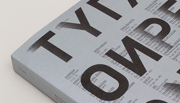
This never gets old. Typography is a kind of trend always fading in and out of the Graphic Designing world. But at the end, it really matters to have a good typeface. Moreover, the wide variety of typographic or fonts available will now be enhanced to make one specific one available to suit every kind of website.
Responsive Web Design
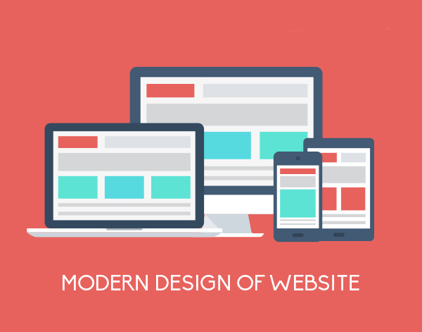
Lastly, one of the most important thing modern designers must keep in mind is that their design is responsive. This means that it is compatible and looks comfortable on both a pc and a mobile phone or tablet. This is crucial to the success of a design, not only because almost everyone who could be a potential client owns a phone, but also because of the fact that all those who own it would love to use it for access to your website. But if it does not fit on the screen or looks the same old boring one from their pc, then it seems that it is not Responsive. Therefore, create a design which will work on every platform, and will make navigation easy on them too. Keep in mind that they will have to touch to move around, not click. Plan accordingly.