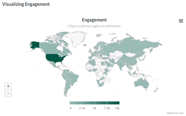
Zoom in to discover where your emails are being read.
A great new feature offering more insight into your subscribers is now available with every email send and monthly insight report:
Geographic data on engagement stats.
And not just the numbers, the team went a step further and added a mapping feature for visual representation.
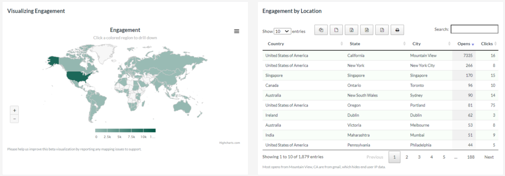
A new way to look at the behaviors of your subscribers, the maps and corresponding data show where your audience is when they open or click your emails. Take a bird’s eye view by looking at countries, or zoom in to drill down for specific regions and/or cities.
Working with this information can offer ideas for location-specific content or, broadly thinking about time zones for different countries, what times of the day seem best to send your emails.
The geographic data and mapping feature is available for all email campaigns sent after October 1, 2020, and any Monthly Insights reports for October 2020 and afterwards. After tweaking this feature in the first few weeks, the development team is looking to how and where else to can expand its abilities to other areas of the app.
Interested in giving this and all of our great features a try? Learn more about our free trial and reach out to us on our Support Page to contact us via email, chat, or even over the phone. Live support is available Monday to Friday, 9 AM to 5 PM Eastern.