I’ve covered basic image galleries with CSS and PHP in previous articles, making it time to do the same thing with JavaScript.
Image Options
As with the other image gallery examples, we need a two versions of each image: a thumbnail image and a full-size image. In this case, you have two options for the images:
- Save the image versions with the same name, placing them in different folders: thumbnails and fullsize. This is probably the best option for sites with many resources, and is the route taken in the code for this article.
- Provide the images with different filenames, and store them in the same location: for example,
newyork-full.jpg(the fullsize image) andnewyork.jpg(the thumbnail). The CodePen demo for this article uses this approach.
The Markup
The markup is very similar to previous examples:
<div id="gallery">
 <div id="thumbs">
 <input type="image" src="thumbnails/desert.jpg" alt="A broad and empty desert"><input type="image" src="thumbnails/watchtower.jpg" alt="An empty watchtower on the edge of the Grand Canyon"><input type="image" src="thumbnails/namib.jpg" alt="Pools of salt in the Namib Desert">
 </div>
 <figure><img src="fullsize/desert.jpg" alt id="fullsize"><figcaption>A broad and empty desert</figcaption></figure>
</div>
The image input elements make the gallery keyboard navigatable, and thus accessible, as well as providing a pointer hint on hover. Perhaps surprisingly, the element also supports srcset for Retina images. (Read on for an example of this).
The CSS
The easiest way to arrange the gallery is with flexbox:
 body {
	background:#111;
	color:#fff;
}
div#gallery {
	display:flex;
	flex-direction:column;
}
div#gallery div>input {
	width:33%;
}
div#gallery figure img {
	width: 100%;
}
The result is what you see at the top of this article.
The Script
Added to the bottom of the page:
 var caption = document.querySelector("#gallery figcaption"), thumbs = document.getElementById("thumbs"), fullsize = document.getElementById("fullsize");
thumbs.addEventListener("click", function(e) {
	var filename = e.target.src.split("/").pop();
	fullsize.src = "fullsize/"+filename;
	caption.innerHTML = e.target.alt;
}
)
An explanation: after identifying the appropriate elements, the script uses event propagation to determine which thumbnail the user has clicked on. The filename for the fullsize image is determined by splitting the file path for the thumbnail into an array and popping off the last element, concatenating the result to fullsize/. The thumbnail image’s alt attribute is used to set the caption text for the fullsize version.
Adding Retina Support
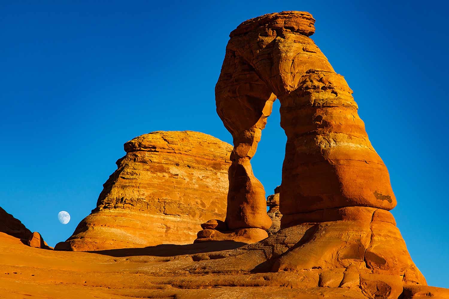
Adding support for HiDPI images is fairly straightforward. The input elements change to:
<input type="image" src="thumbnails/delicate-arch-moab.jpg" alt="Delicate Arch, Arches National Park, Moab, Utah">
And the script sets both the src and srcset attributes of the large image:
 var filename = e.target.src.split("/").pop();
var fileNameArr = filename.split(".");
fullsize.src = "fullsize/"+fileNameArr[0]+"."+fileNameArr[1];
fullsize.srcset = "fullsize/"+fileNameArr[0]+"-2x."+fileNameArr[1]+" 2x";
In this version, the filename is further split to separate out the extension; it is recombined to produce the filename for 2x images (e.g. fullsize/moab-2x.jpg)
Limitations & Drawbacks
While effective, there are a few limitations to this technique, at least as presented here:
- There is no progressive enhancement to this technique; if the user doesn’t run JavaScript, they won’t see any fullsize image except the default one. See the next article for a possible solution to this problem.
- There is no history of user actions on the page, although this could be added via the History API.
- Unlike the PHP method, there’s no way to direct users to a particular image via a link; again, this could be altered by manipulating and reading the browser URL.
Photographs by Mariusz Kluzniak and James Marvin Phelps, licensed under Creative Commons.