Mega Menus and User Experience
The main principle behind using a mega menu should be the answer to one simple question:
Does a mega menu make it easier for people to navigate around my site?
You shouldn’t just add one because they’re the latest cool thing. The addition of a mega menu to your site should take into account user experience (UX). If your mega menu will make the navigation process smoother and more intuitive, then add one. If it won’t, or you just don’t need that many items in the menu, stick to a regular drop-down menu.
Another question you might want to ask yourself when deciding whether to use a mega menu is this:
Will a mega menu help my website meet its objectives?
You might be thinking this is a vague question and one that it’s hard to answer, but all aspects of your site design and content should relate back to what your website is trying to achieve. This could be one of a number of things:
- to sell products online
- to encourage people to contact you to buy your services
- to grow a following
- to promote a charity
- to create a community
- to get subscribers
- to sell tickets to events
I’m sure there are plenty more objectives a website could have, but these are some of the most common. Understanding yours will help you to know exactly which pages in your site you want users to visit in order to achieve your objectives.
So if you want people to buy products online and you have a large and complex store, a mega menu may well be the way to go. But if you have one very specific product or service and you want to funnel people into the sales page for that, then a mega menu could be a distraction.
Before you decide whether to add a mega menu, take the time to consider what you want your website to achieve, where in your site you want to encourage visitors to go, and what kind of navigation is going to encourage them to do that.
Below are some specific examples of when a mega menu might enhance your site.
When to Use a Mega Menu
Let’s take a look at some scenarios when mega menus are a useful addition to your site.
1. When Users Are Expecting One
If your site is a retail site, then users will be accustomed to seeing mega menus and using them to navigate the departments of the store.
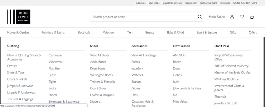
For example, the John Lewis site shown below uses a different mega menu for each major section of the store. The one below is for the women’s clothing section:

People are accustomed to using mega menus in the websites for large department stores like this, and won’t be confused by it. If I visit the site looking for a dress, for example, I can easily go to that section of the site with one click.
2. When a Drop-Down Menu Would Be Too Large
In some cases, a drop-down menu, or a series of them, would contain so many options that it would detract from UX.
Jakob Nielsen and Angie Li did a study showing that for large navigation menus, mega menus enhanced UX compared to drop-down menus. This is because a drop-down menu with lots of content will require the user to scroll down or sometimes scroll down and then back up again. This takes longer, puts more strain on short-term memory, and can be confusing.
So if your site needs to have a lot of elements in the navigation menu, a mega menu may well enhance UX. But make sure that if you do use one, you structure it in a way that’s intuitive for users and that you use design cues such as colours, text effects and fonts to make it easy to browse.
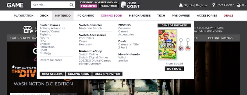
The Game website below is a good example of a series of mega menus, each one relating to a section of the site. These have used spacing and text effects such as bold text and backgrounds to make the menu intuitive and easy to navigate.
3. When the Design of the Menu Enhances the Site
Sometimes, you have the opportunity to add more than just text links to your website.
The Moleskine site, shown below, has a mega menu with a difference. In addition to the text links, it has photos of a few key products, which act as links along with the text overlaying them.
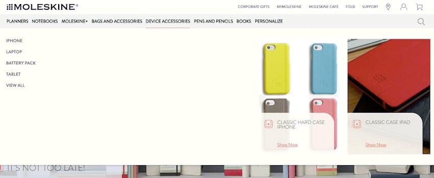
This encourages the visitor to go to those pages and makes the mega menu more than just a functional aspect of the site—it enhances the design and helps meet sales objectives.
When Not to Use a Mega Menu
There will be times when you shouldn’t use a mega menu. Here are some examples.
1. When You Don’t Have Lots of Links
If your site doesn’t have hundreds of pages, then a mega menu will be overkill. For the average small business site or blog, a mega menu will just confuse visitors—and it will look pretty empty, too.
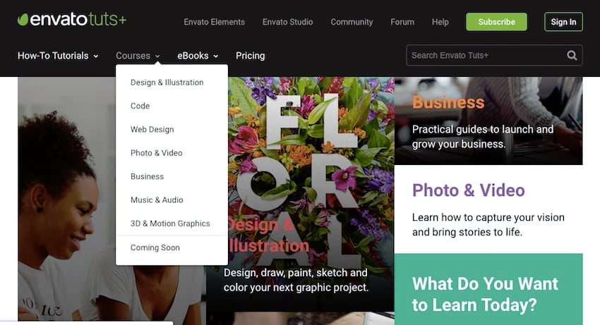
The Envato Tuts+ site uses a combination of mega menus and normal drop-down menus. For those sections of the site which don’t have a lot of links, a normal drop-down menu does the job and covers up less of the page:
2. When Your Home Page Is Nothing But Links
If your homepage is just a page full of links to subpages, then you don’t need a mega menu as well.
An example of this is the UK Government site, which has a page full of links as its homepage:

Once you navigate further into the site, there’s a left-hand navigation menu which can be expanded:

This is also a good example of not using a mega menu in a context where users might not be expecting it. Mega menus are less common in public sector websites than they are in retail, for example.
3. When You Want to Funnel Visitors to a Specific Page
Sometimes your site will be designed to sell just one or two products or services, or to encourage signups to a mailing list.
If that’s the case, you may well have a banner on the homepage directing visitors to a landing page.
In cases like these, you want to keep navigation minimal. A mega menu will give visitors so many options that they’ll be far less likely to visit the page you want them to. So keep your navigation to a minimum and focus on funneling visitors into your landing page.
The Social Media Examiner site is a good example of this. Right now, they want visitors to do one of two things: sign up to their mailing list or buy a ticket to their conference. The banner reflects the second of these, and the call to action that takes up the top section of the homepage reflects the first.
If they gave visitors a big mega menu, it would reduce the chances of them doing one of those two things, so they keep navigation simple instead.

4. On Mobile
It’s going to be difficult to create a mega menu that will be legible on a small screen. To make it work, you’d have to either make the links tiny, which means people wouldn’t be able to tap them, or introduce scrolling. Combining a mega menu with scrolling can be confusing as it’s difficult to know where the mega menu ends and the page content begins.
It’s better practice on mobile to use a burger menu: a menu which is invisible until you tap on a symbol for it. It’s often referred to as a burger menu because of the symbol: three vertical lines look a bit like a hamburger.
The John Lewis site featured above has a menu like this. Tap the symbol, and menu options drop down beneath it.
Things to Keep in Mind When Adding a Mega Menu to Your Site
We have just discussed when you should and shouldn’t add a mega menu to your site. If you decide that a mega menu will improve the usability of your website, it is time to learn about few important things that are worth keeping in mind before you add one to your website.
Links Should be Well Organized
Mega menus will usually contain a lot of links. Therefore, it is important that the links are well-organized and divided in proper sections. This is evident in the screenshot of the mega menu on the John Lewis website. The links under the Women section are further put into different easily navigable categories.
You also want to make sure that all the links in a mega menu are easy to read and click. Links should have enough space between them so that users don’t accidentally click on something that they didn’t want to visit. They should contain limited text but still be able to help users understand where they will take the users once clicked.
You might also want to add some visual cues to the navigation menu to help users understand how the links are organized. For example, an arrow icon will indicate to users that clicking on a particular sub-menu item will show a bunch of new links. Items that are and aren’t clickable should be easily distinguishable.
Mega menus are complicated and resource-intensive. They require a lot of markup, CSS, and JavaScript to work everywhere as expected. Some mega menus also use images very generously. This can have an adverse effect on the loading time of the menu as well as the website. You don’t want your potential customer to get fed up waiting and then going to your competition. Therefore, keeping the mega menu optimized should be a priority.
As we discussed earlier, mega menus don’t work well on mobile devices because of there small screen sizes. You should consider providing an alternate way of navigation on smaller screens to keep your website responsive. For example, you could use the hamburger menu on mobile devices and maybe drop images in the navigation menu on small screens and only use basic links.
Users will be frequently using your mega menu to hop from one section of the website to another. You can use knowledge to boost user engagement by tastefully adding some call to actions or promotions at the right places.
What may seem obvious and correct in a mega menu to you might not be so for the users. Therefore, it is important that you consistently do A/B testing on your mega menu to figure out what kind of layout gives best results for your situation.
It is also equally important that you test your mega menu on as many browsers and devices as possible. Mega menus are complex UI elements and getting them to look right can be a bit tricky. While you are at it, also make sure that all the links in your mega menu are working properly.
For more inspiration for creating your mega menu, you might want to check out these other posts on Envato Tuts+:
Mega menus can be a great way to improve the UX of your site. If you have a large site with lots of links, then adding one will help your users navigate. If your site fits the bill, try adding a mega menu today.