
As bloggers and website owners, we’ve all had our share of fickle website visitors. You know the kind. They are visitors who come to your website and leave within a few seconds. Sure, something about your brand got them interested, but for some reason, they leave without buying or clicking any links
Hurts, doesn’t it?
One way to ensure that your audience stays engaged is to work on your web design. If your website looks outdated or unappealing, visitors won’t think twice about closing the tab. Worse, they will probably leave with a bad impression of your brand.
Ready to revamp your website? Then start looking around for inspiration. Here’s our roundup of the best website designs for 2019 (so far!).
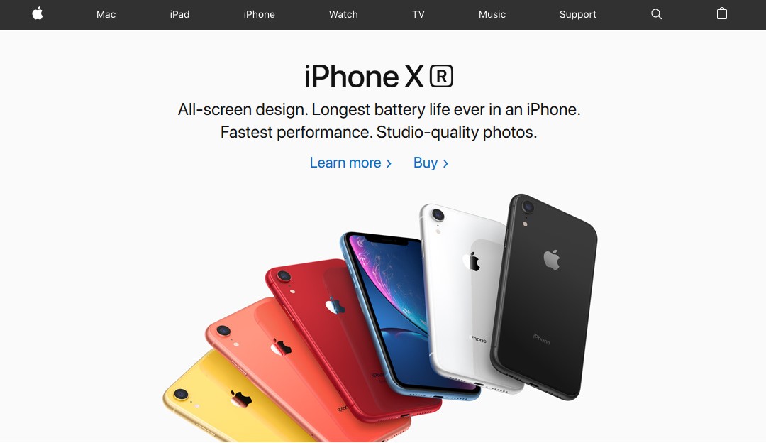
Aside from its innovative products, Apple is also famous for pushing the boundaries of website design. The Apple design team knows that high-quality images sell so wherever you look on the website, expect hyper-realistic images that will make you wish you had the latest iPhone in your hand. The website’s unique lighting really makes Apple products jump out of the screen.
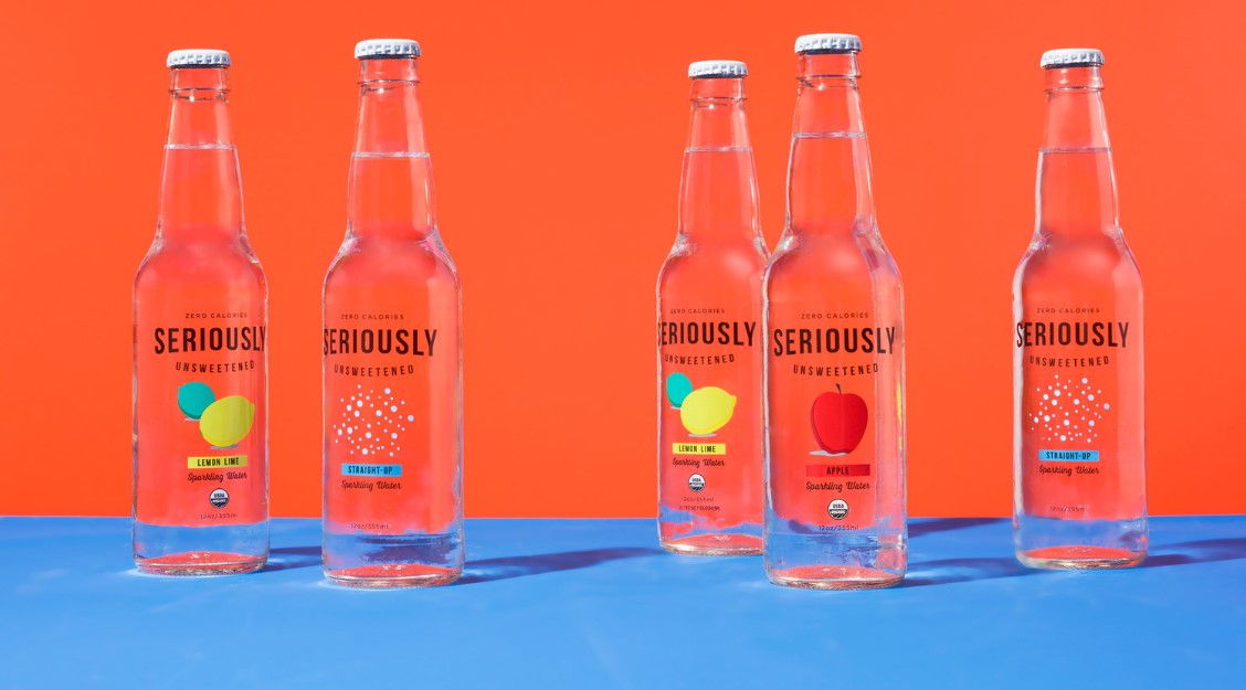
Minimalists everywhere are raving about this thought-proving website. Seriously Unsweetened veers away from complex web design to make life a bit easier for their audience. Since their pages load quicker, bounce rate is drastically reduced and visitors leave with a better understanding of the brand’s purpose. Check out their use of white space and contrasting color schemes.
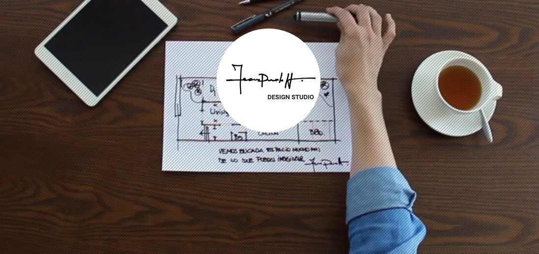
When it comes to building a brand online, Leandro Pedretti definitely knows how to make a first strong impression. His website is a visual masterpiece with videos that show off the company’s design skills. The content is pretty straightforward and with just one click from the homepage, you already know what the website is about. You can replicate the same effect when you use a website builder of your choice. BTW, the Leandro Pedretti website was created on Wix.
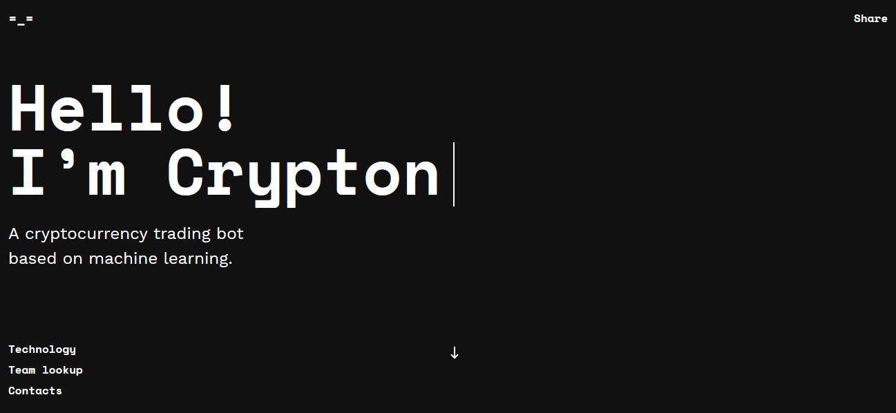
Here’s one for the geeks! The Crypton Trading website uses a bot called Crypton to help you understand cryptocurrency trading. Using AI, Crypton can predict trends and give you the scoop on optimum buying periods. Even if you’re not that into crypto, scrolling through the site will give you serious 80s feels. It’s like talking to an actual robot.
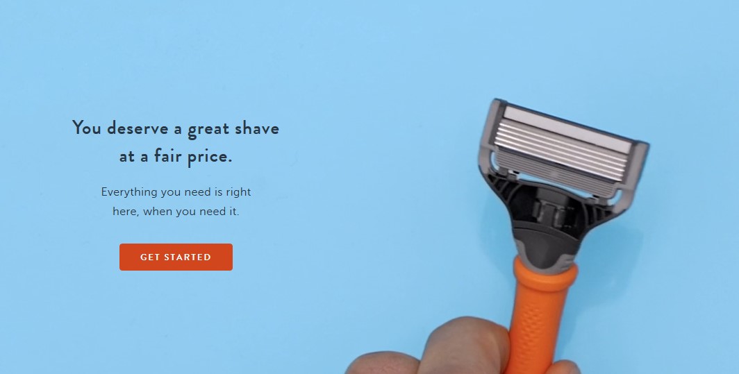
Harry’s web designers know that most people make their buying decisions while scrolling through mobile. Their e-commerce store only carries men’s grooming products, but that’s enough to keep them in business. Why? Because their website’s USP is on point. Whatever it is you need for a great shave, you can easily get it from their store, whenever you need it.
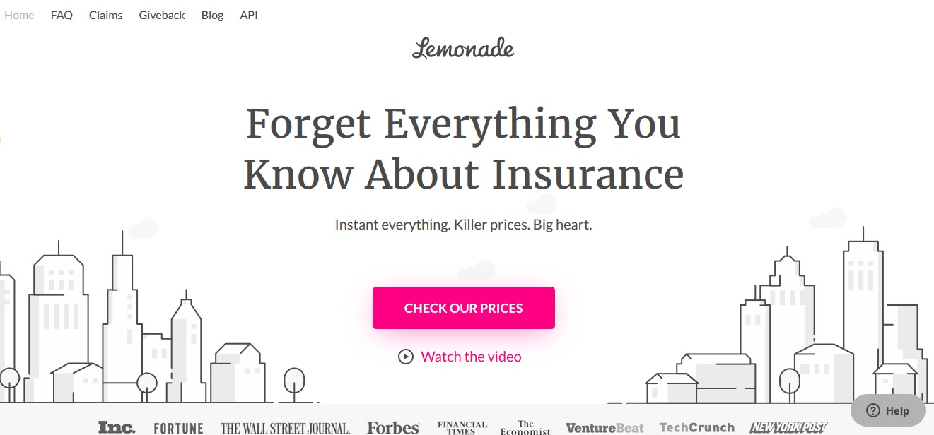
With its clean interface and fun elements, the Lemonade website looks more like a hangout spot for Millenials than an insurance website. It’s one of the most engaging one-page websites we’ve seen in years, complete with a chatbot called Maya. Aside from Maya’s smooth interaction with users, visitors love Lemonade’s focus on UX design. It’s such a treat to navigate!
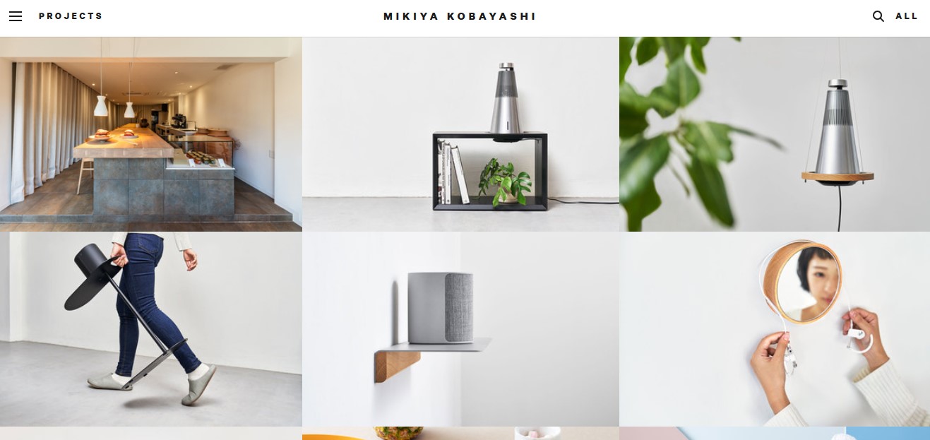
Mikiya Kobayashi’s website has everything you’d expect from a Japanese web designer. The website is originally in Japanese but thanks to Google Translate, anyone can take a look at what this promising product designer has to offer.
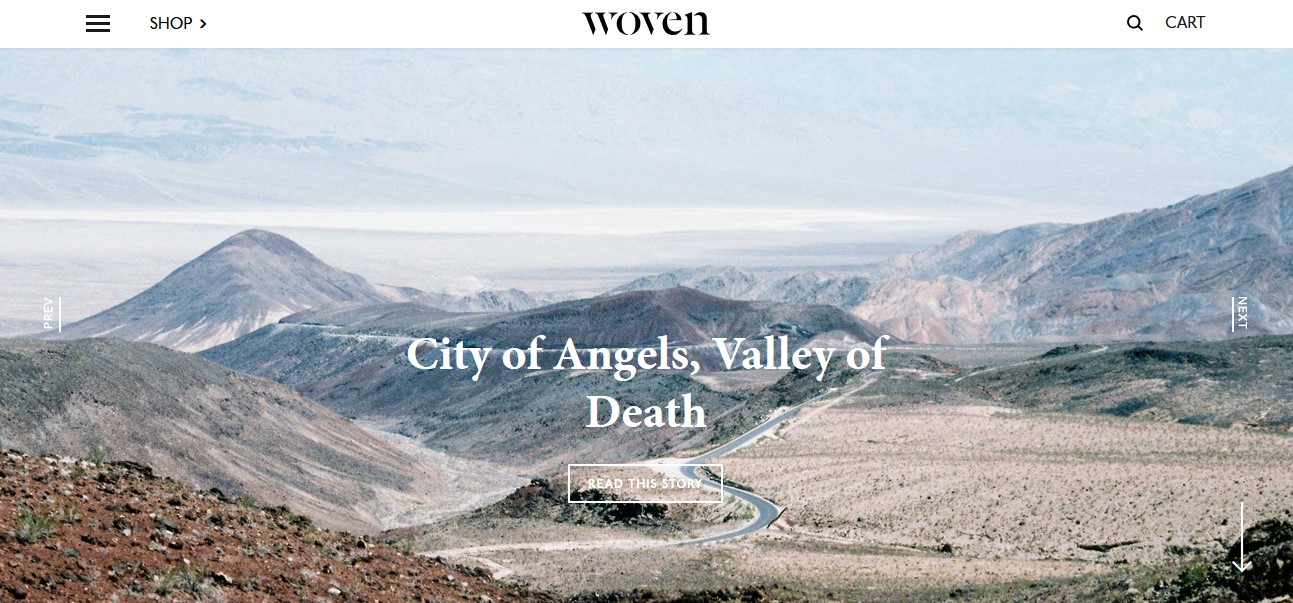
Woven magazine is an online publication that features and caters to artists. Their website represents a new style of web design where the focus is on easy-to-read content. Even though there are some product features, the website is free of obtrusive ads and pop-ups that could otherwise ruin a reader’s experience.
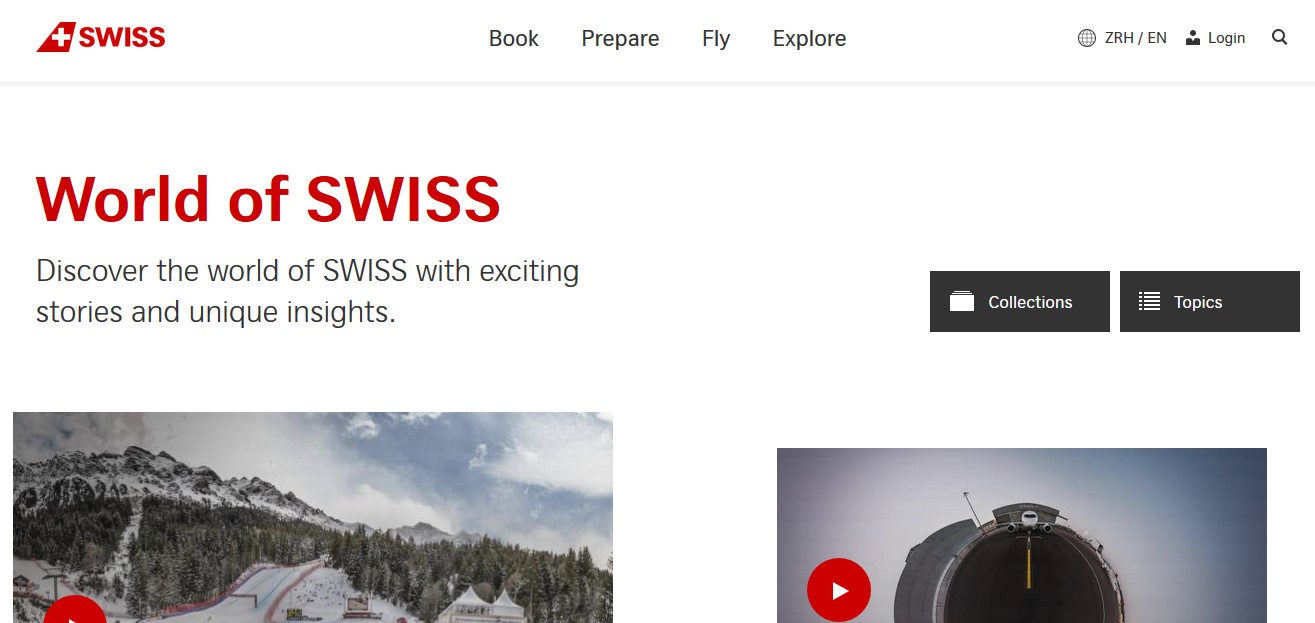
One of the websites with the best design in the airline industry comes from no less than SWISS airlines. Their website features images and stories that will convince you to fly with them. Animated elements will help you navigate through the different sections of the website. This is a perfect example of what you can achieve when you allow content and aesthetic to mix.
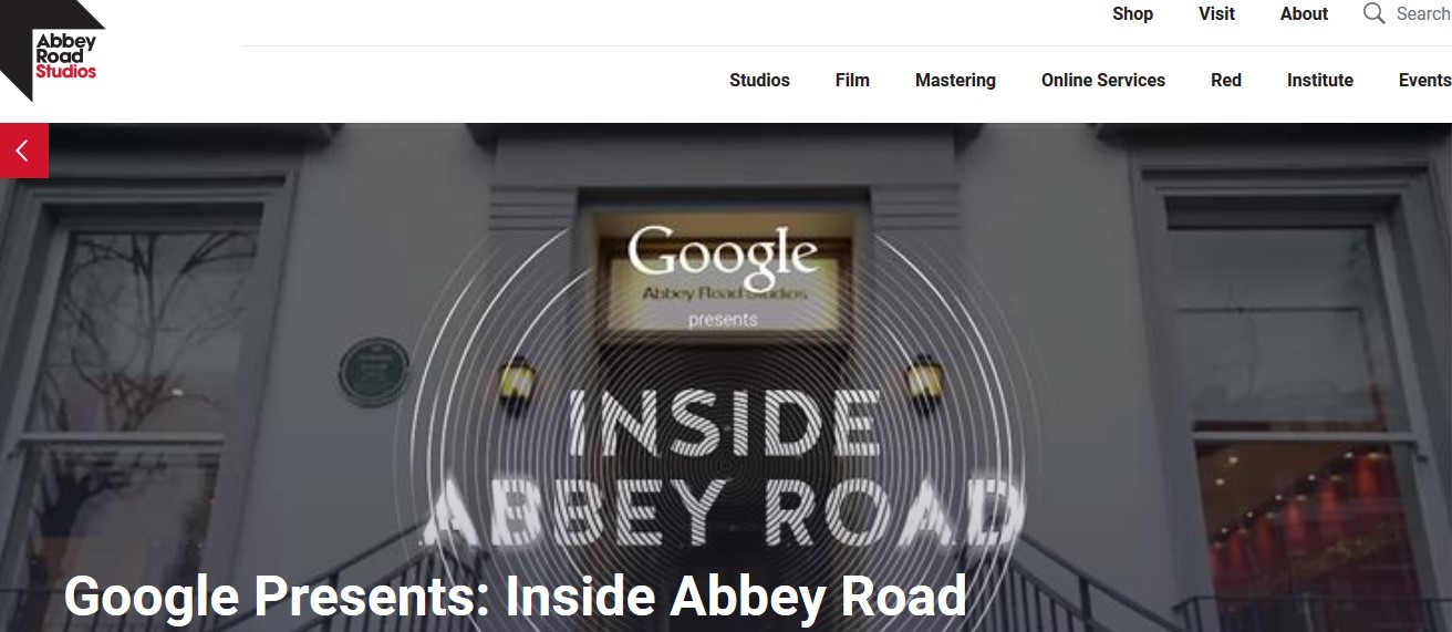
One of the best websites in the music category, hands down, is Inside Abbey Road. This interactive site boasts of brilliant sound design and creative visuals that draws in the crowd. Made by the best website builders from Google, fans from all over the world can experience the infamous studios right from their mobile device or computer.
So, site builders, take note. Design websites not just to showcase a brand, but to serve a purpose as well. Before you think of aesthetics, make sure to create a website that works for your target audience.
Author: Christopher Jan Benitez
Content marketer during the day. Heavy sleeper at night. Dreams of non-existent brass rings. Freelance writer for hire. Pro wrestling fan by choice (It’s still real to me, damnit!). Family man all the time.