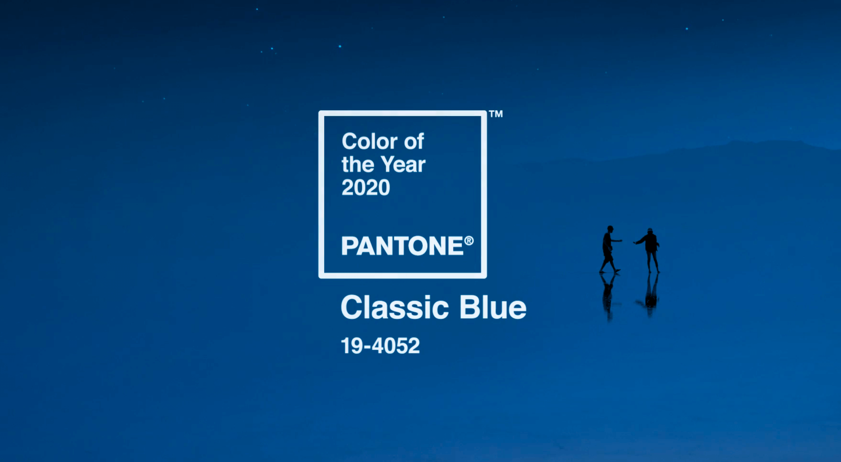
 Each year, at this time, Pantone nominates a color — or colors, in the case of 2016 — to represent humanity’s hopes and aspirations for the coming year.
At least, that is what its PR department sends out. In reality, it’s a rather obvious — if highly effective — marketing gimmick to keep the print-design company relevant to design news year-on-year. It’s an arbitrary bit of self-promotion, that does an excellent job of reinforcing Pantone’s position as an authority on color.
This year, Pantone has selected Pantone 19-4052, or “Classic Blue” to give it its colloquial name. It’s described by Pantone as: “Instilling calm, confidence, and connection, this enduring blue hue highlights our desire for a dependable and stable foundation on which to build as we cross the threshold into a new era.”
Critically speaking, it’s one of the most mis-judged decisions in the short history of this promotion, and significantly mis-reads the zeitgeist.
At a time when the climate is approaching — or may have passed — irreversible breakdown; when global political debate is moving out of our institutions and onto the streets; when the baby-boomer generation is slowly losing its grip on the reins, and millennials are realizing they’ve reached middle-age; Classic Blue is a color that harks back to a time when we hid our head in the sand and pretended everything was fine. It’s the color of the pre-2008 crash, the color of Facebook pre-privacy scandal, the brand color of your parents’ bank. Classic Blue is about as 2020 as Helvetica.
(There’s only one color that effectively represents 2020, and that’s Cyberpunk Pink, a neon hue that is both retro and forward-looking, cross-cultural, irreverent, and even better in dark mode.)
p img {display:inline-block; margin-right:10px;}
.alignleft {float:left;}
p.showcase {clear:both;}
body#browserfriendly p, body#podcast p, div#emailbody p{margin:0;}
