When it comes to website design the possibilities are endless. With the help of a good website designer, you can turn everything you have in mind into reality. Just as with clothing, cars and types of food, our tastes for website design have evolved and changed over time. Moreover, they differ from one person to another, even though we all have the same thing in common: the desire to turn our visitors into customers/fans/members of our community.
For a website to really pop out and convert there are a lot of things that need to be taken into consideration, but among the first ones to agree upon is the style. In recent years, the concept of minimalism or “less is more” has gained a lot of popularity and for a lot of valid reasons. It is a design that removes unnecessary tabs, menus and other content that does not bring value to the customer or that does not support the company’s goals.

Minimalism wishes to only keep the most necessary elements – the idea is to leave out as much clutter as possible: no pop-up videos, no tabs, no dropdown menu navigation.
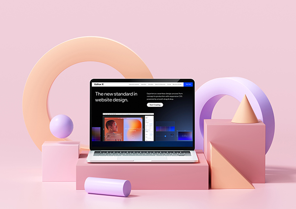
How do you create such a website? The most important thing you need is a powerful and advanced platform that will allow you to easily create the design you have in mind with no programming skills requires. Our top favorite is Editor X as it allows you to experience a “seamless design process from concept to production with responsive CSS powered by smooth drag & drop.”
This basically means that you will be able to define the exact position and behavior of every element without coding a line. This will come in handy when you’ll start wishing for more advanced features and design elements that you now see on famous websites and consider to be difficult to apply to your website. They’re not.
Now that you understand the concept of “minimalist website design,” let’s see the pros and cons so that you can make an informed decision for your business!
What are the pros of minimalist website design?

The most important benefit of using minimalist website design is the fact that through its simplicity it manages to convert and bring in warm leads. Other benefits include:
- Offers easy, intuitive navigation: you probably already know that users are in a hurry and have a terribly low attention spam; minimalist design understands and respects this behavior and offers users exactly what they need: very few but highly useful navigation choices.
- SEO friendly like no other – bots are smart but not that smart and they are always happy to crawl upon a minimalist design as it is so easy for them to understand.
- Faster loading times – it is already a known fact that slow load times lead to higher bounce rates , which means less customers. Minimalist website design will help you avoid that as there won’t be much on it to load.
- Fewer to no problems – the less complex the website is, the fewer issues you’re going to have with plugins, apps and elements that tend to break.
- Always in style – because minimalist design is so plain, clean and simple, it can almost never go out of style. This means that you won’t have to keep changing and adapting it to current trends.
- Easy to remember – users will easily remember your website thanks to the uncluttered design.
Those are the most important positive aspects of having a minimalist website design. Now it’s time to take a look at the cons:
What are the cons of minimalist website design?

As you already know, there is no such thing as perfection, not even in graphic design. Here are the cons of minimalist website design that you need to take into consideration:
- A bit too blank: if you take this concept too far you will end up with a website that looks unfinished. Instead of clean and well organized, your website might look unprofessional and sparse.
- A bummer if your company grows: if your business flourishes you may find yourself hindered by the design. If you don’t plan beforehand, you may need room for more and have nowhere to put it. However, if you plan things out from the beginning this should not be a problem.
- Lack of creativity: using minimalism in the wrong context can be a bad move. For example, if you are a creative spirit and have a lot of creativity to display but your website is blank with a few words on it, it might be hard to convince users of your value.
- Not a lot of room for communication: communicating complex ideas about your products and services is almost impossible with such few words and images, which makes minimalism not a great choice for brands that are technical, for example, and need to explain certain concepts
Yes or no to minimalism website design?
The answer is 100% up to you and your business. First, you need to think about the type of business you own: is it highly creative? Is it technical? Does it require a lot of images and text to successfully communicate your brands’ values and activity? Can you tell your brands’ story with just a few words and images? If so, then go for minimalism and it will definitely be the best choice for you.
Maybe minimalism is exactly what your business needs, or maybe you don’t have to go completely minimalist and rather go for a flat design. Whatever you choose, we’re sure it is going to be a blast!

