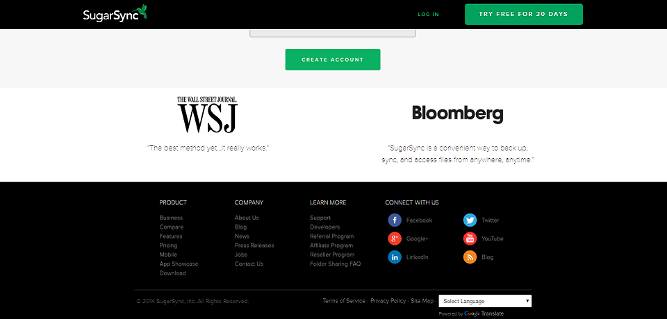
Almost everything in website design has changed over time, but the core elements have always remained the same. There’s a header, navigation, a body, and a footer. But what’s a website footer for? Is it truly necessary, in 2018, to run a footer on your site?
Why should I have a website footer anyway?
Nothing but the core content of your website is “necessary,” but footers can certainly help users find ill-used parts of your site that they very much want to find. It’s a user ease and satisfaction issue.
The core functionality of the footer is to provide additional navigation options to users seeking them out. Users have learned to first check the navigation bar for their desired options. If their goal is not found there, they will typically scroll through the page and then examine the footer. Especially savvy users will use the Find command. Think of the footer as the Control-F-able part of your web page. Even if a user isn’t actually using the Find command to locate text, they’re doing the same thing with their eyes.
If you’re a web design old head, you might think of the footer as a condensed site map. It could contain the most important links on your website, perhaps even mirroring your primary navigation options. Slightly obscure navigation options like legal text, support, detailed contact information, directions, and social media links.
What goes in a website footer?
The true benefit of a footer is that users know how they work. The preponderance of usage means you can drop a footer directly into your website and users will understand exactly how it works. By following the prevailing convention, you make your website easier to use.
Contact info

This includes social media widgets, email newsletter signups, links to automated contact forms, company-wide phone lists, or special-purpose contact information. You might also include a thumbnail map, a link to directions, or store hours.
Additional navigation
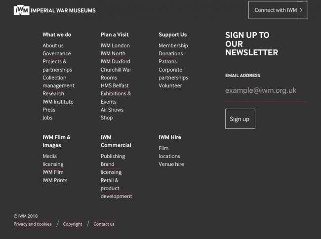
Following the sitemap example from before, the footer is the best place to store additional navigation. You have the freedom to get ultra-detailed here. That’s freedom you would never have in the navigation bar. So feel free to go nuts and put thirty links in the footer! Since footer content is strictly optional, it’s mega-footers offer measurable benefit with very little downside. Provided their well-named and clearly organized, of course.
Press information
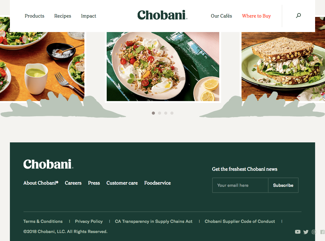
Along the lines of contact information, press and media links are well-placed in the footer. They’re only used by a small portion of your users, and those users know where to find them. This link should go to public relations material or press contact information.
Advertising details
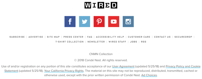
If clients want to advertise on your site, you’ll wan them to get in touch with you. An “Advertise with us” link will tell them what they need to know. You can include media kits here, or just an email to contact. It depends on how selling ads fits into your business.
Current and future employees
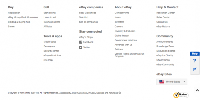
An “our team” link can introduce potential clients to your workforce. A “jobs” link can tell users how to become part of your workforce. Both are well-placed in the footer, but “our team” could live in the navigational bar if your client places a higher importance on that element.
What should a footer look like?

Footer design is typically straightforward. Most footers are roughly the same. They include dark-ish text on a dark background with relatively small text compared to the rest of the page. They’re generally packed fairly deeply with info.
Some websites try to have a little more fun with the footer, putting images and quirky designs at the bottom of the page. If that’s the kind of site you’re designing, it will fit in quite well. But there’s no reason to force uniqueness on to your footer if the overarching design of your website doesn’t support that.
Conclusion

As in all user interface design, focus on making your footer useful and pleasant to use. It’s likely the simplest part of your website to design. Stick useful links in there, and you’ve accomplished its primary purpose.
You might also be interested in the following posts:
