Hand-picked collection of corporate brand visual identity design examples for inspiration. A strong business identity is one of the most important assets for any company or brand. Corporate branding helps people recognize your business and understand what it stands for. It also makes your brand look clear and consistent.
Basic items like business cards, compliment slips, envelopes, and letterheads play an important role in branding. These elements carry the same logo, colors, and fonts, which helps keep the identity consistent across all materials. When used properly, they support a clean and professional brand image.
Good brand identity helps people recognize a business quickly. A clear corporate visual identity uses logo, colors, fonts, and layout in a simple way. In this collection, you will see more than twenty examples that show how brands keep their look consistent. Each example focuses on clear shapes, readable text, and balanced color use.
The designs are made to work on websites, social media, and print. When all parts look connected, the brand feels easy to understand. These examples show how small design choices can make a strong and clear visual identity for any company.
Creative Brand Visual Identity Design Examples You’ll Love
These design examples are useful for learning. You can study how brand uses space, color, and type. Try to notice what makes the design easy to read and easy to use. Keep your designs simple and clear. Test them on sizes and screens. Make changes when needed and keep improving. A visual identity grows over time and stays consistent in every place where the brand appears.
A strong visual identity makes a brand recognizable, memorable, and trusted.
List of 20+ best brand visual identity design examples. Check the previews to see how each design works and how the elements stay consistent. Feel free to share your thoughts in the comments and tell me what you want to see next. I will try to add more visual identity design examples soon. Enjoy!
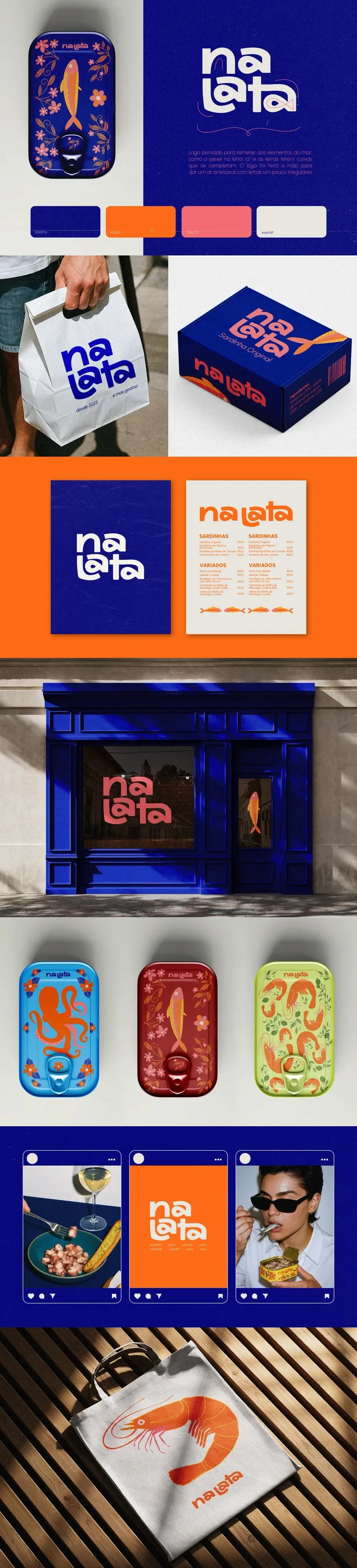
Food Can Brand Brand Visual Identity Design
Food Can Brand Design Corporate Visual Identity showcases a modern and professional design approach with strong visual identity, clean composition, and creative branding execution.

Crypto Visual Identity Design

No Ordinary Accessories Brand Visual Identity Design
No Ordinary Accessories (Noa) is a bespoke manufacturing house creating lighting and objects for the hospitality industry. We partnered with Noa at their inception – working alongside them to develop their naming, visual identity system, custom typography, digital experiences, and even a soon-to-be-released physical lamp.
The identity is rooted in bold geometric forms – stripped down to their essentials – yet creating enough movement and flexibility to expand effortlessly into a rich, dynamic, textural system.

Kozai Brand Visual Identity Design
Kozai Corporate Visual Identity showcases a modern and professional design approach with strong visual identity, clean composition, and creative branding execution.

Cowboy Coffee Brand Visual Identity Design
Cowboy Coffee Visual identity for COWBOY, a coffee “cantina” that features a minimalist and bold illustration of a cowboy’s profile, characterized by sharp, geometric forms and a monochromatic color palette that conveys a modern yet rugged aesthetic.
The clean typography and uncluttered layout emphasize simplicity while evoking the spirit of adventure. Building upon this visual language, we created a series of unique illustrations for the specialty coffee bags – each flavor represented by a different design.
These graphics not only differentiate the products visually, but also extend the brand’s personality across merch, posters, and other graphic materials, adding depth and versatility to the overall identity.

Uncommon Brand Visual Identity Design
UNCOMMON is a performance-driven agency built for DTC brands operating at scale

Hyperware® Brand Visual Identity Design
Hyperware is AI and Dapp development infrastructure for building at lightspeed. We aim to provide a comprehensive suite of tools and infrastructure to simplify the creation and deployment of decentralized applications, including those leveraging AI.
The logo design emphasizes infrastructure, decentralization, and the speed of light through the use of geometric shapes that convey modernity and futurism. This approach aligns with the brand’s current values, focusing on simplification and innovation to drive a growing brand identity.
This approach represents the brand as disruptive, creating an environment that stands apart from conventional designs.

Finboo Brand Visual Identity Design
Brand identity project for a global payments fintech. The goal was to transform the complexity of international work into something simple, human, and trustworthy.
The visual system combines professionalism and approachability, with a distinctive typeface, modern color palette, hand-drawn illustrations, and a clear, accessible tone of voice.

Evohomes Brand Visual Identity Design
Evohomes is a premium home furnishing and interior brand that blends modern design with smart living. This branding project focuses on creating a minimal, meaningful identity that reflects evolution, elegance, and everyday comfort.
From logo design to color strategy, the brand is crafted to feel both functional and refined—just like the homes it helps create.

Folio, Coffee Packaging & Branding Brand Visual Identity Design
FOLIO is a homegrown coffee brand shaped by the rhythm of New York City, built on the idea that every day is a page worth filling.
Positioned between the warmth of personal ritual and the energy of urban life, Folio treats coffee not as a pause, but as fuel for daily creation. The brand identity blends confident typography with expressive illustrations to capture the imperfect, human moments that define everyday routines: working, thinking, moving, and making.
Designed as a flexible system across cups, menus, storefronts, and lifestyle applications, Folio rejects café elitism and mass sterility, instead presenting coffee as an approachable, creative companion for modern urbanites.

Altar Brand Visual Identity Design
Altar is a technical performance and outdoor apparel brand founded in New Mexico, USA. It focuses on developing trail running, trekking, and camping gear designed to withstand harsh environments, from cold and wind to high-altitude conditions.
Each garment is built as a tool, lightweight, functional, and precise, supporting the body in motion and enhancing outdoor performance. The brand merges technology and nature, creating products that deliver endurance, thermal comfort, and long-term durability.
Its purpose is to encourage a renewed connection with nature, bringing back the ancestral act of movement: running, climbing, exploring, and finding balance in the wild.
The name Altar reflects this idea of elevation and self-encounter. Just as an altar is a place of devotion, the brand sees the mountain as a symbolic space where body and mind meet through effort, endurance, and stillness.

Velotti Brand Visual Identity Design
Velotti Corporate Visual Identity showcases a modern and professional design approach with strong visual identity, clean composition, and creative branding execution.

Toyto Brand Visual Identity Design
Visual identity for TOYTO — brand of open-ended wooden toys designed to help children think, explore, and express themselves.

The Almshouse Bakery Brand Visual Identity
The Almshouse Bakery Brand Visual Identity showcases a modern and professional design approach with strong visual identity, clean composition, and creative branding execution.

Senzor — Brand Identity Brand Visual Identity Design
Senzor — Brand Identity Corporate Visual Identity showcases a modern and professional design approach with strong visual identity, clean composition, and creative branding execution.

Bode Do Nô Brand Visual Identity Design
Much more than a regional restaurant. It’s a space that provides joyful experiences and highlights the rich gastronomy of Northeast Brazil.
A place for those who wish to enjoy an excellent meal and, at the same time, immerse themselves in the authentic flavors of regional cuisine and the essence of Northeastern culture. It’s as if we brought a little piece of the Northeast to you, transmitting the culture, the gastronomy, and the unique spirit that makes the Northeastern people so special.
Our goal in this redesign was to value the riches of this region and preserve its traditions, maintaining the identity that the brand has built over the years.
.

Brand Identity And Packaging Design For A Matcha Brand Brand Visual Identity Design
Brand Identity And Packaging Design For A Matcha Brand Corporate Visual Identity showcases a modern and professional design approach with strong visual identity, clean composition, and creative branding execution.

Dds – Branding & Visual Identity Brand Visual Identity Design
The central inspiration for this year’s D.D.S identity design by IDC emanates from the concept of “Unity in Diversity.” This concept lies at the heart of our community, where differences harmonize to create a strong, unified whole.
The design beautifully portrays the seamless fusion of diverse elements, a visual representation of IDC’s fundamental values and principles.

Quinzh Visual Identity &Restaurant Branding Brand Visual Identity Design
Quinzh is a restaurant and billiard lounge that combines quality dining with a comfortable social setting. Created as a place beyond conventional dining or entertainment, Quinzh is designed to support social interaction—where guests can eat, talk, and spend time together in a well-considered space.
Quinzh positions itself as a modern social destination where food and leisure coexist seamlessly.

Arion — Fashion Brand Identity &Visual Branding Brand Visual Identity Design
Arion — Fashion Brand Identity &Visual Branding Arion is a premium luxury fashion brand that embodies strength, confidence, and superiority.
This project presents a complete visual identity system, including logo design, typography, apparel graphics, packaging, and digital applications, reflecting a timeless and modern luxury aesthetic.

Hubfix Brand Visual Identity Design
Hubfix is a brand specializing in the sale of smartphones, technical assistance, and accessories, bringing a new concept to the market by embracing minimalism and elevating its identity to a global level.
With a strategic and innovative design, the brand becomes more appealing to international markets, reflecting its leadership in mobile technology.
More than just a repair service, Hubfix represents the evolution of the industry, combining sophistication, functionality, and innovation to transform the user experience.

Mimô – Visual Identity Brand Visual Identity Design
Mimô is a cafeteria located at UFRGS (Federal University of Rio Grande do Sul) with the goal of providing a place where you can pamper yourself with handcrafted and welcoming gastronomic experiences.
There, each coffee and brownie is designed to bring comfort, well-being, and a special break from everyday life.

Alienkind – Visual Identity For Juice Brand
ALIENKIND is Bangalore’s first alien-themed juice brand, delivering a truly out-of-this-world experience.
StudioDraft designed a bold and futuristic visual identity, seamlessly blending vibrant orange with deep black accents. This striking aesthetic not only sets ALIENKIND apart but also immerses customers in a unique, otherworldly brand journey.

Omni© Brand Visual Identity Design
Omni© Corporate Visual Identity showcases a modern and professional design approach with strong visual identity, clean composition, and creative branding execution.

Gowe Brand Visual Identity Design
Identidade visual para a Gowe, empresa brasileira de marketing estratégico. O projeto abrange logo, sistema gráfico, tipografia e aplicações — com linguagem visual que combina tecnologia, confiança e movimento.
Brand identity for Gowe, a Brazilian strategic marketing company. The project covers logo design, graphic system, typography, and applications — with a visual language that blends technology, trust, and motion.

(Visited 17 times, 17 visits today)