The home page of any website is one of the most important design elements for several reasons. It’s the one aspect of a company’s commercial brand, or economic or academic entity, and its shapes, colors, fonts, and images usually are different from others in a similar market. And when it comes Top-notch Technology Brands Stores on Amazon marketplace to showcase the products in the marketplace then being different yet appealing for the possible customers is surely needed. As there are thousands and hundreds Top-notch Technology Brands Stores on Amazon are available so looking for some uniquely different stores would be an inspirational for web designers and even for tech users, if they are looking to buy something from them.
Therefore, companies pay close attention when it comes to their home page design. In this post, you will find how creatively, the top-notch technology companies designed their home pages on Amazon store to ignite their customers to click, explore and buy their latest tech related products.
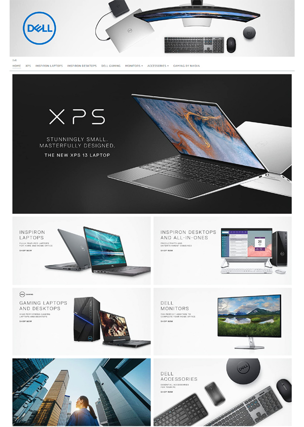
Simple yet covering the diversified range of products in one glance.
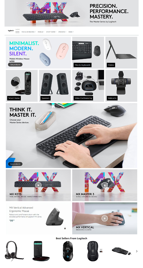
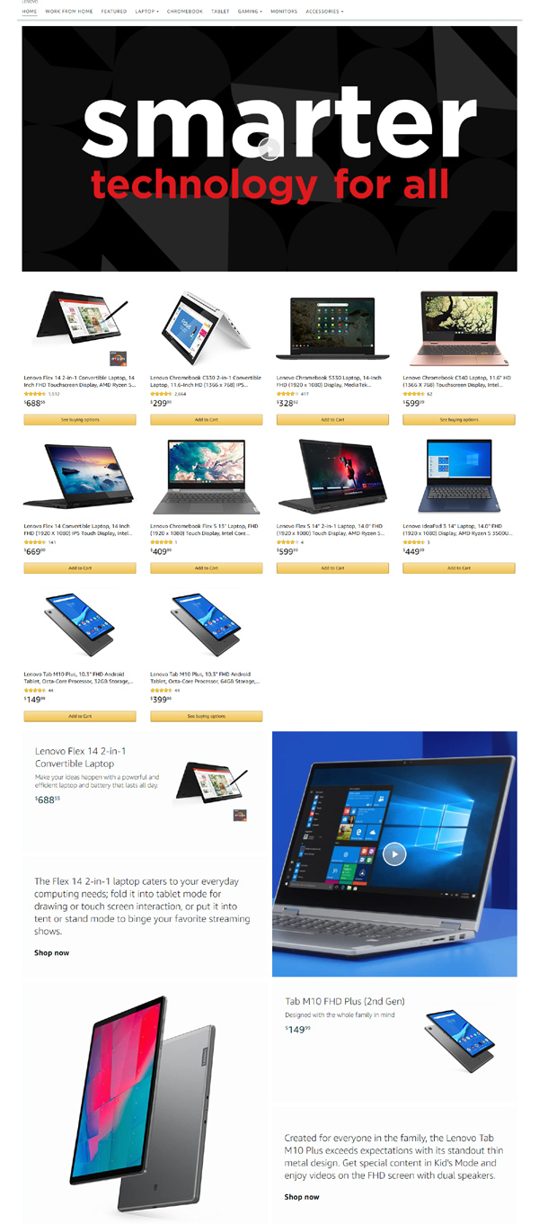
Showing the complete range of accessories with some video exposure.
Having the techy design, the company is trying to ignite the customers need to show their products in hybrid style.
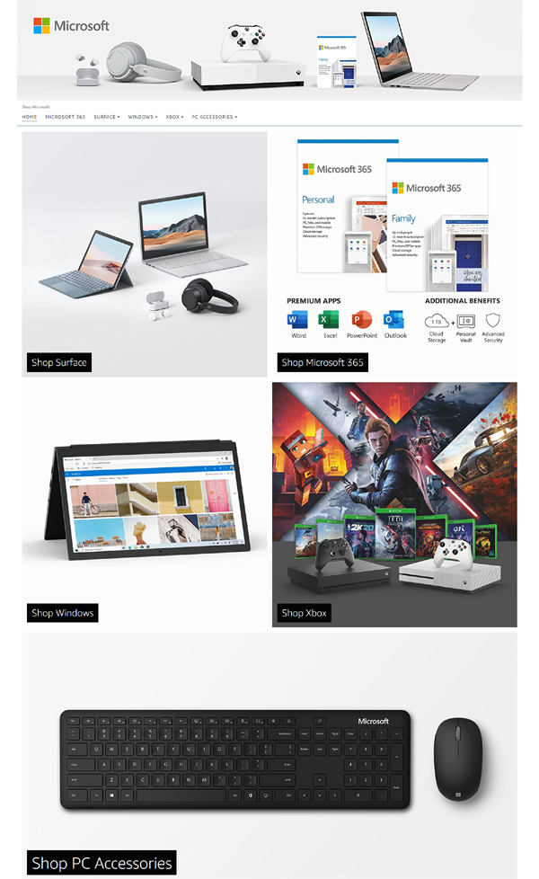
Elegant design having simplicity and organized layout expressing the minimalism way of lifestyle.
Categorized in a tabular format, the design shows minimum products on the homepage to invite customers to discover more.
Showing their unique products in the motivating way to discover more about, once visiting their home page is quite different than others.
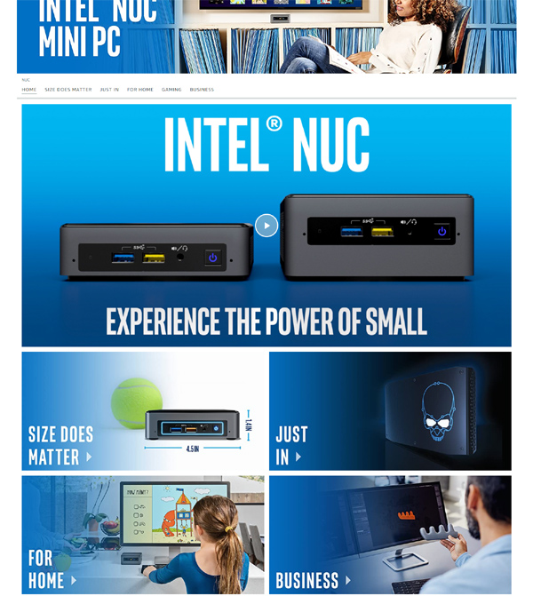
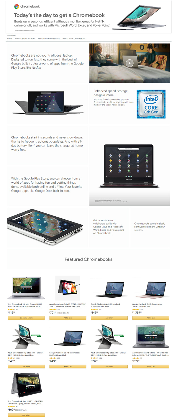
To the point layout having the video of latest product is really simple.
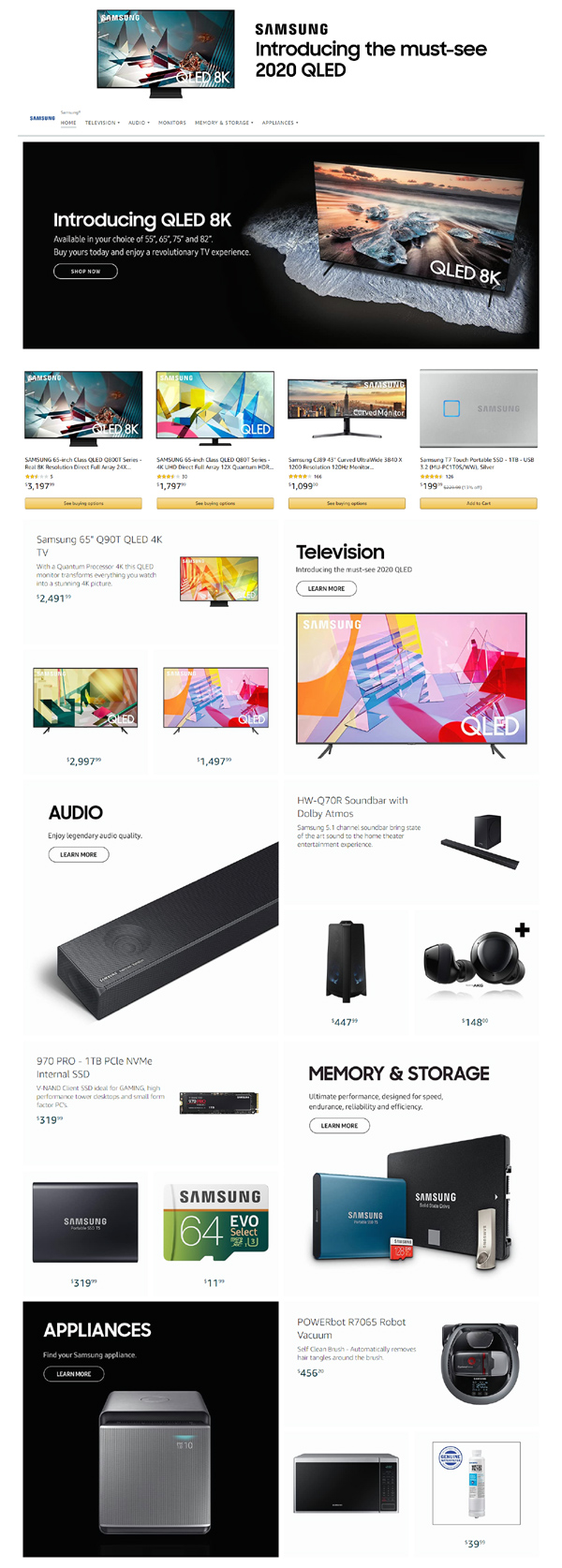
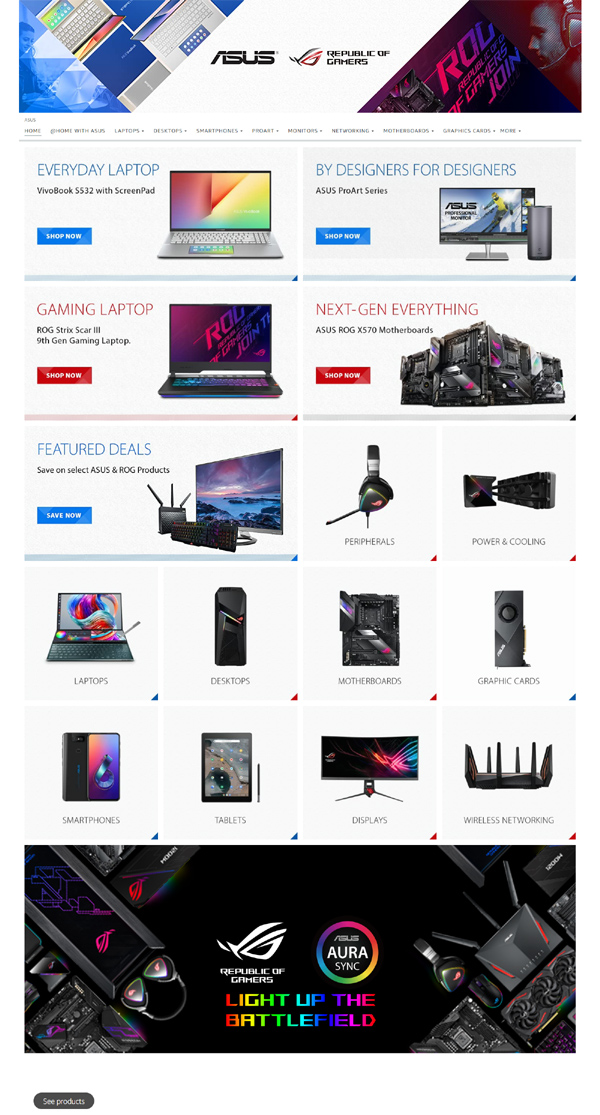
One page and everything shown is a right word for this. When someone comes on this home page, it gives the huge range of products available on this store without any waste of time.
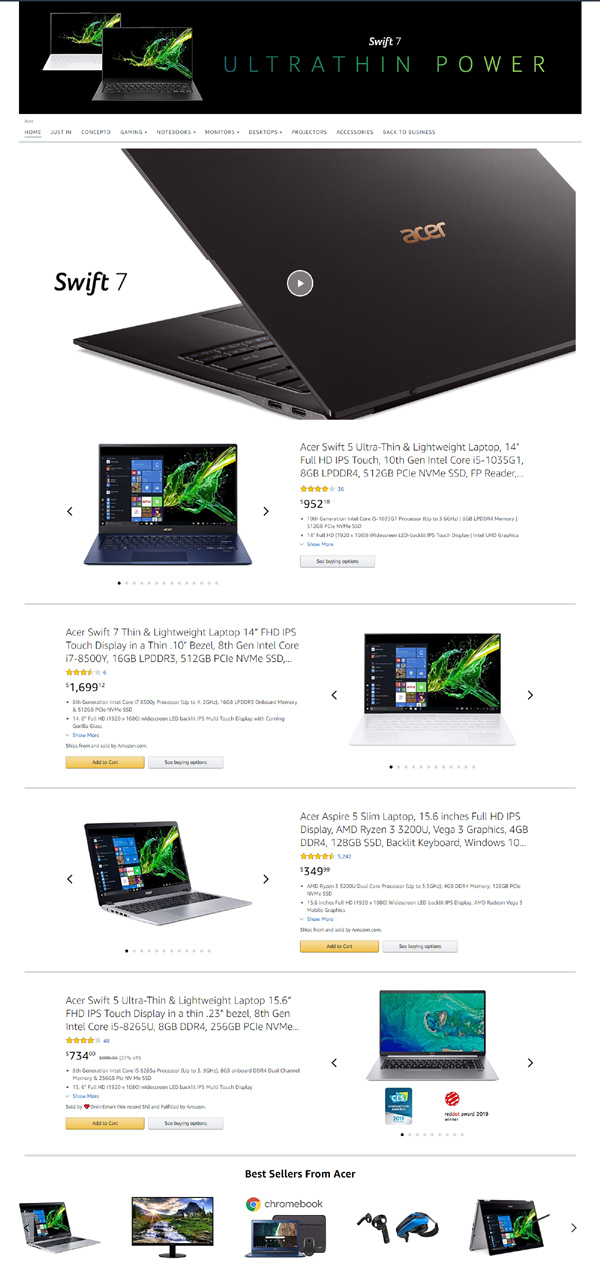
As usual, the most simple and typical e-commerce style look and feel with the products listing on the homepage.
The unsaid simplicity, decency and elegance gets together on this home page as they always represents for their products and branding by showing the categories of items in first glance.
Typical, e-commerce style with few top trending products shown on the home page is the uniqueness of this home page.
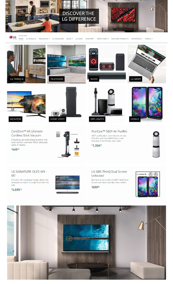
Products categorization has made this page different than others. This way, anyone can click and explore the desired lists of products without wasting of his precious time, here and there.
* If you buy any product from our referral link, It won’t cost you extra penny. But we will receive some amount to manage our blog to continue providing you the best stuff out there.
