
During these troubling times and with the ever-looming threat of the coronavirus, most of us have come to realize the importance of the internet and websites. Those in lockdowns or quarantines would certainly find appreciation for clinics or doctors or hospitals especially those with good health websites.
This is where the layout and the overall theme of the website are more important than ever. People are flocking to health websites to check the most important details about illnesses. Therefore, having great or at least decent health websites is doing everyone a favor and a service. Whoever said web designers can’t with help the fight against COVID-19?
Of course, if you’re one, then you might also want to take your cues from some of the best health website designs around the internet. These are the leaders and paragons of website design when it comes to the most important aspects of basic human needs.

Lifecare pulls no punches and immediately informs all the visitors of the website how many practices or practitioners it has. It also lets visitors select which practices or practitioners they need in order to narrow down the search and the needs as well as minimizing the number of clocks. The background is also everything and Lifecare manages to make it’s own quite jolly.
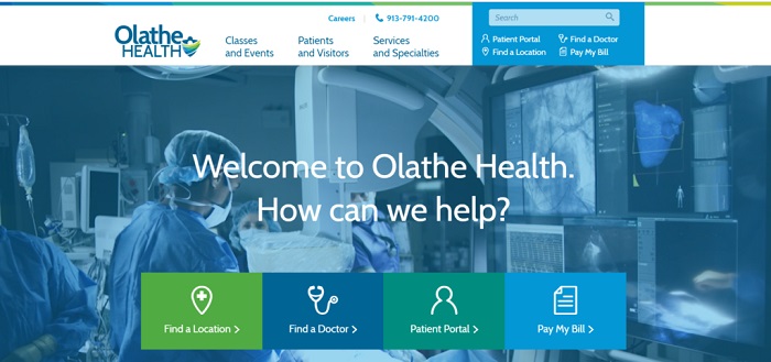
Olathe Health manages to strike a good balance between functionality and aesthetics by making some clickable cards that are essential to medical service seekers. You can easily schedule a medical appointment or find yourself a doctor. If not it’s nothing that urgent, then you can enjoy the website’s professional-looking front-page.
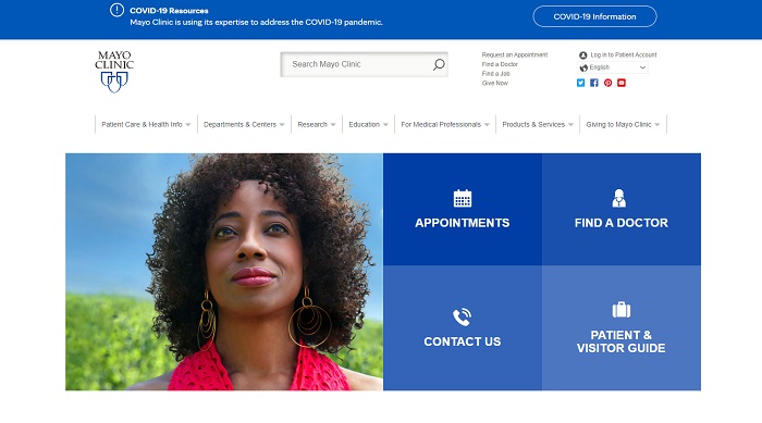
Whatever you’re looking for in Mayo Clinic, you’ll be sure to find it quick and easy with the concise and simple design of the domain. All the important details and functions (even the search bar) are located at the forefront of the website itself. It’s more functional than aesthetic but for a health website, that is a design standard.
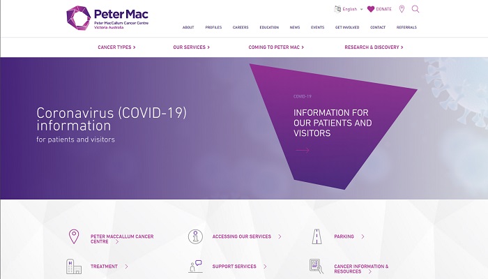
Being a specialized hospital for cancer treatment, Peter MacCallum Cancer Centre prides itself on its professional standards. Its website then reflects just how robust and accomplished the institution is when it comes to medical care. The purple theme and color palette is a welcome change and sets the website apart from the others.
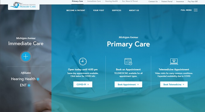
Michigan Avenue Primary Care is one of the more unique websites or hospitals on this list. It’s one of the few ones out there which allow telemedicine appointments especially for patients that do not have easy access to their hospitals. It can also be great if you have a personal doctor in the hospital. As for the design? It’s every bit as functional and good-looking.
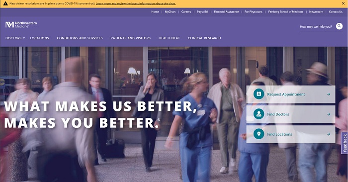
Modern website designs are hard to balance out especially if you’re designing for urgent health websites. Northwestern Medicine, however, managed to pull it off with a contemporary-looking theme and the unique use of contrasting colors. All the important functions are also there the moment you visit the website.
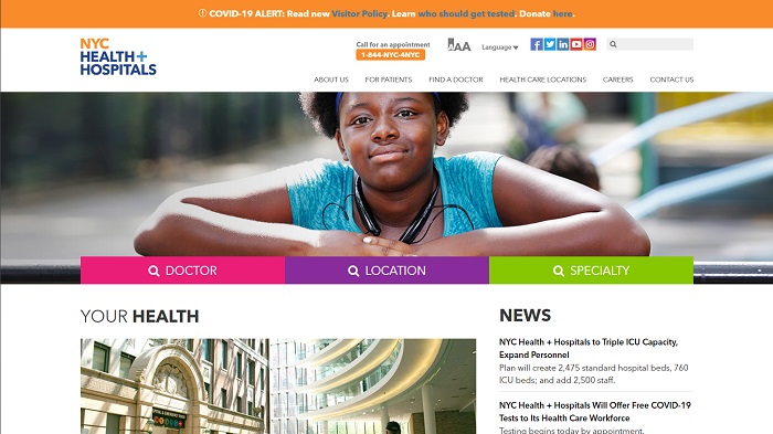
Hospital websites can most look either bland or intimidating with its lack of happy color combinations where function takes center stage. NYC Health+ Hospital’s website, however, still manages to make good use of playful and positive colors while incorporating those with functionality. It’s a good way to ease the mind of visitors and potential patients.
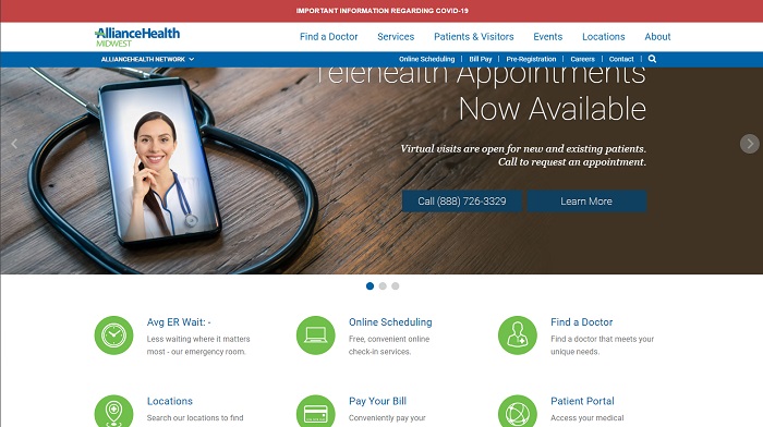
Alliance Health is also one of the few hospitals that offer telemedicine appointments and they make it a point to let every visitor on their website know about it. After all, that’s the point of having a good health website. Apart from that, it also features extensive online functions that you usually have to visit the hospital for, such as paying bills.
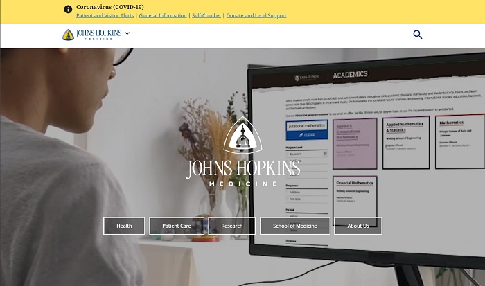
John Hopkins Medicine’s website takes the modern design philosophy up a notch by including a video background of their doctors hard at work in their facilities. While it does trade a bit of functionality, it also makes the website more interactive and representative of the institution’s reputation. A bit of scrolling down might be needed to get to the patient’s functions.
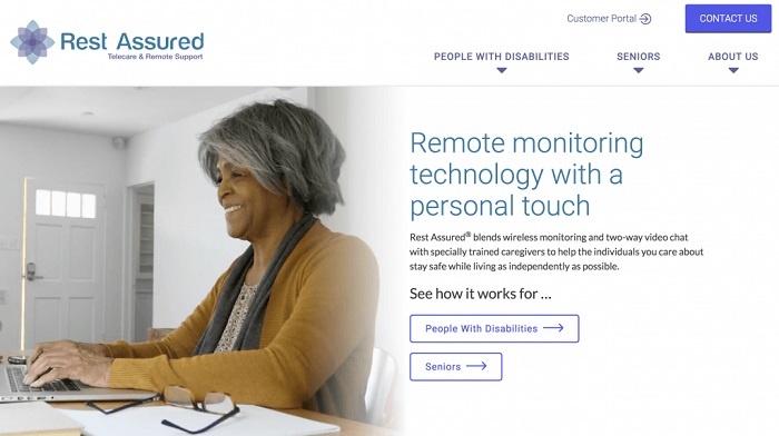
When it comes to accessibility, Rest Assured’s website takes the cake. Its dominant use of large fonts and keyboard navigation is something all websites need to see and adopt. They also cater well to people with disabilities and senior citizens, hence the accessibility-focused design. It’s the perfect caregiving platform for seniors and PWDs.
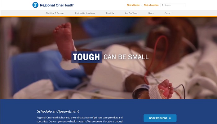
Dramatic storytelling is what will surprise you if you visit Regional One Health’s website. Like John Hopkin Medicine, it also showcases video backgrounds on its front-page except more intense and with better narrative. Besides that, you also get the basic functions in the home page from booking appointments to searching for locations.
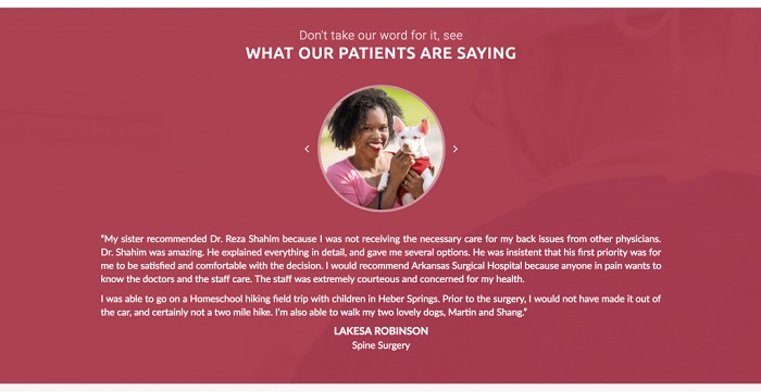
Sometimes hospital buzzwords and noble imagery or promises of professionalism aren’t enough to drive the point home. Reviews and patient testimonials are more powerful. Arkansas Surgical Hospital Understands this well, which is why it features an extensive display of testimonials and reviews on the home page along with a decent layout and accessible functions.
RELATED: 30 Health and Fitness Website Layouts for Design Inspiration
Author: Sidlangan Natividad
