The number of icons we see on daily basis is amazing. They are everywhere around us, both online and offline. We love to use them. They enhance the aesthetic of our sites and can provide a better user experience. Sometimes however, we forget the reason behind using an icon, and that’s when it becomes easy for icons to lose their effectiveness.
Universal Communication Mechanism
The primary attribute for icons is being a common visual language which effectively bridges language gaps. They’re instantaneously recognizable and remove open interpretation. This makes them perfect for a digital context, as the Internet is shared by many people and their corresponding cultures.
Designing an icon which is universally readable is still a huge challenge. Our cultures all have graphic conventions which can lead to confusion about the meaning behind some custom-designed icons.
Exploring a new interface consisting of many icons can be challenging at first sight. It takes us a while to become aware of where everything is and get used to each icon’s meaning. For this reason, labeling icons (using the title attribute, or perhaps custom tooltips) will improve the effectiveness for learning a new interface and is considered a best practice. In actual fact, it’s widely accepted that icons in combination with labels are more quickly processed by users.
Create Visual Interest
One of the most common mistakes we make is that we use too many icons in a given setting. Icons are most effective when they improve visual interest and grab the user’s attention. They help guide users while they’re navigating a page. Use too many icons and they’ll become nothing more than decoration. Their use for navigation on a webpage can often cause dilution.
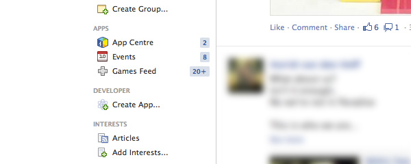
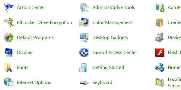
By limiting the amount of icons you use, you will grab the attention of the user faster, making navigation easier.
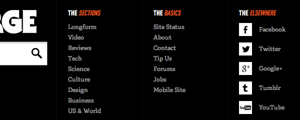

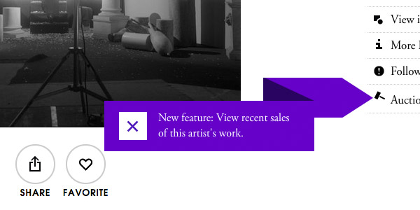
Icon kits are great, but sometimes it’s better to try and design your own icons, or edit existing icons (with permission) to suit your needs. The look and feel of a website should be reflected in the icons you use. As you can see in the examples, this shouldn’t necessarily be a very difficult task, and it’s definitely something you can keep in mind to improve the branding of your website. It’s the little details which make the difference between a great website and an exceptional website.
On the other hand, creating a contrast from the regular branding can make it even easier to build visual interest. Here’s an example from Twitter. See how the button to write a tweet stands out?

In terms of visuals, interface icons should be varied enough to be distinctive, whilst being consistent enough to work as a cohesive whole.
The biggest pitfall is in using icons because they offer up an aesthetic, not because they communicate. Great icons are both visually pleasing and communicate with users.
Provide Functionality & Feedback
Without icons, we would be obliged to use text to describe certain functionality to our users. Whilst this makes interfaces accessible, can you imagine a video player only using text that says “play”, “pause”, “like”, “fullscreen”? Icons provide familiar metaphors to communicate quickly.

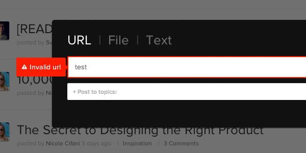
It’s also possible to give users feedback through icons, usually done in combination with color. For example, a green checkmark shows users that a username is available. A cross in a red box tells the user they didn’t re-enter a new password correctly. Icons can add wonderful support, especially if applied real time. In the example above, I get notified if I’m entering something which isn’t a URL real time. The concept behind this has many potential purposes, all of which improve user experience.
Technical Constraints
We’re now living in a time with different screen sizes, fluid layouts and varying pixel densities. This has had a major influence in how we deal with images and thus it only makes sense that it also influences how we deal with icons.
We are increasingly in the habit of optimizing images for different devices, but we can also tailor our icons to create a flawless experience. A particular icon may work extremely well at 200px, but is its message still clearly conveyed at 12px, or does its detail become blurred? Recently, we published an article that deals with responsive iconography, explaining this concept further.
Ignoring Conventions
Icons are abused by ignoring common practices. When users become accustomed to recognising an icon as meaning something, altering the action behind that icon is extremely confusing.
For this reason, standards are continually being proposed and existing iconography refined. Take a look at what Andy Clarke has to say about an icon standard for responsive navigation .
The most important rule remains though: don’t step away from existing user patterns. Although a fancy new menu icon sounds like a great way to challenge your design skills and come up with a unique design, at the same time it could be a disaster for usability.
Discussing Hollow Icons
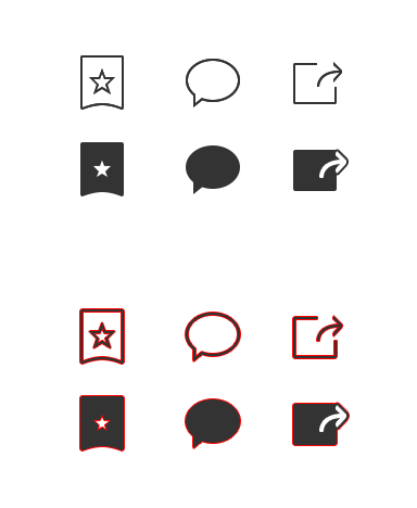
More recently, a blog post published on Medium criticized the use of hollow icons, after the recent release of iOS 7. It claimed that the use of hollow icons require more “work” from users. This blog post has been widely discussed in the web design community. There are different, interesting point of views. Though, what we all agree on is the fact that iconography should make sense to the user. Which, of course, is all about conventions.
Conclusion
I had one goal in mind when writing this article: to remind us all to ask ourselves why we’re using icons on websites we create. For many of us it has become an automatisation to include them in our projects as a matter of course. Next time, ask yourself what the added value of that extra icon is and how it compares to the other icons on the website.
